Three charts are available that provide an overview of email delivery:
Delivery chart — Shows global delivery rate and volume of all emails transferred for the last two months. You can also view the data in a grid.
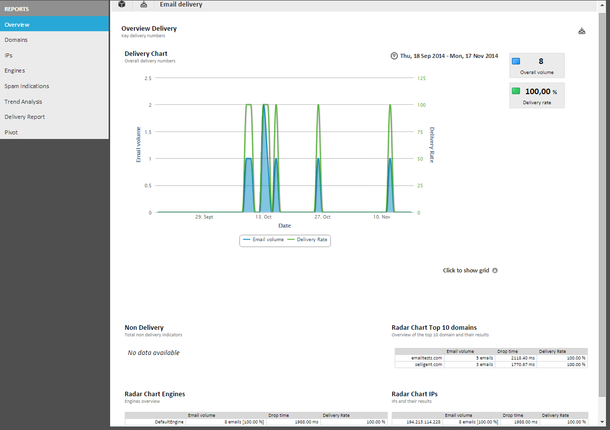
Non delivery — One pie chart and a radar chart show the distribution of causes of non-delivery for emails and the top ten domains targeted.
Per domain, you can find information on:
- Volume — The top domain is automatically attributed a value of 100%. The other percentages are calculated in respect to this top domain.
- Drop time — Express mail delivery time, in milliseconds. This is the average time required to drop a mail in the inbox.
- Delivery rate — Percentage of emails actually dropped in the inbox.
Radar chart with MTA engine states and broadcast IPs — Shows which engines are used to send out emails, the drop time and delivery rate, the IP addresses used to broadcast emails, and the number of emails sent using these IP addresses.
