Best day and daytime to send emails
What is the best day of the week and the best time of the day to send out your communication for a specific organization.
In this exercise we will:
- Use a Column chart to visualize the number of emails sent per day of the week
- Create a line chart to visualize the number of emails sent per time of the day
- Add a search Filter on organization to only display the data for a certain organization
- Use a Bar Chart to visualize the Open and Click Rate per time of the day
- Copy an existing chart for re-use
- Add Date filter to limit the scope of the data displayed
- Use a Pivot table to compare different categories
- Overall Dashboard filtering
- Make the dashboard ready for other devices
- Share and distribute dashboards
Create a Column Chart with number of emails sent per day of the week
To identify this we will create a Column chart, displaying the sent messages for each day of the week.
1. If you do not have a dashboard yet, create one first.
2. Select the data set to use for this chart. We will use communication_stats as this dataset contains all the details per sent communication.
3. Next, drop the Column chart through the 'Add item' button onto the dashboard
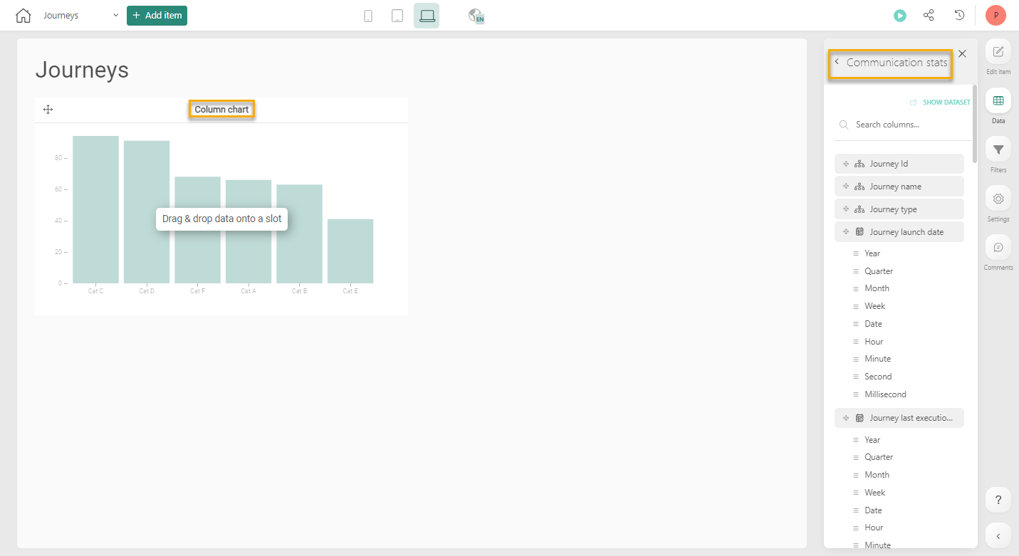
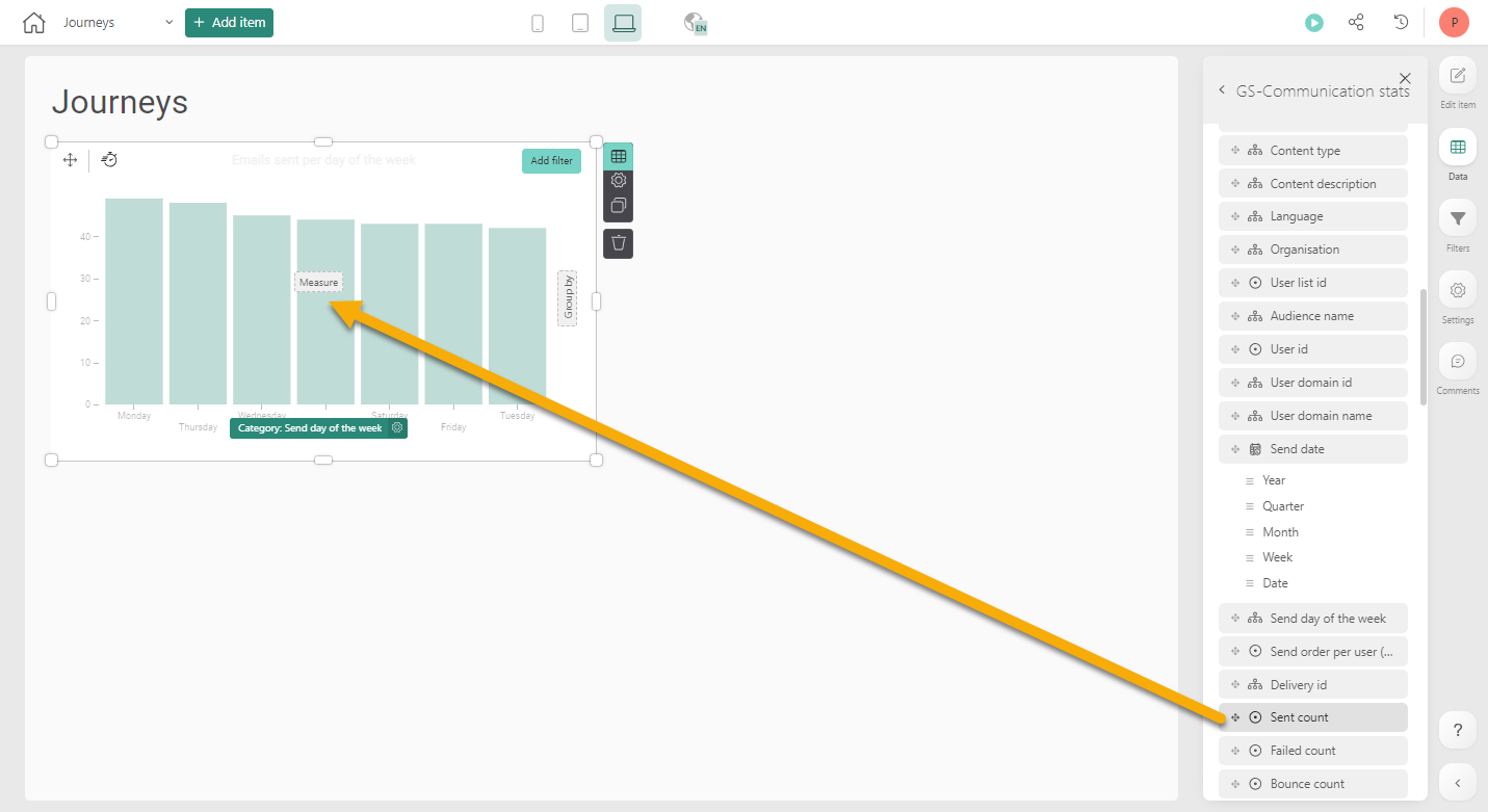
4. To define the data for this graph, click the Data icon in the component:
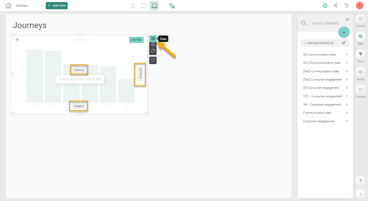
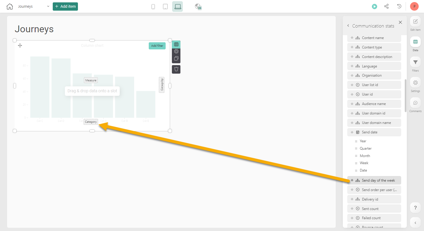
5. Next we will use the hierarchy SEND_DAY_OF_WEEK and use it as a category. Drop the column onto the Category field:
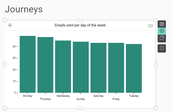
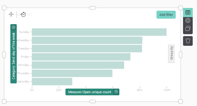
The Column chart shows the first results.
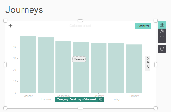
6. Without a measure being specified, the chart displays the number of records in the dataset. In this case, each record in the dataset represents a single communication sent. So this bar chart shows the number of communications sent over all time, split per day of the week.
7. As a next step, change the title of the chart to represent the actual data.
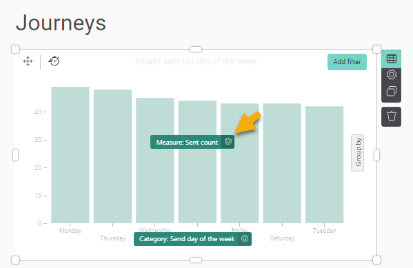
8. The measure currently displayed on the chart is the default number of communications sent. This is already the measure that we need, but best practice is to always select explicitly the measure for the graph. To do this, drag and drop the measure SENT_COUNT onto the measure field in the chart:
When you hover the graph, the SEND_COUNT is displayed:
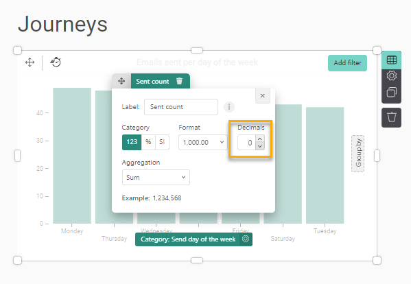
9. The SEND_COUNT contains decimal characters. We will remove these as they are not required for a count. Click the Data icon on the chart to display the data components on the chart and then click the Gear icon on the measure to access the properties:
11. In the properties dialog, set the Decimals to 0.
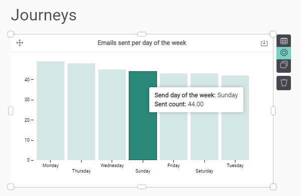
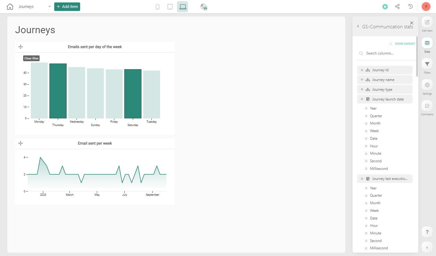
Note: the Bars in the Column chart can also be used as a filter. Clicking them will select the corresponding categories and filter all the other graphs in the dashboard accordingly: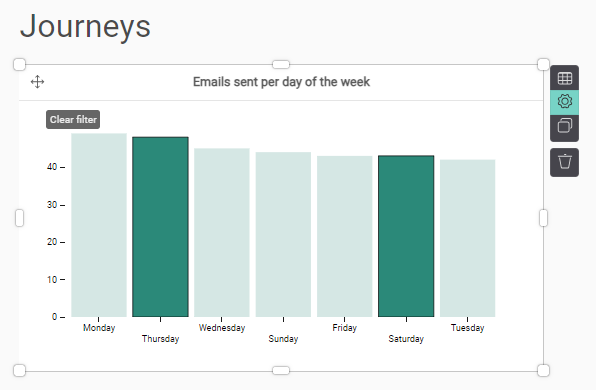
You can remove the filter again by clicking the 'Clear Filter' button in the top left.
Create a Line chart with the number of email sent per week
Visualizing a fluent sequence is best done using a Line chart.
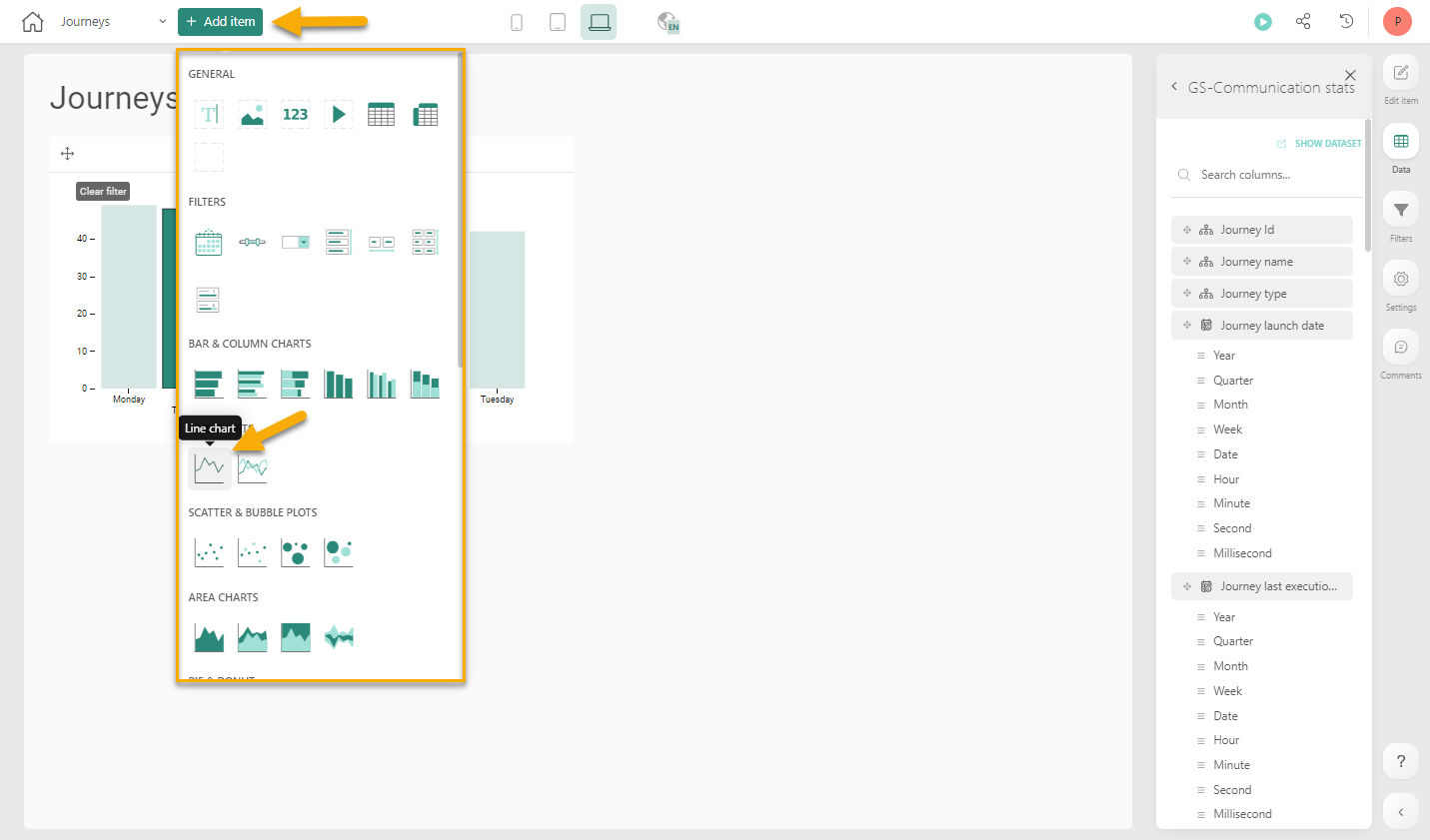
1. Drag and drop a Line Chart onto the Dashboard.
2. Drop the column SEND_WEEK onto the x-axis
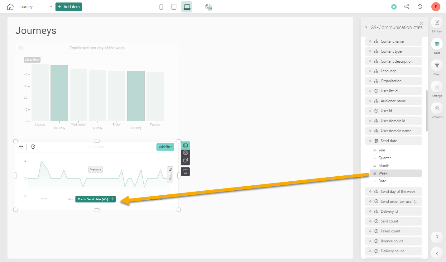
3. Drop the SENT_COUNT onto the measure and change the decimals parameter to 0 in the settings of the measure.
4. Set a title for the Chart.
Note: The Line chart is automatically linked to the Column chart created previously. Filtering the Column chart will also apply the filter on the Line chart.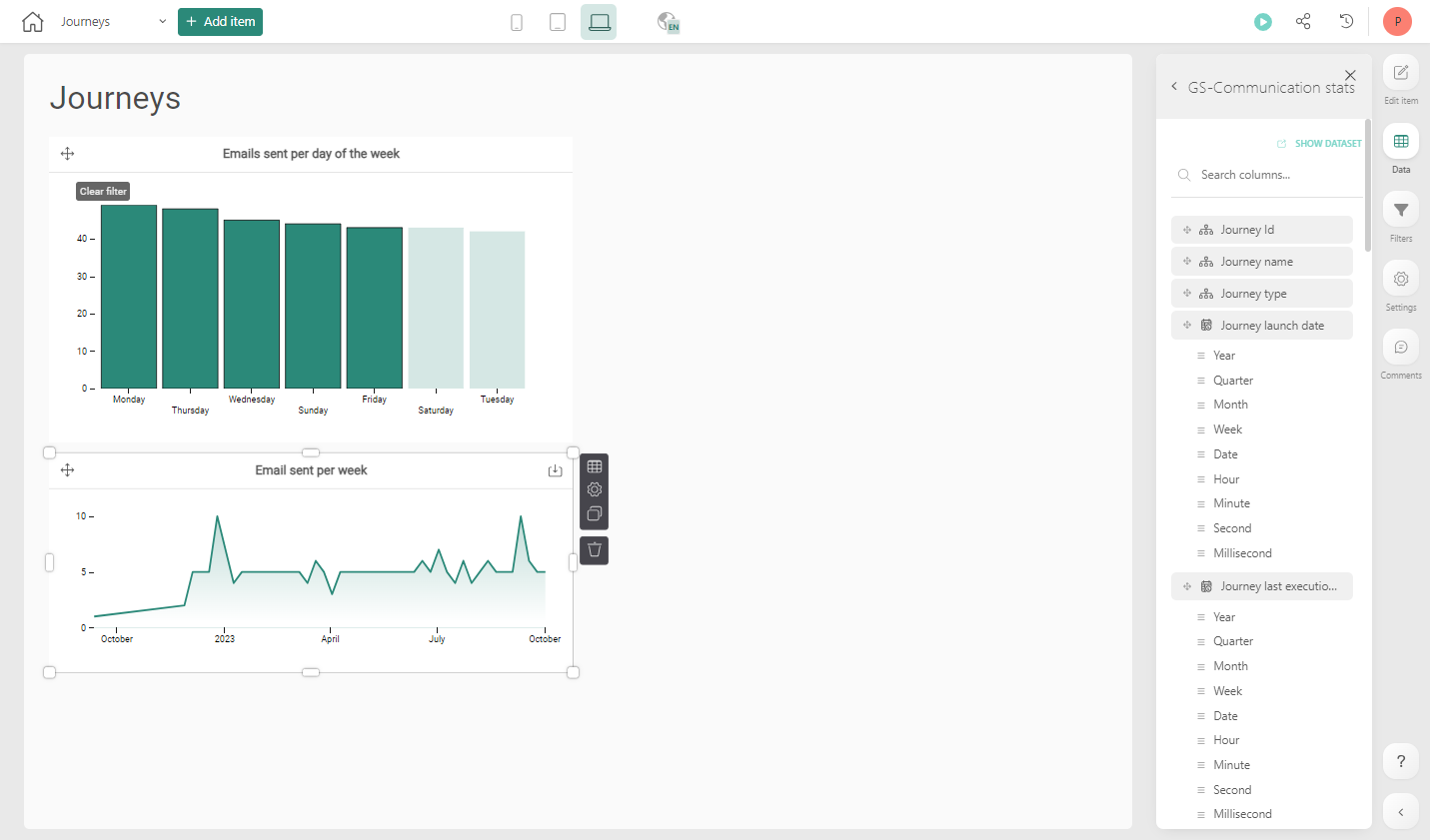
The Line chart can also be filtered by selecting a time range on the chart. This filter is automatically applied to the Column chart as well: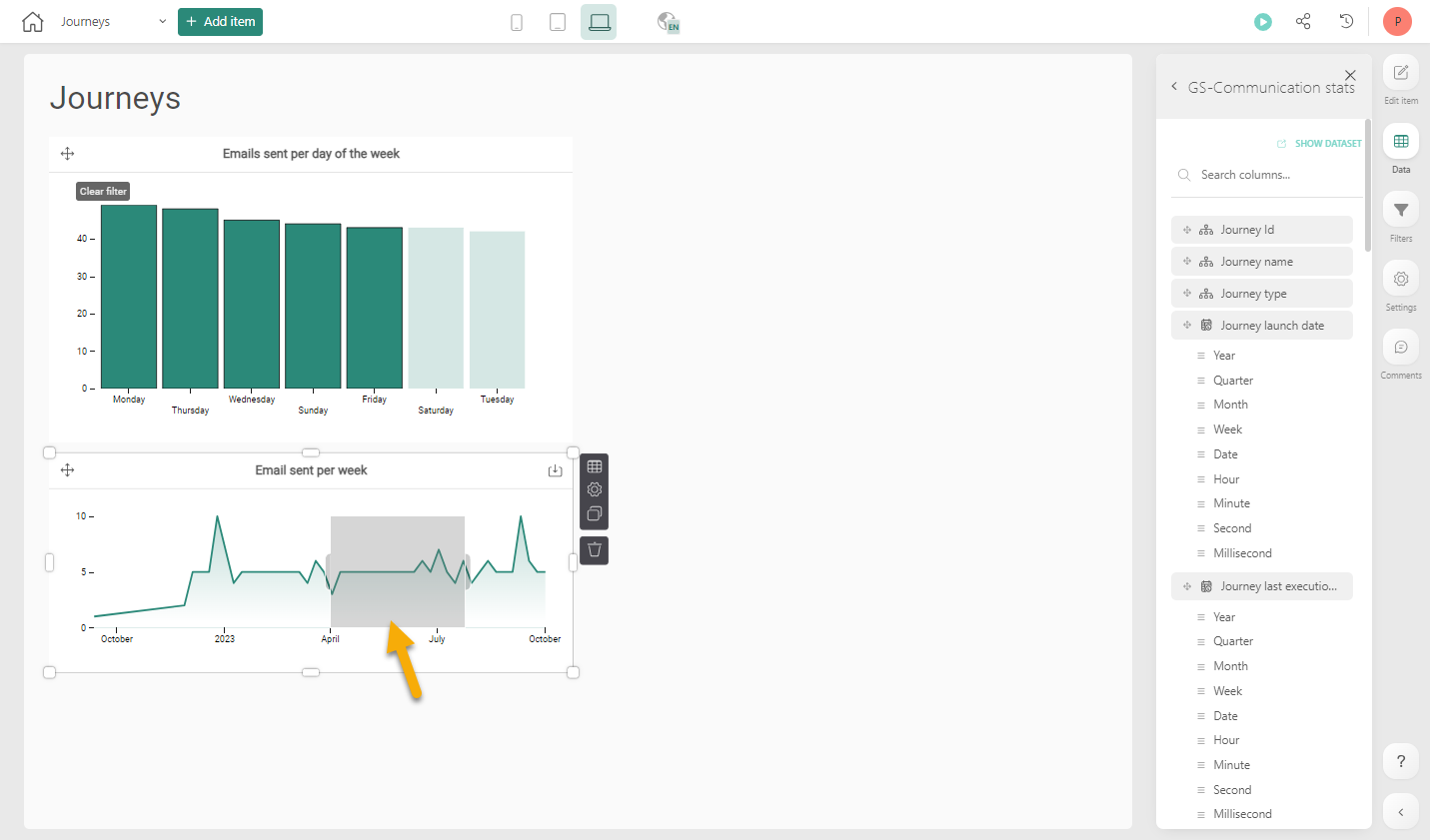
Filter on Organization
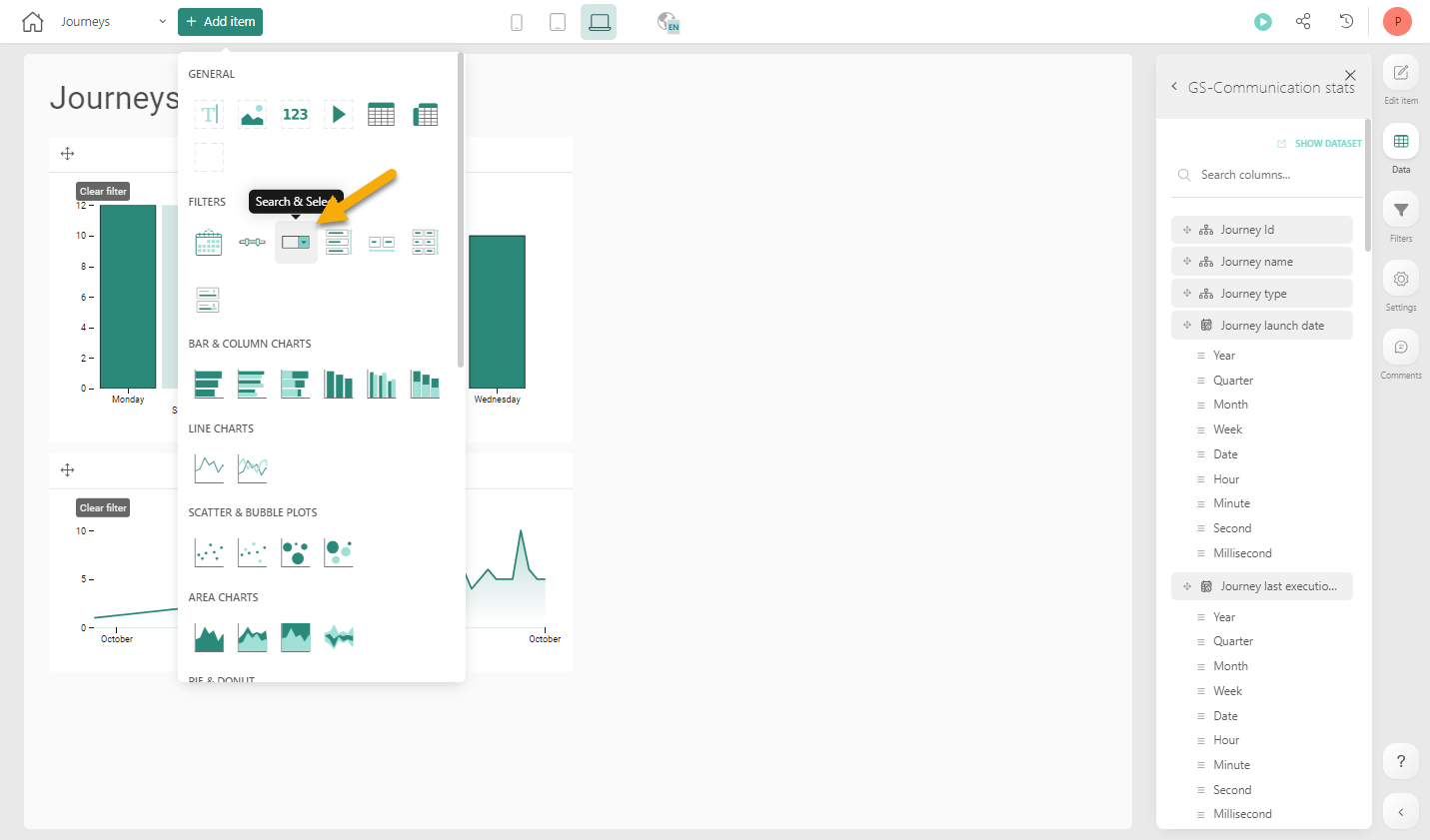
The data displayed on the previous charts is data for all organizations. To allow the marketer to select the organization, a Search and Select field can be added to the dashboard:
1. Drag and drop a Search and Select field from the left navigation onto the Dashboard.
2. Next, select the Organization field from the dataset and drop it onto the filter.
3. The filter is automatically linked to the Column and Line chart and the charts will be adapted accordingly when an organization is selected.
Users will now be able to select an organization and only display the data for that organization;
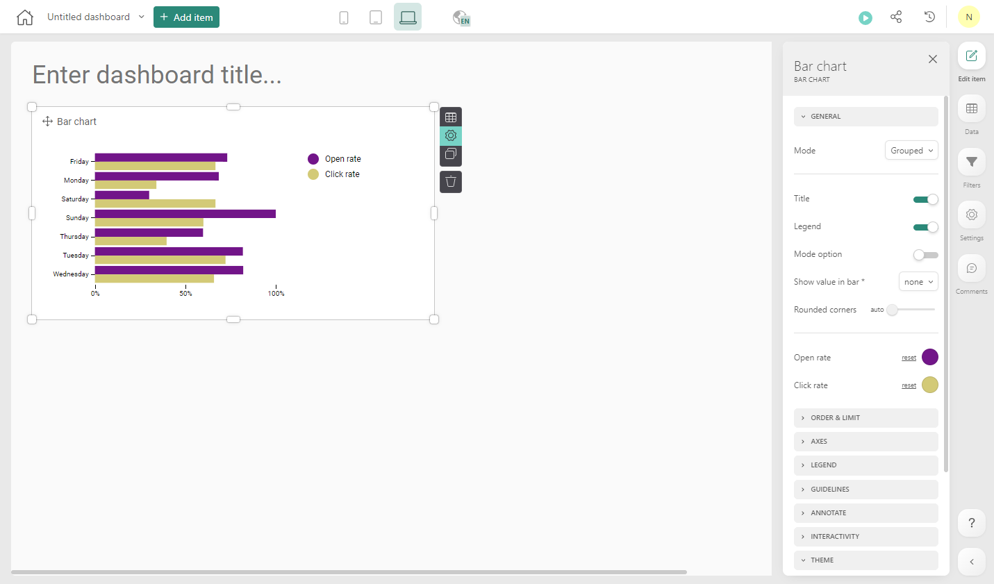
Use a Bar Chart to visualize the Open and Click Rate per time of the day
1. Add a Bar chart to the Dashboard
2. Add the DAY_OF_WEEK column to the category field
3. Drag the measure OPEN_COUNT_UNIQUE onto the measure in the chart. The OPEN_COUNT_UNIQUE counts the number of unique e-mails opened. So when a user opens 1 e-mail 5 times, it is only counted as 1.
4. We want to use the Open Rate, which is the number of unique opens vs number of delivered e-mails. => OPEN_COUNT_UNIQUE / DELIVERY_COUNT
On the measure-tab of the bar chart, select the settings-tab of the measure.
Make the following changes:
- Aggregation = RATE
- Denominator = DELIVERY_COUNT
- Label = Open Rate
- Decimals = 0
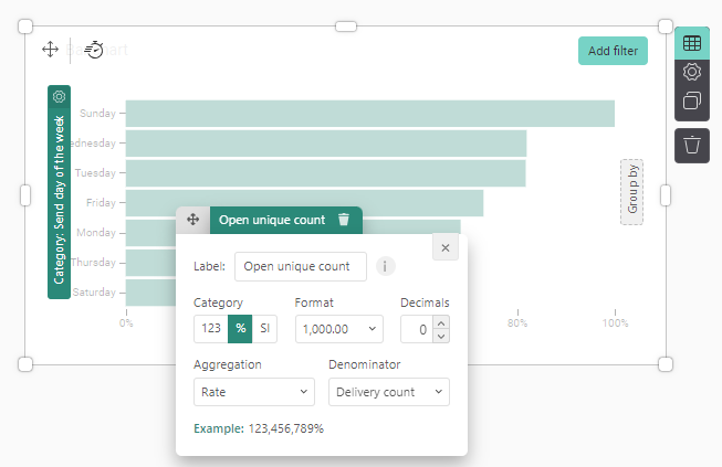
5. Finally, in the same dialog change the format to %. The result is as follows:
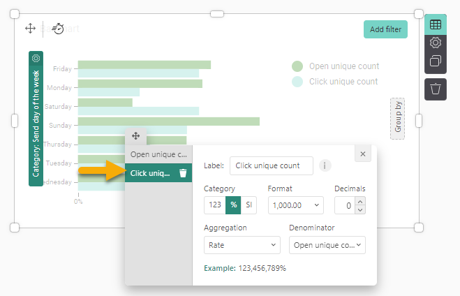
6. We have now 1 measure, the Open Rate. We also need to add the Click Rate to the chart. The Click Rate is the number of messages clicked vs the number of messages delivered. (CLICK_COUNT_UNIQUE / OPEN_COUNT_UNIQUE). Drag and drop the CLICK_COUNT onto the measure
Note: The new column can be dropped onto the same measure field as the previous column. However, only 1 bar is displayed as the values for the Open Rate are a lot smaller than the values for the CLICK_COUNT.
7. Change the CLICK COUNT to a Click Rate. To do this, go to the Settings of the measure and select the measure CLICK_UNIQUE_COUNT on the left
8. Make the following changes
- format= %
- Aggregation= Rate
- Denominator = SENT_COUNT
- Label= Click Rate
The result is following:
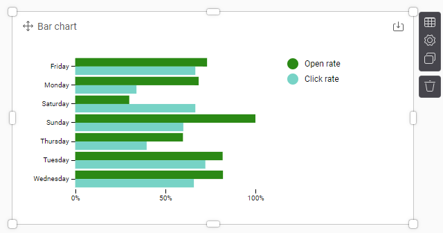
You can change the colors of the graph easily by going to the Settings of the Chart and change the colors for the different measures in the properties dialog on the right:
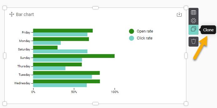
Copy an existing chart for re-use
When you already have a bar chart available, and you want to make a similar bar chart, you can avoid rework by ‘cloning’ the bar chart. For example, you want to re-use the bar chart with the Open Rate and Click rate and display the number per time of the day.
1. Select the CLONE-button on the bar chart. A copy is automatically made.
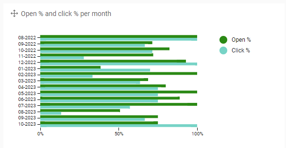
2. On the copied version, you can replace the category SEND_DAYOFWEEK to SEND_MONTH by drag & dropping SEND_MONTH over the existing category.
3. Change the title to “Open % and CTO % of e-mails per month” and change the size of both created bar charts, so all bars of the hour-chart are nicely visible next to each other.
Add Date filter to limit the scope of the data displayed
Without any filtering on date, all the available data will be shown. There are different ways to place a date filter:
- slider
- date filter.
Both will be used in this dashboard.
1. Drag & drop the slider on to the dashboard. Then, drag & drop SEND_DATE on the slider.
2. Rename the title to “Slider Sending date”
Note: There are different possibilities when drag & dropping a date-field on a slider. When using a date-component(year, month, week,…) , this will be the granularity that will be shown on the slider. When using the main object, the smallest available granularity will be shown. In most cases, date, week, or month are used.
3. Another option is to use a date filter. Drag & drop the date filter on to the dashboard. And drag & drop SEND_DATE on the date filter.
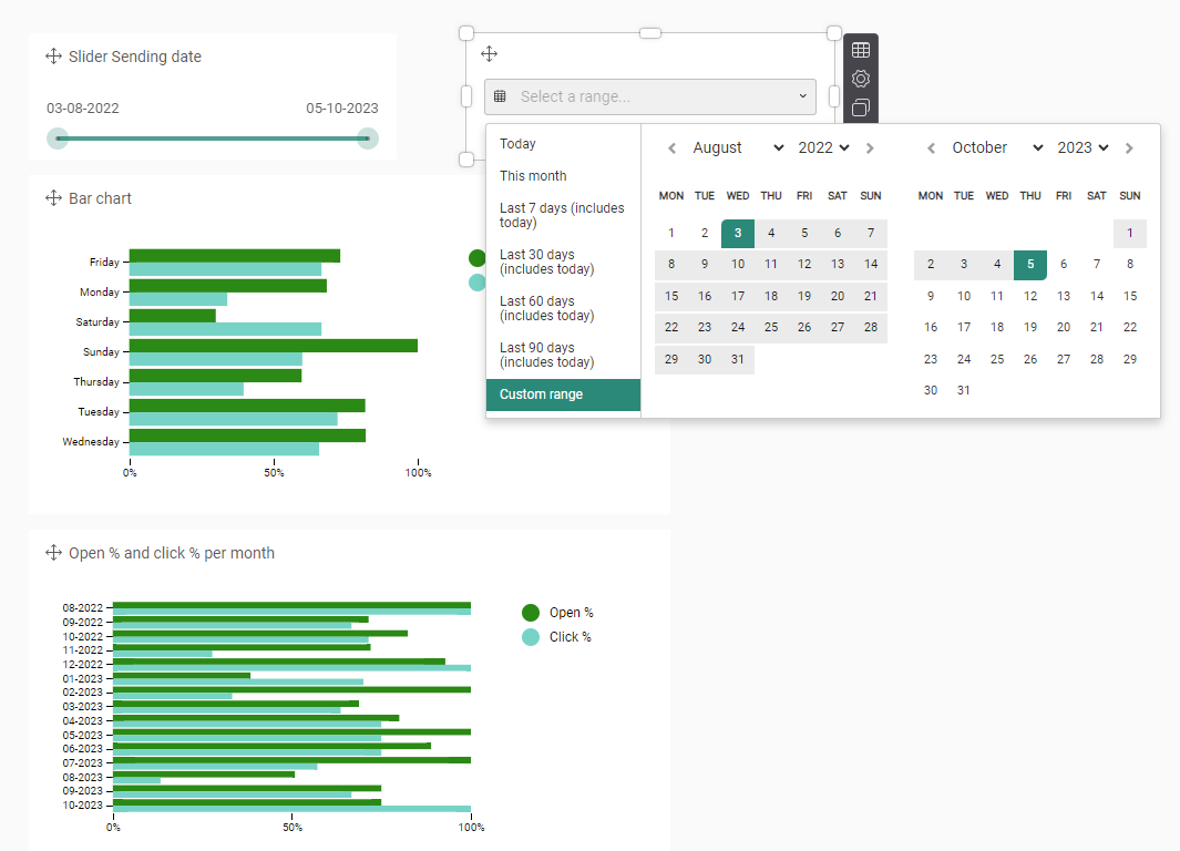
The date filter allows you to make easy selections of a custom time range or the last 7, 30, 60 or 90 days.
Note: the Date filter applies to all components in the Dashboard.
Use a Pivot table to compare different categories
The above graphs provided information on the best day of week to send communications. However, the best day of the weekis often different depending on the month
To visualize this we will create a pivot table.
1. Drag and Drop a Pivot table onto the dashboard.
2. Drag and drop SEND_HOUR on the row-section of the pivot. Drag and drop SEND_DAYOFWEEK on the column-section of the pivot-table. The result is following:
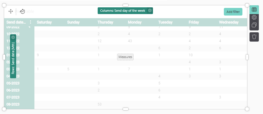
Note: You can change the size of the chart according to the data. Resize the chart so all times are displayed.
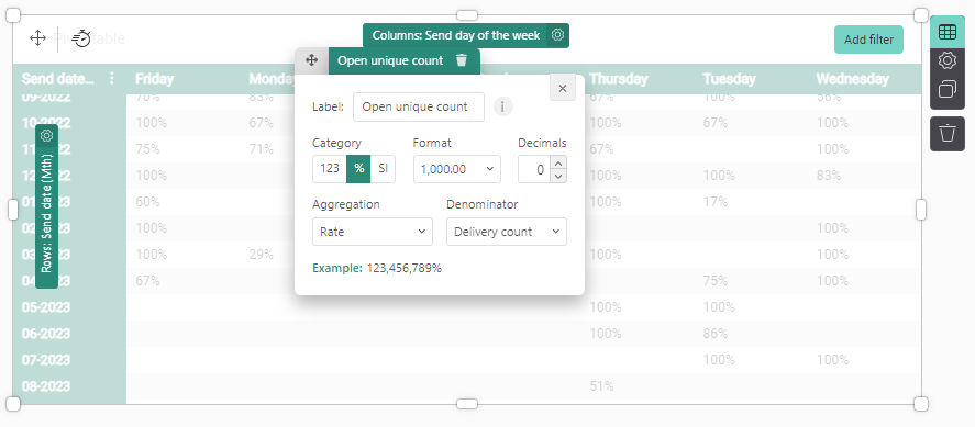
3. As a measure we will again use the Open Rate. Therefor, drag and drop the OPEN_UNIQUE_COUNT measure onto the chart and configure the measure to display an Open Rate (see previous exercise).
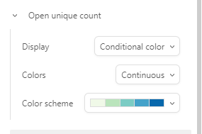
4. To make the table easier to read, you can change the color of the values in the chart and make these conditional, where the highest numbers are displayed against a darker background.
Overall Dashboard filtering
Depending on the dataset and the requirements of your dashboard, it could be that you want to filter all visual components at once.
Example: you can have a dashboard which is only applicable to e-mail. Or you would like to make 2 separate versions of the same dashboard, one for e-mail, one for mobile.
In these cases you can make use of an overall dashboard filter.
1. On the right-hand side of the screen, you select the tab FILTERS. This displays all the static filters deployed to the complete dashboard or on 1 or more charts.
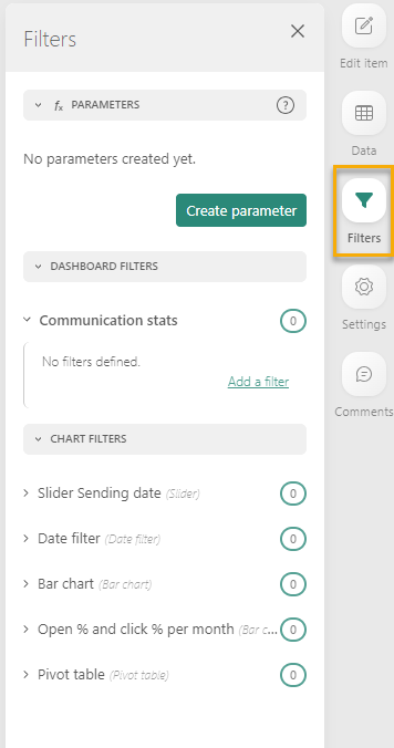
For each of the visuals, you can see how many static filters are set and what is filtered.
2. To set a new filter (on the dashboard and/or on a chart), hover the number and click. A dialog is displayed where a new filter can be defined:
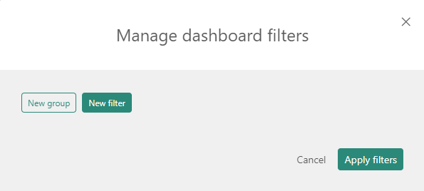
3. Click New filter.
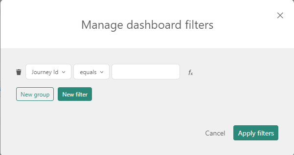
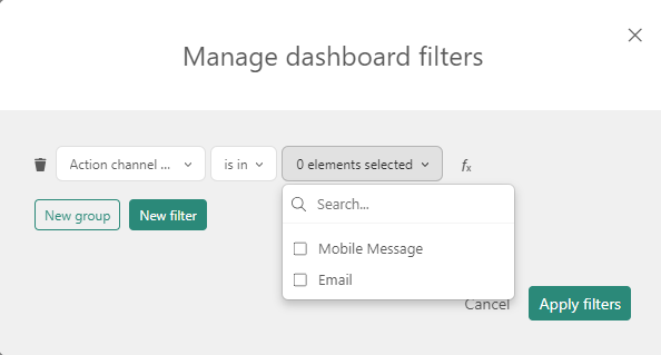
4. Select the field to be used in the filter, the function, and the elements (if applicable). In this case, we made a dashboard for E-mail, so we add an extra filter ACTION_CHANNEL_NAME is in EMAIL.
5. Click Apply to apply the dashboard filter. The Filters section on the right now indicates 1 filter has been set:
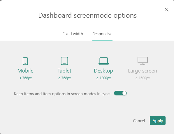
Make the dashboard ready for other devices
To ensure the dashboard can be visualized correctly on other devices, dedicated options are available to see what it looks like.
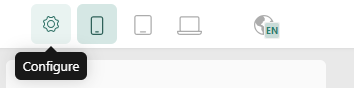
1. Click the mobile or tablet icon at the top:
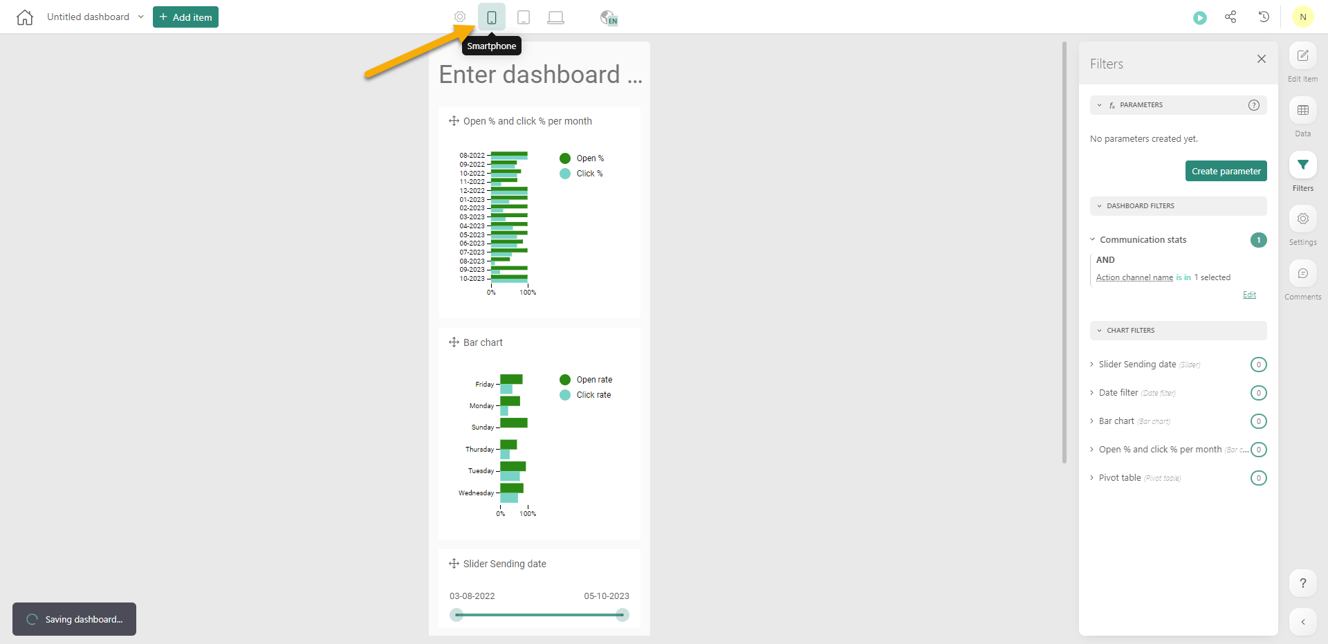
A preview is displayed.
2. To make changes to the visualization, click the gear icon, next to the device icons:
In the configuration you have the option to keep all visuals in sync (or not).
3. When you open the dashboard in another mode for the first time, you will notice that some objects might have shuffled. If you set this correct, this visual representation will remain as is for the existing objects on the dashboard.
share and distribute dashboards
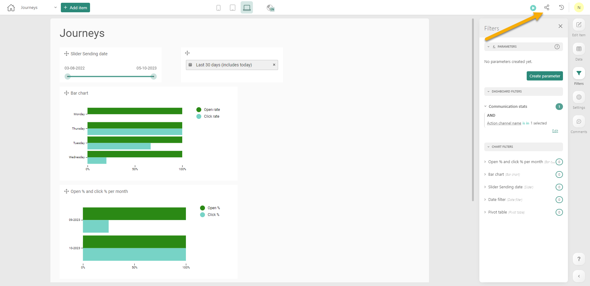
1. Click on the dedicated sharing-icon on the upper-right of your screen to arrive in the sharing menu.
From here you can export, send an export or share a link of the dashboard.
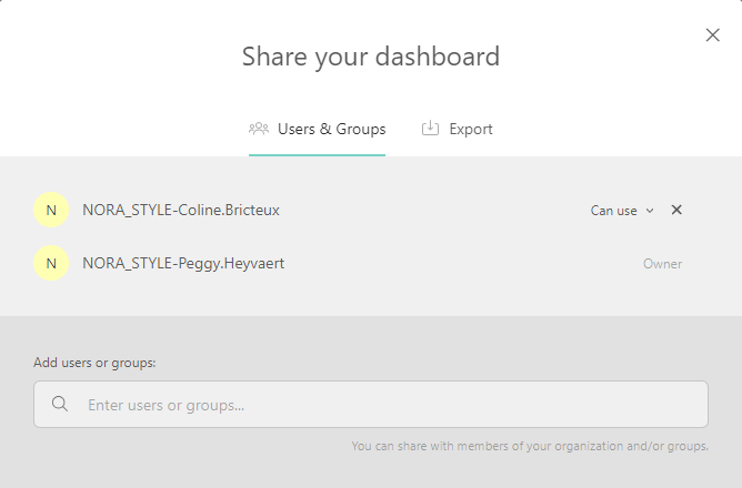
2. Exporting, scheduling and distribution of a dashboard can be done via the tab “Export”.
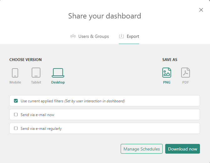
Here you can see different options to share different versions (with/without filtering).
When you want a dashboard to be scheduled and send over by e-mail, make sure you only use small characters.
