Building a dashboard is about displaying the data collected over time in a structured way allowing the marketer to get founded insights in how their campaigns are performing. To achieve this, it is important to understand the data and the way in which it is stored.
Below you will find details on how to build some common KPI widgets using the standard data available in Marigold Engage.
The concepts explained
Aggregation filters
Before explaining the creation of most common KPI widgets, a word on aggregation filters.
For performance reasons, the standard datasets are sending back a maximum of 10.000 records based on the filter or aggregation level applied. The aggregation filters define on which level records are sent back. This means that depending on the type of information you want to retrieve, different aggregation filters need to be used. As a result, different widgets in a dashboard can use different aggregation filters depending on the type of information that needs to be displayed.
Note: The above limit of 10.000 records only applies to the standard datasets, not to custom datasets as there is no limit there to the number of records returned.
Available aggregation filters per dataset:
Communication Stats:
- Deliveries (default)
- Content
- Domain
- Journey
- Global
Consumer Engagement
- Consumer (Default)
- Global
Example1:
In dashboard widgets using the communication stats dataset and with the aggregation filter set to journey, Data Studio will return 10.000 journey records (the most recent ones first). If you want to show a filter widget holding all possible journey types, Data Studio will return journey types based on those 10.000 journey records.
If no aggregation filter is set, the default is set to deliveries. For the above example, that would mean Data Studio sends back 10.000 records based on the most recent deliveries. However, if these deliveries are all linked to the same journey (and thus journey type) the list of journey types will not include all types and leave some types out that do not appear in the 10.000 records. This is not the expected result and is why the aggregation filter needs to be set to journey.
Example2:
Display a list of possible audiences to choose from in a dashboard using the Consumer Engagement dataset.
The default aggregation filter for this dataset is “Consumer”. In this case, information is returned about the consumers belonging to the default audience (defined at system level) or the audience with the smallest ID for this organization.
However, some customers have several audiences and would like to build a dashboard that allows them to switch between audiences.
If you use a “Search and Select” widget to filter on the Audience Name field, you will see one audience available in the list and won’t be able to select another audience.
To solve this you need to define a filter on the widget to change aggregation type to “Global". By doing so, all Audience List names are returned.
Note: It is advised to set an aggregation level for each widget added to the dashboard.
Also, some fields in the dataset are only available as a value or for grouping in certain aggregation filters. An overview of which fields are available on what level can be found in the online help, in the Dataset overview topic. Note that all fields can always be used for filtering, regardless the aggregation level.
Example: Domain name is only available for the global and domain aggregation filter. Journey type is only available at journey, content and deliveries level.
Counts vs Sums
When designing a numerical widget, it is important to know when to use a count and when to use a sum. The choice depends on the way information is stored in the database.
Count will simply count the number of records while sum will add the values. In some case this results in the same, but often it doesn’t.
Example:
When emails are sent out, there is a record for each email sent and the value in the field "Sent count" is set to 1. This means that a count of the records is the same as the sum of all the values in the Sent count field.
Let’s explain:
We have 5 emails that have been sent.
- Record1 : SentCount:1
- Record2 : SentCount:1
- Record3 : SentCount:1
- Record4 : SentCount:1
- Record5 : SentCount:1
A count of the number of Sent Count would be 5 as 5 records were sent.
A distinct count is 1, as there is only 1 possible value, which is 1.
Sum will do a sum of the values in the Sent Count field 1+1+1+1+1=5
However, there is a difference between count and sum for all other measures (Delivery Count, Open Count, Click Count, Unsubscribe count).
Take the example of the emails that have been delivered. The formula Count would simply count the number of records, which corresponds to the number of records that have been sent, but some of these are delivered and others are not. For each record that information is stored in the Delivery/Open/Click/Unsubscribe Count field. Value 1 for delivered/Opened/Clicked/Unsubscribed, 0 for not delivered/Opened/Clicked/Unsubscribed. So in this case we need to make the sum of all those numbers 1 to get the correct amount of records.
We have 5 emails that have been sent of which 4 have been delivered.
- Record1 : DeliveryCount:0
- Record2 : DeliveryCount:1
- Record3 : DeliveryCount:1
- Record4 : DeliveryCount:1
- Record5 : DeliveryCount:1
A count of DeliveryCount would be 5 as there are 5 records
A distinct count is 2, as there are only 2 different values: 0 and 1
Sum will do 0+1+1+1+1=4
How to build a dashboard
To explain how the different widgets work and are created, we will analyze a few of the default dashboards and go into detail of the different types of widgets.
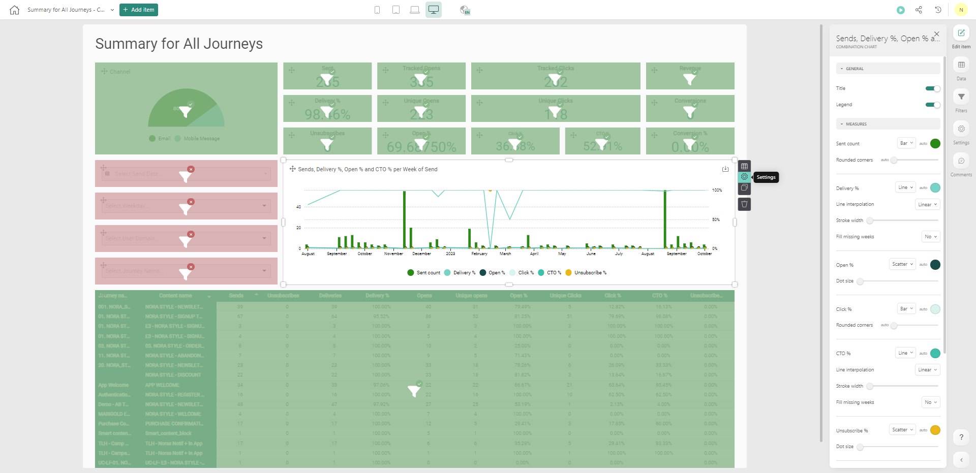
“Summary for all journeys” dashboard
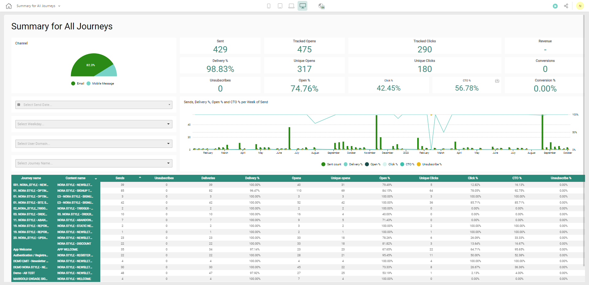
This dashboard is based on the Communication Stats datasets as it provides insight on all communications and interactions on journeys and content.
The following widgets are explained:
Widget 1: Number of Emails SentWidget 1: Number of Emails Sent
Widget 2: Tracked Opens
Widget 3: Delivery Rate
Widget 4: Open Rate
Widget 5: CTO rate
Widget 6: Filter on Sent date
Widget 7: Filter on Week dayWidget 8: filter on domain
Widget 9: filter on journey name
Widget 11: table view, per journey, per content, the most important KPIs
Widget 1: Number of Emails Sent
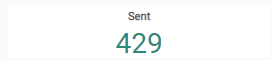
Widget type - Use a Number widget for this as just 1 number needs to be displayed
Fields used - This widget uses the field Sent count as a measure in the Communication Stats. For each email sent, a record is created and the field Sent count is set to 1.
Formula - Use the formula Count as you want to count the number of records that have been sent. In this case this corresponds also to the sum of the values in the Sent count field.
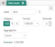
Aggregation filter -To retrieve all messages sent, the aggregation filter is set to global, meaning it retrieves all the information for all journeys.
Note: If the aggregation level would be set to Journey, then the 10.000 most recent journeys are returned and the number of emails sent would be calculated based on those journeys, which is not a true reflection of the total amount of emails sent. This is why you need to use the global aggregation filter.
Widget 2: Tracked Opens
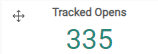
Widget type - Use a Number widget for this as just 1 number needs to be displayed.
Fields used - This widget uses the field Open count. For each email that has been opened, the value in this field is set to 1.
Formula - Change the formula to Sum here. Count would simply count the number of records, but some of these are opened and others not. For each record that information is stored in the Open count field. Value 1 for delivered, 0 for not delivered. So in this case we need to make the sum of all those number 1s to get the correct amount of emails opened.
Note: The above also applies to Delivered, Clicks and Subscribes.
Aggregation filter -To retrieve all messages, the aggregation filter is set to Global, meaning it retrieves all the information for all journeys.
Widget 3: Delivery Rate

Widget type - This is also a Number widget as you want to display just 1 percentage.
Fields used - This widget uses the Delivery count field. For each email that has been delivered the value in this field is set to 1.
Formula - In the configuration of the measure, you need to indicate that it is a Rate that is calculated compared to the number of emails sent (denominator). Change the format to % and select Rate as Aggregation. The Sent Count field is selected as the Denominator.
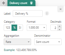
Aggregation filter - Aggregation filter Global as you want to have deliveries of all message over all journeys.
Widget 4: Open Rate
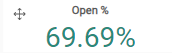
Widget type - This is also a Number widget as you want to display just 1 percentage.
Fields used - This widget uses the Open unique count; multiple opens of the same message should only be counted once.
Formula - In the configuration of the measure, you need to indicate that it is a Rate that is calculated compared to the number of emails delivered (denominator) as it makes sense to only take into account the emails that were actually delivered.

Note: You can also assume that the opens matter for emails that were actually sent and change the denominator to sent count instead of delivery count. It is up to the marketer to see how numbers should be treated and interpreted and clearly indicate in the title of the widget what the number represents.
Aggregation filter - Aggregation filter is set to Global as you want to have opens over all journeys.
Note: The widgets Click rate and Subscribe rate work in the same way as the Open rate.
Widget 5: CTO rate
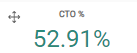
Widget type – This is also a Number widget as we want to display just 1 percentage.
Fields used – This widget uses the fields Unique click counts and Unique open count.
Formula - CTO rate is the number of opens that lead to clicks, so for this you also use the unique click count but compared to the unique opens.
Aggregation filter - The Aggregation filter is Global.
Widget 6: Filter on Sent date
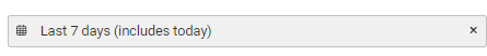
Widget type - We use a Date filter widget for this as we want to allow marketers to select a start and end date
Fields used - The Send date of the emails is used as a measure. However, you can use different precision levels such as the date, which will use the exact start and end dates, but also week, month, quarter to extend the search to respectively the full week, month or quarter.
Formula - None
Aggregation filter - Aggregation filter is Global as we want to be able to filter over all journeys.
Widget 7: Filter on Week day

Widget type - Here, we use a Select and Search filter widget because we need a drop-down with the days of the week.
Fields used - The measure is Send day of week as we want to display every possible day of the week in the drop-down.
Formula - None
Aggregation filter - The aggregation filter is set to Global as we want to have all possible weekdays in the drop-down. If we would for example set the aggregation filter to journeys, only the weekdays that appear in the 10.000 most recent journeys will be listed.
Widget 8: filter on domain
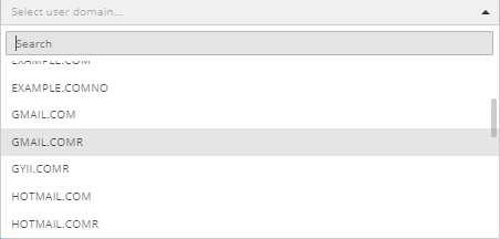
Widget type - Use a Select and search filter widget to create a drop-down of domain values.
Fields used - Use the measure User domain name to display a drop-down of the available domains.
Formula - None
Aggregation filter - The aggregation filter is set to Domain, so we can retrieve all the different domains used.
Note: If you would set the aggregation filter to Journey for example, Data Studio will retrieve 10.000 journey records and get the domains that exists in those journeys. But that doesn’t necessarily mean all existing domains. To retrieve all available domains, data need to be retrieved on Domain level.
Note 2: The domain name is only available for aggregation filter domain and deliveries.
Widget 9: filter on journey name

Widget type - Use a Search and select filter widget to display a drop-down of journey names.
Fields used - Use the Journey name field as we want to display a list of journey names
Formula - None
Aggregation level - The aggregation filter is set to Journey as we want the journey names for the 10.000 most recent journeys.
Note: If you would choose aggregation filter Deliveries, Data Studio will return the journey names for the 10.000 most recent deliveries and if these are all linked to the same or only a few journeys, we will not get a full list of all journey names.
Note: Journey name is only available on aggregation level Journey, Content and Deliveries.
Widget 10: Graphical overview over time of most important KPI rates
We want to display the number of records sent, the delivery rate, Open rate, click rate, click to open rate and unsubscribe rates, and this on a timeline
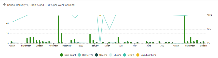
Widget type - We use a Combination chart for this as the number of emails sent should be displayed in a bar and all the other rates as a line.
Fields used - As measures to be displayed in the graph, use Sent count, Delivery count, Open count, Click count (once for the click rate and once for the CTO rate) and Unsubscribe count.
On the x-axis put the Month of the send dates. This is our timeline over which you want to see the numbers. It is important to think about what date or fraction of the date (quarter, year, month) you want to use. If the date of delivery is more important that the send date, you can use this on the x-axis.
Formula - Each of these measures must be configured to be a Rate; How to do this is explained in the previous examples.
Aggregation level - The aggregation filter is set to Global.
To define the look of this chart, click the settings icon and change some properties on the right
- Sent count is set as a bar, the others as lines.
- The legend is placed below and a title is displayed
You can play around with colors.
Widget 11: table view, per journey, per content, the most important KPIs

This table provides an overview of the KPIs per journey and per content in the journey.
Widget type – Use a Pivot table as widget type
Fields used - The rows of the table are built using 2 fields: Journey name and Content name. The columns use 11 measures based on the emails sent, the open, click, delivery and unsubscribes numbers and rates.
Note: Because this is a Pivot table, data will be grouped by journey name, then content and then sorted on the measures, which means that it is not possible to sort the data over all journeys and content based on the measure. For example, showing the journeys with the top delivery counts first is not possible.
Formula - These are calculated in the same way as in the previous widgets. The counts use the Sum formula where the Rates use the %.
Aggregation filter - Because you are using information that goes down to the level of content, the aggregation filter is set to Content for this widget.
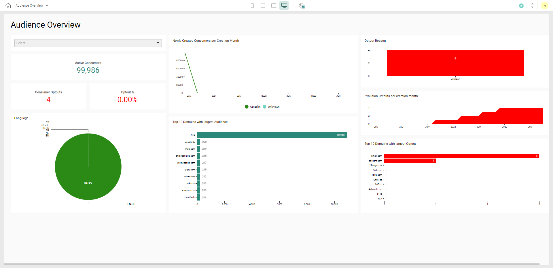
"Audience Overview" dashboard
The Audience Overview dashboard displays information linked to the consumers and uses the Consumer Stats dataset. When using the Consumer Stats dataset, data is always displayed for one specific Audience List. This default Audience List is configurable for the environment but is by default set to the one with the smallest ID.
Widget 1: Filter the data by list name
If you want to leave the option to the marketer to choose the Audience List, a Search and filter widget using the List Name field can be added.
Widget type - A Search and filter widget is used.
Fields used - The List name is selected as dimension.
Formula - None
Aggregation filter - The aggregation filter is set to Global as you want to retrieve the full list of all Audience List names
Note: If you would use aggregation filter Consumer, then only 1 Audience List name will be returned, as the dashboard by default only displays details on consumers belonging to one and the same list.
Widget 2: Top 10 domains with largest consumer count
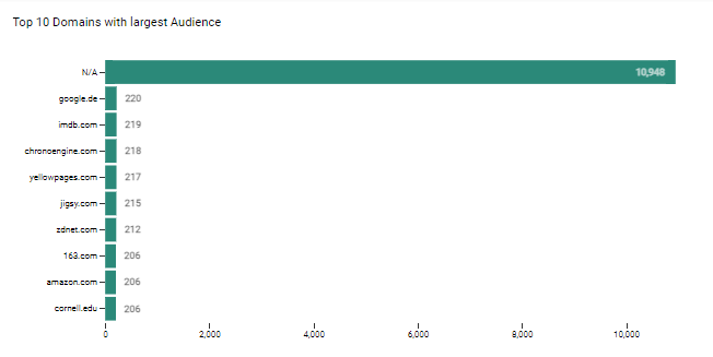
Widget type - You can use a Bar chart for this.
Fields used- The measures used are the Consumer count and as category the Mail domain name.
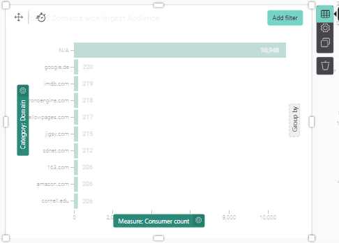
To limit the results to the top 10 domains, you need to configure the widget as follows. This is done in the settings of the widget:
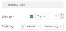
- Limit to top 10
- Order by measure (which is the consumer count) descending, meaning the most consumers at the top
Note: The widget "Top 10 domains with largest optout" is created in the same way, using the Domain name as Category and Consumer Optouts as measure.
Widget 3: Newly created consumers per Creation Month

Widget type: Use a Line chart widget to display the evolution over time
Fields used: To know how many consumers are created per month, the ID of the consumer is used and a count is performed. The Month in the Creation date of the consumer record is used for the timeline. A grouping based on Optout is applied to give insight in how many of these consumers are still active.
Formula: Use the Count for the IDs field. This will count the number of records that have their creation date in that specific month.
Aggregation filter: The aggregation filter is set to Consumer.
