Checkbox Components can be used individually to indicate a specific yes or no choice (subscribe or not) or in a group of checkboxes where the contact can choose from a series of options. Each checkbox in a group of options is considered as an individual option and the corresponding values can be used to update distinct fields in the database.
When a Checkbox Component is added to the form, the following <input> tag of type checkbox is added to the source.

The ID of the Checkbox is used to display the used component in the Available components section on the right.
Note: When a Checkbox Component is added and no form tag is available yet, the system will create one automatically.
Checkbox Properties
To access the properties, click the <input> tag of type checkbox in the source or click the corresponding element in the list of available components. When working in Wysiwyg mode click the component in the interface.
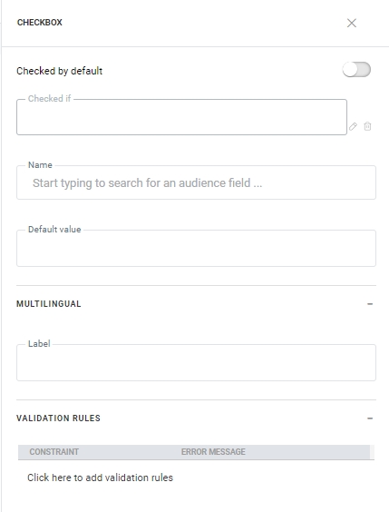
Checked by default — Activate the option if the default status of the Checkbox is checked.
Checked if — Checking the box by default can depend on a specific condition being true. Click the pencil to access the Constraint Editor and define the condition using fields from the Audience and extended Lists. (For more details on using the Constraint Editor, check out this topic)
Name — The name of the Checkbox. Fields from the Audience and linked lists can be selected from the drop-down. You use this field name to retrieve the posted value after the form is submitted. A Checkbox will only submit if checked, otherwise the posted value will be empty.
Default Value — Define the value for the check box. This can either be 1 or TRUE depending on the type of field. 1 is used for text fields and true for boolean fields. This value is posted when the Checkbox is checked. When the Checkbox is not checked, no value is posted.
Note: In HTML forms, the value of a Checkbox is only posted if the checkbox is ticked. This means that when the Checkbox is unchecked, the value in the database will not be updated. We therefore recommend using a function when posting the value of a Checkbox in a data component. (Example: [%if(eq(requestValue('Loyal'),'1'),'1','0')%] )
Multilingual properties
All translatable fields in the component are listed in this section. To define the value in a different language, select the language from the drop-down in the toolbar and enter the translated value.
Label — Enter text you want to display just after the Checkbox indicating the purpose of the Checkbox.
Validation rules
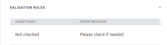
Validation rules — These rules validate the posted value and display an error message when validation fails. When multiple rules are defined and more than one fails validation, all the corresponding messages are listed.
Click the pencil icon to create a new rule. A dialog is displayed.
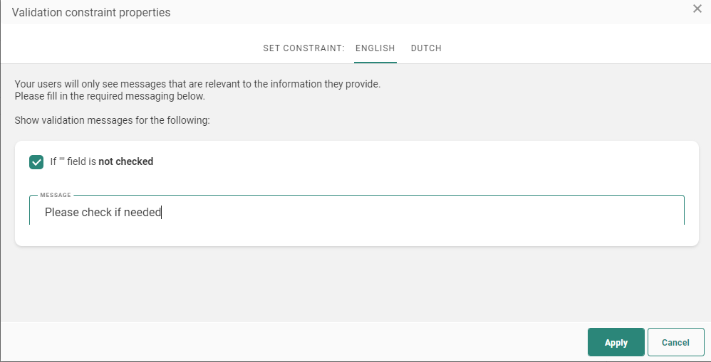
On the Validation constraint properties dialog, you can create a rule that requires that the message recipients check the Checkbox before they can submit the form. If the box is not checked, the text you specify in the ‘Message’ field will be displayed to the recipient. This validation can be used in situations where the general conditions need to be accepted before they can submit a form.
When the page is created in multiple languages validation messages can be set in the other languages by selecting the language in the menu bar.
When done setting the validation rules, click Apply. The rules are now listed in the Validation rules section in the Field properties panel. Clicking a rule will take you straight to the Validation rules dialog where you can make the necessary changes.
Note: When you create or update form validation rules on a page that is already being used inside one or more journeys, those journeys must be published for the changes to take effect.
Copy Check Box Component content to other languages
By default, when adding new Content Components to a message, only the structure of the component is copied automatically to other languages. However, using the function copy content to other languages, you can now copy the component with its content to one or more languages.
This option is available once the component is placed onto the message and multiple languages have been defined for the message.
Click the button Copy content to other languages in the component properties.
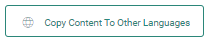
A dialog is displayed in which the target languages can be selected.

