A Textbox Component in a form is used to create the Input fields in the form, such as name, first name, email, password. By using this component you have access to all the properties of the textbox, including the label that goes with it and the validation rules that apply on the values entered.
Note: The Textbox Component is multi-language. All translatable text can be created in multiple languages. This is the case for the label of the field, the placeholder text and the validation rules
When a Textbox Component is dragged on the form you need to enter the ID of this component and click OK. The result looks as follows:
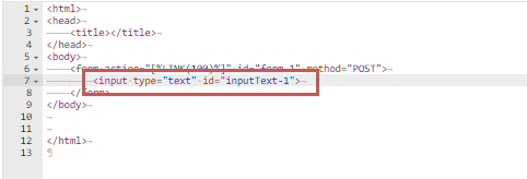
An <input> tag of type text is added. The ID of the component is used in the Available components section on the right. It allows to easily identify the component in the list and access the properties.
Note: When a Textbox Component is added and no form tag is available yet, the system will create one automatically.
Textbox Properties
Click the <input> tag on the page or the element in the list of available components on the right to access the properties. For every defined property, information is automatically added to the source code.:
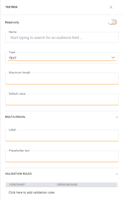
Read only — Toggle this option on if the field is read only.
Name — The name of the Texbox Component. This is used to retrieve the posted value for that form field. A drop down list holds all the fields in the audience list and linked lists. Select the one that corresponds to your textbox (eg. FirstName). In the source code, after selecting a field here, the following is added (when firstname is selected) : "[%loadValue(requestValue('FIRSTNAME'),'FIRSTNAME','')%]". A the same time, the Value property is filled out as well with this same function.
Type — The type of Texbox field. This is filled out automatically when a field is selected from the audience or extended list. A choice can be made between TEXT, EMAIL, NUMBER, HIDDEN or PASSWORD. The type defines the behavior of the field such a Password fields showing **** and email fields requiring a specific format of content.
Maximum length — The max allowed length for the posted text. This information is filled out automatically when a field is selected.
Default Value — The default value displayed in the Textbox field. This property is automatically filled out after a field has been selected for the Name property and holds the following code (when firstname is selected) : [%loadValue(requestValue('FIRSTNAME'),'FIRSTNAME','')%]. This implies that, when returning to the form after it has been posted with errors, the posted value will be displayed in the form as the default value for the field FirstName, and if not available, the database value for that field. If neither of those are available, the textbox field is left blank.
Multilingual properties
All translatable fields are listed in this section. To define the value in a different language, select the language from the drop down in the toolbar and enter the translated value.
Label — This is what is displayed in front of the Textbox.
Placeholder text — This is the text displayed in the field, typically an instruction such as Please fill in your email.
Validation rules
Validation rules — These rules allow to validate the posted value and display an error message when validation fails. When multiple rules are defined and more than one fails validation, all the corresponding messages are listed. The validation options differ depending on the type of field.
Text, Password — Checks if field is not empty, equal or not equal to a given value
Email — Checks if the field is not empty, if the email is valid and if it is equal to or not equal to a given value
Number — Check that the field is not empty, if a number is entered and if it is bigger, smaller or equal to a given value
To create a rule, click the pencil next to the Validation rules entry. A dialog is displayed. In the example below, the field cannot be empty. The message is displayed if the field is indeed empty.
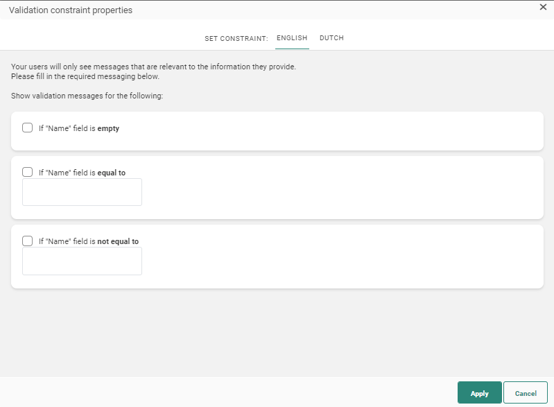
When the page is created in multiple languages, the messages for the other languages can be entered straight from this dialog by selecting the language from the top menu in this dialog.
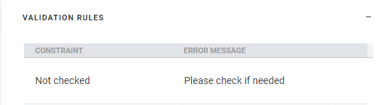
When done setting the validation rules, click Apply. The rules are now listed in the Validation rules section in the Field properties panel. Clicking a rule will take you straight to the Validation rules dialog where you can make the necessary changes.
Note: When you create or update form validation rules on a page that is already being used inside one or more journeys, those journeys must be published for the changes to take effect.
Copy Text Component content to other languages
By default, when adding new Content Components to a message, only the structure of the component is copied automatically to other languages. However, using the function copy content to other languages, you can now copy the component with its content to one or more languages.
This option is available once the component is placed onto the message and multiple languages have been defined for the message.
Click the button Copy content to other languages in the component properties.
A dialog is displayed in which the target languages can be selected.

