Note: The WYSIWYG editor is available for email messages, templates and pages created in Source mode.
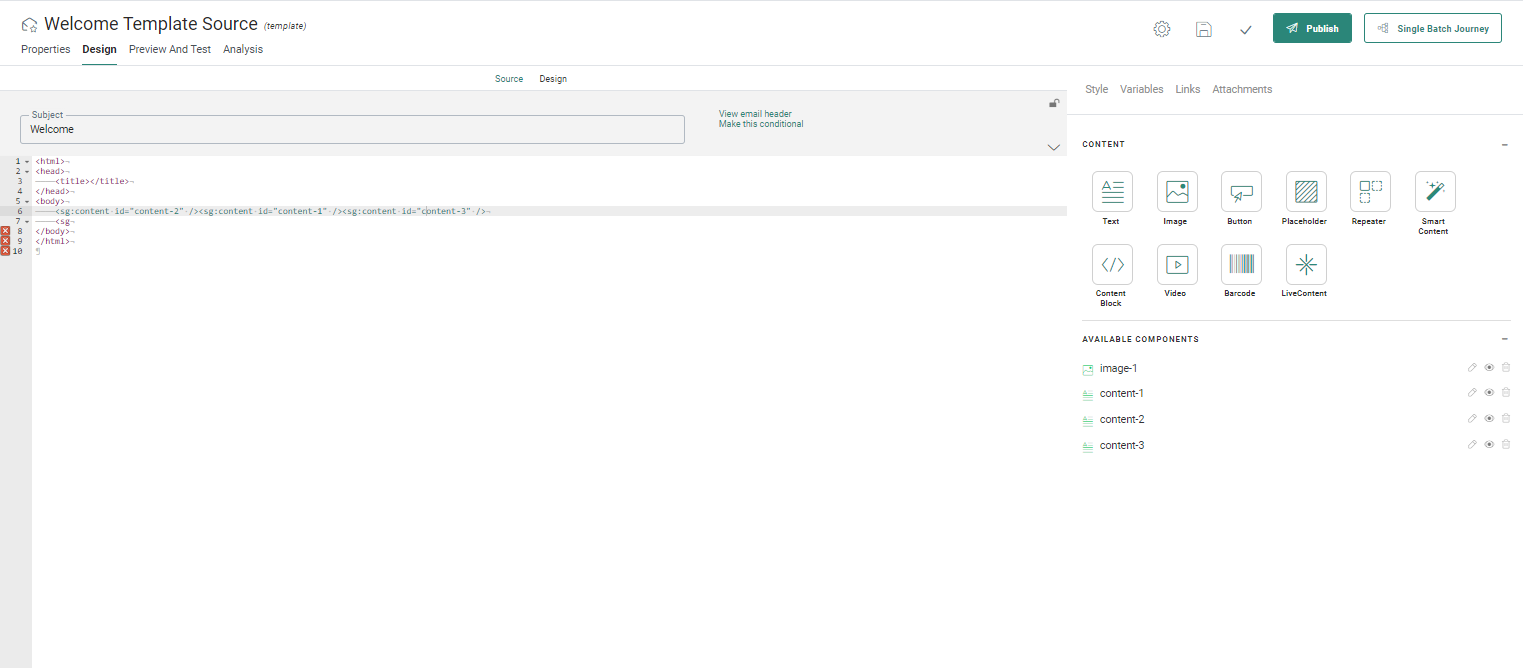
When you create content in HTML Source mode (from a blank source or by importing an HTML), a WYSIWYG editor is available and lets you make changes to the message in a visual way. This editor is available through the Design link displayed at the top of your panel. You can switch between Source mode and WYSIWYG (Design) mode , each mode reflecting the changes made in the other mode.
Warning: When the imported HTML is very complex and contains custom tags, switching between Source mode and Design (WYSIWYG) mode may cause issues. It is advised NOT to toggle between both modes as some elements from the source will not be translated correctly to the Design mode and vice versa. After import it is best to stick either to Source mode or to Design mode.
Use the links at the top of the message to switch between modes:
In WYSIWYG editor you can:
- drop standard Content Components on the design and configure them
in the properties panel. This includes
- Text
- Images
- buttons
- Repeaters
- Additionally placeholders for templates.
- Form component is only available for Pages in source mode
- Content Blocks
- Smart Content
- Barcodes
- Videos
- set Visibility Constraints on components and rows
- manually add text, personalization, tables and edit these through the WYSIWYG toolbar.
Using the WYSIWYG toolbar

The WYSIWYG toolbar lets you visually modify the content.
- Add text manually to the canvas and apply styling. Font, size, format, alignment and many more can be edited through the toolbar.
- Add tables and fill the
cells manually or through drag and drop from the list of content
components on the right.
When right-clicking a table, you have access to the table properties to make changes to the look and feel such as borders, headers, width and height among others.
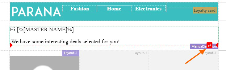
A right-click in a cell of the table lets you set the properties of that individual cell, merge or split cells, and add or remove columns and rows. - Add personalization fields. When a personalization field is added through the toolbar, it can be moved round in the design. Hover it to display an icon and drag it to its new position.
- Add tracked links or remove them. When a tracked link is added, the entire link can be moved to a new position. You can even decide on the color of the link in the text.
Adding standard Content Components
Moreover, in the WYSIWYG editor, standard Engage components can be added through drag and drop from the Components panel on the right. The upside of using these components is that it lets you create multilingual content, contrary to adding these buttons, images or text manually to the source.
When such a component is added to the design it can be moved around
in the design. A square icon appears when hovering the component:  Click it and drag the component to the new
position in the Design.
Click it and drag the component to the new
position in the Design.
When a standard Engage component is used in the design, its properties panel is displayed on the right. The user can then modify the properties directly in this panel. Any changes made in the properties is immediately visible in the design.
For more information on the different types of components, check out the chapter on 'Basic content components'
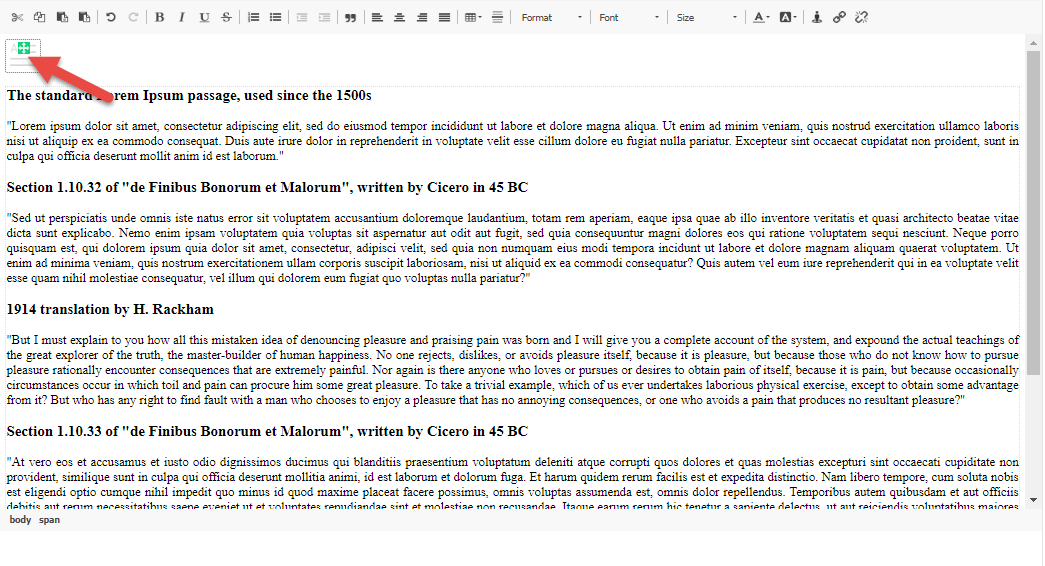
TIP: When you want to manually enter text, tables or other elements after, before or between content components and there is no space available, hover the component until a red line with a carrier return is displayed. Click the carrier return to create a space below or above to put your content:
Using Visibility Constraints
Every component added to the WYSIWYG design area can be dynamically shown or hidden by means of Visibility Constraints.
Note: When a Responsive Design with row constraints has
been converted to Source mode, the row constraints are shown in the WYSIWYG
editor and can also be edited there.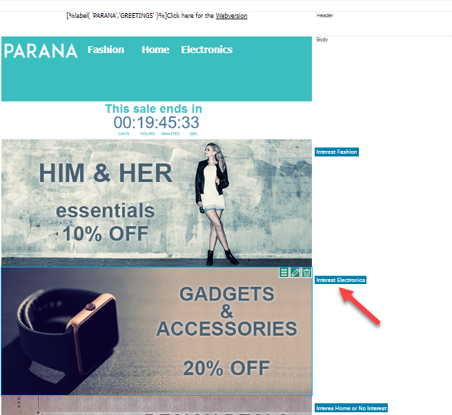
To access these constraints, right-click the component or the row in the design and select the option Edit Visibility Constraint.
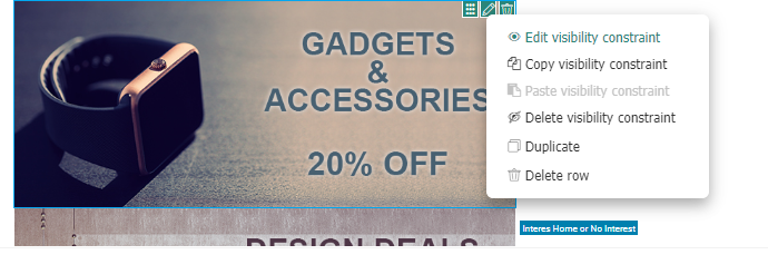
The Visibility Constraint dialog lets you set a condition using fields from the audience and linked lists, Date/time information and System data. For more information on how to create constraints, please check out the corresponding topic.
Test your knowledge about content creation in Source mode
For which content types is the WYSIWYG design editor available?
