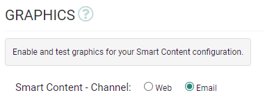
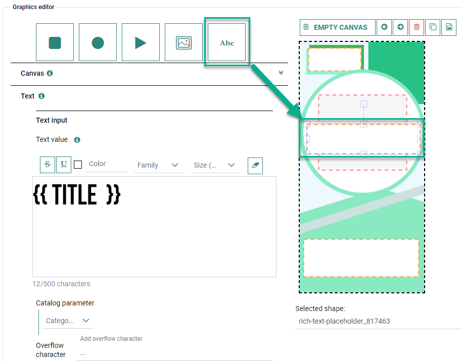
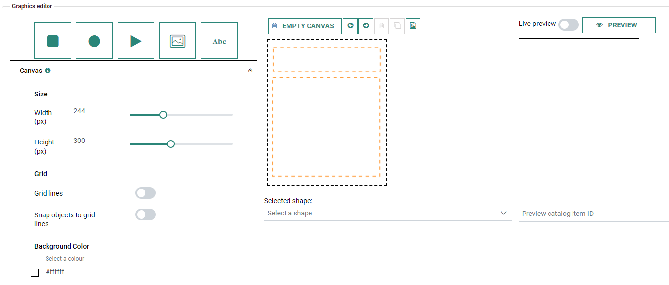
'Email' Smart Content offers an Email Graphics Editor to create the Smart Content in a visual way.
The Email Graphics Editor consists out of 4 main sections :
-
On the left, there are buttons to add objects onto the canvas and define their settings.
-
In the middle, there's the canvas on which you design.
-
On the right, a preview can be rendered to validate the actual outcome of your design.
-
On the top, action buttons are available for the design canvas and for the preview.
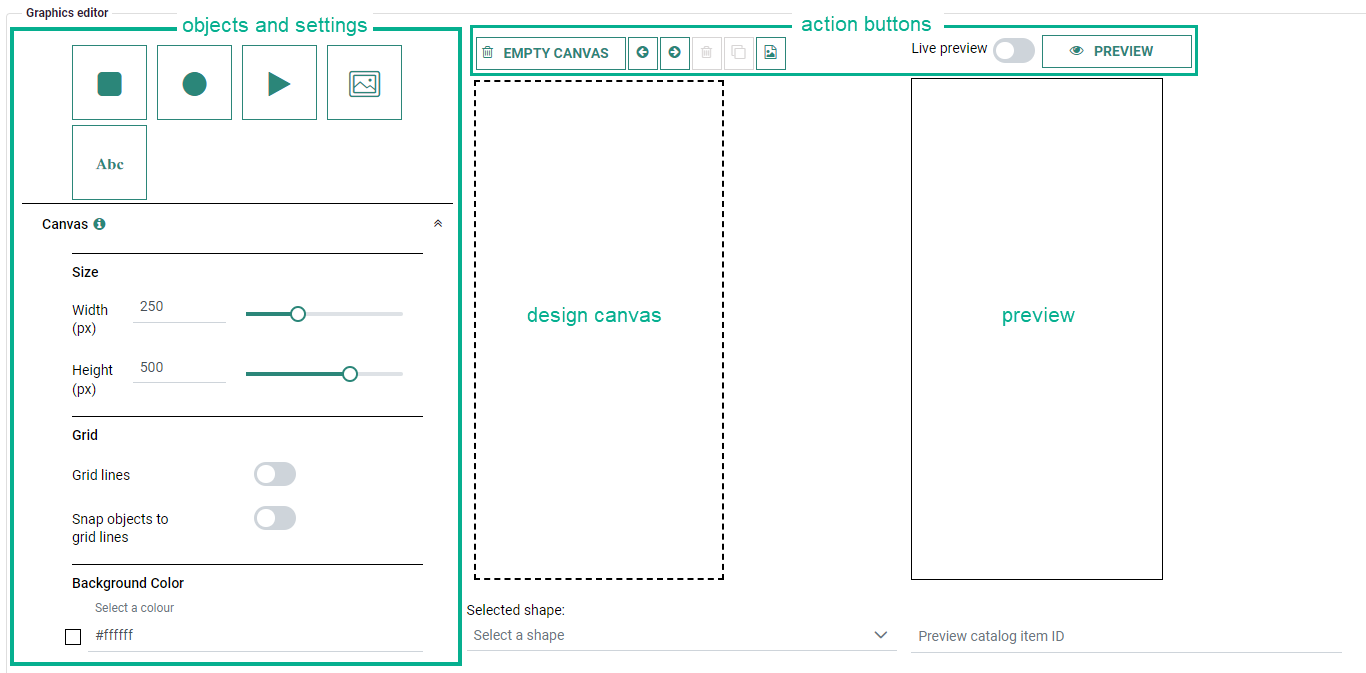
You can add objects to the canvas, such as square, circle and triangle shapes, catalog and local images, and static and catalog texts.
The following settings can be defined :
- Canvas Settings
- Text Settings
- Layout Settings
- Image Settings
Furthermore, Constraint Builder rules can be set to show/hide objects.
The action buttons that are visible at the top, are explained in the bottom section of this page.
Note:
You can right-click on the canvas to show a contextual menu, through which you can quickly access the following actions :
- toggle grid lines
- toggle object snapping
- set an object to the front/back
- undo changes
- clone/delete a selected object
- add a new object to the canvas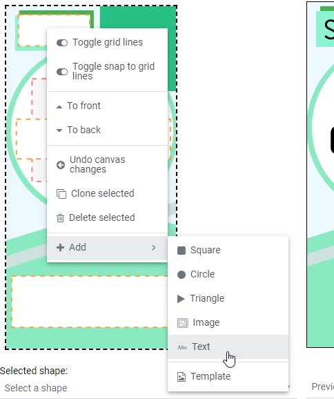
Add objects to the canvas
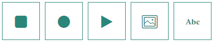
Objects can be added to the canvas in different ways :
- By clicking on the object button
- By clicking and dragging the object button onto the canvas
- By right-clicking on the canvas and selecting the object from the context menu that appears
The different objects available are :
- Square — Adds a square shape onto the design canvas.
- Circle — Adds a circle shape onto the design canvas.
- Triangle — Adds a triangle shape onto the design canvas.
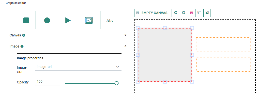
- Image — Adds a catalog or local image onto the design canvas.
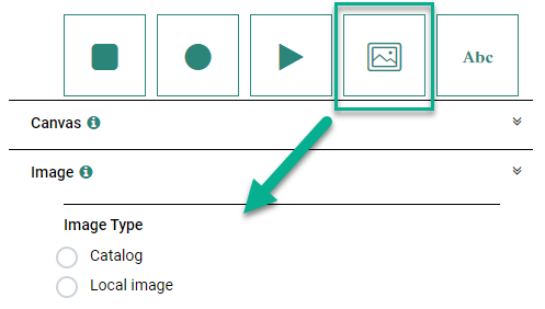
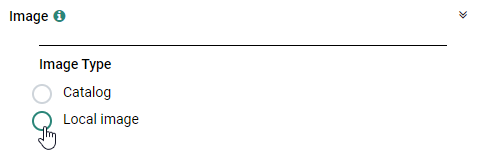
After selecting the Image object, choose 'Catalog' or 'Local image' as image type.
Depending on your selection, the settings below appear.- Catalog image — This is a placeholder to define the location and size of the catalog image that will be generated by Smart Content. The image URL needs to be selected from the image settings.
The actual image will be rendered by the chosen algorithm in the Smart Content configuration.
On the canvas, the Catalog Image object looks like this :
- Local image — You can upload a new image by clicking on the 'Upload image' button and selecting a local file.
Click on the '+ Add to canvas' button to add the image to the canvas.Note 1: The maximum image file size is 200 kb.
Note 2: The maximum amount of local images that can be rendered on the canvas is set to 5. You will receive an error message when this limit is exceeded.
- Catalog image — This is a placeholder to define the location and size of the catalog image that will be generated by Smart Content. The image URL needs to be selected from the image settings.
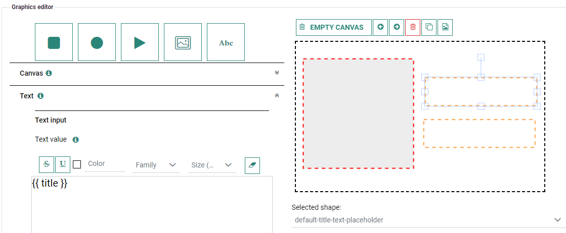
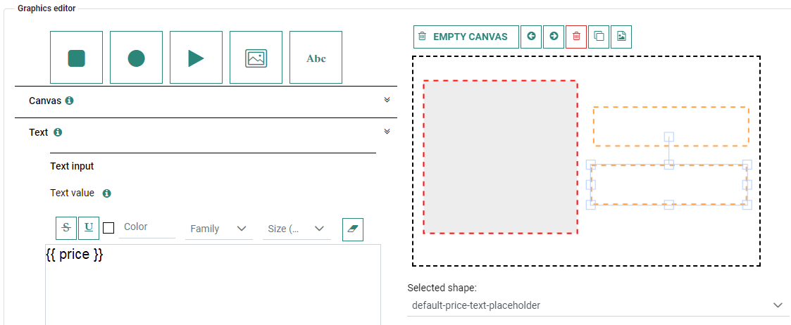
- Text — Adds static or catalog text (or a combination of both) onto the design canvas.

- Static text — After selecting the Text object, the Text input settings are shown. Text can be added in the rich text editor(1) and styling can be applied.
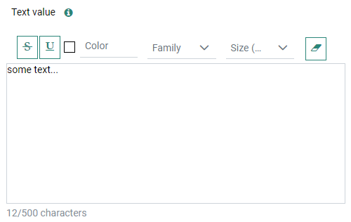
Text styling available is : strike-through, underline, font color, font family and font size.
At the right, the icon allows to remove the applied text styling (mark text first before clicking this icon).
Styling can be applied in two ways :
1. First set the style values and then start typing (the styling will be applied to all text).
2. Mark existing text you want to style and then choose the styling (this way you can apply different styling to different parts of the text).
- Catalog text — You can select a Catalog parameter from the drop-down.
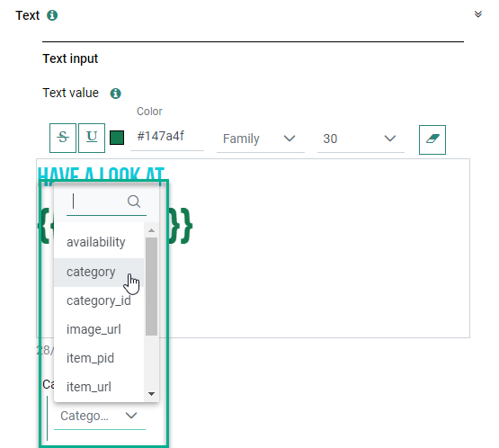
A catalog parameter can be added to the text by clicking on the + sign.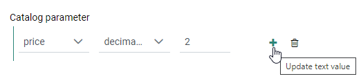
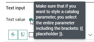
Inside the rich text editor, you can apply text styling in the same way as for static text (see above). (1)
Note: When you want to apply text styling to an existing catalog parameter value, make sure to mark the entire value including the curly brackets.
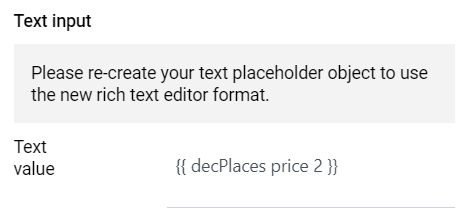
(1) Note: The initial version of the Email Graphics Editor had a simple text editor. Because there's a rich text editor now, previously created text-placeholders now notify you to re-create them, so they're usable as rich text in the updated text editor.
'Old' text objects (without rich text) are still visible in your existing Email Smart Content , but all styling and text properties are disabled.
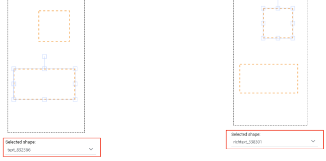
On the design canvas you can identify 'old' and 'new' text objects by selecting them, and looking at the corresponding object name in the drop-down underneath the design canvas.
- 'text_id' means 'old' (no rich text)
- 'richtext_id' means 'new'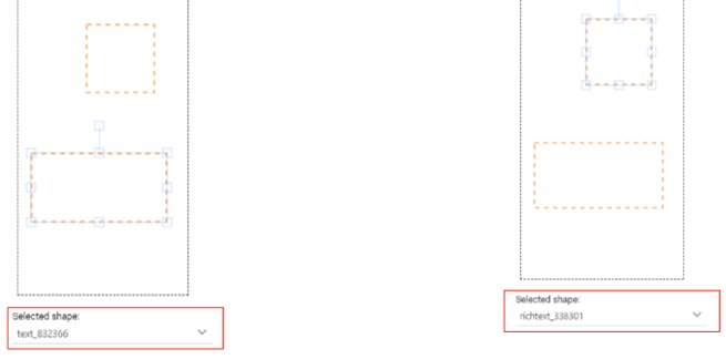
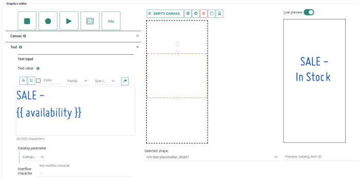
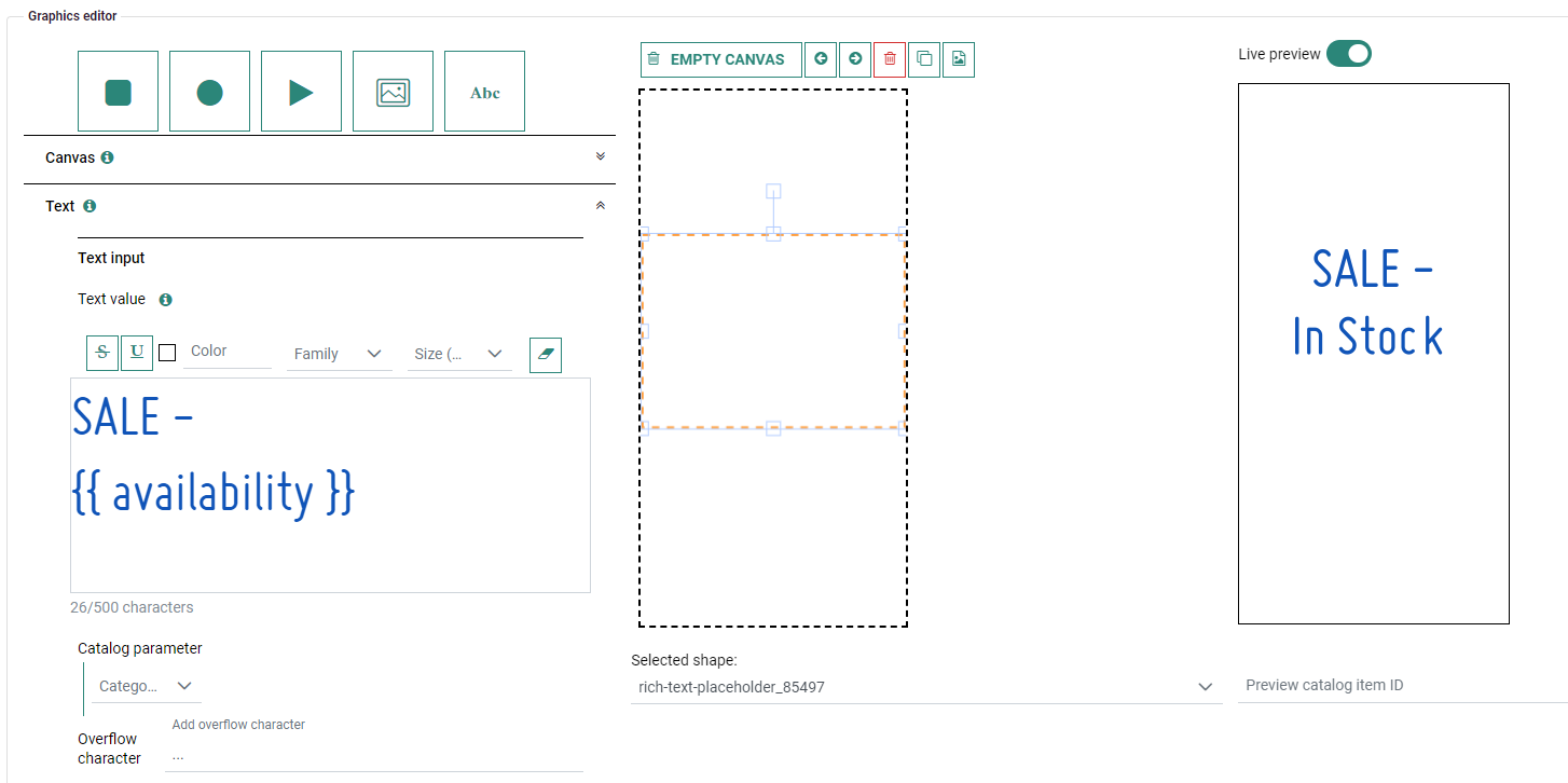
Example of a text value with combined static text "SALE -" and a catalog parameter "{{ availability }}" :
It's also possible to use functions for formatting purposes.
These can be selected from the second drop-down.
The available functions depend on the selected catalog field type.
Textual field functions :
- uppercase
- lowercase
- capitalize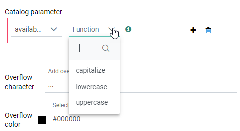
Numerical field functions :
- decimal comma separator — Adds a comma separator to a numerical value.
- decimal point separator — Adds a dot separator to a numerical value.
- decimal places — For example {{decPlaces volume 2}} : Adds a comma separator to a numerical value, with a number of digits (in this example 2) after the comma.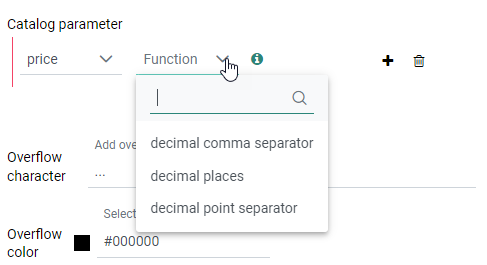
Note: When the 'price' catalog field is selected, the value also receives its currency symbol in front of the number.
If you want to use the 'price' field, but don't want the currency to be displayed, this can be achieved by manually adding an underscore in front of the price : {{_price}}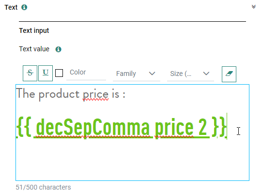
Note: Functions need to be added in front of the catalog value for correct usage.
Examples :
{{uppercase title}}
{{decSepComma price}}
You can also define an overflow character, that will be shown in case the text is too long.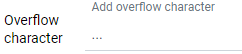
On the canvas, the Text object looks like this :
Note: The maximum amount of Text objects that can be rendered on the canvas is set to 20. You will receive an error message when this limit is exceeded.
- Static text — After selecting the Text object, the Text input settings are shown. Text can be added in the rich text editor(1) and styling can be applied.

Objects on the canvas can be :
1. Moved — Hold the left mouse button down on the center of the object and drag the object to a new location.
2. Resized — Hover over one of the corner/side squares until an arrow icon appears, then hold the left mouse button down and drag until the desired size is reached.
3. Rotated — Hover over the top-centered square until a cross icon appears, then hold the left mouse button down and drag until the object reaches the desired rotation angle.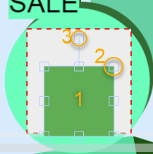
Underneath the design canvas, the selected shape ID is mentioned.
You can also select shapes from the drop-down list, instead of selecting them directly on the canvas.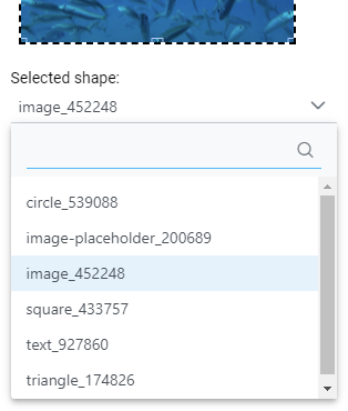
In the Layout settings, you can set a Shape ID for any shape, to identify them easier.
Canvas Settings
Define the Canvas properties for the width and height of your canvas (in pixels), show grid lines (and choose your preferred grid size) to easily align your objects and optionally snap them to the grid, and edit the canvas background color through a visual color selector or by entering an RGB or HEX color code.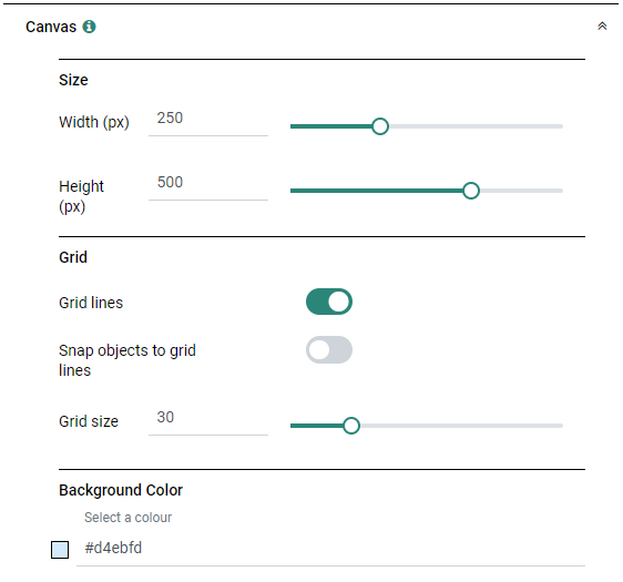
When the 'Grid lines' toggle has been enabled, grid lines are visible on the canvas :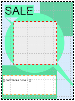
Text Settings
You can add Static text and Catalog text values through the Text properties.
When editing existing Text, you can view and adapt the text styling in the rich text editor, and configure field resizing, placement and shape identifier.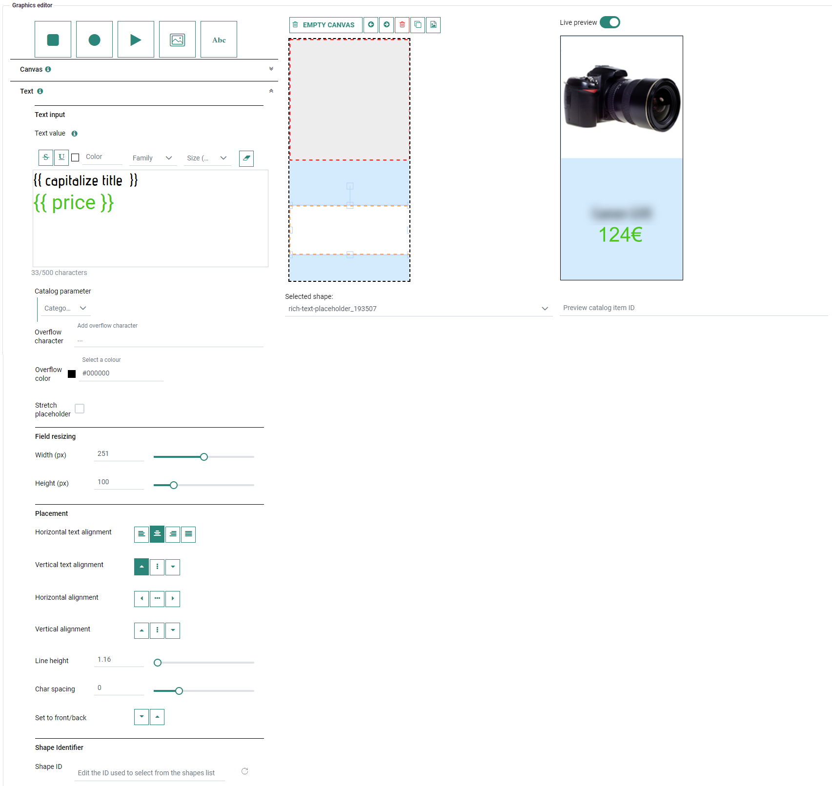
Layout Settings
- For the 'triangle', 'square' and 'circle' shapes, and 'local image' object : Properties can be set for styling, resizing, placement, border and shape identifier.
- For the 'catalog image' object : Properties can be set for resizing, placement and shape identifier.
Note: Layout settings do not apply to texts (they use these Text settings).
- Styling — Set the shape's color through a visual color selector or entering an RGB or HEX color code, define the shape's corner radius and set the opacity level (color and corner radius are only available for the square, circle and triangle shapes, not for local images).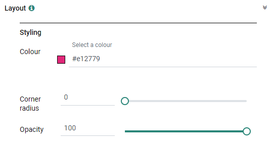
- Resizing — The width and height of the object can be resized by dragging the sliders or entering values manually. These values are in pixels, and can be anything between 0 and 500.
For the square, circle and triangle shapes, skew values can also be set to change the angle of the object on both the X and Y axes. These values can be anything between 0 and 90.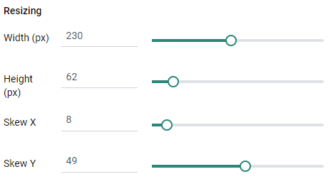
- Border — A border can be added around the object, with a chosen border color and size.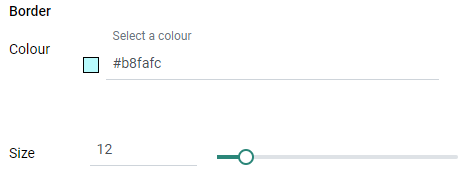
- Placement — The following settings can be defined :
Horizontal alignment — Horizontally, shapes and images can be left, center or right aligned onto the canvas.
Vertical alignment — Vertically, shapes and images can be top, middle or bottom aligned onto the canvas.
Set to back/front — If objects overlap, you can use this option to place the selected object behind or in front of another object. (Generate a preview to see the effect).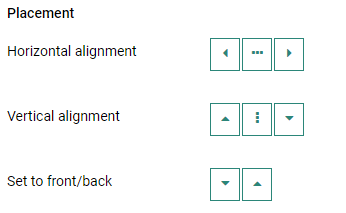
Group/Ungroup objects — With multiple objects selected, an additional 'Group objects' button becomes available to group different objects so they can be treated as a single object (for example for positioning/aligning them all at once).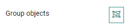
(To select multiple objects, drag a rectangle around the objects with the mouse cursor, or hold the shift key + left-click on the objects with the mouse cursor)
A group of objects can be ungrouped again with the 'Ungroup objects' button, to treat them as different objects. 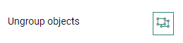
- Shape identifier — You can set a Shape ID for any shape, to easier identify them.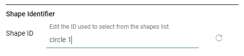
The defined ID will then also be visible in the selected shape drop-down.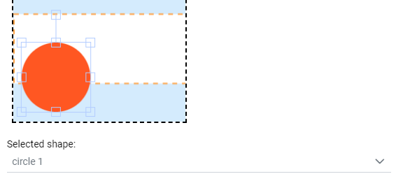
Image Settings
Image Settings can be defined for catalog images and local images.
Catalog image :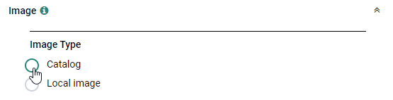
After selecting the catalog radio button, the catalog image settings are shown.
- Any catalog field that's defined as image URL (in the Smart Content catalog section) can be selected in the drop-down.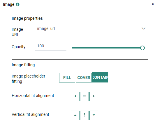
- The opacity of the image can be set.
- Additionally, the image fitting can be defined :
Fill = The image is resized to fill the given dimension. If necessary, the image will be stretched or squished to fit.
Cover = The image keeps its aspect ratio and fills the given dimension. The image will be clipped to fit.
Contain = The image keeps its aspect ratio, but is resized to fit within the given dimension.
For both the 'Cover' and 'Contain' fittings, horizontal and vertical fit alignments can be selected.
Example:
For an image object, the fitting 'Contain' is selected, and the horizontal fit alignment has been set to 'left align'.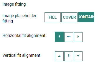
When the image placeholder's width (250px) is larger than its height (150px) on the design canvas, a catalog image which has the same width and height (150px) is now left aligned within the placeholder's region, containing its aspect ratio.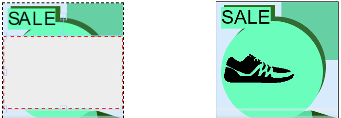
Local image :
When selecting the local image radio button, the local image settings are shown.
You can upload a custom image (with a maximum size of 200kb) and add it to the canvas.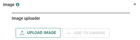
Constraint Builder
Set constraint rules to define if an object needs to be shown or hidden.
Example :
If the catalog parameter 'availability' is not equal to value "available", then hide the selected object.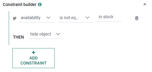
Note: The available operators (in the second drop-down) depend on the chosen catalog parameter (in the first drop-down).
- For textual fields, the available operators are :
is equal to, is not equal to, is not null, is null.
- For numerical fields, the available operators are :
is equal to (=), is greater or equal than (>=), is greater than (>), is not equal to (<>), is not null, is null, is smaller or equal than (<=), is smaller than (<).
Action buttons
At the top of the Email Graphics Editor, the following buttons are available :

-
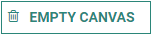 Empty canvas — Your design will be completely removed, to start with a blank canvas again.
 -
 Undo canvas changes — Click the arrow pointing to the left to undo your last changes.
 -
 Redo canvas changes — Click the arrow pointing to the right to redo your last changes that were undone.
 -
 Delete object — Select an object from the canvas and click this button to delete the selected object. Other objects on the canvas remain the same. (the button is grayed out when no object is selected)
 -
 Clone object — Select an object from the canvas and click this button to create an exact copy of the selected object. (the button is grayed out when no object is selected)
Note: It's not possible to clone an object when multiple objects are currently selected or when a 'group' object is used.
-
 Select a template — Clicking on this button shows the available template presets in a pop-up from which you can choose one :
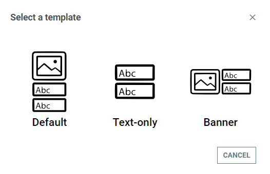
You can hover over a template with your mouse cursor to see a tool-tip with more info about that template.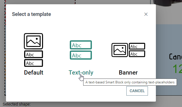
After selecting one of the templates, the Graphics Editor is shown with the selected template preset visible on your design canvas.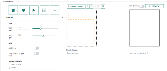
Example :
When the 'Banner' template is selected, the following components are added to your design :
- a catalog image on the left, with the 'image_url' (from the product catalog) selected by default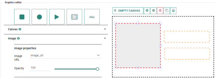
- a catalog text on the top-right, with the 'title' value (from the product catalog) selected by default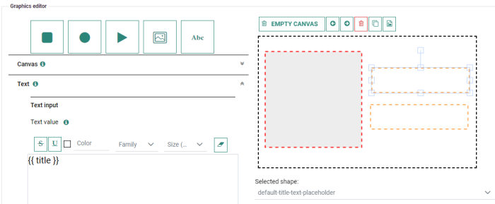
- a catalog text on the bottom-right, with the 'price' value (from the product catalog) selected by default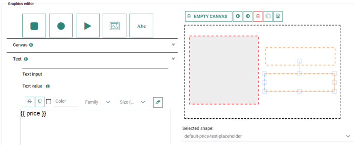
This way, it's very easy to quickly setup a Smart Content email with images and text.
It's of course still possible to edit all of the components in the Graphics Editor.Note: If you clicked the button
to see the available templates, but you don't want to select any, you can go back by clicking on the 'Cancel' button in the pop-up.
No template preset will be applied, and you can continue working on your original email design.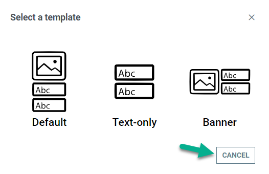
-
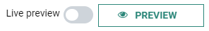
Preview — Click this button to see a preview of your design on the right. You can click this button anytime to refresh the preview to validate your changes.
You can also activate the 'Live preview' toggle.
When you do so, each change on the design canvas is immediately reflected in the preview.
In that case, the Preview button to generate a preview manually is hidden.Note: When opening an existing Smart Content design, make sure that the 'Live preview' toggle is enabled, or that you click on the manual Preview button (when the toggle is off) to see a preview.
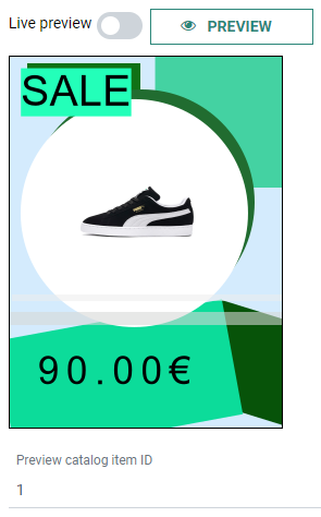
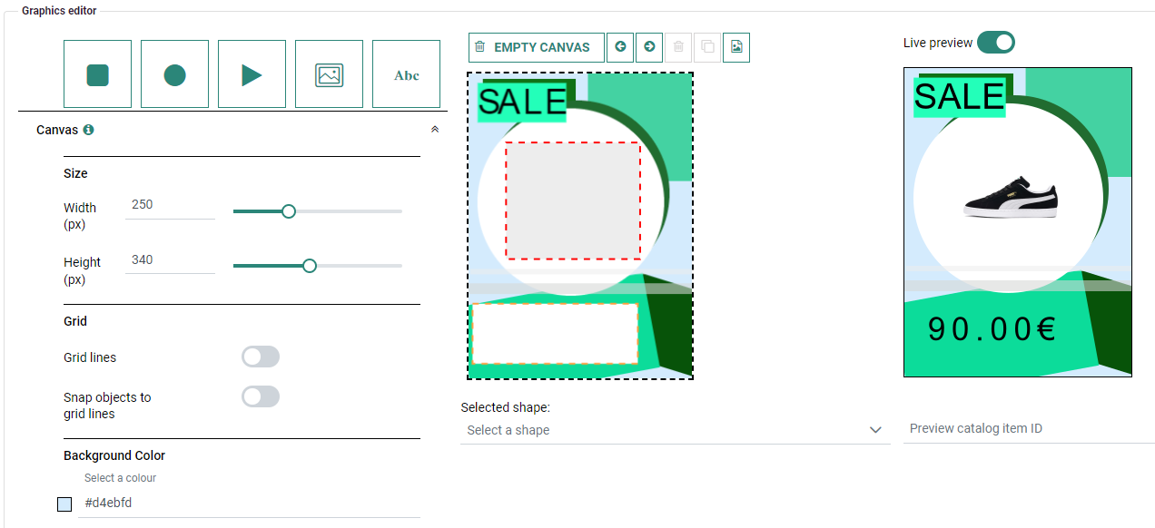
Example of a design (in the middle), and its preview (on the right) :

Instead of the default catalog item that's being rendered in the preview (the one with the lowest ID), you can also preview specific catalog items, by entering the catalog item ID in the field under the preview.
Note: When an 'Image URL' field (used for catalog images) does not contain a value in the catalog (is empty), no image will be rendered.
Example of a catalog item with ID 1:
Example of a catalog item with ID 10: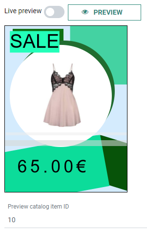

Note: When an object on the canvas is selected, clicking anywhere outside of the canvas with the left mouse button removes that selection.
You can also use the following keyboard shortcuts (when hovering over any of the applicable buttons, a tooltip is shown with this info) :
-
Control (Windows) / Command (Mac) + Delete — Remove the selected object.
-
Control (Windows) / Command (Mac) + Z — Undo the last change.
-
Control (Windows) / Command (Mac) + Y — Redo the last change.
-
Control (Windows) / Command (Mac) + C — Clone the selected object.
-
Control (Windows) / Command (Mac) + Shift + V — Load Preview.
Note: Hovering over an info icon, shows a popup with info about that section.
 Related Topics