Compare time slots
Build a dashboard that allows you to compare 2 different periods to each other.
For this dashboard, we’ll make use of the dataset : Communication_stats which contains all details per sent communication. In this exercise we will
- Create a numeric value displaying an evolution
- Create a numeric value displaying a total and add an icon to the number object
- Add a Selection filter
- Add a data slider
- Add a Line chart displaying the evolution of the Open Rate and CTO Rate
- Change graph and filter dependencies
Create a numeric value displaying an evolution
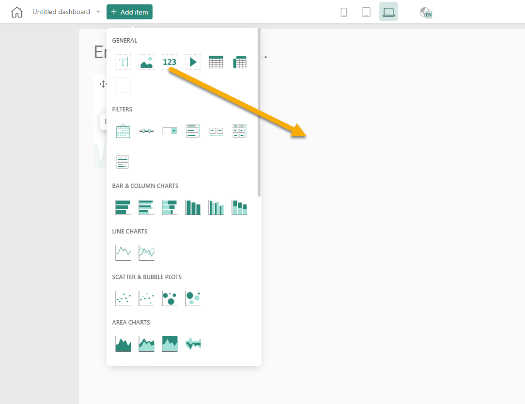
1. Drag and drop the Number component onto the dashboard.
2. Drag and drop SENT_COUNT to the measure of the number item.
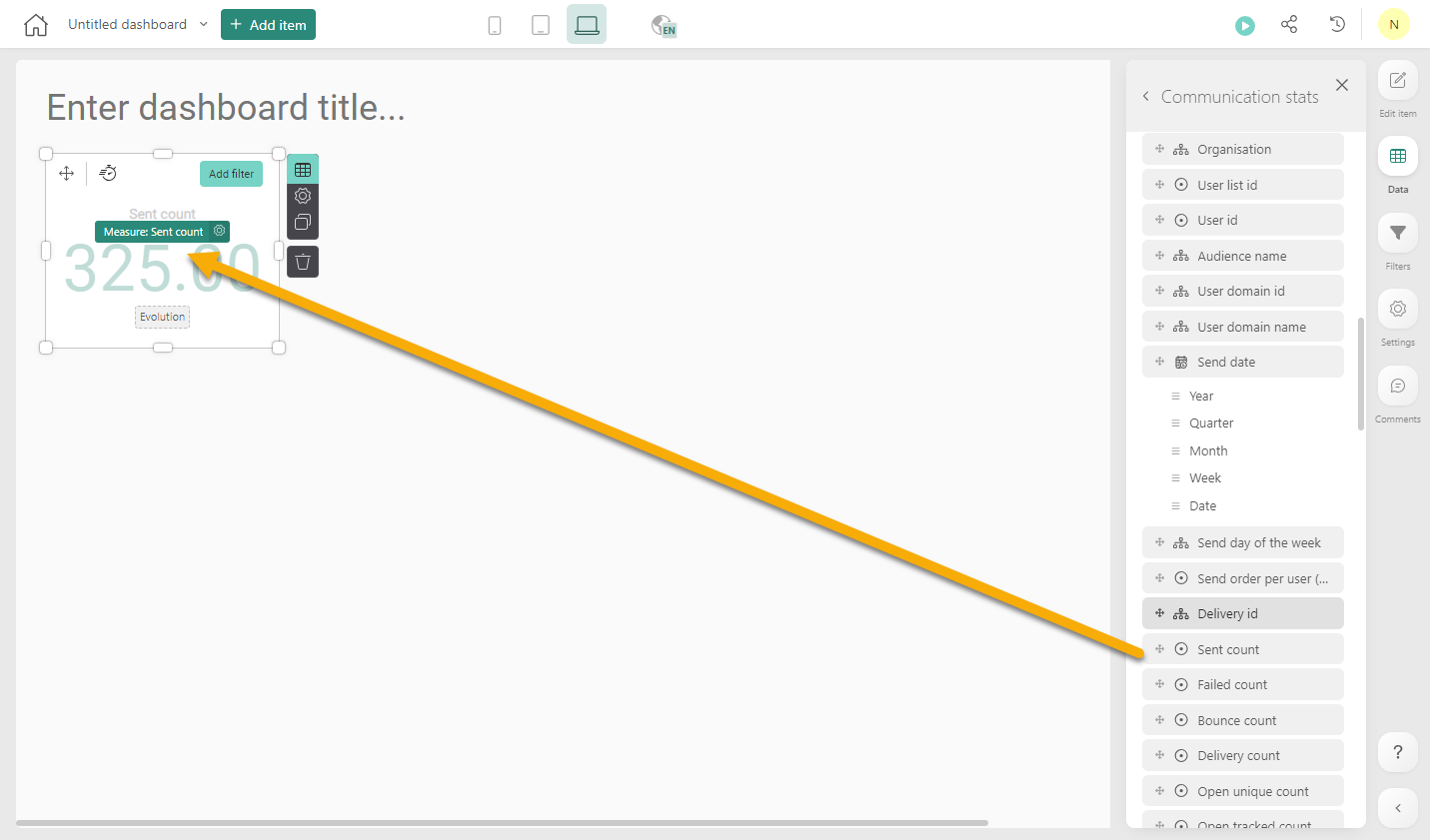
By default, the sum of the SENT_COUNT is shown in the number item.
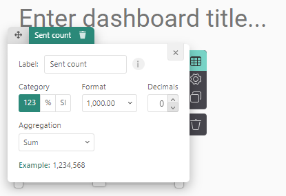
3. In the settings of the measure, change the decimals to 0.
4. Next, clone the Number component.
5. In this cloned Number component, we want to show the evolution per week of the number of emails sent. To do so drag and drop the "Week" of the SEND_DATE onto the evolution:
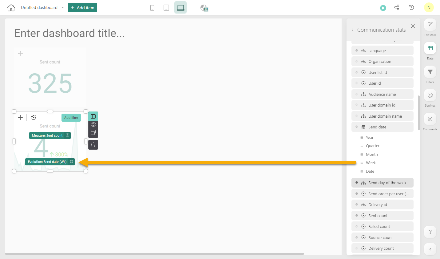
This graph displays the number of emails for the last week together with the evolution over time:
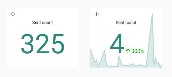
The percentage indicates the increase/decrease for the last week compared to the previous week.
Create a numeric value displaying a percentage and add an icon to the number object
We also want to have more info on the Open Rate and Click Rate.
- Open rate = # unique views (= # users that viewed) / # delivered messages : Shows the interest to your company and your subject line
- Click-To-Open rate (CTO) = # unique clicks / # unique views CTO : Measures the quality of your message and so the success of your segmentation.
1. We will once more use the Number Component. Add 2 of these components onto the Dashboard.
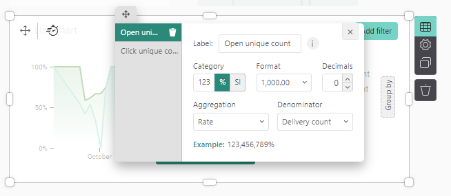
2. Drag and drop the OPEN_UNIQUE_COUNT onto the measure of the first component and then change the settings to display a Rate and select the DELIVERY_COUNT as the denominator:
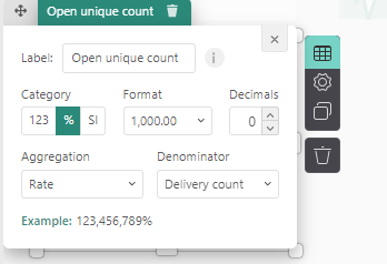
Change the format to % and decimals to 0.
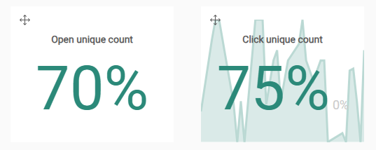
3. Drag and drop the CLICK_UNIQUE_COUNT onto the measure of the second Number component. Change the settings to display a Rate with as denominator DELIVERY_COUNT.
4. The result is the following:
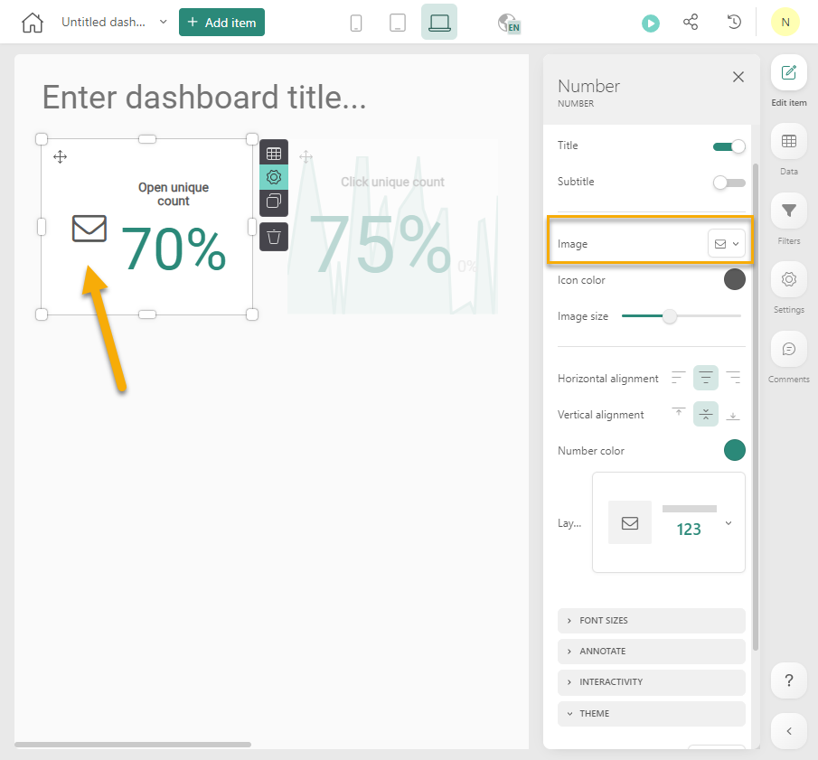
5. Last, add an icon to the Number component. Click on the Settings icon of the Number component and in the properties on the right, select the icon to apply:
Add a data slider
The Number components are now showing information regarding all data. This can be limited to data over a specific time period.
1. Add a Date slider to the dashboard and then add the SEND_DATE to the component. This is the result.
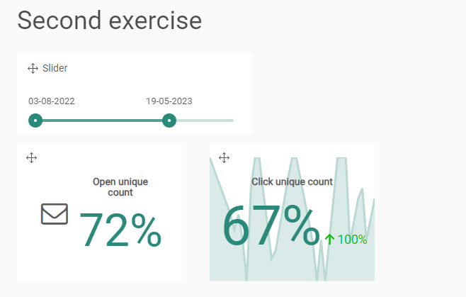
The data in the charts can now be limited to the selected time slot.
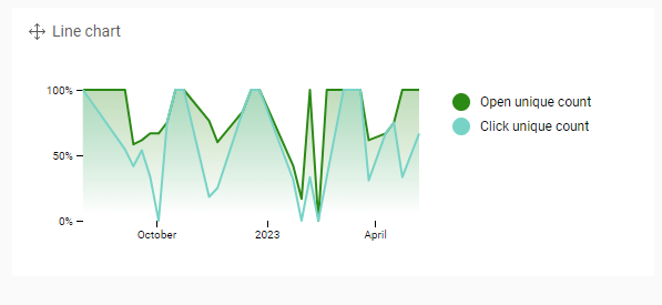
Add a Line chart displaying the evolution of the Open Rate and CTO Rate
Typically, to display an evolution of a statistical number, a Line chart is always a good way to represent this:
1. Add a Line chart to the dashboard.
2. Drag the SENT_DATE Week on the x-axis of the line chart. This will be our timeline, on a weekly base
3. As measures, add the OPEN_UNIQUE_COUNT and the CLICK_UNIQUE_COUNT and change both measures to a Rate with denominator the DELIVERY_COUNT:
4. The result is as following:
Change graph and filter dependencies
When adding a filter to a dashboard, you can see which components are depending on that filter.
1. Click the Settings icon on the Date :
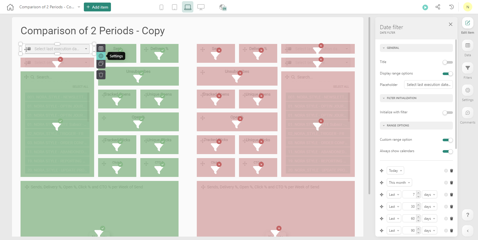
2. Components depending on the Date slider are displayed in green. To unlink a component and make it no longer dependable on the filter, click the Filter icon in the component.
The component is displayed in red and no longer depends on the filter.
