New features in Selligent Marketing CloudJuly 2022Version 5.21 |
Improved Search and Navigation in Online Help 
In this release, multiple changes have been introduced to the search and navigation of the online help, improving user experience, providing better search results and simplifying navigation.
Search filtering — The online help contains articles, videos and other material for all Selligent Tools. When searching for a specific subject, you want to filter down the results to only the tool you are interested in. This was already possible in the help in the following way:
Clicking this icon displays a drop-down to limit the search to one tool only.
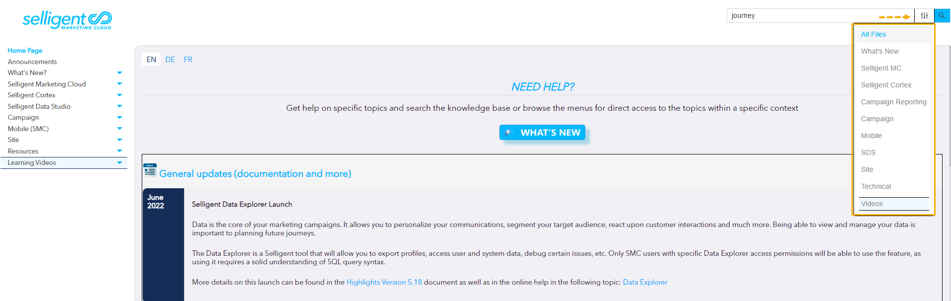
In search of a more intuitive option, we have now added filter buttons in the header, making it more obvious that a tool filter can be selected but also indicating which filter is currently applied:
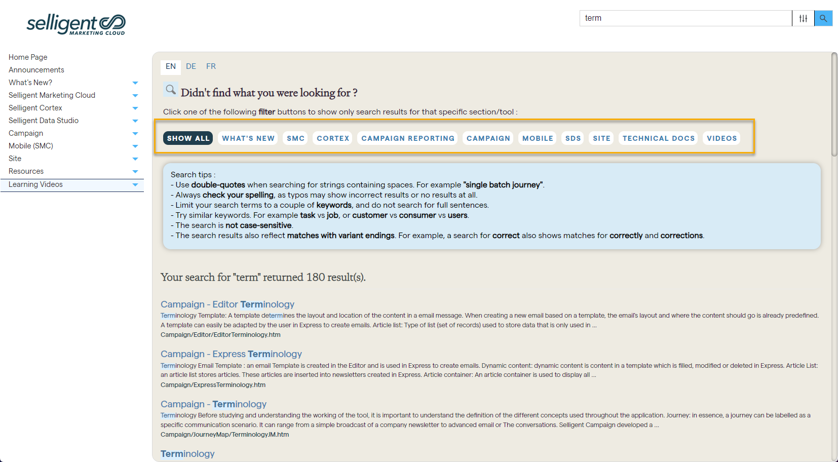
Search tips — In addition, to guide users in their searches, search tips are now provided. For example, depending on the search engine, different syntax might be required when searching for a group of words vs individual words. Or, is your search term case sensitive or not? The tips are automatically displayed after a first search:

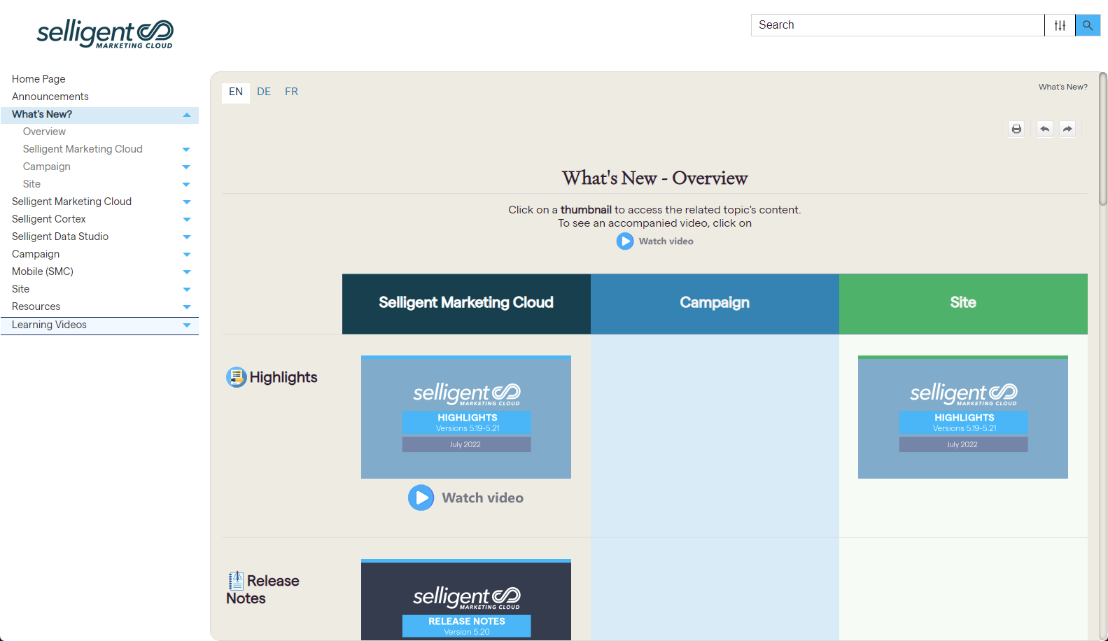
Topic navigation — Easy navigation within a topic is now possible thanks to a side menu, reflecting the structure of the topic. Clicking an entry in the menu takes you straight to the corresponding location in the topic. Scrolling through the topic, updates the selected menu item on the right.

In addition, the look and feel (fonts, coloring, notes and examples, etc) of the help as well as the landing page and Release Notes overview have been revamped. Below is a preview of the new Release overview page:
Content Block Enhancements
To allow marketers to render specific things in the head section of a message (override certain styles for outlook and obtain a correct message styling), a new sg:head tag can now be used in a Content Block.
The content of this sg:head tag will always be added to the head section of a message. When multiple sg:head tags are detected, in one or more Content Blocks, these are rendered sequentially in the head section, in the order in which they appear in the message.
Example:
<sg:head>
<style type="text/css">
.custom-css-class {
background-color: #000000;
color: #ffffff;
}
</style>
</sg:head>
When used in the Content Block, the style of the content is adapted.
<p class="custom-css-class">
This is a paragraph.
</p>
Headers in Web Custom Components
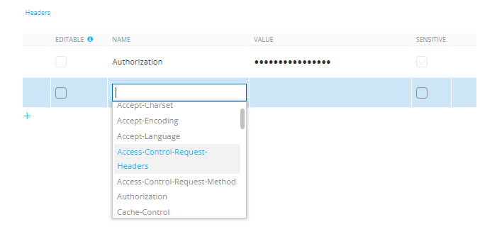
To support a wider variety of use cases for the Custom Component, it is now possible to use headers in Custom Components of type 'Web'.
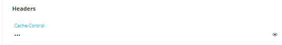
With headers, additional information can be passed with an HTTP request or response. It is used for additional settings and configuration such as authentication, caching options, accepted types of content and more.
This header is configured in the settings of the Custom Component in the Data Exchange chapter :

The different types of header are available from a drop-down list in the Name cell.
When using the Custom Component in a journey, if at least one header is set to ‘editable’, the header section is displayed in the properties of the component together with all the fields that are set as editable in the header.
Sensitive defines if the input field will be masked or not when filling it out in the journey, and if it will be stored encrypted in the database.
Personal Data Claim
Personal data should not always be accessible to everyone using the SMC tool. A new permission is now available allowing administrators to define individually whether an individual user has access to personal data.
You can set this permission In the Permissions section of the Admin Configuration tool:
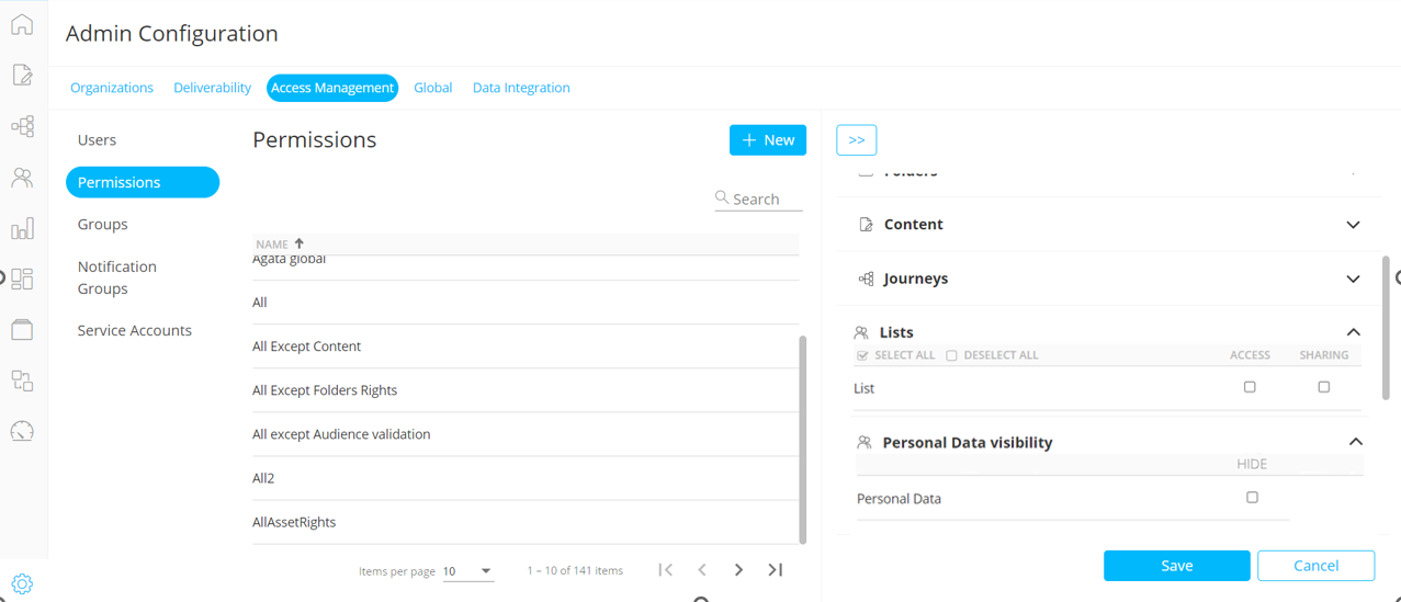
By default, users have access to all personal data. If no access should be granted, tick the check box ‘Hide personal data’. Users with Personal data restrictions do not have access to
- the Data tab for Audience and Data Lists.
- the Data tab in Dynamic and Static segments for Audience and Data lists.
- the Data tab in Custom Event Lists
Corrections
- The properties of a duplicated Content Block are shown correctly in a message.
- Using an itemValue function in a parameter of an sgmc link in a Content Block works correct
- When setting the source of an image component in a message, it's now possible to use any expression within the resource function.
- Dashboard exports now contain all data from the selected widget, including data that's outside of the visible screen in SMC.
- Notes are copied on Journey duplication.
- It's possible to create Custom Event records through a Custom Journey when the data contains over 4000 characters.
- It's no longer allowed to use an incorrect scope (such as a Data Selection List) in the Data Component properties.
