Appearance (Web Smart Content only)
Arrows (for website Smart Content only)
Add to cart button (for website Smart Content only)
Note: Most of these graphical parameters only apply to 'Web' Smart Content. For 'Email' Smart Content, you can build your Smart Content in a visual way.
General
Display On/Off
'Display On/Off' activates and deactivates the visibility of the Smart Content.
These are the two possible settings:
| Graphics setting | Explanation |
|---|---|
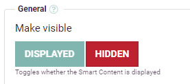
|
The Smart Content is hidden on your website. It will not be displayed and will take 0 pixels in width and height. |
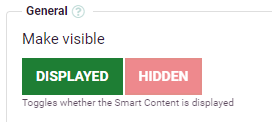
|
The Smart Content is activated and will be displayed on your website on all locations where the Smart Content's <div> is placed. All the settings you configured will be applied. |
If you have configured a multi-language catalog, a grey button titled 'By language/location' will be displayed. This allows you to configure the display/hide setting specifically for each version of your international website. For example, if you have a website configured with Belgium as location and three languages (FR, EN, DE), and you only want to display the Smart Content for websites in FR & DE languages (and not in EN), then your setting would look like this:
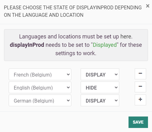
In order to use this setting, the global 'Display on/off' setting needs to be set to 'Displayed'.
Smart Content ID
The ID of the Smart Content used by Recommendations to locate and place the Smart Content on a web page or in an email. This ID can only contain letters, numbers or the underscore character (_).
Warning:
If you already had Smart Content set up on your website and you change the Smart Content ID, the Smart Content will not appear anymore as the placement <div> would still have the old Smart Content ID.
Smart Content Name
The name of the Smart Content is used in the Recommendations dashboard to identify the Smart Content. Unlike the Smart Content ID, the Smart Content Name can contain any character without restrictions.
Appearance (Web Smart Content only)
Smart Content Format
The Type defines the general Smart Content graphical style and orientation. The available Smart Content types are described in the following table.
| Type Name | Description |
|---|---|
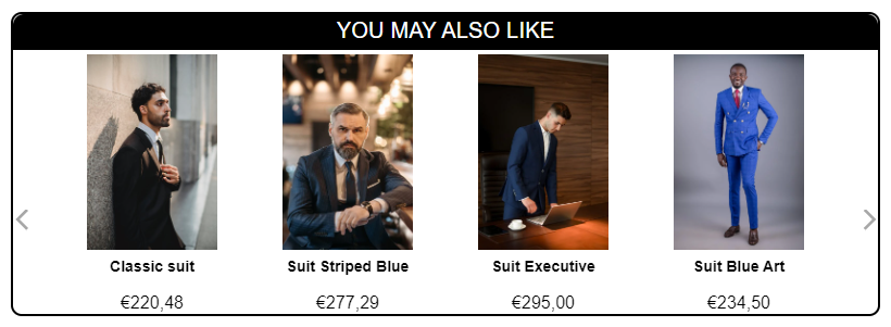
| Horizontal Modern |
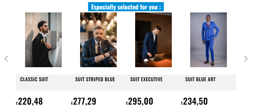
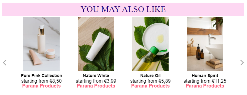
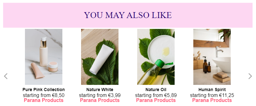
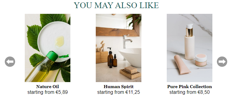
This is the most widely used Smart Content format showing products in a row. It fits well on all kinds of pages (home, categories, cart, products) :
If the width is set to -1 (automatic), the Smart Content will adapt to the available horizontal space. If the height is set to -1, the Smart Content will automatically adapt its height to make sure all the content is visible. |
| Horizontal |
This is a horizontal Smart Content, similar to Horizontal Modern. Its particularity is that it uses old web technologies (no CSS3) which makes it compatible with all browsers starting from IE7. The cons of using this Smart Content is that some graphical aspects and effects (e.g. the sliding effect) will be less smooth. If you are constrained to support old web technologies, this type is what you need. If not, you should use the Horizontal Modern Smart Content type. |
| Vertical |
This will show products in a column rather than in a row. This type of Smart Content is mainly used in side navigation bars. Sliding products will be done vertically. If you do not see products displayed in the preview when configuring the vertical type, it's probably because you need to increase the height of the Smart Content or reduce the size of pictures.
|
| Grid |
This Smart Content type displays a table of products with several rows and columns. It's responsive and will adapt to the size of the screen. There is no sliding behavior for this Smart Content.
|
Width
The width of the Smart Content in pixels. It can be set to any non-negative value, or to -1 which means that the width of the Smart Content will adapt to the available space.
Note: If you want to set a specific relative value, for example: "75% of the available width", you would have to put the Smart Content <div>in a parent <div>for which you would set the width to 75%:
<div style="width: 75%;">
<div class="thRecommendations" data-widgetid="my-widget"></div>
</div>
Height
The height of the Smart Content in pixels. It can be set to any non-negative value, or to -1 which means that the Smart Content will be automatically wrapped around its content.
Titlebox appearance
The graphical shape of the rectangular area containing the title of the Smart Content.
| Parameter Value | Details |
|---|---|
| Standard |
The title box stretches through the entire Smart Content width. Combined with changes in the Title box category, you can get a title which looks like this:
This design was configured with Title box border size=2, Title box background color=000000, Title box font color=FFFFFF, Title box alignment=center |
| Tab-like |
The titlebox will not stretch across the whole Smart Content and will only have the width of the text in it. With the tab-like appearance, but the same set of titlebox parameters, here is what the Smart Content would look like:
|
Number of Products
The maximum number of products displayed in the Smart Content. If the 'Number of Products' configured exceeds the amount of products that can be shown in the Smart Content (due to its width), the arrows can be used to slide through the available products.
Most of the time, the number of products will be exactly equal to the 'Number of Products' parameter. However, depending on the algorithm/filters configuration, it's possible that the number of products actually displayed is lower than the parameter. This can happen for example if the filters configured are too restrictive.
For example, if there are only 3 products in the catalog with a price lower than 10, and the filter used is "The price of products in the Smart Content must be lower than 10", the number of products displayed in the Smart Content will be (maximum) 3, even if the 'Number of Products' actually configured is 10.
Border color
The color of the border around the Smart Content. The value can be any color in the format XXXXXX, for example: 000000 or FFBA0F, or the exact word 'transparent' (for a transparent border). See the 'TitleBox Appearance' parameter above for a graphical example.
Border size
The size of the border around the Smart Content in pixels. See the 'TitleBox Appearance' parameter above for a graphical example with a Border Size of 2px.
Border radius size
The Border Radius Size corresponds to the CSS property border-radius. It's used to add round corners in the four corners of the Smart Content.
The same Smart Content with the standard appearance used in the 'TitleBox Appearance' with a 'Border Radius Size' of 10 would look like this (note the rounded corners) :
Title Box
Text
The title text to display at the top of the Smart Content. If this text is empty, the title box will not be displayed at all.
For a website with a multi-language catalog set up, a "Translations" button will appear :
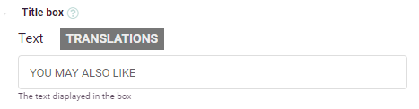
Click the button and an overlay lightbox appears for you to set up translations in all the configured languages :
Background color
The background color of the title box in hexadecimal 'XXXXXX' format (for example : 000000 for black, FFFFFF for white), or the value 'transparent' for a transparent background. See the 'TitleBox Appearance' parameter for an example with a black Background Color and other variations of Smart Content Border and Type.
Font family
This parameter represents the fonts used for the title box. Clicking on the field displays a drop-down box showing fonts that are available.
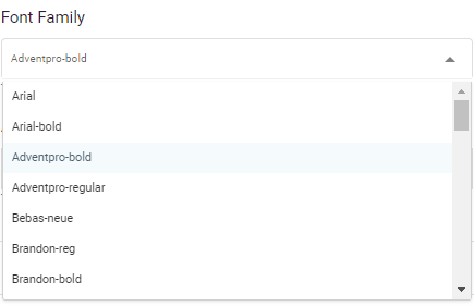
If you want to make sure the font renders correctly, you should pick one of the fonts displayed in the drop-down.
If you want to use a custom font defined in the 'Custom HTML' field, you can use any combination of comma-separated font names (this font family field controls the font-family CSS property). Font names that contain spaces need to be enclosed in double quotes (e.g. "Times New Roman", Georgia, Serif).
Fonts are generally a complex topic as the correct display of fonts depends on the browser and operating system of your visitors. There is a lot of documentation on the web and you can find a lot of "web safe" fonts that you can use as values for this parameter. Here is a short list.
To add your own fonts, please look at the 'Custom HTML' parameter.
Font size
The size of the font in pt. For example: 14 or 20.
Font color
The color of the font in hexadecimal format (XXXXXX). A black font would have the value 000000. If you have the impression your text does not appear, please make sure the Text Font Color is not the same as your Background Font Color.
Font weight
This is the weight of the font. It uses the font-weight CSS property. You can use bold, normal, lighter, or numbers such as 100, 200, 300, etc...
Font letter spacing
This parameter defines the spacing between letters in the title text. It uses the letter-spacing CSS property. The values are in px (positive or negative). For example: -1, 3, 0.1
Text padding
This parameter defines the space (in px) between the title text and the edge of the title box.
This Smart Content has a Text Padding equal to 6 :
The same Smart Content with a Text Padding equal to 24 :
Alignment
This parameter defines how the title text is aligned: Left, Center or Right. This parameter only applies when the Smart Content Type is set to 'Standard'. When the Type is 'Tab-like', this setting has no effect.
Title link
If you want the title to be a clickable link, you can insert a URL in this parameter. The link will be the same for all visitors every time the Smart Content is displayed.
This parameter is mainly used when configuring Smart Content with a category-specific filter. With a title such as Our popular products in category X, you can add a link to Category X in the Title Link.
Product image
Image width and image height proportion (for website only)
The size of product images inside the Smart Content (in px) is defined here. The width of the image is mandatory, the height is optional. Resizing the image always keeps the aspect ratio.
The final image dimensions depend on the dimensions of the original image.
- If only a width is entered and the height is left blank, the image will be resized proportionally to match the desired width.
- If both width and height are entered, the image will be resized proportionally against whatever dimension was the longest in the original image. For example, if "100" was entered for both dimensions in the parameters, and the original image was 400 wide by 260 high, the resized image would be 100 wide by 65 high.
| Image Width Set
|
Height Set | Actual Image width | Actual Image Height | Result |
|---|---|---|---|---|
| 100px | 90px | 75px | 100px | The image is resized to a height of 90px. The width is resized and centered respecting the aspect ratio. |
| 100px | 100px | 150px | 120px | The image is resized to a width of 100px, and the height is resized and centered respecting the aspect ratio. |
| 100px | no value | 150px | 200px | Although the width is smaller than the height, the image is resized based on the entered width size. The result will be an image of 100px wide. The height follows the resizing and is centered, keeping the aspect ratio. |
When the 'Image Height Proportion' is set to 'Relative' with a width of 100 px, the image always has a width of 100 px and the proportions (and therefore height) are being kept. This setting does not guarantee the placement of other graphical blocks, however the images will be bigger. Adjustments can be made in the 'Custom CSS' parameter.
Image border, color and size
These parameters add a border to product images inside Smart Content. 'Border Size' defines the size of the border in pixels and the 'Border Color' defines the color in hexadecimal (XXXXXX) format. With a 'Border Size' of 5px and a 'Border Color' of 000000 (black), the result on two images would for example be:
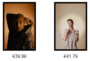
Image zoom
If set to On, the product images will be zoomed (magnified) when hovering over the image with the mouse cursor.
Arrows (for website Smart Content only)
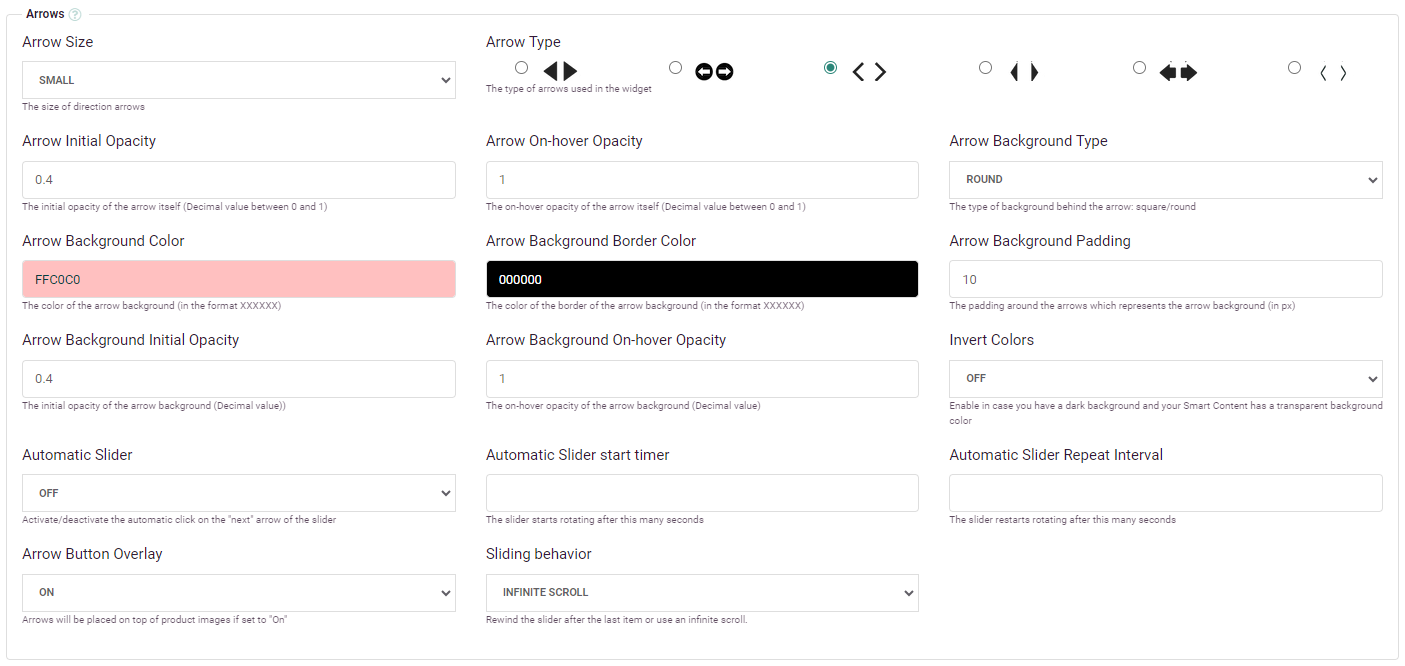
Arrow type
The different types of arrows. All arrows automatically adapt to the Smart Content general 'Type' : up/down for Vertical Smart Content, left/right for Horizontal/Horizontal modern Smart Content.
You could also use a custom arrow image if you set up the 'Custom CSS' field to replace the existing ones provided by Recommendations. Here is an example (you'll need to replace the URLs for this to work) :
.arrow-img.arrow-next {background: url('https://www.my-shop1.com/arrow_right.png') 22px 0 no-repeat;}
.arrow-img.arrow-prev {background: url('https://www.my-shop1.com/arrow_left.png') no-repeat;}
Arrow size
The size of the arrows provided by Recommendations :
- Big arrows variations 40x40px
- Small arrows variations 20x20px
These are the real sizes of the images which will be displayed. You can of course modify the size of these images with Custom CSS if you want to tune the width/height of arrows to the pixel.
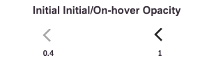
Arrow initial opacity
The Initial Opacity of the arrows is a decimal value between 0 and 1, defining the level of transparency. Here is an example with the parameter set to 0.4 and 1:
Arrow on-hover opacity
Same as 'Arrow Initial Opacity', but this is the value of the parameter set dynamically when you hover over the arrow.
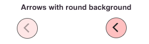
Arrow background type
This is the format of the area/background behind the arrow symbol.
| Value | Description | Illustration |
|---|---|---|
| None | No background will be displayed |
|
| Round | A circle will be displayed around the arrow |
|
| Square | A square will be displayed around the arrow |
|
Arrow background color
The color of the background behind the arrow in hexadecimal format (e.g. 000000 for black, FFFFFF for white). For this parameter as well as all the background-related parameters, here is an example configuration :
And this is what it will look like. The left screenshot is for the initial state, while the right one is the mouse on-hover state.
Arrow background border color
This parameter defines the border color of the background behind the arrow (in the hexadecimal XXXXXX format). If the Arrow background type is set to 'None', this parameter has no effect.
In the previous example, this parameter was set to : 000000.
Arrow background padding
This parameter represents the space (in pixels) between the arrow itself and the background border. This value is set to 10 in the previous example.
Arrow background initial opacity
This parameter is a value between 0 and 1 (for example 0.4, as in the previous example), which defines the transparency level of the background. As you can see in the example, initially the pink background (ffc0c0) is a bit more pale than the hovered-on version.
Arrow background on-hover opacity
This parameter is a value between 0 and 1, which defines the transparency level of the background when hovering over the arrow with the mouse cursor.
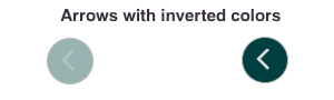
Invert Colors
The Invert Colors parameter inverts all the hexadecimal colors defined for the arrows and background. As arrow images are dark by default, this is a good way of having light arrows on a dark background. The previous example with pink Background Color will look like this if 'Invert Colors' is set to On:
Automatic slider
The 'Automatic Slider' parameter, if set to ON, will make the Horizontal, Horizontal Modern and Vertical Smart Content slide automatically, using the timer and interval settings.
If set to OFF, this parameter as well as the 'Automatic Slider Start Timer' and 'Automatic Slider Repeat Interval' will have no effect. If the 'Number of Products' is lower or equal to the number of products which can actually fit inside the Smart Content given its width, the 'Automatic Slider' will not have any effect even if it is set to ON.
Automatic slider start timer
This parameter defines the number of seconds after which the slider starts its first slide movement.
Automatic slider repeat interval
This parameter defines the number of seconds during which the slider waits between each slide movement after the first one.
Arrow button overlay
This parameter indicates how the arrows are integrated inside the Smart Content. If set to On, the products will take the full length of the Smart Content while the buttons will overlay on top, like in this example :
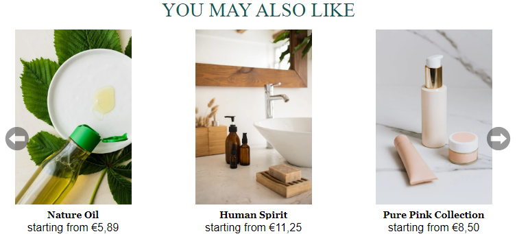
If set to Off, the arrows will take 20px or 40px on each side of the products, depending on the Arrow type, which will look like this for the same Smart Content example :
The difference is noticeable particularly on the left side of the Smart Content where you see that the arrow has its own horizontal space before the first product.
Description text
Description font
This parameter represents the font used in the product descriptions. This is all the text which is displayed under the product images. Please refer to the 'Font Family' parameter above for more details on allowed fonts.
| Font : Georgia |
|---|
|
| Font : Helvetica |
|---|
|
Description font size
The size of the font used in the text that appears under the product image in pt. For example: 14 or 20.
Description font color
The font color used in the text that appears under the product image, expressed in hexadecimal format (XXXXXX). A black font would have the value 000000.
Description alignment
This parameter defines how the text block under the product image is aligned: Left, Center or Right. This block includes the product title, description, price and other parameters activated using the 'Fields Displayed' parameter.
Underline title on-hover
If set to 'On', this parameter underlines the product title (under the product image) when hovering over it. If set to 'Off', this parameter has no effect. This parameter is set to 'On' by default.
Display on-hover
If set to 'Off' (default), the text block (which contains title, description, price, and other parameters activated using the 'Fields Displayed' parameter) will be displayed under the product image.
If set to 'On', this text block will be shown on top of the product image, while hiding the product image with a semi-transparent dark overlay.
Here is an example :
| Display on-hover set to OFF | Display on-hover set to ON | Display on-hover set to ON with custom CSS |
|---|---|---|
|
|
|
The opacity of the overlay box as well as other parameters can be tuned using the 'Custom CSS' parameter. The third column shows an example of what you can do with 'Custom CSS' and 'Custom JS' (eg. for launching a movie trailer directly from a custom button).
Price
Price font
This parameter represents the font used for the 'Price' and 'Sale price', displayed under the product image. Please refer to the 'Description Font' and 'Font Family' parameters for more details on allowed fonts.
Price font size
The size of the font used for the 'Price' and 'Sale price' under the product image, in pt. For example: 14 or 20.
Price font color
The color of the font used for the 'Price' parameter under the product image, expressed in hexadecimal format (XXXXXX). A black font would have the value 000000.
Price font weight
This parameter sets the weight of the 'Price' font. Refer to the 'Font Weight' parameter to get a list of possible values and more details on how to use it.
Price prefix
This parameter can contain a chain of characters displayed in front of the 'Price' and 'Sale price' in the text block under the product image. This parameter is often used to add a "starting from" prefix to be used for products which have variable prices (eg. marketplaces with different vendors, products with different options).
Price prefix font size
The font size of the prefix in pt. For example: 10 or 11 (it's usually lower than the 'Price'/'Sale price' themselves). If no Price prefix is set, this setting has no effect.
Price prefix font color
The color of the 'Price prefix' prepended at the left of the Price/Sale price. It has to be in hexadecimal format (XXXXXX). A light-grey font would have the value EAEAEA (the prefix is usually lighter than the Price/Sale price).
Sale price font color
The color of the font used for the 'Sale price' parameter under the product image, expressed in hexadecimal format (XXXXXX). A black font would have the value 000000.
Price decimal separator
This parameter sets the type of separator used for decimal prices. The price €2,99 will be displayed as €2,99 if this parameter is set to 'Comma', and €2.99 if this parameter is set to 'Dot'.
Remove trailing zeros in price
If set to 'Yes', this parameter will remove the trailing zeros from a price, if this price is a whole number but written in decimal format.
For example, instead of displaying "29,00" , it would display "29".
If the parameter is set to 'No', when the price is "29,00", it will continue displaying "29,00". 'No' is the default setting.
Add to cart button (for website Smart Content only)
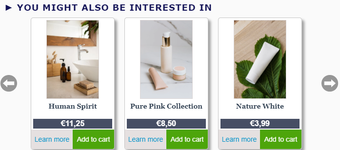
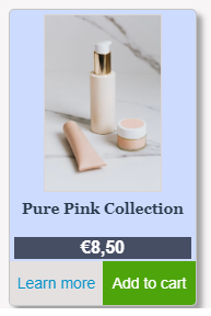
It's easy to set up an add-to-cart button without coding, if your website provides a direct link to add a specific product to the cart. Here is an example showing how to set up an 'Add to cart button' under each product in Recommendations Smart Content.
The result can look like this, with the green buttons linking to a cart addition of the product above:
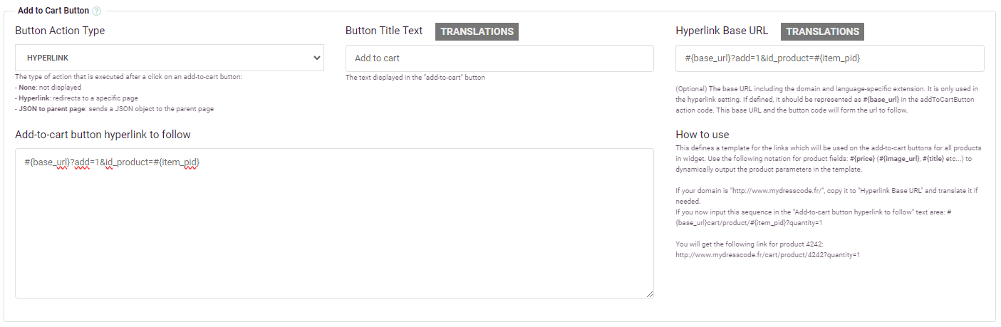
This is the configuration used to set up the button:
With some custom css for the 'Add to cart button' styling :
Custom CSS
.item-col .bottom-btn {
   cursor: pointer;
   background: #4da50b;
   color: #ffffff;
   width: 100%;
}- The Add-to-cart button action type has to be set to Hyperlink. This means that when someone clicks on the button, the action triggered is to follow a link defined in the Hyperlink Base URL and Add-to-cart button link fields.
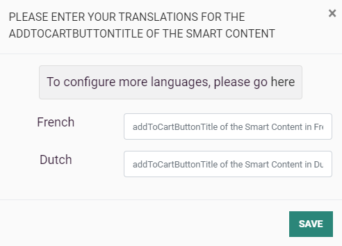
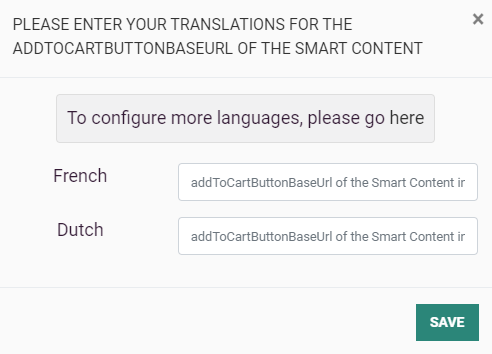
- The Button title text defines the text placed on the button. If your website is only in one language, this is the only text box you have to fill in. If your website has a multi-language catalog setup, click on the 'Translations' button, and the following screen will appear, allowing you to give a translation for each language that you set up :
- The Hyperlink Base URL is the first chunk of the URL which will be called when the visitor clicks on the Add-to-cart button. If you do not have a multi-language catalog, just set this parameter to the beginning of the URL that has to be called, without the variable parameters which depend on the specific product the user clicks on (e.g. http://www.myshop1.com/cart). If your catalog is multi-language, click on the 'Translations' button and fill in the different base URLs, which will probably be different for every language you set up.
The Add-to-cart button link is the second chunk of the URL which will be added to the previous 'Hyperlink Base URL' parameter. This parameter is a template containing variables, which will automatically be replaced by product-specific parameters. Use the following notation for product fields :
| Parameter name | Template notation |
|---|---|
| Your Hyperlink Base URL | #{base_url} |
| Unique ID | #{item_pid} |
| Page URL | #{item_url} |
| Image URL | #{image_url} |
| Title | #{title} |
| Subtitle | #{subtitle} |
| Description | #{description} |
| Price | #{price} |
| Sale Price | #{sale_price} |
| Category | #{category} |
| Quantity | #{quantity} |
| Type | #{type} |
| Brand | #{brand} |
| Availability | #{availability} |
| Condition | #{condition} |
| Color | #{color} |
| Any custom property e.g. productCategory | #{productCategory} |
| Tracking link Follow URL (*) | #{follow_url} |
(*) The follow url is needed in order to generate conversion tracking. Data insights will then provide conversion info.
In the example above, the Add-to-cart button link is set to:
#{base_url}?add=1&id_product=#{item_pid}
In most cases, your 'Add-to-cart button link' should start with #{base_url}, which holds your translated 'Hyperlink Base URL'. Then simply add the second chunk of your direct add-to-cart URL, replacing product-specific parameters by the right template field, as shown in the table above.
Let us have a look at an example with the following hypotheses :
- We're looking at a product page in which our Smart Content is inserted.
- The Smart Content is configured with the previous parameters for adding an Add-to-cart button.
- The page we're looking at is in the French language.
- We click on the Add-to-cart button under product with pid 1234.
This is the link to which we will be redirected:
http://www.myshop.fr/panier?add=1&id_product=1234
The 'Hyperlink Base URL' for a page in french language is 'http://www.myshop.fr/panier' and the chunk holding product-specific parameters is '?add=1&id_product=1234' for product with a unique ID equal to 1234.
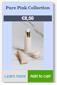
Learn more button
The Learn more button is much simpler than the Add-to-cart button with the configuration above. The only parameter to configure is the 'Button Title Text', which is simply the text displayed on the button. This button will always redirect the visitor to the 'Page URL' of the product when they click on it. In case the catalog is a multi-language catalog, you have to add translations by clicking on the Translations button.
The result can look like this (including 'Learn more' and 'Add to cart' buttons) :
With some custom css for the 'Learn more' button (shown on the bottom-left of each item) and the 'Add to cart' button (shown on the bottom-right of each item) :
Custom CSS
.item-col .bottom-btn, .item-col .bottom-half-left-btn {
cursor: pointer;
background: #e5e0e0;
color: #0091c9;
}
.item-col .bottom-btn, .item-col .bottom-half-right-btn {
cursor: pointer;
background: #4da50b;
color: #ffffff;
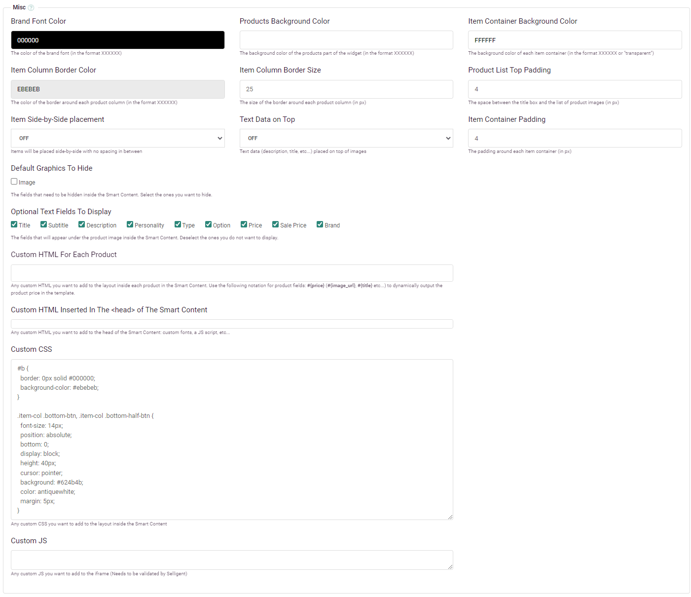
}Misc
Brand font color
The color of the 'Brand name' displayed below the title/description/price block, if the brand parameter is configured and parsed correctly in the catalog update. It has to be in hexadecimal format (XXXXXX).
Products background color
The color of the background of the Smart Content in which the products are displayed. It has to be in hexadecimal format (XXXXXX) or set to the value 'transparent' if you want the background to be transparent.
In the following example, the background is set to a light-grey color (fafafa):
Item container background color
The color of the background of each individual product displayed. It has to be in hexadecimal format (XXXXXX) or set to the value 'transparent' if you want the background to be transparent.
In the following example, the same Smart Content is used as in the 'Products Background Color' example above. The only parameter changed is the 'Item Container Background Color' parameter, which is set to a light-blue color (cddbff) :
Item column border color and size
These two parameters set the color and size of the border around each product. In the Smart Content used for the 'Products Background Color' example, the Border Color was set to a medium light-grey color (cecece) and a 'Border Size' of 1. This creates a grey border around each product.
On top of this, some custom CSS was added to make borders round and show a shadow effect around each product (among other graphical effects):
#recList .item-col {
 border-radius: 5px;
 box-shadow: rgb(0 0 0 / 35%) 5px 5px 5px;
}
Product list top padding
This parameter sets a distance in px between the 'Title Box' and the block containing all products. In the previous example, this parameter was set to 4.
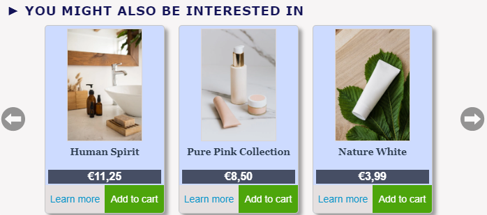
Item side-by-side placement
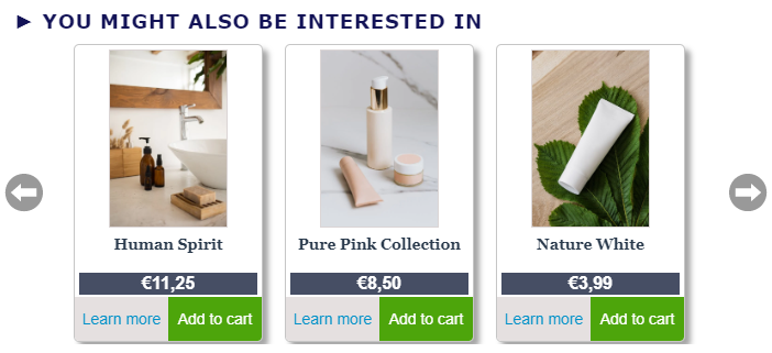
By default, products are displayed separated from one another by a variable amount of blank space which adapts to the size of the screen. This makes it convenient to display Smart Content on mobile as you do not have to change anything to adapt the number of products displayed to the size of the screen.
There can be cases where you want to place your products one next to the other without any margin, or with a hard coded margin. Here is an example of what such Smart Content can look like :
In case you do not want the items to touch each other, you can add some 'Custom CSS' to automatically add a margin to the right of each product. Here is the code you would use to add an 8px margin to the right of each product :
#recList .item-col {
 margin-right: 8px !important;
}
Text data on top
If set to On, this parameter puts the text block (containing the title, description, price, brand and all the properties activated in the 'Fields Displayed' parameter) on top of the product image. By default this parameter is set to Off.
| OFF — Text data under the product image | ON — Text data above the product image |
|---|---|
|
|
Item container padding
This parameter defines the space in pixels between the edge of the product image and the border of the whole product container.
| Item Container padding of 4 px |
|---|
|
| Item container padding of 20 px |
|---|
|
Here is a screenshot of the Misc options that were used to configure the previous Smart Content(with the 4px padding) :
Fields displayed
This parameter activates the display of optional product parameters. These parameters come from the configuration you setup in your catalog import.
For each parameter, if the corresponding checkbox is checked and the parameter is available for the specific product being displayed, the parameter will be displayed. If the parameter is not available (not configured, or configured but not imported for the specific product), the parameter will not be displayed without any graphical artifact. For example, in the configuration screenshot above, the options 'brand' and 'sale price' are checked but not available.
Custom HTML for each product
If the product parameters you want to display for each product are not available in the 'Fields Displayed' parameter, you can add them via this 'Custom HTML' parameter.
This parameter is a template in which you can type HTML code that includes product-specific parameters. These parameters are written in the form #{parameter} and are replaced by the value of this parameter for this specific product when the Smart Content is rendered.
The following code is an example of what you could type in your Custom HTML field :
<a href="#{manufacturer_url}" class="highlight-link">#{manufacturer}</a>If the product has the parameter 'manufacturer_url' equal to "https://www.selligent.com" and the parameter 'manufacturer' equal to "Selligent", the following HTML code will be rendered under each product image :
<a href="https://www.selligent.com" class="highlight-link">Selligent</a>Note: In order for this to work, you also have to configure two custom fields named manufacturer and manufacturer_url in your catalog import configuration.
This feature allows you to configure advanced graphics for each product. Although it's always easier to use your dashboard's graphical configurator, some specific features you want to implement may not be supported. 'Custom HTML For Each Product' allows you to go further in customization.
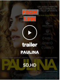
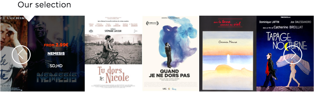
The following example shows you what you could do and the Custom HTML code which was used to generate it.
| Result | Custom HTML code |
|---|---|
|
|
None |
|
|
<a href="#{item_url}" class="info" target="_top">
|
In the last row of the table above, a system has been implemented to launch a trailer when someone clicks the play button that appears on top of a movie's thumbnail. To launch the trailer, the Smart Content sends a trigger to the Recommendations tag, which itself calls an existing Javascript function in the parent page. The following paragraph explains in detail how it works.
Inside the Custom HTML, the trailer button contains a special Recommendations class called 'custom-action-btn'. Adding this class to an HTML element inside the Smart Content will trigger a call to a function called 'setReceiveDataFunction', whenever the user clicks this element. This call also contains a parameter : all the data contained in the 'data-obj' parameter of the HTML element, which has to be a "stringified" object.
The function 'setReceiveDataFunction' called when a user clicks on the trailer is defined in the tag. The Custom HTML will only launch the trailer if the Recommendations tag declares the function 'setReceiveDataFunction' like this :
<script type="text/javascript">
 var _thq=_thq||[];
 _thq.push(['setId','CustomerX']);
 _thq.push(['trackPageView']);
 _thq.push(['trackEvents']);
 _thq.push(['detectChanges']);
 _thq.push(['setReceiveDataFunction', function(data){launchTrailer(data);}]);
 (function(){
  var th=document.createElement('script');
  th.type='text/javascript';
  th.async=true;
  th.src=('https:'==document.location.protocol?'https://':'http://')+'www..com/static/th.js';
  var s=document.getElementsByTagName('script')[0];
  s.parentNode.insertBefore(th,s);
 }) ();
</script>
A click on the Trailer button in the Smart Content will call the following function which has to be defined on the parent page containing the Smart Content :
launchTrailer({
"trailer": "#{trailer}",
"popin":"#{item_pid}",
"name": "#{title}",
"videotype":"#{video_type}",
"cover":"#{image_url}"
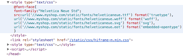
});Custom HTML inserted in the <head> of the Smart Content
This parameter allows you to insert static HTML in the <head></head> section of the Smart Content. This HTML code will be loaded prior to Custom CSS code and all your standard graphics parameters.
Recommendations provides a limited number of fonts by default (as described in the Title Font Family section). Custom HTML for the <head> is often used for adding custom fonts and reusing these fonts in your graphical parameters (title font or description font).
To add a custom font hosted on your servers (we use myshop.com as an example domain) :
<style type="text/css">
@font-face{
 font-family:"Helvetica Neue Std";
 src:url('//www.myshop.com/static/fonts/helveticaneue.ttf') format('truetype'),
 url('//www.myshop.com/static/fonts/helveticaneue.woff') format('woff'),
 url('//www.myshop.com/static/fonts/helveticaneue.svg') format('svg'),
 url('//www.myshop.com/static/fonts/helveticaneue.eot') format('embedded-opentype')
 }
</style>
This code will be inserted as-is in the <head></head> section:
Custom CSS
This parameter works the same way as the previous <head> Custom HTML, but it's specific to CSS code. Any custom CSS added in this field will "override" any previously defined CSS property (following standard CSS rules).
To make sure the order of insertion of the different Custom parameters in the HTML code is clear, here is an example :
<html>
 <head>
  [**Custom HTML**]
  [Smart Content default CSS]
  [**Custom CSS**]
 </head>
 <body>
  [Smart Content HTML]
  [**Custom JS**]
 </body>
</html>
If you want to add a 20px left margin to your Smart Content title and set the font to the 'Helvetica Neue Std' font you added in your Custom HTML parameter, you would write the following in your Custom CSS :
.rec_title {
 left-margin: 20px;
 font-family: "Helvetica Neue Std";
}
Note: To get the name of the HTML elements and CSS classes used in the Smart Content, right-click on a Smart Content block and select the "Inspect Element" option in the drop-down (in the dashboard preview, or on one of the Smart Content blocks already displayed on your website), if you use Google Chrome as your browser.
If you have no idea how CSS works, check this introduction to CSS.
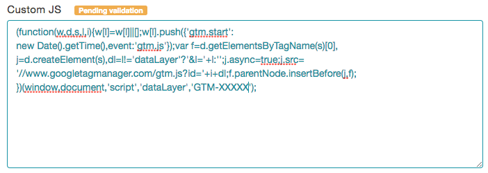
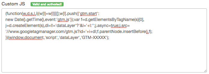
Custom JS
This parameter works the same way as the previous Custom CSS parameter. It is placed at the end of the <body></body> element and will be run after the Smart Content's standard Javascript is executed.
This field is often used to add a Google Analytics tracking code inside a Smart Content. Since it makes it possible for you to run undesirable JS on the Recommendations.com domain, our team has to validate the code input in the field before it can be activated inside Smart Content. When you write JS code and save your configuration, the field will look like this with a 'Pending validation' tooltip :
Once it's validated by our team, the same parameter will show a 'Valid and activated!' tooltip :
If you encounter any problems with this validation procedure, feel free to contact us via the live chat or via email.
Warning: The following Custom JS example is for advanced users only. We do not recommend doing this unless you know exactly what you are doing.
This same Custom JS parameter can be used to manipulate content inside the Smart Content.
For example, if you absolutely want the Smart Content title to be displayed on two lines, with each line having a different font and font-size, it can't be done easily with Custom CSS only. You would need to configure something like this in your Custom JS to split the single line in two :
var t = document.querySelectorAll('.rec_title');
if (t.length && t[0].innerHTML.length) {
 var ar = t[0].innerHTML.split(' ');
 var i1;
 if (ar.length < 4) {
  i1 = 2;
 } else {
  i1 = 4;
 }
 var t1 = ar.slice(0,i1).join(' ');
 var t2 = ar.slice(i1,ar.length).join(' ');
 var parent = t[0].parentNode;
 parent.innerHTML = '<div class="rec_title"><div class="rec_title_top">'
 + t1 +'</div><div class="rec_title_bottom">' + t2 + '</div></div>';
}
Based on this new HTML, you can add Custom CSS for the newly created elements :
#top_bar {
 height: 80px;
}

.rec_title_top {
 font-family: Economica, Verdana, Arial, sans-serif;
 font-size: 18px;
 text-transform: uppercase;
 letter-spacing: 3px;
 height: 10px;
}

.rec_title_bottom {
 font-family: CheddarJack, Verdana, Arial, sans-serif;
 font-size: 34px;
 text-transform: lowercase;
}
 Related Topics