Smart Content are configurations holding three types of information: algorithms, filters and graphics. Algorithms and filters are the basis of how products are selected inside Smart Content and offer almost the same options whether the Smart Content is created to be used on a website or inside an email.
The type of graphics can be selected in the configuration of each Smart Content:
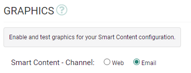
Web
For 'Web' Smart Content, all aspects of Smart Content can be configured inside the dashboard. Our graphical configuration tool allows you to modify a wide range of graphical parameters for every Smart Content without typing a single line of code.
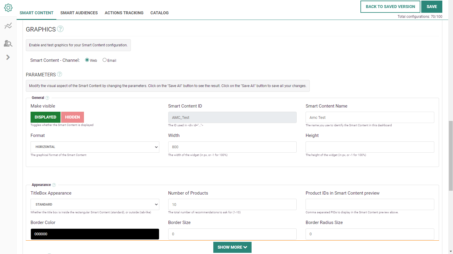
These parameters include:
- General — Display/hide the Smart Content, set the Smart Content name for identification, define the Smart Content format (horizontal, vertical or grid), and the widget's width and height.
- Appearance — Title box appearance (standard or tab-like), number of product recommendations, product ids to display, border color/size/radius.
- Title box — Text to display, font family/size/color/weight, alignment, spacing, padding, background color, title link.
- Product image — A mandatory image width and optional height can be set. Resizing images is always relative, keeping the aspect ratio of the image. You can also define an image border color and size, and activate/deactivate an effect to zoom in on the image.
- Arrows — Type, size, color and more settings related to the arrows used, including an automatic slider and other animations.
- Description Text — Description formatting.
- Price — Formatting of the price.
- Add to Cart Button — The type of action that is executed after a click on an add-to-cart button ('None', 'Hyperlink' or 'JSON to parent page'), and the text displayed on the 'add-to-cart' button.
- Learn More Button — The text displayed on the 'show more' button at the bottom of the Smart Content.
- Misc — Miscellaneous settings such as product item formatting, custom HTML, CSS and JS (when specific graphical effects and animations are needed).
Note: A complete description of each one of these parameters is available in the graphical features glossary.
If the type of graphical generation and configuration does not suit your needs, please contact your Marigold account team or certified partner to give you access to the Recommendations API.
Note: The Recommendations API documentation can be found here.
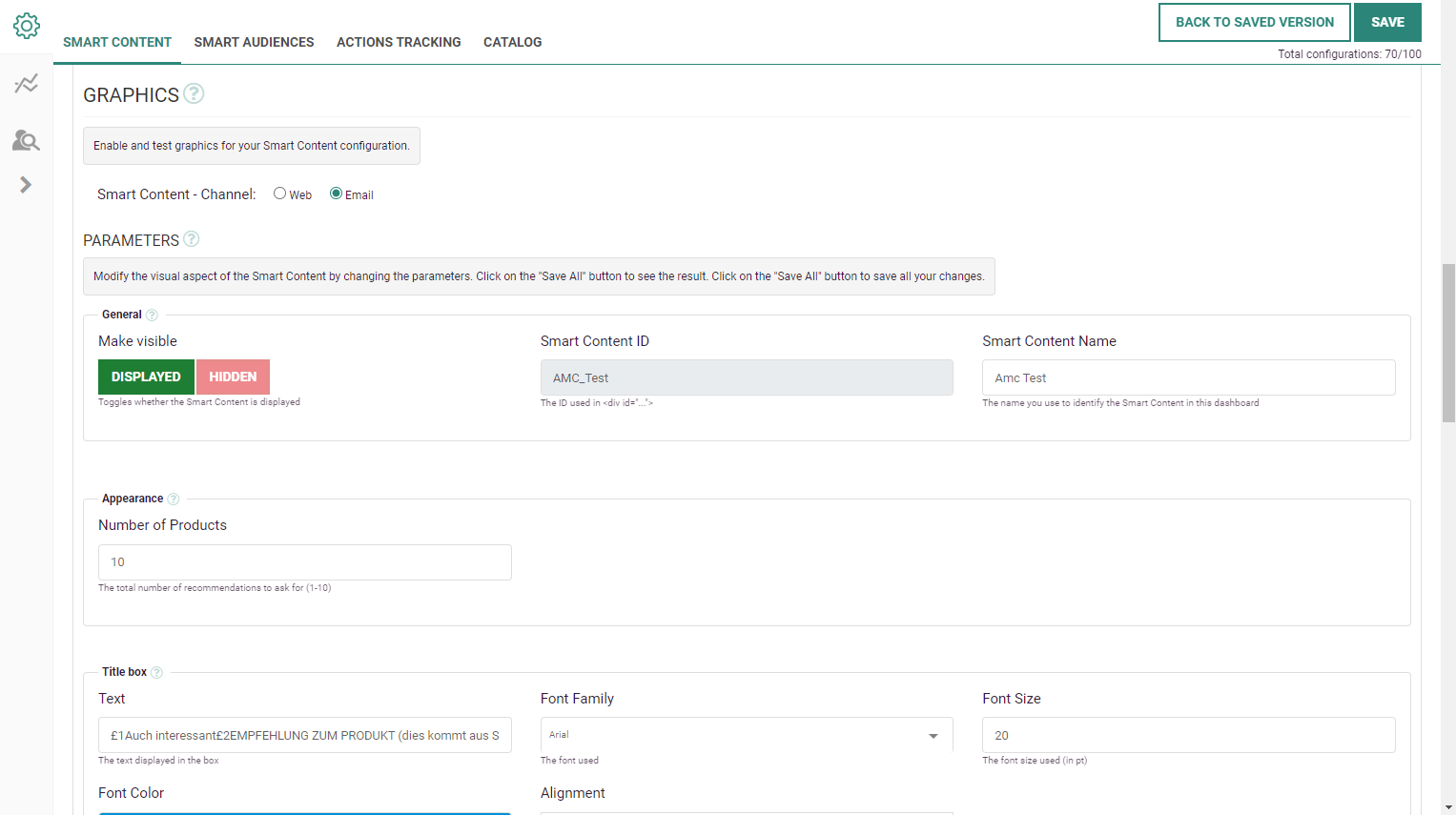
For 'Email' Smart Content , the following graphical settings can be configured through parameters:
- General — Display/hide the Smart Content and set the Smart Content name for identification.
- Appearance — Number of product recommendations.
- Title box — Text to display, font family/size/color/, alignment.
Underneath these parameters, a Graphics Editor is visible that allows you to build your Email Smart Content in a visual way.
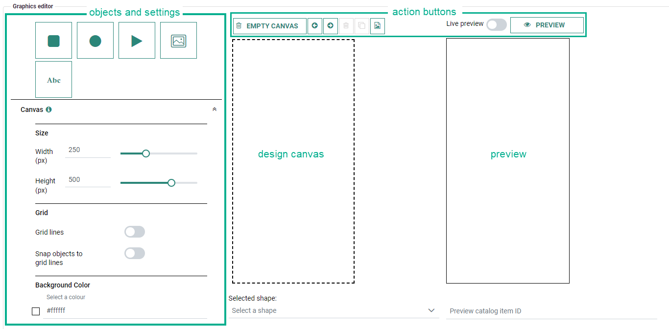
The Email Graphics Editor consists out of 4 main sections :
-
On the left, there are buttons to add objects onto the canvas and define their settings.
-
In the middle, there's the canvas on which you design.
-
On the right, a preview can be rendered to validate the actual outcome of your design.
-
On the top, action buttons are available for the design canvas and for the preview.
Note: A complete description and demo of the Smart Content Email Graphics Editor can be found here.
 Related Topics