A Content Block is a piece of content that is created in the Library and can be used and reused in different messages. Typical examples are
- The footer of a message with information and contact details that should be displayed in the same way in every message
- Disclaimers and legal text blocks
- Logos
- Branded dividers
These are Content Blocks you want to add to multiple messages sent for the same organization.
Content Blocks can be used in source mode, WYSIWYG mode, and responsive designs for:
- email messages
- email templates
- pages
You can find more information on using these Content Blocks in content in this topic.
When accessing the Content Blocks section, a Start page is available giving an overview of all existing Content Blocks. The Start page presents information on the name, description, labels/tags and usage of the Content Block.
Content Blocks are stored in folders and follow the same folder structure and management as for the other chapters. (More details on folder management can be found here.)
Note: Users with read-only rights are able to view the Content Blocks but without the ability to make any changes. On the overview, an 'Eye' icon provides viewing access to the Content Block where a message informs users they don't have permission to alter the document.
From the Start page, Content Blocks can be edited, duplicated, moved or deleted.
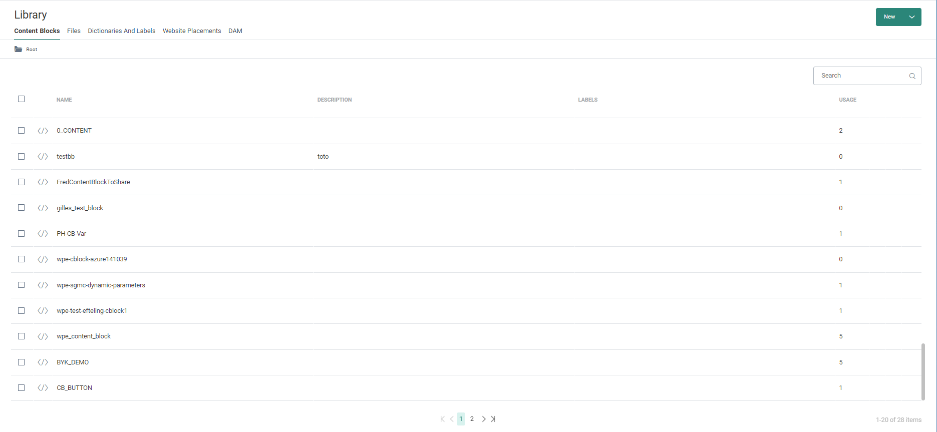
A Content Block can be available for multiple organizations or only for the organization in which it has been created. The usage tells you how many times this content block has been used in messages.
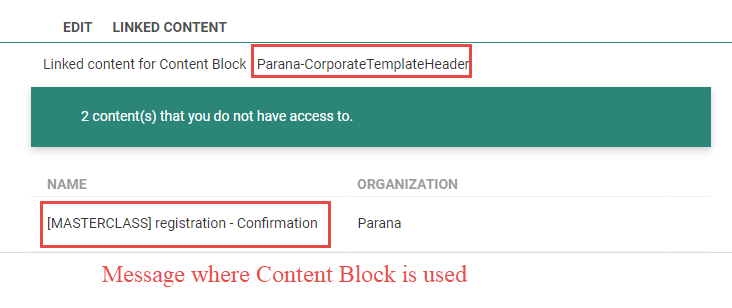
Content Blocks can be deleted from the dashboard. However, if the Content Block is used in a message, the user is alerted and a list of all messages using the content block is displayed for the organizations the user has access to.
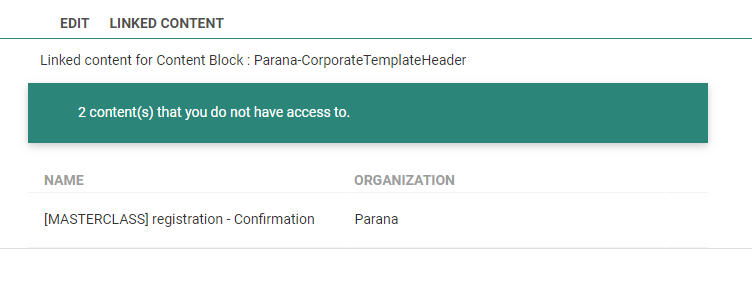
Note: When the Content Block is used in messages for organizations the user has no access to, an alert is displayed informing that the content block is used in other organizations, without specifying where it is used.
Also, when the Content Block is used in messages residing in folders the user has no access to, these messages will not be listed.
In this chapter:
- Create a Content Block
- Add Personalization
- Add Links
- Add SG-Tags
- Use Multiple Languages (SG-lang tag)
- Using Variables (SG:VAR tag)
- Using custom CSS
Create a Content Block
1. To create a new Content Block, click New. The properties page is displayed.
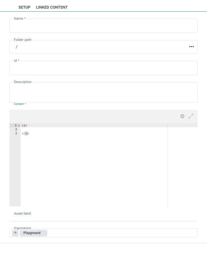
2. Enter a Name and Description and make sure this is a clear indication of what the Content Block contains. When using the Content Block in a message, it is this name that is listed.
Note: The Name field can contain any value.
3. An ID must be defined. Upon creation of the Content Block the ID is automatically filled out based on the name entered for the Content Block. However, a different value can be entered at this point. Upon editing an existing Content Block the ID field is read-only.
Note: The ID field can only contain alphanumeric characters, underscores and dashes. No special characters are allowed.
4. Select the Folder where the Content Block is stored. Click the ... to access the Folder selector.
5. Next, fill out the actual Content. This is done in HTML source code with auto-complete function. You can also copy-paste HTML code in this section.
The HTML code in this section can be a complete HTML tag or can contain only part of the code, such as a Table, or the footer content, or a section with text and images, etc. The HTML code must be valid and a validation is done.
Technical Note: Text must currently be put in a <p> tag to render correctly in the message.
You can use the toggle button  in the upper right corner to change to full-screen mode.
6. Assign one or more Asset labels to the Content Block. A drop-down list is available with a list of all labels. (These labels are configured in the Admin configuration.) Users with the proper Access permissions can also create new labels here by typing the new label value in the field.
7. Last, indicate if the Content Block should be available for use in other organizations as well. By default the current organization is selected. Others can be added. Click the + icon to add additional organizations.
When done, Save.The Content Block is added to the dashboard.
Note: Saving the Content Block can also be done by using CTRL + S while editing the code of the Content Block.
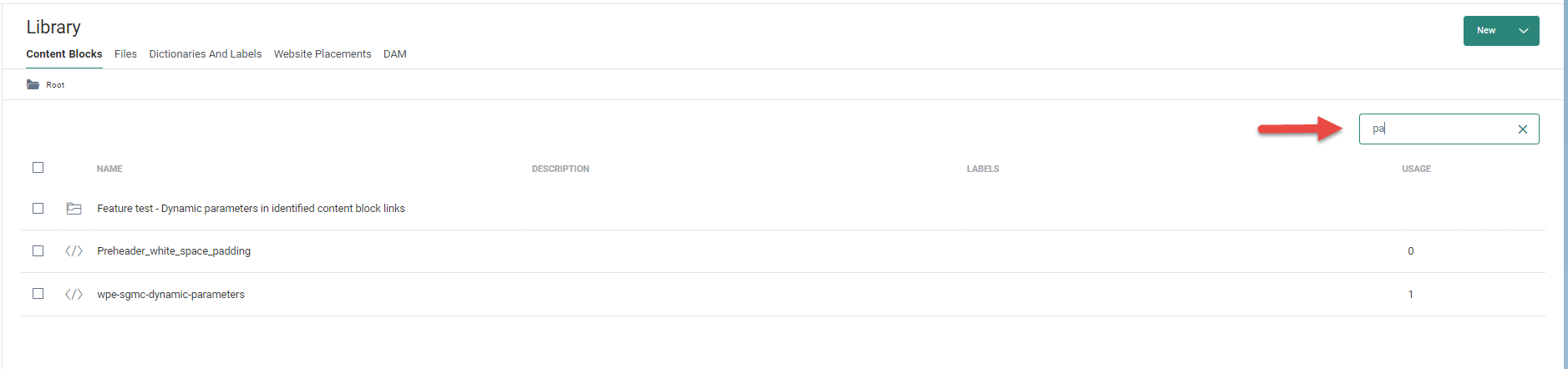
8. You can perform a search to locate the Content Block.
The dashboard presents an overview of the Content Blocks and their usage.
When editing a Content Block, the Linked Content tab provides an overview of all the messages where this content block is used. Hover over a message in the overview and click the  icon to go straight to the message and edit it.
Add Personalization
Emojis, Personalization fields, and Data Selection fields can be added to the Content Block. When the Content Block is used in a message, validation is performed to check if the used personalization fields match the available fields of the lists in the message itself.
Fields from the Audience List
When using fields in a Content Block, you must make sure these fields also exist in the Audience List used in the message.
Example: If the Content Block uses a personalization field [%[MASTER.NAME]%], this field must also exist in the Audience List of the message.
Fields from a Data Selection
Fields from a Data Selection can be used in a Content Block which it then used in a Repeater or outside of the Repeater.
Outside of the Repeater
When using Data Selection fields in a Content Block that will be used outside of a repeater, the following syntax needs to be used:
[%itemValue('DS_Name', ROWNUMBER, 'Field_Name' )%] where
DS_Name references the name of the Data Selection configured in the message
ROWNUMBER references the exact record to choose from the Data Selection
Field_Name references the field in the Data Selection that must be displayed
Note: In this case, the Content Block can only be used in messages that include the referenced Data Selection in their properties.
In a Repeater
When Data Selection fields are used in a Content Block and that Content Block is added to the Repeater in the message, the properties of the Repeater apply (eg. number of columns) and the number of times and what data will be shown depends on the Data Selection definition for the Repeater:
To be able to use Data Selection fields in the Content Block you must make sure that:
1. The Data Selection List selected as the source of the Data Selection contains the fields used in the Content Block.
2. The fields in the Data Selection definition and exposed for personalization in the Repeater.
3. The Content Block is added to a Repeater using the Data Selection that has those fields defined.
Example: Use the IMAGE_URL in the Data Selection and display it. The following syntax is used in the Content Block:
[%itemValue( 'IMAGE_URL' )%]
Example code: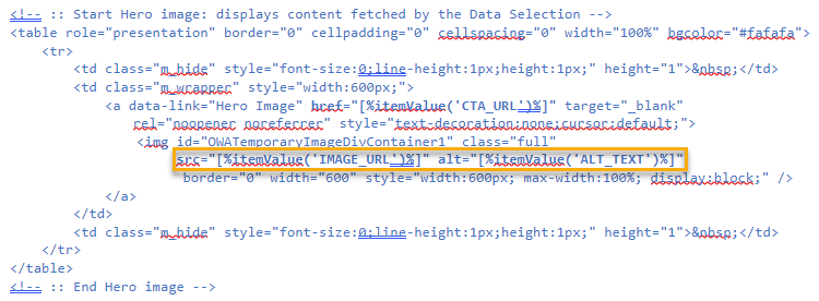
Note: The syntax used does not contain any reference to a Repeater or Data Selection. Hence this Content Block can be used in ANY Repeater with ANY Data Selection that features the referenced field.
Add Links
Links can be added to the Content Block as well. Depending on the syntax used, links will be tracked or not when used in a message.
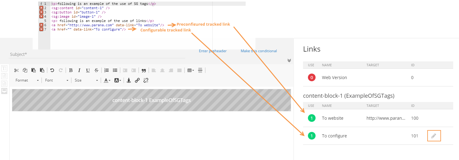
Data-link attribute for tracking purposes
To create a tracked link, add the data-link attribute to the syntax and provide a name for it.
Example:
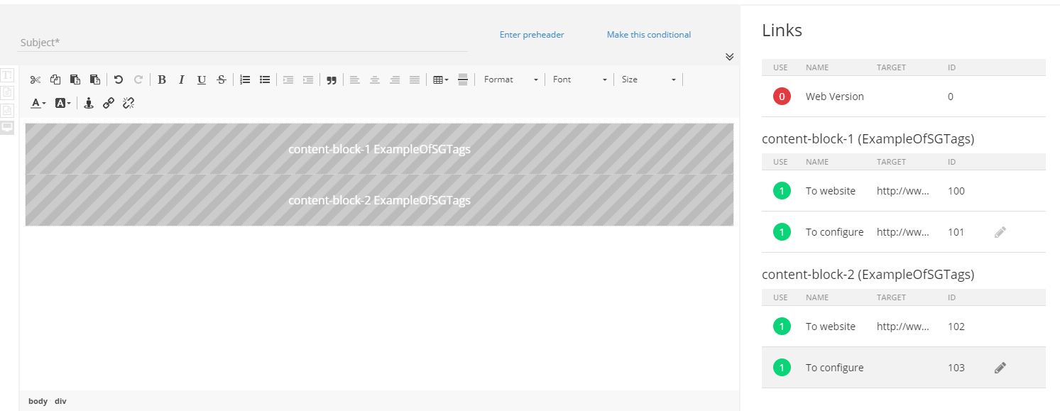
<a href="" data-link="Website">
In the below example, it looks like following: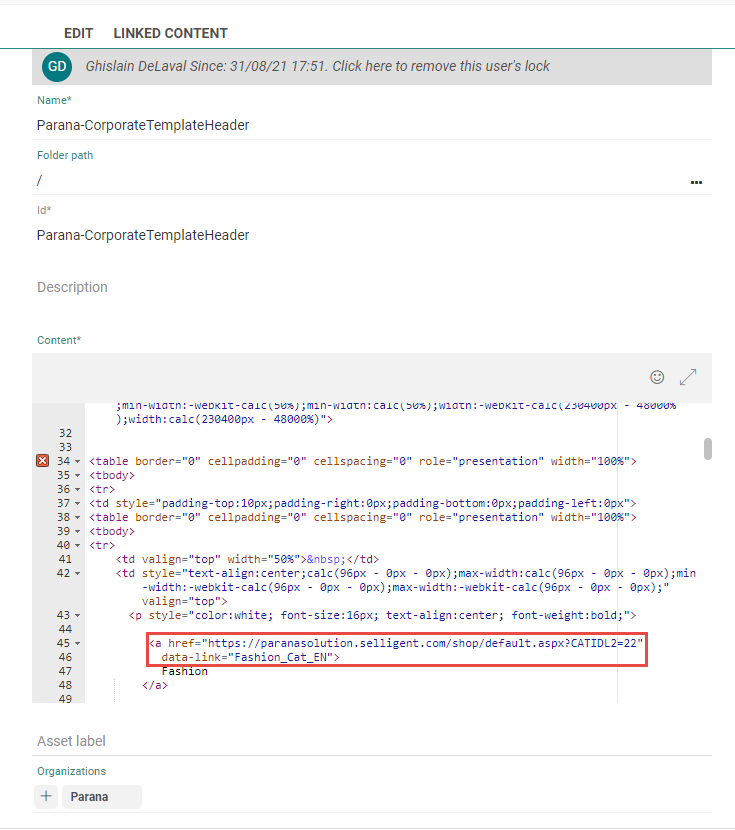
When the Content Block is used in the message, the link appears on the right, in the Links panel.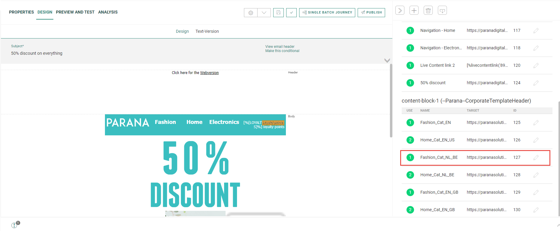
Note: Use of the anchor # tag in a data-link attribute is not permitted.
When a Content Block with links is added to a message, the tracked links will be listed on the Links tab of the message. The name given to the data-link attribute is the one displayed on the Links tab when the Content Block is used in a message. If the same Content Block is used multiple times in the same message, distinct links will be created for each time the Content Block is used. This allows also tracking which Content Block generates the most interaction.
Technical note:
In a Content Block, it is possible to reference links using the name of the Link instead of the ID.
For example, for the following tracked link in the Content Block <a href="http://www.google.be" data-link="my_url">ClickMe</a>
you can use [%link('my_url')%] in any Link expression used in the Content Block (ex. [%concat(link('my_url'), '&context=', urlencode([VARIABLE.URL]))%] )
Note that this only applies for expressions added to the Content Block itself, not to the message. You can use the name of links defined in the Content Block as well as the name of links defined in the message.
Because the tracked links are displayed multiple times this can lead to confusion. Therefore, tracked links can be given an alias, so there is a clear distinction between them, which is useful especially in reporting. This alias is assigned when editing the properties of the Content Block link in the message.
In the Links section, click the pencil icon next to the link to display the Properties dialog and define an alias.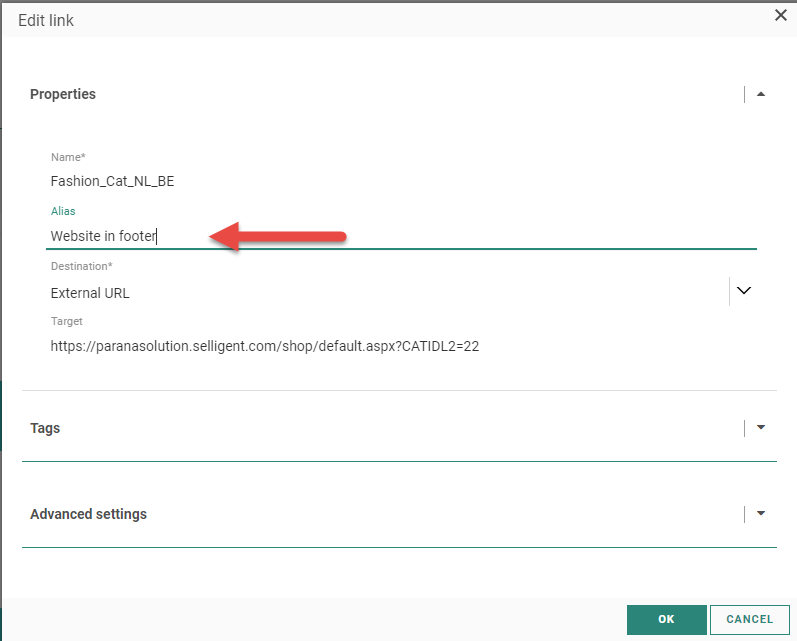
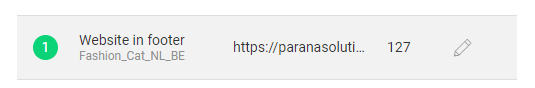
The alias and the name of the link are displayed in the Links overview:
Note: In case the link points to an existing journey, it is possible to pass on parameters to the Input Component of that journey. This can be done directly in the query string:
<a href="sgmc://journey/123/456?c=subscribe&canal=email" data-link="SMC-journey">Click here</a>
It is also possible to pass expressions:
<a href="sgmc://journey/123/456?c=subscribe&canal=[%[PREFERENCES.PREFERRED_CHANNEL]%]" data-link="SMC-journey">Click here</a>
When no data-link attribute is added, the link is an ordinary hyperlink. It will not be displayed on the Links tab when used in a message and it cannot be edited once used in the message.
href attribute to indicate the target
In addition, when the href attribute is filled out, the link target is not editable when the Content Block is used in a message. On the other hand, when no href attribute is defined for the link in the Content Block, the user will be able to define the actual target in the properties of the link when used in a message. The target can be an external URL, a page in an existing journey or the target can be defined in the journey. (You can find more information on the use of Content Blocks in this topic. )
Example: The Content Block contains one pre-configured hyperlink where the HREF attribute is filled out and one without the HREF attribute. They will both be listed in the Links section of the message. The second hyperlink will be configurable.
If we add the same Content Block twice, a second section is added with the links in the second Content Block. Although the same Content Block is added to the message, the configurable links can be configured differently.
When the Content Block link points to a specific journey in Campaign or in Engage, parameters can be passed on in the Content Block. The following syntax must be used and will only work when used in Content Blocks:
Example of links to journeys:
<a href="sgmc://journey/123/456" data-link="SMC-journey">Link to Marigold Engage journey</a>
<a href="sgmc://campaign/123/456" data-link="Campaign-journey">Link to Campaignjourney</a>
Example of links with parameters:
<a href="sgmc://campaign/123/456?USERNAME=Andrew" data-link="Campaign-journey-param">Link to Campaignjourney</a>
In all examples above, the indicator 123 refers to the Journey ID and the indicator 456 to the Component ID.
When you want to add the web version link to the Content Block, the following syntax is used.
<a href="LINK(0)" style="text-decoration:none;color:#0000aa;">web version</a>
where LINK(0) always refers to the default web version link created in every message. This link is non-editable.
Unsubscribe and Analytics attributes for reporting
If the link in the Content Block is used as an unsubscribe link, you can add an attribute to the link so that this link will not be included in reporting. The syntax is as following:
Example:
<a href="sgmc://journey/123/456" data-link="Unsubscribe" unsubscribe-link="true">link to Unsubscribe journey</a>
Technical note: If a link is flagged as an unsubscribe link, this results in the following behavior:
The Unsubscribe link is separated from the other links in reporting to ensure a dedicated metric that provides information on the number of customers who have clicked it.
Unsubscribe links are also available as a separate event in the Segment Builder. This lets you create segments that take account of the actions on an Unsubscribe link.
Clicks on Unsubscribe links will not be taken into account when calculating the winner of an AB test on a message.
On the other hand, tagging a link in the Content Block will allow it to be included when trackers are activated on your environment. The syntax is as following:
Example:
<a href="https://acc3.emsecure.local/shop/default.aspx?CATIDL2=47" data-link="Home_Cat_NL_BE" analytics-link="Home Electronics"> Electronica </a>
Note: It is possible to use expressions in the analytics-link attribute.
More information on the use of Content Blocks with links can be found in this topic.
Interest Tags attributes for interest tracking
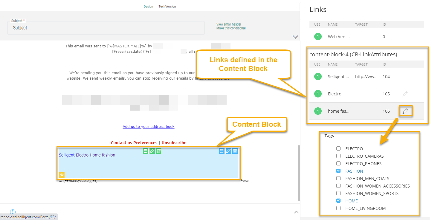
When creating a Content Block with links, you can now tag these links with Interest Tags as well. This is done in the following manner:
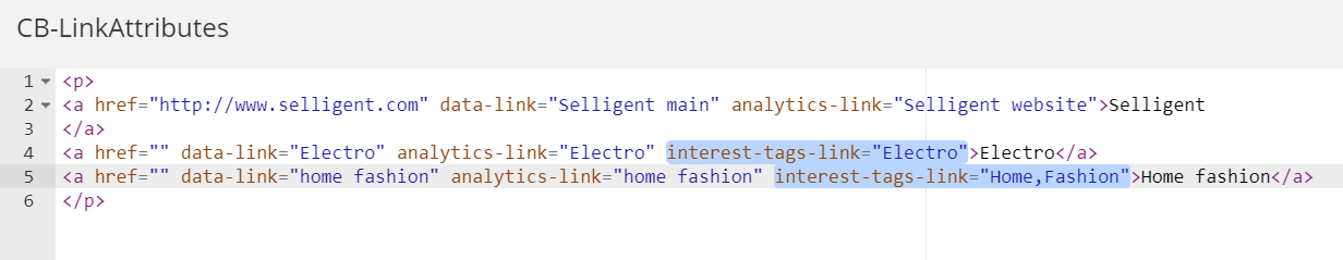
The attribute ‘interest-tags-link’ is added to the link tag. The tags are separated by a comma.
Technical note: Note that the Interest tags used in the Content Block should correspond to the tags in the Tag List linked to the Audience List for which the content is being created.
When this Content Block is used in a message, the links used in the Content Block are listed and when opening a link, the different Interest tags set for the link are shown:
Add SG-Tags
Note: Content Blocks support the use of SG tags. Remember that SG tags are Marigold Engage-specific HTML tags that allow configuration of the layout and content through a properties panel and make it language dependent. When these tags are added and the Content Block is used in a message, the user will be able to configure these SG tags directly in the message. This means that the same Content Block used multiple times in the same message or in different messages can have different content for these SG tags. This can typically be used to create multilingual content.
The following tags can be added:
<sg:content id=""/>
<sg:button id=""/>
<sg:image id=""/>
<sg:text id=""/>
<sg:barcode id=""/>
<sg:video id=""/>
In addition, the following sg tag can be added as well: <sg:head id=""/>.
This sg tag is treated differently from the others, as all sg:head tags will be rendered at the bottom of the head-section in the message. When multiple sg : head tags have been detected, in a single Content Block or multiple Content Blocks, they are all rendered sequentially. The order of the Content Blocks in the message determines the order in which they are rendered.
Example: We have a Content Block with three SG tags. When this Content Block is used in a message, the SG tags will be listed and the user can edit the content. A preview of the SG tag is shown. If the SG tag has content defined in it, that will be displayed in the preview. If no content has been defined yet, an icon is displayed with the name of the SG component.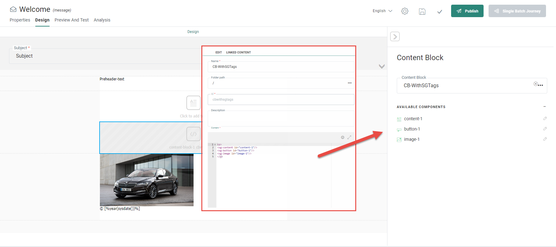
For some SG tags used in Content Blocks, you can set any style option through attributes in the tag.
Example: <sg:image id="my_img" alt="alternative text" style="width:100px"/>
The following attributes are supported for the following SG tags:
| SG:image |
src — the source of the image |
| SG:button | href — the button link text — button text style — style options such as width |
| SG:content | style — style options such as width |
| SG:video | poster — Image to be shown when the video is downloading or until the user clicks the play button src — The source of the video href — The video link img — The fallback image style — Style options such as width |
| SG:spacer | style — Style options such as width |
| SG:barcode | barcodetype — The type of barcode. You can choose from Ean-13, Code39, Code128 or QR value — What will be encoded to generate the barcode (example: "mailto:support@somecompany.com") Personalization can be included as well, e.g. "https://discount.shop/basket.asp?visitor=[% MASTER.ID %]" alt — The text to be displayed if the selected barcode cannot be shown. orientation — It defines the barcode orientation on the page. You can choose between 'Normal', 'Turn 90 Left', 'Turn 90 Right' and 'Turn 180' fontsize — The font of the barcode text in pixels width — The width of the barcode in pixels height — The height of the barcode in pixels borderwidth — The width of the border in pixels version — Only for QR codes. The selected version defines the overall dimensions of the symbol. A value from 1 to 40 is expected errorcorrectionlevel — Only for QR codes (More details here) style — Alignment (Left, Right, Center) |
Note: When you set an attribute on an SG component in the Content Block, it becomes read-only when the Content Block is used in the message. Changes to the style options in the Content Blocks will be reflected in the messages using these Content Blocks.
More information on the use of Content Blocks with SG-tags can be found in this topic.
Use Multiple Languages (SG-lang tag)
Content Blocks are generally non-editable when used in a message, except for SG tags and editable links. These can be modified once the Content Block is added to the message.
By using the following syntax, you can make the content of a non-editable Content Block language dependent:
<sg:lang value="EN">…</sg:lang>
<sg:lang value="NL" >…</sg:lang>
Example of a Content Block using the SG:lang tag: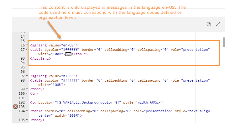
Note that these SG tags can only contain HTML. You cannot include other SG tags in a SG:lang tag.
Note: Ensure that the language code used in these SG tags corresponds to the language codes used for the organization. Consult with your system administrator to obtain these language codes.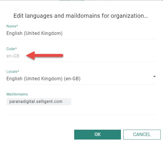
Note: If the message has a language code that is not included in the Content Block, no content will be rendered.
Language tags can also be used inside other SG tags. This lets you set language-specific attributes for these SG tags. Only the attributes specific to the user's language will be rendered.
Note: Language-specific attributes have priority over generic attribute values.
The following attributes can be set as language-dependent:
- Images — src, href, alt
- Buttons — text, href
Example for an image:
<sg:image id="my_img" style="width:100px">
<sg:lang value="nl" alt="De zon" />
<sg:lang value="fr" alt="Le Soleil" />
</sg:image>
Example for content:
<sg:content id="content-1">
<sg:lang value="NL">Nederlandse content</sg:lang>
<sg:lang value="EN">English content</sg:lang>
</sg:content>
Where value is the language code that needs to correspond to the language of the message in which the Content Block is used.
More information on the use of Content Blocks with multiple languages can be found in this topic.
Using Variables (SG:VAR tag)
Content in a Content Block can be made dependent on a variable. Variables are used in templates, giving a level of flexibility when this template is used in a journey. You can then fill out this variable and influence the final look and feel of the content.
Example: I want a multi-functional button, but must be able to adapt the size and the alignment. In this case, you can create a Content Block for the button and have two variables defined for the color and the alignment.
A template variable exists on template level and when used in a Content Block, the value selected for the variable applies to all Content Blocks in the template using that variable.
To use an existing template variable in the Content Block the following syntax is used.
[%[VARIABLE.Name]%]
Example: <sg:conditional id="social" expression="all(eq([VARIABLE.Social], 'true'))">
All content added in between these sg:conditional tags will be dependent on the value that you enter for the variable.
A local variable is defined and used in the Content Block
To use a local variable in a Content Block that does not yet exist in the template, the following SG syntax is used:
<sg:var name="" type="" value="" alias="" description=""/>
You can set :
- a name
- the type of the variable. This defines the type of value that is expected for the variable and the way it is displayed on the interface: a text variable will only allow to enter textual values; a color variable displays a color selector, a boolean variable displays a check box.
- the default value (optional) for this variable. When used in a content, the default value is automatically applied.
- an alias (optional). This is used in the variable field in the content block properties. If no alias is provided, the name of the variable is used.
- a description (optional). This is displayed below the variable field in the content Block properties
<sg:var name="MyText" type="Text" value="mytext" alias="my_alias" description="my_description"/>
<sg:var name="Mycolor" type="Color" value="#0000FF" alias="my_alias" description="my_description"/>
<sg:var name="MyName" type="Number" value="75" alias="my_alias" description="my_description"/>
<sg:var name="MyBoolean" type="Boolean" value="TRUE" alias="my_alias" description="my_description"/>
<sg:var name="MyDecimal" type="Decimal" value="0,01" alias="my_alias" description="my_description"/>
<sg:var name="MyDateTime" type="Datetime" value="2019-10-17 10:00" alias="my_alias" description="my_description"/>
<sg:var name="MyDate" type="Date" value="2019-10-17" alias="my_alias" description="my_description"/>
<sg:var name="MyTime" type="Time" value="10:00" alias="my_alias" description="my_description"/>
<sg:var name="My_image" type="image" value=""/>
Example:
On the right, the Content Block created in the Library chapter, contains 3 variables of type text, boolean and color.
On the left, when using the Content Block in a message, the properties window displays all 3 variables, with their alias and description. 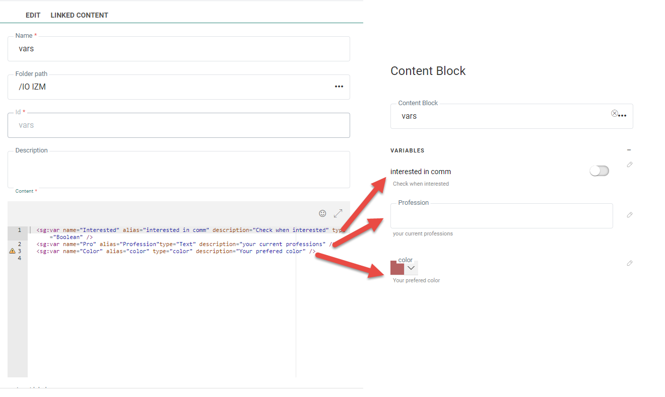
Additionally, this is how you can define the different possible values for a variable for a marketer to choose from.
<sg:var name="MyValues" type="text" value="option2">
<sg:option value="option1 ">Option 1</sg:option>
<sg:option value="option2">Option 2</sg:option>
</sg:var>
Have a look at this example, where the background color of the template header is stored as a variable with 2 possible options: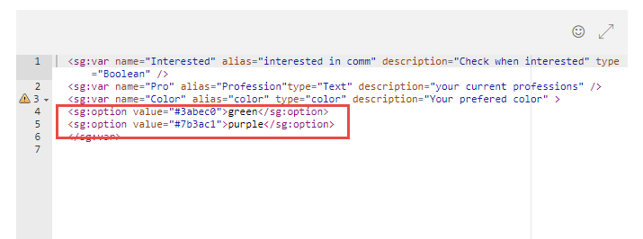
The variable is then listed in the message using the Content Block and the marketer can select a different background color on the right, in the Variables section. The 2 options are displayed.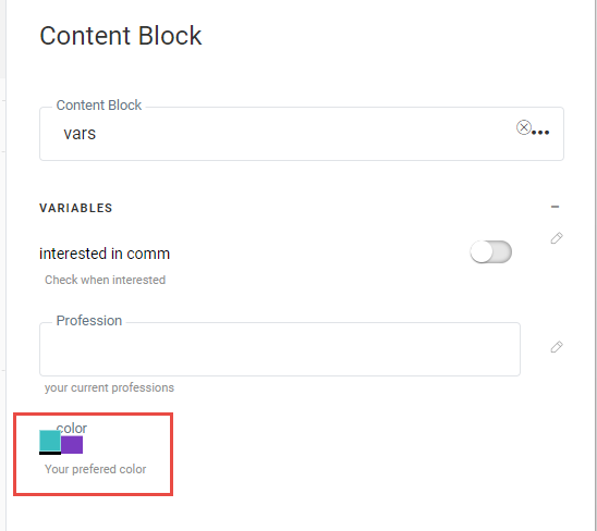
Everywhere the variable is used in the Content Block, the color will be adapted to the selected value.
Example: A variable of type Image is added to the Content Block and used in an Image tag: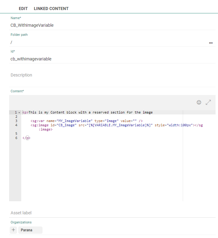
In the message, an image can be selected for this variable: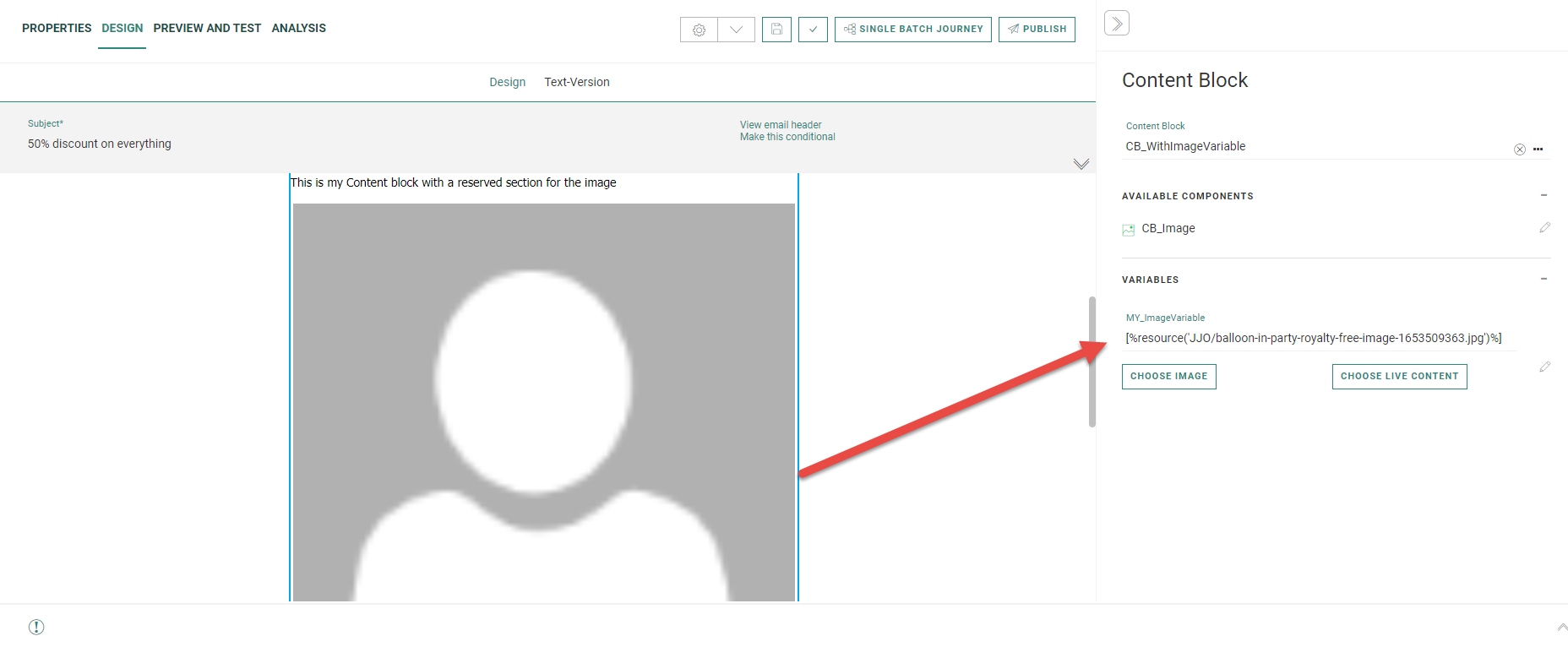
Example: A variable of type color is defined in the Content Block and then used as the background color of a paragraph: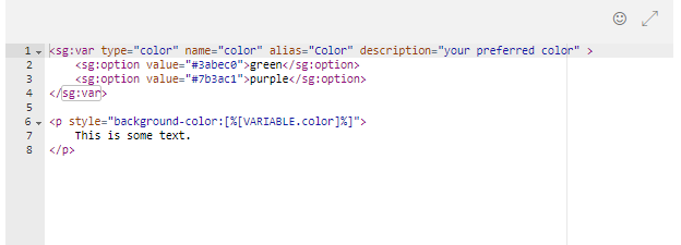
Note:
Local variables are defined in the Content Block and for each Content Block added to the template, the variable value needs to be defined. This means that although the same Content Block can be used multiple times, they can all look differently.
When template variables are used in a Content Block, this value is defined only once when using the template and applied to all Content Blocks using that variable.
More information on the use of Content Blocks with variables can be found in this topic.
Example : Using global variables
Using custom CSS
Note: From Version 5.21 the data-head attribute is no longer supported and needs to be replaced with the sg:head tag.
Content Blocks can also contain custom style definitions, contained within <style> tags. When the sg:head tag is detected, those styles are then correctly placed in the message <head> section.
Example:
<sg:head>
<style type="text/css">
.custom-css-class {
background-color: #000000;
color: #ffffff;
}
</style>
</sg:head>
When used in the Content Block, the style of the content is adapted.
<p class="custom-css-class">
This is a paragraph.
</p>
Note: Engage specific SG-tags (eg. sg:var, sg:image, ...) and attributes (eg. data-link, unsubscribe-link, ...) are only supported in Content Blocks created in the Library. Currently, they are not supported for use when importing HTML for messages, templates and pages.
Examples :
- Introduction to Content Blocks
This course gives an introduction to the Content Blocks feature with a simple formatted text example.
- Using Content Blocks in Headers and Footers
This Content Blocks course goes deeper into the use of images, tracked links, and the use of SG Tags to define basic variables.
Test your knowledge about Content Blocks
Considering all the users have the appropriate permissions, what will happen in the next scenario ?
User 1 has created a Content Block in Organization 1, and added all available organizations during the setup of the Content Block.
User 2 uses the Content Block in any content in Organization 1.
Now user 3 wants to use the Content Block in Organization 2.
Afterward user 4 wants to delete the Content Block in Organization 3.
A: User 3 can use the Content Block in Organization 2. User 4 can delete the Content Block.
B: User 3 can use the Content Block in Organization 2. User 4 can NOT delete the Content Block.
C: User 3 can NOT use the Content Block in Organization 2. User 4 can delete the Content Block.
D: User 3 can NOT use the Content Block in Organization 2. User 4 can NOT delete the Content Block.
