In Source mode, content creators can create messages entirely from scratch in HTML or modify an imported HTML file directly in the code. In addition, the Source mode editor also allows users to drag-and-drop Engage content components into the source code:
Important note: Using tildes in the source code may lead to unwanted behavior when sending out the message. To allow the use of tildes, which are for example used in CSS, it is important to 'escape' the tilde.
Example:
Instead of using the following :
<a href="https://support.google.com/android/answer/9075928?hl=en#:~:text=1%20Open%20the%20screen" target="_blank" style="color:#000000;">Android</a>
Do this :
<a href="https://support.google.com/android/answer/9075928?hl=en#:~~:text=1%20Open%20the%20screen" target="_blank" style="color:#000000;">Android</a>
When using standard HTML code in the message, the exact same content is used
for all language versions of the email.
However, using the Engage Content components provides the following advantages:
- The content of the Engage component can be created for different languages so that the text, buttons or images can be displayed in the correct language of the message. In the source, Engage components can be recognized by the very specific <SG> tag.
- There is direct access to the properties and styling options of the component which simplifies any updates to the component.
Note: When creating or editing content in Source mode, a WYSIWYG editor is available through the Design tab, that allows the user to make changes to the content in a visual way. The user can toggle between both modes, respecting the changes made in the other mode.
Warning: When the imported HTML is very complex and contains custom tags, switching between Source mode and Design mode may cause issues. It is advised NOT to toggle between both modes as some elements from the source will not be translated correctly to the Design mode and vice versa. After import it is best to stick either to Source mode or to Design mode.
In this topic:
Adding Content Components to the source code
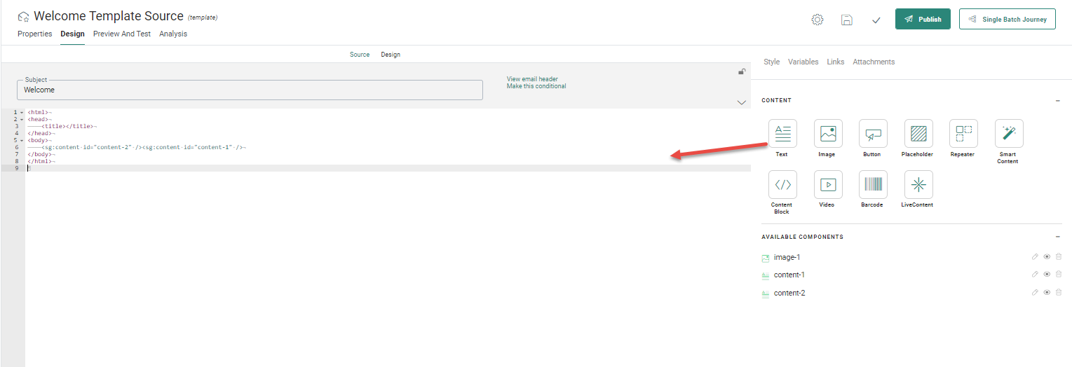
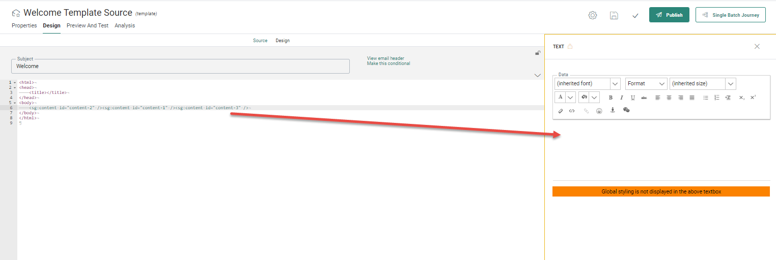
When Content Components are added to the source code of the template or email, automatically an <SG> tag is added to the source. These <SG> tags are specific to Engage. Clicking such a tag in the source allows editing the content directly in the properties panel on the right.
Note: You can
also type in the <SG> tags manually. The source mode provides an
auto-complete: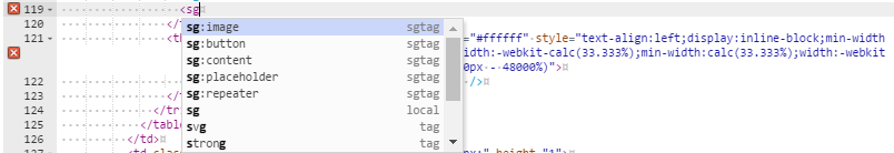
For more information on the different types of components, check out the chapter on 'Basic content components'
In addition Text, Button, Image , Repeater, Smart Content, Video, Barcode or Content Block components added to the source are also listed among the 'Available components' on the right:
- The pencil icon allows editing the component in the properties panel
- The eye icon highlights the component in the code
- The bin deletes the component from the source
Example: Add
a Text component:
Drag the Text component onto the body.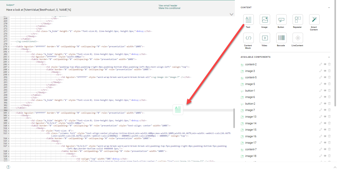
A dialog pops up to change the ID of the component. You can also leave
it as is.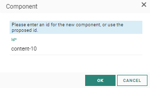
We name it Salutation and click OK.
An SG:content tag is now added to the source and the Text component is
now listed in the Available components section.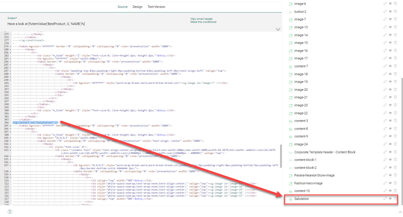
Engage specific tags
The following <SG> tags are created in the source for each one of the content types dragged and dropped onto the source code.
- text — <sg:content id="" expression="" allowhtml=""/>
- image — <sg:image id=""/>
- Livecontent — <sg:livecontent id="Coupon" />
- video — <sg:video id=""/>
- barcode — <sg:barcode id=""/>
- button — <sg:button id="" style=""/>
- divider — <sg:divider id=""/>
- spacer — <sg:spacer id=""/>
- placeholder — <sg:placeholder id=""/>
- Content Block — <sg:contentblock id=""/>
- Smart Content — <sg:smartblock id=""/>
- repeater —
<sg:repeater id="" structure="1" dataselection="" columns="" responsive="true" orientation="horizontal" item-mode="" >
<sg:repeaterheader visible=""> </sg:repeaterheader>
<sg:repeateritem id:"" name=""> </sg:repeateritem>
<sg:repeaterfooter visible=""> </sg:repeaterfooter>
<sg:repeaterempty visible=""> </sg:repeaterempty>
</sg:repeater>where the following attributes are used:
- dataselection — Name of data selection used for this repeater
- columns — Number of columns in the repeater. The number can be set to 0. As a result, no extra table, TR and TD tags are added.
- responsive — If it is responsive on mobile devices
- orientation — How content should be displayed on mobile devices, horizontally or vertically
- item-mode — If a variable layout is used for the item section
- visible — If the section such as header or footer is visible in the message.
Note: All properties for the Repeater or layout sections are added to the source.
Example:
The
layout option is set to alternating, visibility to mobile, number of columns
to two. The chosen data selection is added as well to the source.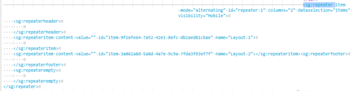
To define the content of the header, item, and footer of the repeater, simply drop Text, Button or Image components onto the source code within the right <SG> tag.
- Visibility constraints can be added to a content (text, button, image, etc) component by using an expression in an attribute.
Example:
<sg:content expression="all(eq(tobool([VARIABLE.Loyal]),tobool('true')))"
> — Text only
visible to contacts when the boolean variable Loyal is set to true.
<sg:button expression="all(ne([MASTER.TESTUSER], toint('1')))"
> — Button only
visible if the contact is not a test user.
When an entire row or column requires a Visibility Constraint, a conditional tag is created around the row or column, with an expression in it.
Example:
<sg:conditional id="1" expression="all(isnotempty([MASTER.NAME]))"> </sg:conditional>
Note: Double-clicking the SG tags in the source displays the properties panel on the right and allows editing the content.
