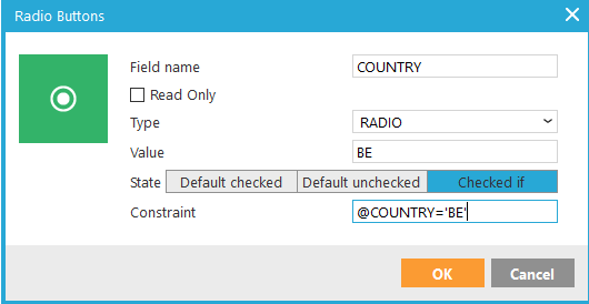
- Name: enter a suitable name for the field. You use this name to retrieve the posted value after the form is submitted. E.g. @COUNTRY will hold the value of radio buttons with name 'COUNTRY' after submit.
- If the element should be Read Only, check the corresponding box. A read-only input field cannot be modified (however, it can be tabbed, highlighted, or copied from).
- Field type: the field type is applied automatically when the radio button is placed. You can also change this to a checkbox
- Value: define the value for the radio button: this can be done in the usual way: 1,0, yes, no, etc.
- State:
-
- Default checked
- Default unchecked
- Checked if: this option allows applying a condition.
Example: display the radio button as selected if the value in the database for the COUNTRY field is 'BE'.
@COUNTRY='BE'
Radio buttons are not used separately, but as a group of radio buttons. Once a radio button is selected, you cannot 'unselect' a radio button (default html behavior). The radio buttons in the group will all have the same Field name, but different values. Only the selected value is submitted.
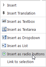
If a list field has an option list linked to it, and the field is set as type 'single value', you can insert that field as radio buttons in the form. The 'OPTION' function will get the translated value from the option list, for the field value. See list design and translations for more info on option lists.
Source code:
<label><input id="COUNTRY_BE" msgchecked="~IF(CHKPROP(@COUNTRY,'BE'),CHECKED,)~" name="COUNTRY" type="radio" value="BE" />~OPTION(COUNTRYR.BE)~</label><br />
<label><input id="COUNTRYR_FR" msgchecked="~IF(CHKPROP(@COUNTRYR,'FR'),CHECKED,)~" name="COUNTRYR" type="radio" value="FR" />~OPTION(COUNTRY.FR)~</label>
