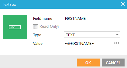
- Name: enter a suitable name for the element. You use this name to retrieve the posted value after the form is submitted. E.g. @FIRSTNAME will hold the value of a text box (input field) with name 'FIRSTNAME' after submit.
- If the element should be Read Only, check the corresponding box. A read-only input field cannot be modified (however, it can be tabbed, highlighted, or copied from).
- Field type: Choose between text, hidden or password.
- Value: The value that will be submitted. If you enter the posted value of the text box, e.g. ~@FIRSTNAME~ where FIRSTNAME is the text box name, the text box will be pre-filled with the submitted value. This way, when validation fails and the form is displayed again with error messages, the contact does not need to fill in the text box again. If you keep the value the same as an audience list field name, the text box will be pre-filled with the contact's value for that field, if the form is displayed for the contact (not anonymous).
NOTE: Add a ''DATA_ERROR'' system property to the page. This allows displaying messages when the form is being validated. The content of these messages is defined in the journey, on the Validation tab of the Data component. These messages are automatically displayed.
Source code: <input name="FIRSTNAME" type="TEXT" value="~@FIRSTNAME~" />
