Extensive reporting on email performance and activity provide marketers insight on how their campaigns are doing. These reports and insights are available from the Dashboards chapter. The dashboards are structured across category tabs, according to the category assigned to each individual dashboard.
Categories for dashboards are defined in the backend by the system administrator. Categories allow you to group similar dashboards, such as dashboards for comparison reporting or performance related reporting.
Each individual report is built from a series of widgets. The interaction features allow you to filter the data displayed by selecting a specific metric from a widget. Filtering is applied to all widgets in the dashboard.
Dashboards and widgets can be exported as images and PDF files.
Dashboards reporting offers different channel selections (email, SMS, push, MMS) to show channel-specific reporting data.
Important: Allowing third party cookies is mandatory for Dashboards to be shown in Marigold Engage. If they're blocked, dashboards will keep on loading indefinitely.
The Dashboards section provides a tab per category :
- Audience — Dashboards with widgets containing activity info of contacts in a specific audience.
- Audience overview — Compare info about active contacts and opted out contacts in an Audience List.
- Single Customer View — Dashboard showing omni-channel details of a specific contact in a selected Audience List. This includes general information on the contact, optin/optout details, preferences, historical interactions, etc.
- Comparison — Activity dashboards with dynamic reporting widgets to compare performance by journey, periods or domains.
- Comparison of 2 periods — Compare multi-channel journey performance by periods for the same or different journeys.
- Comparison of Multiple Journeys — Compare multi-channel performance of different journeys.
- Domains overview — Compare the performance of domains used for sending communications.
- Channel Performance — Activity dashboards with dynamic reporting widgets about multi-channel performance.
- Email Metrics — Dashboard showing email metrics of a selected target audience.
- Summary for All Journeys — Multi-channel performance metrics for all journeys over time, per executed day of week and per domain.
- Summary for Selected Journeys — Multi-channel performance metrics for selected journeys over time, per executed day of week and per domain
- Summary of Revenue Conversions — Overview of generated revenue, conversions and purchases for one or all journeys and domains, for the selected channel and date range.
Note 1: Revenue, purchase, article and conversion info is based on shop tracking results. Only if Marigold Engage receives the shop tracker info, those results can be shown in the dashboard widgets.
If there's no quantity or price (for example: revenue amounts are tracked, but article counts are not), it will be counted as a purchase but the quantity and price associated will have no tracked data (and thus '0' values).
Note 2: Also, if Marigold Engage receives revenue information that is not related to a journey or a click, it won't be shown in the dashboard widgets, as all dashboard info relates to journeys and clicks. This means that even if the list/user id is filled, we're not taking these into account for the communication stats dataset as we can't link it to a communication.
- Email Metrics — Dashboard showing email metrics of a selected target audience.
Note: You can publish your own custom dashboards from within Engage Data Studio. When you do so, an additional Custom category tab becomes available, containing the published dashboards.
Custom dashboards are only available in Marigold Engage organizations that they have been shared to.
For all reporting widgets with visual charts and bars, all of the items inside are active by default.
Hovering over such an item shows a tooltip with more info.
All reports can be downloaded as an image (PNG) or a CSV file, by clicking on the download button  , that appears in the top-right corner of each reporting widget when hovering over it.
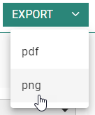
A full export of a complete dashboard, containing all reporting widgets, can be done by clicking on the Export button on the top-right of the screen :
- You can click on the
 button itself — This creates a PDF export.
 - You can click on the arrow on the right of the button — This gives you the choice between PDF or PNG export.
Note : Exports take into account all filters applied to the dashboard.
Technical note: The dashboards are optimized to be used in Google Chrome.
For all dashboards that offer a date range selector 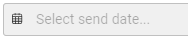 , the time zone applied is the browser's time zone on the client's local machine (for example : UTC +2).
Notes:
- All dashboards show metrics per journey, message and communication.
→ Communication = a message sent to a user.
Note that the same message can be sent twice or more to the same user from the same or a different journey. Each occurrence of the message will be considered as one communication.
Example: order confirmation message → A user makes 2 orders, and receives 2 order confirmation messages, one for each order. This will result in 2 communications.
- All open/click/CTO/CTR values are based on unique interactions (unless mentioned otherwise), calculated per communication (not globally).
For the Dashboards, metrics are calculated per journey.
→ All message data is aggregated.
→ Depending on the dashboard, we can also split the result up to the message level via a selector.
* OPEN TRACKED COUNT = Total of tracked opens
→ It can be a lower value than the number of unique opens if contacts have not downloaded the images (see note (1) below).
* UNIQUE = unique per communication
→ When the journey sent the same message twice to the same contact, this results in : Sent count = 2
→ When the contact opens each of the two messages one time, this results in : Unique open count = 2
→ When the contact clicks in each of the two messages one time, this results in : Unique click = 2
- For all Dashboards, the data taken into account for the initial load is historical data of the last 14 months.
However, for all new interactions, these are only taken into account if they are related to communications done this month or the previous month. New interactions on older communications are not included.
(1) Note: When a user opens an email, it's only counted as a tracked open (view) if they allow downloads of images (that are inside the body of the email).
When a user clicks on any link in an email, it's counted as a unique open, not as open.
Therefore, in case link clicks occurred but image downloads where not allowed, the number of unique opens can be higher than the number of opens in the dashboard reports.
For SMS and MMS, the only metrics that are retrieved by default are deliveries. There is no open/click interaction supported out of the box for SMS and MMS.
For mobile push and in-app, deliveries/opens/clicks are available. There is no distinction between a mobile push and an in-app; both are exposed as one channel "Mobile".
Using filters in dashboards
Almost all reporting widgets can be used as filter for other widgets.
Clicking on one or more items in a widget, highlights the clicked item(s) and applies your selection as filter for all the other widgets in the current dashboard.
When a widget filter is active, you can click on the Clear filter button that appears inside the widget, to reset the filter.
All items in that widget then become active again and other widgets in the dashboard are dynamically updated to show results without the filter.
Note: Legends can only be applied as filter for the widget containing the legend itself, not for other widgets.
Example:
Note: When the marketer applies a dynamic filter to a dashboard, the filter is saved automatically within the session and cross-session. Saving the filter gives them the ability to navigate away from the dashboard and when returning have the filter automatically applied to the dashboard. Each dashboard can have its own set of filters. A Reset button allows to clear the current dashboard filter and start from scratch.
Charts
For the charts used in the different dashboards, the following rules apply :
- The timeline is shown from left to right on the x-axis.
- The values/percentages are shown from bottom to top on the y-axis.
- The legend blocks Delivery %, Open %, CTO % and Sent count that appear under the chart are clickable, to filter on one or more types.
- You can select a period of time by clicking and dragging the mouse cursor within the chart itself, which filters all metrics for the selected period.
- A 'Clear filter' button allows to remove the applied filtering.
See example (ex1) below.
(ex1) Chart filtering demo :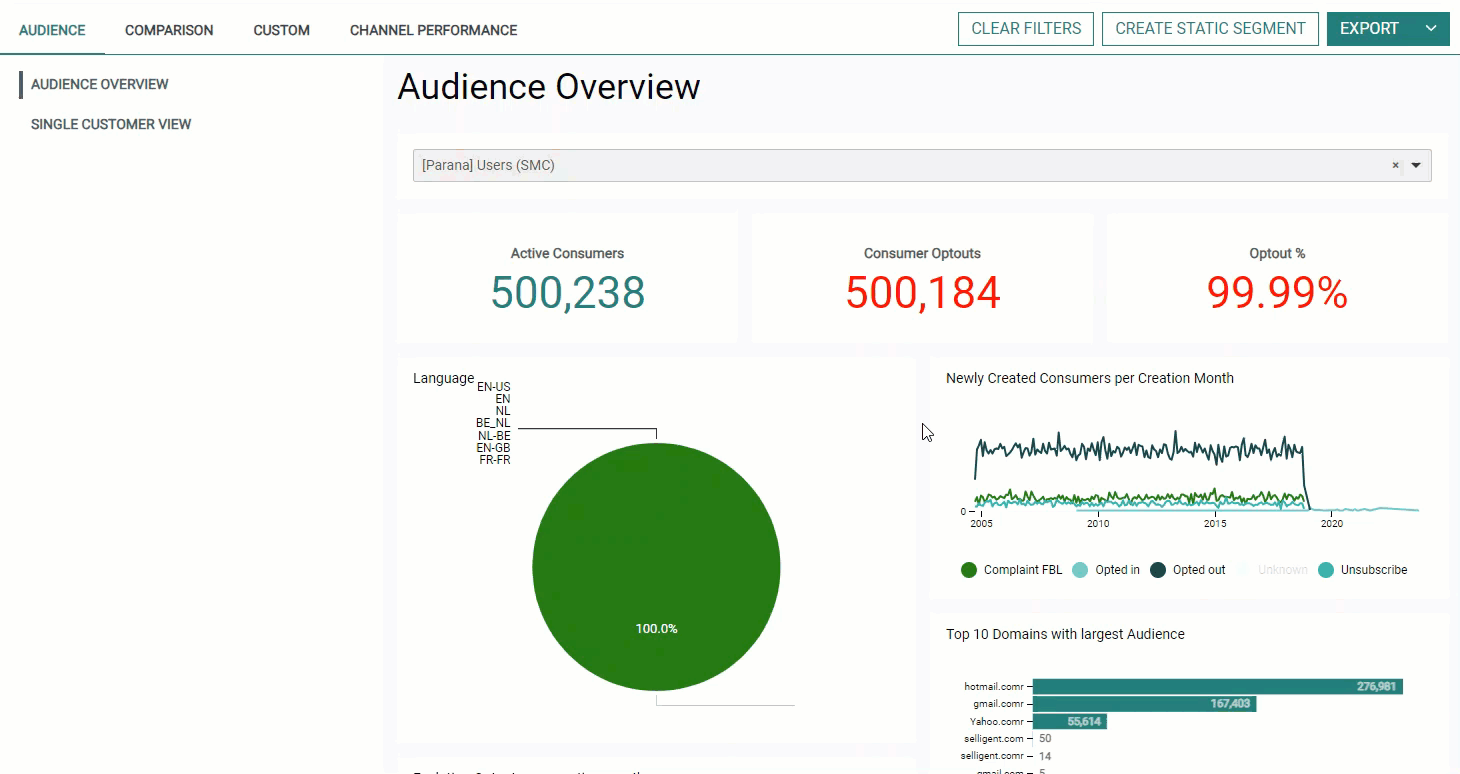
When hovering the chart, the mouse cursor becomes a cross icon.
You can then draw a rectangle by pressing the left mouse button, dragging the cursor to the desired location and releasing the left mouse button again.
The selected period can be changed by resizing or moving your selection :
- The double-arrowed cursor when hovering the left/right border of the rectangle, allows to extend the selected period.
- The 4-directional-arrowed cursor when hovering inside the rectangle, allows to move the selected period.
Every time you release the left mouse button, the entire dashboard refreshes to reflect the values of the selected period.
Both Marigold Engage journey types and Campaign journey types are available in the (filters of the) dashboards.
- Engage journey types :
- Custom
- Single Batch
- Single Batch AB
- Transactional
- Recurring Batch
- Campaign journey types :
- Single shot
- Data driven
- Triggered
- Campaign — this is the case for Campaign journeys that have no type defined
Creation of static segments (Data Studio Pro Only)
Each Dashboard allows you to create a static segment of the filtered data of the selected Dashboard. This can be done by clicking on the button at the top-right.
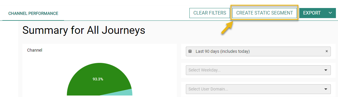
Note: At least one filter needs to be set to enable the button to create a static segment.
After clicking on the button, a setup screen is shown :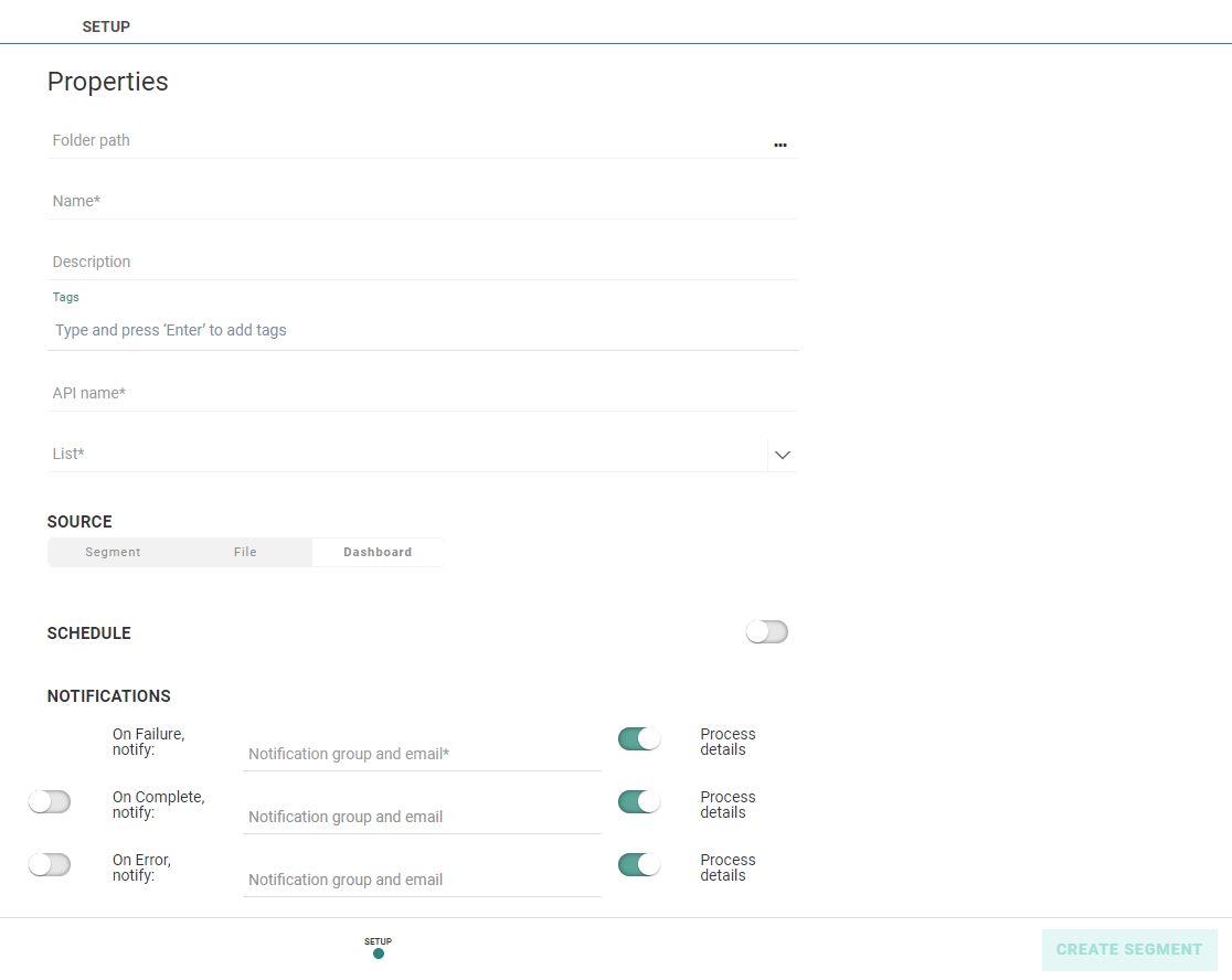
The following details can be set (the ones with an asterisk are required, the others are optional) :
- Folder path — The folder path where the segment will be stored. You can select a folder from the folder dialog accessible from the three dots.
- Name* — Provide an explicit name for the segment.
- Description — You can also provide a description for the segment.
- Tags — Tagging your segment helps to simplify searching it afterward.
- API name* — The name of the segment as it will be used by the API methods (Only alphanumeric characters and underscores are allowed). By default, the API name gets automatically copied from the name field.
- List* — You need to select a list from the drop-down that will contain the segment you're about to create.
Note: The available lists are only the Audience Lists that correspond to the data with the Dashboard filters that were set.
- Source — This is a read-only field to show that the source of the static segment is filtered Dashboard data (while in the Lists chapter of Marigold Engage, static segments can also be created from a file or another segment).
- Schedule — Scheduling of static segment updates is optional but when active you can update the static segment at regular time intervals (daily, weekly, monthly). Note that when setting up a schedule and saving it, a first update of the static segment is done immediately and consecutive updates will be done at the indicated time interval.
- Notifications* — When the creation or update of the static segment fails a notification email is sent. Other notifications on completion and error are optional.
After clicking on the 'Create Segment' button, your newly created static segment is shown in the Segments Overview, with all other existing segments in the selected folder location for the selected Audience List.
It can then be used in the same way as other static segments.
Note: Static segments generated from Dashboard filters have additional properties in the Segments overview. The Scheduling entry provides details on the configured schedule while the History entry gives information on the past updates. More details can be found in this topic.
Audiences Dashboards
Audience overview
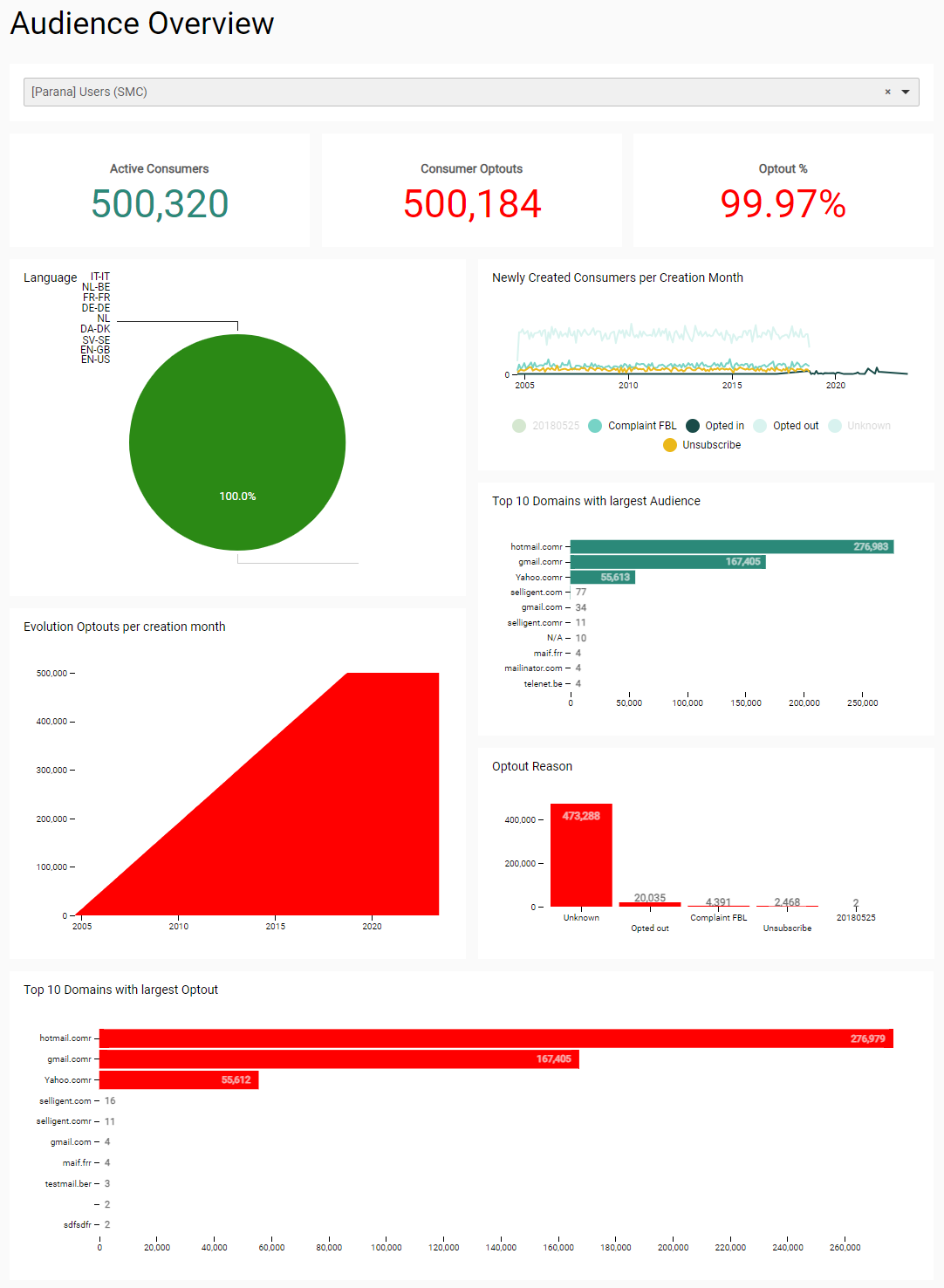
The 'Audience overview' dashboard allows to compare info about active contacts and opted out contacts of a selected Audience List, such as languages, and optin and optout statistics.
- Select Audience List — A single audience can be selected, to filter all widgets with info about contacts that belong to the selected audience.
- The list shows all available Audience Lists in the current active organization.
- You can also search for a specific audience by entering text in the search field to reduce the list of Audience Lists shown.
- When you make a selection, all widgets are updated.
- The list selected by default is the 'oldest' list within the organization (meaning the one with the smallest list ID).
Note: It's important that list names have a unique name, as you will not be able to make the distinction between lists having the same name.
- Consumers — The total number of contacts in the selected Audience List.
- Consumer Optouts — The number of contacts that opted out (for which the optout field in the Audience List contains a value different from 0 or null).
- Optout % — The percentage of contacts that opted out (for which the optout field in the Audience List contains a value different from 0 or null).
- Language — Pie chart to see the contacts per language (code). Hovering over a piece of the pie chart with the mouse cursor shows the number and percentage of contacts for that language. You can filter on one or more languages, by clicking on the respective parts.
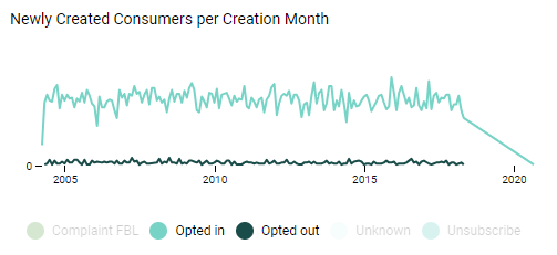
- Newly Created Consumers per Creation Month — The number of new contacts in the selected Audience List per month.
- Top 10 Domains with largest Audience — Top 10 mail domains, with the total number of contacts for each domain, sorted in descending order. The domains correspond to the email address of the contacts.
- Optout Reason — Bar charts to reflect the number of contacts that opted out per optout reason (category) for the selected Audience List.
- Evolution Optouts per creation month — Cumulative view of the opted out contacts in the Audience List over time (per month).
- Top 10 Domains with largest Optout — Top 10 mail domains, with the number of opted out contacts for each domain, sorted in descending order. The domains correspond to the email address of the contacts.
Single Customer View
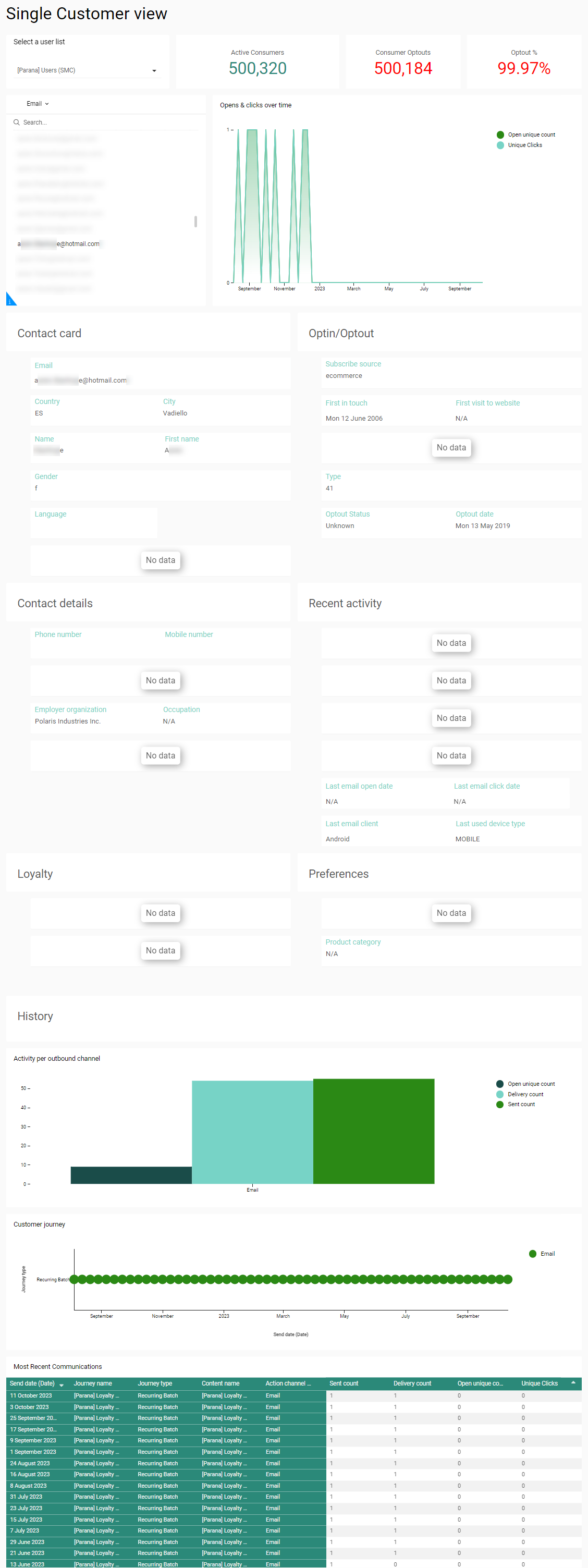
The Single Customer View provides visibility on a specific contact in an easy-to-read centralized overview including demographic data, interactions through the different channels, and key metrics. This information is based on data in the Consumer Engagement dataset crossed with data coming from the Communication Stats dataset.
By providing this information from a central location,
- Sales representatives can quickly see if the customer is in the retention stage of acquisition stage
- Customer agents have a direct view on the last interactions with the customer when a new call from that customer comes in
- Sales representatives can plan their calls to customers based on their most recent purchase
- Marketers get better insights on what information is missing for a customer and create more engagement by taking one customer as an example and manually action this observation for the next campaign.
Note: The Single Customer View dashboard is accessible to all Marigold Engage users with access to the Dashboards chapter. The Marigold Engage user does not require access to the Content, Journey or List chapter.
When multiple Audience Lists are available, you can first select the Audience List. If there is only one Audience List, this one is by default selected.
Next, you can filter the data for one specific contact by entering the email address or unique internal or external identifier for the contact.
Following details are available for the selected Audience List:
- Active consumers — The number of contacts that haven't opted out.
- Consumers optouts — The number of contacts that have opted out (for which the optout field in the Audience List contains a value different from 0 or null).
- Optout % — The percentage of contacts in the Audience list that have opted out.
For the selected contact following details are available from the Contact Card:
- Personal info — Email, name and first name, gender, birth Date, Age category, country, city, language
- Contact Details — Land line, mobile number, occupation, Employer organization, Marital status
- Preferences — Preferred store and product category
- Loyalty details — Loyalty number, activation date, loyalty level and points, last time they spent money.
- Optin/optout— Information such as subscribe source, Type, optin optout
- Recent activity — Last time an email was opened or clicked, last device used, last time a visit was made to the website, etc
- History— Providing insights in the activity per channel and opens and clicks over time.
- Most recent communications— Includes a list of journeys and messages that included the current contact
Note: When no data is available for a contact N/A is displayed on the dashboard. This can happen for customers not using Site for example, or who do not have information for instance for loyalty, preferences, etc.
Note: Field mappings may need to be set up between the fields from the Marigold Engage lists and the Consumer dataset fields before this dashboard will be available for your environment. Contact Marigold to set this up.
Comparison Dashboards
Comparison of 2 periods
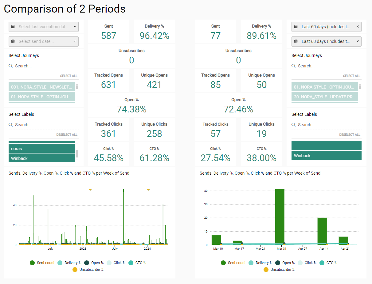
The 'Comparison of 2 Periods' tab provides a dashboard to compare performance metrics by periods.
The dashboard is divided into two columns, to compare performance over two periods.
By default nothing is selected.
Per column, the following is shown :
- Last execution date period picker — A range can be selected, to filter the performance info to be shown over a specific period. One of the following presets can be chosen : today, this month, last 7 days, last 30 days, last 60 days, last 90 days, or a custom range can be defined through date selectors.
- Last send date period picker — A range can be selected, to filter the performance info to be shown over a specific period. One of the following presets can be chosen : today, this month, last 7 days, last 30 days, last 60 days, last 90 days, or a custom range can be defined through date selectors.
- Journey selector — Select journeys that you want to visualize.
- The list shows the most recently executed journeys for the selected period.
- You can select as many journeys as you want.
- You can also search for a specific journey name by entering text in the search field on top to reduce the list of journeys.
- By default, no journeys are selected and thus no reporting data is available on the screen.
- When you make a selection, all reporting widgets are dynamically updated.
- When multiple journeys are selected, widgets will show aggregated data for all selected journeys.
Note 1: Selected journeys remain selected after being filtered out of the list after a search.
Note 2: Journeys having the same name appear only once in the list, but selecting the name will select all journeys having that name.
Note 3: Renaming a journey from the Marigold Engage user interface does not rename it in the dashboards.
- Select Labels — Filter the metrics on one or more labels that are applied to used assets and journeys in the organization.
- Sent — Number of communications sent in total for all selected journeys.
- Delivery % — Percentage of messages that have been delivered successfully for all selected journeys over the selected period.
- Unsubscribes — Number of unsubscribe links that have been clicked for all selected journeys over the selected period.
- Tracked Opens — Number of communications that have been opened for all selected journeys over the selected period.
For emails, the opens will only be counted if the user downloaded the image. - Unique Opens — Number of communications for which the user has interacted (via an open and/or a click) at least once over the selected period.
- Open % — Percentage of communications that have been viewed or clicked for all selected journeys over the selected period.
- Tracked Clicks — Number of clicks performed by users on communications for all selected journeys over the selected period.
- Unique Clicks — Number of communications that have been clicked at least once for all selected journeys over the selected period.
- Click % — Percentage of delivered communications that have been clicked for all selected journeys over the selected period.
- CTO % — Percentage of opened communications that have been clicked for all selected journeys over the selected period.
- Chart — Visual chart with a representation of the sent count, delivery %, open %, click % and CTO % of the communications per week of send for all selected journeys over the selected period.
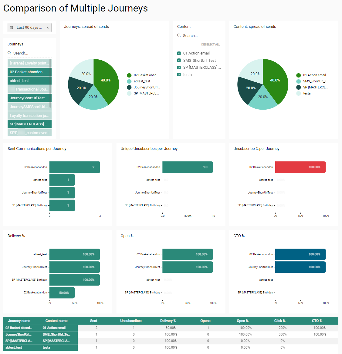
Comparison of Multiple Journeys
The 'Comparison of Multiple Journeys' tab provides a dashboard in which you can compare performance metrics of different journeys.
- Select Send date — A range can be selected, to filter the performance info to be shown over a specific period based on the send date. One of the following presets can be chosen : today, this month, last 7 days, last 30 days, last 60 days, last 90 days, or a custom range can be defined through date selectors. By default the 30 days preset is selected.
- Journey selector — Select journeys that you want to visualize.
- The list shows the most recently executed journeys for the selected period.
- You can select as many journeys as you want.
- You can also search for a specific journey name by entering text in the search field on top to reduce the list of journeys.
- By default, no journeys are selected and thus no reporting data is available on the screen.
- When you make a selection, all reporting widgets are dynamically updated.
- When multiple journeys are selected, widgets will show aggregated data for all selected journeys.
Note 1: Selected journeys remain selected after being filtered out of the list after a search.
Note 2: Journeys having the same name appear only once in the list, but selecting the name will select all journeys having that name.
Note 3: Renaming a journey from the Marigold Engage user interface does not rename it in the dashboards.
® Contact Marigold support when you need a change. - Journeys spread of sends — Pie chart widget showing comparison of journeys per number of sent communications. Journeys that have a sent value lower than 3% are grouped in an "Other" section.
- Content — Select different content to compare by checking the corresponding content names. By default all content is selected.
- Content spread of sends — Pie chart widget showing comparison of content per number of sent communications. Content with a sent value lower than 3% of is grouped in an "Other" section.
- Sent Communications per Journey — Bar chart showing the number of sent communications grouped per journey. Journeys can be selected/unselected by clicking on the corresponding colored legend block or on the corresponding bar. The 'clear filter' button allows to remove the applied filtering. By default all journeys are selected.
- Unique Unsubscribes per Journey — Bar chart showing the number of communications in which an unsubscribe link was clicked, grouped per journey. Journeys can be selected/unselected by clicking on the corresponding colored legend block or on the corresponding bar. The 'clear filter' button allows to remove the applied filtering. By default all journeys are selected.
- Unsubscribe % per Journey — Bar chart showing the percentage of communications in which an unsubscribe link was clicked, grouped per journey. Journeys can be selected/unselected by clicking on the corresponding bar. The 'clear filter' button allows to remove the applied filtering. By default all journeys are selected.
- Delivery % — Bar chart showing the percentage of communications that have been successfully delivered, grouped per journey. Journeys can be selected/unselected by clicking on the corresponding bar. The 'clear filter' button allows to remove the applied filtering. By default all journeys are selected.
- Open % — Bar chart showing the percentage of delivered communications that have been viewed or clicked, grouped per journey. Journeys can be selected/unselected by clicking on the corresponding bar. The 'clear filter' button allows to remove the applied filtering. By default all journeys are selected.
- CTO % — Bar chart showing the percentage of opened communications that have been clicked, grouped per journey. Journeys can be selected/unselected by clicking on the corresponding bar. The 'clear filter' button allows to remove the applied filtering. By default all journeys are selected.
- Grid overview — Overview of all the metrics, per journey and per message :
- Sent — Number of communications that are actually sent to an audience.
- Unsubscribes — Number of clicks on unsubscribe links that occurred for the message.
- Delivery % — Percentage of communications that have been delivered successfully.
- Opens — Number of communications that are viewed (every tracked open counts as a new view).
- Open % — Percentage of delivered communications that have been viewed or clicked.
- Click % — Percentage of delivered communications in which one or more links have been clicked.
- CTO % (Click-to-open percentage rate) — Percentage of opened communications that have been clicked.
Domains overview

The 'Domains' tab provides a dashboard to compare the performance of domains that were used for sending messages.
- Select Send date — A range can be selected, to filter the performance info to be shown over a specific period based on the send date. One of the following presets can be chosen : today, this month, last 7 days, last 30 days, last 60 days, last 90 days, or a custom range can be defined through date selectors. By default the 30 days preset is selected.
- Domains selector — Select domains that you want to visualize.
- The list shows the most recently used domains for the selected period.
- You can select as many domains as you want.
- You can also search for a specific domain by entering text in the search field on top to reduce the list of domains.
- By default, all domains are selected and thus reporting data is available on the screen for the selected period of time.
- When you make a selection, all reporting widgets are dynamically updated.
Note 1: Selected domains remain selected after being filtered out of the list after a search.
Note 2: Domains having the same name appear only once in the list, but selecting the name will select all domains having that name.
Note 3: Renaming a domain from the Marigold Engage user interface does not rename it in the dashboards.
® Contact Marigold support when you need a change. - Top 10 Domains by Sent Communications — Top 10 domain names and the number of messages sent through each domain. They are ordered in descending order, with the domain through which the most messages were sent on top.
- Delivery % — Percentage of messages that have been delivered successfully for the selected domains.
- Open % — Percentage of messages that have been viewed for the selected domains (every open counts as a new view).
- CTO % — Click-to-open rate percentage of messages for the selected domains.
- % Unsubscribes — Percentage of unsubscribes that occurred through clicks on unsubscribe links in messages for the selected domains.
- Chart with Delivery %, Open %, CTO %, Unsubscribe % — Line chart showing the percentages mentioned above for delivery, opens, click-to-opens and unsubscribes of all communications for the selected domains. The x-axis represents the timeline, while the y-axis represents the percentage value.
- Top 10 Delivery % per Domain — Top 10 domain names and percentage of delivered messages, based on the delivery percentage per domain. They are ordered in descending order, with the domain through which the most messages were delivered on top.
- Top 10 Open % per Domain — Top 10 domain names and percentage of opened (viewed) messages, based on the open percentage per domain. They are ordered in descending order, with the domain through which the most messages were opened on top.
- Top 10 CTO % per Domain — Top 10 domain names and percentage of messages that were clicked after being opened, based on the CTO percentage per domain. They are ordered in descending order, with the domain through which the CTO percentage is the highest on top.
- Top 10 Unsubscribe % per Domain — Top 10 domain names and percentage of unsubscribes (through clicks on unsubscribe links in messages), based on the unsubscribe percentage per domain. They are ordered in descending order, with the domain through which the unsubscribe percentage is the highest on top.
- Delivery % of top 10 Domains by Sent — Domain name and delivery percentage of the top 10 domains, based on the number of sent communications. They are ordered in descending order, with the domain through which the most messages were delivered on top.
- Open % of top 10 Domains by Sent — Domain name and open percentage of the top 10 domains, based on the number of sent communications. They are ordered in descending order, with the domain through which the most messages were opened on top.
- CTO % of top 10 Domains by Sent — Domain name and CTO percentage (messages that were clicked after being opened) of the top 10 domains, based on the number of sent communications. They are ordered in descending order, with the domain through which the CTO percentage is the highest on top.
- Unsubscribe % of top 10 Domains by Sent — Domain name and unsubscribe percentage (through clicks on unsubscribe links in messages) of the top 10 domains, based on the number of sent communications. They are ordered in descending order, with the domain through which the unsubscribe percentage is the highest on top.
- Grid overview — Overview of all the metrics, per domain :
- Sent — Number of communications that are actually sent to an audience.
- Delivery % — Percentage of communications that have been delivered successfully.
- Opens — Number of communications that are viewed (every tracked open counts as a new view).
- Open % — Percentage of delivered communications that have been viewed or clicked.
- Clicks — Number of delivered communications in which one or more links have been clicked.
- Click % — Percentage of delivered communications in which one or more links have been clicked.
- CTO % (Click-to-open percentage rate) — Percentage of opened communications that have been clicked.
- Unsubscribes — Number of clicks on unsubscribe links that occurred in messages.
- Unsubscribe % — Percentage of clicks on unsubscribe links that occurred in messages.
Channel Performance Dashboards
Email Metrics

The 'Email Metrics' dashboard shows email engagement metrics of a selected target audience.
Note: This dashboard is visible to all Marigold Engage users with Dashboard permissions, but when you're not using the 'Engagement Metrics' feature, no data is displayed in the dashboard.
At the top, you can select any Audience List, and a time span (either for the 'days since the last email delivery', or the 'days since the last email open').
Note: The default Audience List is selected when there's one configured. If that's not the case, the list with the smallest ID is selected.
Important: Please be aware to select the correct audience. It may occur that an Audience List is not activated for EMIT and therefore shows no data.
Different from all other dashboards, only the audience and the time span can be selected as filters. The data shown in the widgets will be updated accordingly :
- Contacts — The total number of contacts for the selected audience.
- # Contacts per series of unopened emails — The number of contacts who have not opened their last emails, grouped per last 1-5 unopened emails, 5-10, and so on.
- Avg Email delivery count — The average number of emails that have successfully been delivered to the target audience over the selected time span.
- Email open rate — The percentage rate of emails that have been opened by contacts of the audience over the selected time span.
- Email click-to-open rate — The percentage rate of emails that have been clicked after being opened by contacts of the audience over the selected time span.
- Email click rate — The percentage rate of emails that have been clicked by contacts of the audience over the selected time span.
- Delivery frequency evolution (last 5 mails) — The percentage of the last 5 emails that have successfully been delivered to the audience over the selected time span.
- Open rate evolution (last 5 mails) — The percentage of the last 5 emails that have been opened by contacts of the audience over the selected time span.
- Click-to-open rate evolution (last 5 mails) — The percentage of the last 5 emails that have been clicked after being opened by contacts of the audience over the selected time span.
- Click rate evolution (last 5 mails) — The percentage of the last 5 emails that have been clicked by contacts of the audience over the selected time span.
- # Contacts per amount of mails delivered — The number of contacts (blue bars) per amount of delivered emails (x-y mails on the left).
- # Contacts per open % category — The number of contacts (blue bars) per percentage of opened emails (x-y% on the left).
- # Contacts per click-to-open % category — The number of contacts (blue bars) per click-to-open percentage (x-y% on the left).
- # Contacts per click % category — The number of contacts (blue bars) per click percentage (x-y% on the left).
- Average open % per amount of mails delivered — The average email open percentage rate (blue bars) per amount of delivered emails (x-y mails on the left).
- Open % spread per group of emails delivered over 90 days — The number of contacts (bars with values) that opened a certain percentage of emails (% on the bottom), over 90 days, per group of emails that were delivered (x mails on the left), for the selected audience and time span on top.
- Click % spread per group of emails delivered over 90 days — The number of contacts (bars with values) that clicked on a certain percentage of emails (% on the bottom), over 90 days, per group of emails that were delivered (x mails on the left), for the selected audience and time span on top.
Note: Please take into account that the most recent email interactions are not shown right away. There can be a delay up to 2 days, before they're visible in the dashboard.
Note 2: While datasets used for the dashboards keep historical info from the last 12 to 18 months, EMIT only keeps data from the last 3 months (or optionally 6 months). The EMIT limit is the one that determines the available data shown in the Email Metrics dashboard.
Summary for All Journeys
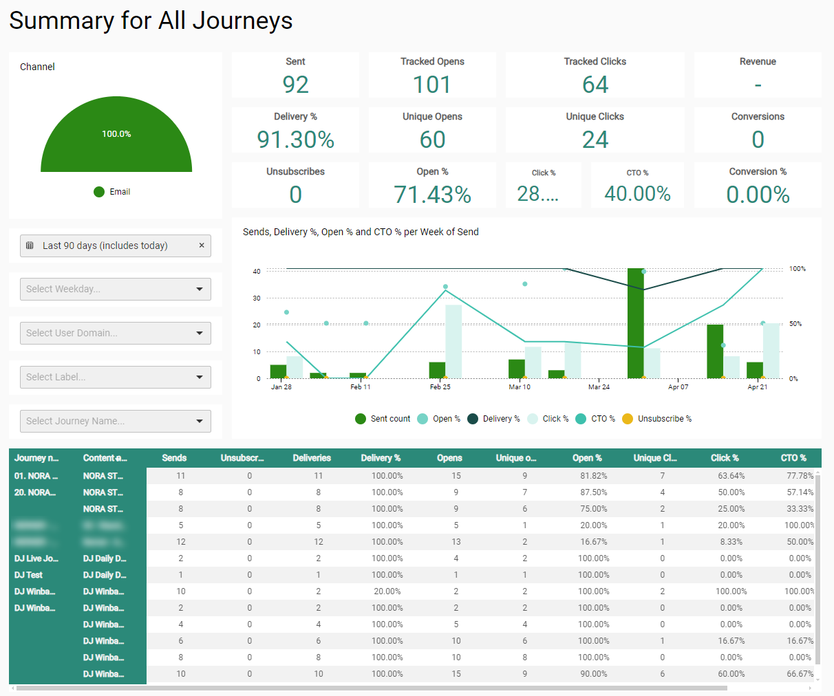
The 'Summary for All Journeys' tab provides a dashboard with multi-channel performance metrics.
- Channel — A semi-circle widget showing the proportion of communications sent per channel type. Supported channels are Email, Mobile, SMS and MMS.
- All channels are selected by default.
- Selecting a channel will filter all dashboard metrics for the selected channel.
- The 'Clear filter' button will select all channels again.
- Select Send date — A range can be selected, to filter the performance info to be shown over a specific period based on the send date. One of the following presets can be chosen : today, this month, last 7 days, last 30 days, last 60 days, last 90 days, or a custom range can be defined through date selectors.
- Select Send day of the week — Drop-down to filter the metrics per send day of the week.
- Select user domain — Drop-down via which you can select one specific domain.
- When a domain is selected, you can click on the 'x' icon to remove the selection.
- By default, no domain is selected. The reporting widgets show metrics of all domains.
- Select Label — Drop-down to filter the metrics on a label which is applied to used assets and journeys in the organization.
- Select Journey name — Drop-down via which you can select one specific journey.
- When a journey is selected, you can click on the 'x' icon to remove the selection.
- By default, no journey is selected. The reporting widgets show metrics of all journeys.
- Sent — Number of communications sent for the selected send date period, day of week, domain (or for all domains when no domain is selected) and journey (or for all journeys when no journey is selected).
- Delivery % — Percentage of messages that have been delivered successfully for the selected send date period, day of week, domain (or for all domains when no domain is selected) and journey (or for all journeys when no journey is selected).
- Unsubscribes — Number of unsubscribe links that have been clicked for the selected send date period, day of week, domain and journey.
- Tracked Opens — Number of communications that have been opened for the selected send date period, day of week, domain and journey.
For emails, the opens will only be counted if the user downloaded the image. - Unique Opens — Number of communications for which the user has interacted (via an open and/or a click) at least once.
- Open % — Percentage of communications that have been viewed or clicked for the selected send date period, day of week, domain (or for all domains when no domain is selected) and journey (or for all journeys when no journey is selected).
- Tracked Clicks — Number of clicks performed by users on communications for the selected send date period, day of week, domain and journey.
- Unique Clicks — Number of communications that have been clicked at least once for the selected send date period, day of week, domain and journey.
- Click % — Percentage of delivered communications that have been clicked for the selected send date period, day of week, domain and journey.
- CTO % — Percentage of opened communications that have been clicked for the selected domain (or for all domains when no domain is selected).
- Revenue — Total generated revenue for the selected send date period, day of week, domain and journey (or overall in case of no selection). Shop tracking results are used for this.
- Conversions — The number of communications that led to a conversion for the selected send date period, day of week, domain and journey (or overall in case of no selection). Shop tracking results are used for this.
Note: For conversions, each unique communication counts once.
- When the same contact clicks and converts through the same communication multiple times = counts as 1 conversion.
- When the same contact clicks and converts through 2 different communications = counts as 2 conversions. - Conversion % — The conversion rate percentage for the selected send date period, day of week, domain and journey (or overall in case of no selection). Shop tracking results are used for this.
- Chart — Visual chart with a representation of the sent count, delivery %, open %, click % and CTO % of the communications for the selected send date period, day of week, domain and journey.
- Grid overview — Overview of all journeys with metrics per message :
- Sent — Number of communications that are actually sent to an audience.
- Unsubscribes — Number of clicks on unsubscribe links that occurred for the message.
- Deliveries — Number of communications that have been delivered successfully.
- Delivery % — Percentage of communications that have been delivered successfully.
- Opens — Number of communications that are viewed (every tracked open counts as a new view).
- UOpens — Number of unique communications that have been opened.
- Open % — Percentage of delivered communications that have been viewed or clicked.
- UClicks — Number of unique communications that have been clicked.
- Click % — Percentage of delivered communications in which one or more links have been clicked.
- CTO % (Click-to-open percentage rate) — Percentage of opened communications that have been clicked.
- Unsubscribe % — Percentage of unsubscribes (through clicks on unsubscribe links) that occurred for the message.
Summary for Selected Journeys
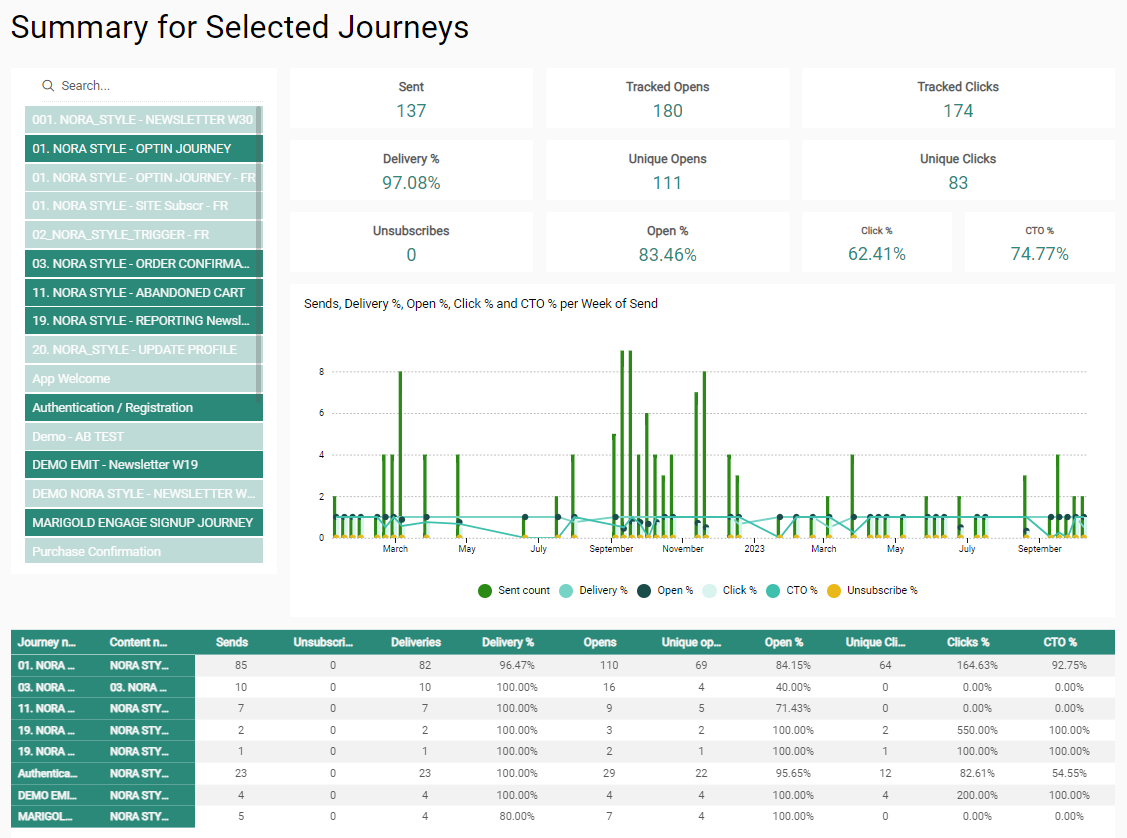
The 'Summary for Selected Journeys' tab provides a dashboard with summary info of the journeys that are selected.
- Journey selector — Select journeys that you want to visualize.
- The list shows the most recently executed journeys based on sent date.
- You can select as many journeys as you want.
- You can also search for a specific journey name by entering text in the search field on top to reduce the list of journeys.
- By default, no journeys are selected and thus no reporting data is available on the screen.
- When you make a selection, all reporting widgets are dynamically updated.
- When multiple journeys are selected, widgets will show aggregated data for all selected journeys.
Note 1: Selected journeys remain selected after being filtered out of the list after a search.
Note 2: Journeys having the same name appear only once in the list, but selecting the name will select all journeys having that name.
Note 3: Renaming a journey from the Marigold Engage user interface does not rename it in the dashboards.
® Contact Marigold support when you need a change. - Sent — Number of communications sent in total for all selected journeys.
- Delivery % — Percentage of messages that have been delivered successfully for all selected journeys.
- Unsubscribes — Number of unsubscribe links that have been clicked for all selected journeys.
- Tracked Opens — Number of communications that have been opened for all selected journeys.
For emails, the opens will only be counted if the user downloaded the image. - Unique Opens — Number of communications for which the user has interacted (via an open and/or a click) at least once.
- Open % — Percentage of communications that have been viewed or clicked for all selected journeys.
- Tracked Clicks — Number of clicks performed by users on communications for all selected journeys.
- Unique Clicks — Number of communications that have been clicked at least once for all selected journeys.
- Click % — Percentage of delivered communications that have been clicked for all selected journeys.
- CTO % — Percentage of opened communications that have been clicked for all selected journeys.
- Chart — Visual chart with a representation of the sent count, delivery %, open %, click % and CTO % of the communications per week of send for all selected journeys.
- Grid overview — Overview of all the metrics, per journey and per message :
- Sends — Number of communications that are actually sent to an audience.
- Unsubscribes — Number of clicks on unsubscribe links that occurred for the message.
- Deliveries — Number of communications that have been delivered successfully.
- Delivery % — Percentage of communications that have been delivered successfully.
- Opens — Number of communications that are viewed (every tracked open counts as a new view).
- UOpens — Number of unique communications that have been opened.
- Open % — Percentage of delivered communications that have been viewed or clicked.
- UClicks — Number of unique communications that have been clicked.
- Click % — Percentage of delivered communications in which one or more links have been clicked.
- CTO % (Click-to-open percentage rate) — Percentage of opened communications that have been clicked.
Note: The grid is limited to a maximum of 20 lines.
One journey can have multiple lines if it contains multiple communications.
For example : The grid shows 18 journeys of which 2 journeys each have 2 communications, and all others have 1 communication = a total of 20 lines.
The journeys and communications shown in the grid are the ones that come first in the list of selected journeys, sorted alphabetically.
Depending on your screen resolution, either everything appears, or you can use a scrollbar to scroll through the grid and see all the lines.
When you export this dashboard to a pdf or png file, the visualization of the grid is used. This means that in case of a small screen resolution, it may be that only the first number of lines appear in the pdf/png export. To see all the lines (max 20) on your screen and in the export, please use a high screen resolution.
Summary of Revenue Conversions
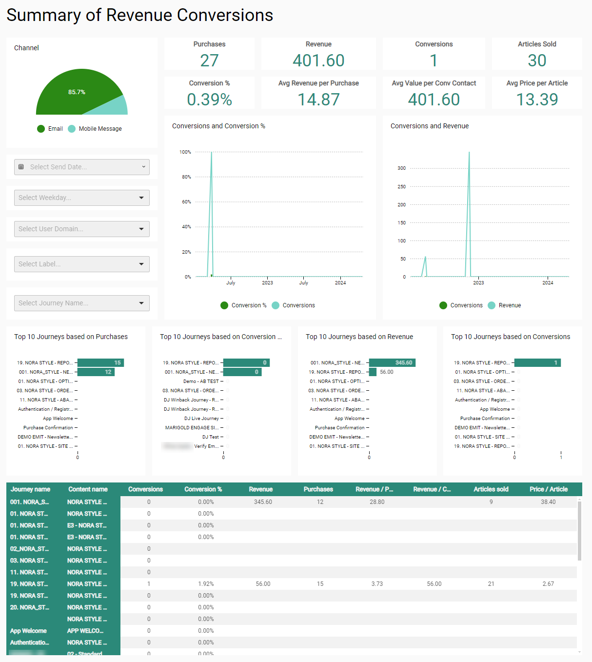
The 'Summary of Revenue Conversions' dashboard shows an overview of generated revenue, conversions and purchases for one or all journeys and domains, for the selected channel and date range.
Note: All revenue, purchase, article and conversion info is based on shop tracking results.
- Channel selection — Selector for the available communication channels (email, SMS, mobile, MMS) for which to show metrics.
- Select send date — A range can be selected, to filter the info to be shown over a specific period based on the send date. One of the following presets can be chosen : today, this month, last 7 days, last 30 days, last 60 days, last 90 days, or a custom range can be defined through date selectors.
- Select send day of the week — Drop-down to filter the metrics per send day of the week.
- Select user domain — Drop-down via which you can select one specific domain.
- When a domain is selected, you can click on the 'x' icon to remove the selection.
- By default, no domain is selected. The reporting widgets show metrics of all domains.
- Select journey — Drop-down via which you can select one specific journey.
- When a journey is selected, you can click on the 'x' icon to remove the selection.
- By default, no journey is selected. The reporting widgets show metrics of all journeys.
- Purchases — The number of purchases done for the selected (or every) channel, journey, domain and period/day.
Note: For purchases, each click that leads to a conversion counts.
When the same contact clicks and converts through the same communication multiple times = counts as 2 purchases. - Revenue — Revenue value for the selected (or every) channel, journey, domain and period/day.
- Conversions — The number of communications that led to a conversion for the selected (or every) channel, journey, domain and period/day.
Note: For conversions, each unique communication counts once.
- When the same contact clicks and converts through the same communication multiple times = counts as 1 conversion.
- When the same contact clicks and converts through 2 different communications = counts as 2 conversions. - Articles Sold — The number of articles sold for the selected (or every) channel, journey, domain and period/day.
- Conversion % — The conversion rate percentage for the selected (or every) channel, journey, domain and period/day.
- Avg Revenue per Purchase — The average revenue amount per purchase for the selected (or every) channel, journey, domain and period/day.
- Avg Value per Conv Contact — The average amount per converted contact for the selected (or every) channel, journey, domain and period/day.
- Avg Price per Article — The average price per product article for the selected (or every) channel, journey, domain and period/day.
- Conversions and Conversion % — Line chart showing the number of conversions and the conversion percentage rate over time, for the selected (or every) channel, journey, domain and period/day.
- Conversions and Revenue — Line chart showing the number of conversions and the generated revenue over time, for the selected (or every) channel, journey, domain and period/day.
- Top 10 Journeys based on Purchases — The top 10 journeys based on the number of purchases, sorted in descending order, for the selected (or every) channel, journey, domain and period/day.
- Top 10 Journeys based on Conversion Rate — The top 10 journeys based on the conversion rate percentage, sorted in descending order, for the selected (or every) channel, journey, domain and period/day.
- Top 10 Journeys based on Revenue — The top 10 journeys based on the generated revenue, sorted in descending order, for the selected (or every) channel, journey, domain and period/day.
- Top 10 Journeys based on Conversions — The top 10 journeys based on the number of conversions, sorted in descending order, for the selected (or every) channel, journey, domain and period/day.
- Grid overview — Overview of all the metrics per journey and message. You can scroll through the grid, and it can be sorted by clicking on any column header.
- Journey name — The name of the journey.
- Content name — The name of the message.
- Conversions — The number of conversions done through the journey/message.
- Conversion % — Conversion percentage rate for the journey/message.
- Revenue — Generated revenue for the journey/message.
- Purchases — The number of purchases done through the journey/message.
- Revenue / Purchase — Generated revenue per purchase for the journey/message.
- Revenue / Contact — Generated revenue per contact for the journey/message.
- Articles sold — The number of articles sold for the journey/message.
- Price / Article — The total revenue divided by the total count of articles for the journey/message.
