Journey reports are live reports that can be viewed by clicking the Report icon for a specific journey on the Journey Start page.
Note: These reports are updated near real-time.
Reports are available for one specific language or all languages of the journey. The report numbers and statistics depend on the channel type.
Note:
All reports in grid format can be exported to a CSV file.
Depending on the active tab (Overview, Detail, Delivery, Email clients), this can be done through an export icon (![]() ) that's visible on the top-right of the grid or through a button above the grid (
) that's visible on the top-right of the grid or through a button above the grid ( ).
).
Note:
All open/click/CTO/CTR values are based on unique interactions (unless mentioned otherwise).
For Journey reports, metrics are calculated per message.
→ Each message is on a different tab.
→ There is no general metric for the whole journey.
* OPENS (TOTAL) = Total of tracked opens OR total of unique contact interactions when the total of opens is lower than the number of unique clicks.
- Contacts can open a message but not download the images. In that case the open is not tracked.
- To count the unique opens we take all interactions into account (opens, clicks), so the total number of opens can sometimes be lower than the unique opens.
→ Summary : we use unique opens for total opens only when the tracked opens has a lower value.
* UNIQUE = unique per journey and message for one contact
→ When the journey sent the same message twice to the same contact, this results in : Sent count = 2
→ When the contact opens each of the two messages one time, this results in : Unique open count = 1
→ When the contact clicks in each of the two messages one time, this results in : Unique click = 1
In this topic:
- Reports for Single Batch Journeys, Custom Journeys, AB Journeys and Transactional Journeys
- Reports for Recurring Batch Journeys
- Examples
- Device types and email clients
- Email client namings for Apple
Reports for Single Batch Journeys, Custom Journeys, AB Journeys and Transactional Journeys
Journey reports for Single Batch Journeys, Custom Journeys, AB Journeys and Transactional Journeys provide the following details :
- Journey name
- Toolbar containing
- Properties button — To show the journey properties
- Report button — To show the journey report
- Design button — To show the graphical journey builder.
Note: The Design button is only available in case of a Custom Journey.
- The current status of the journey
- Start date of the journey execution (not applicable for Transactional Journeys)
- End date of the journey execution (not applicable for Transactional Journeys)
- Creation date of the journey
- Last modified date of the journey
- Message analytics tag set in the journey properties (not applicable for Custom Journeys)
- Campaign analytics tag set in the journey properties (not applicable for Custom Journeys)
- Channel(s) used in the journey
Example (Transactional Journey) :![]()
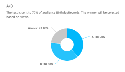
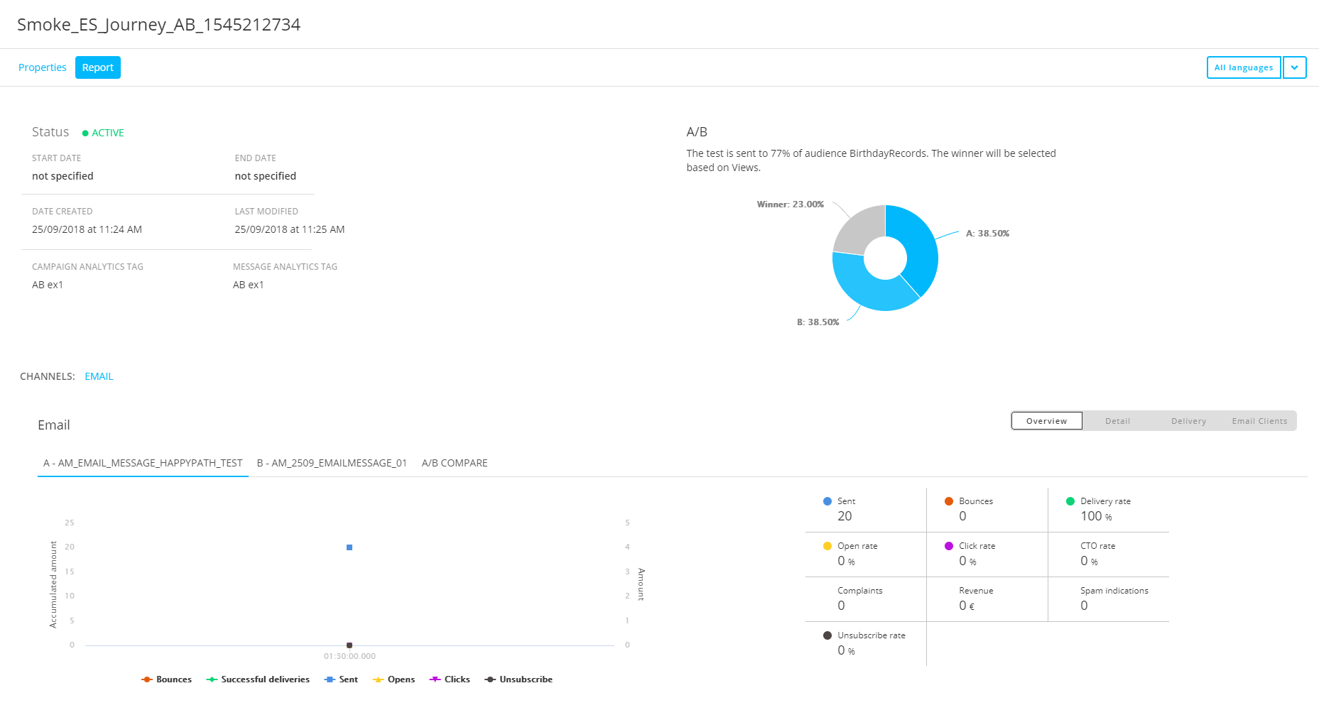
Journey reports for A/B Journeys provide the following extra details :
- Textual information — Target audience (percentage) to which the AB test versions are sent, and the condition that is used to select the winning version.
- Pie chart — Target audience (percentage) per test version and target audience (percentage) of the winning version.
Depending on the channel type, reporting graphs and data can differ.
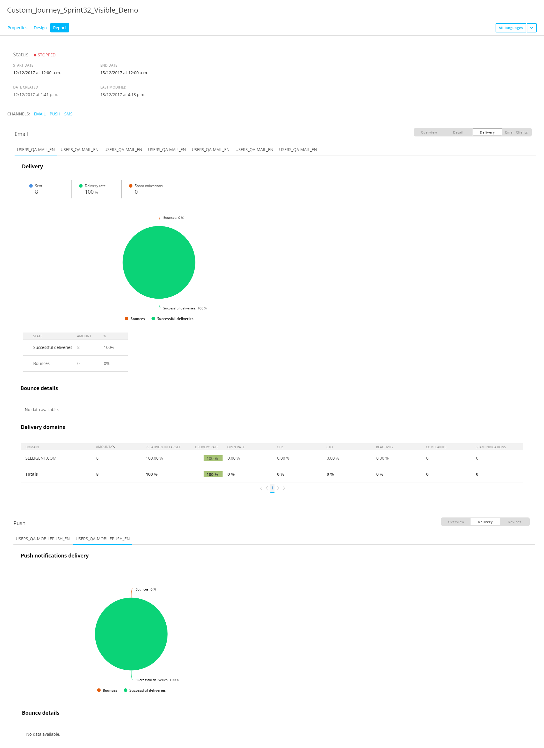
For the Email channel, the following buttons are available to change the reporting view :
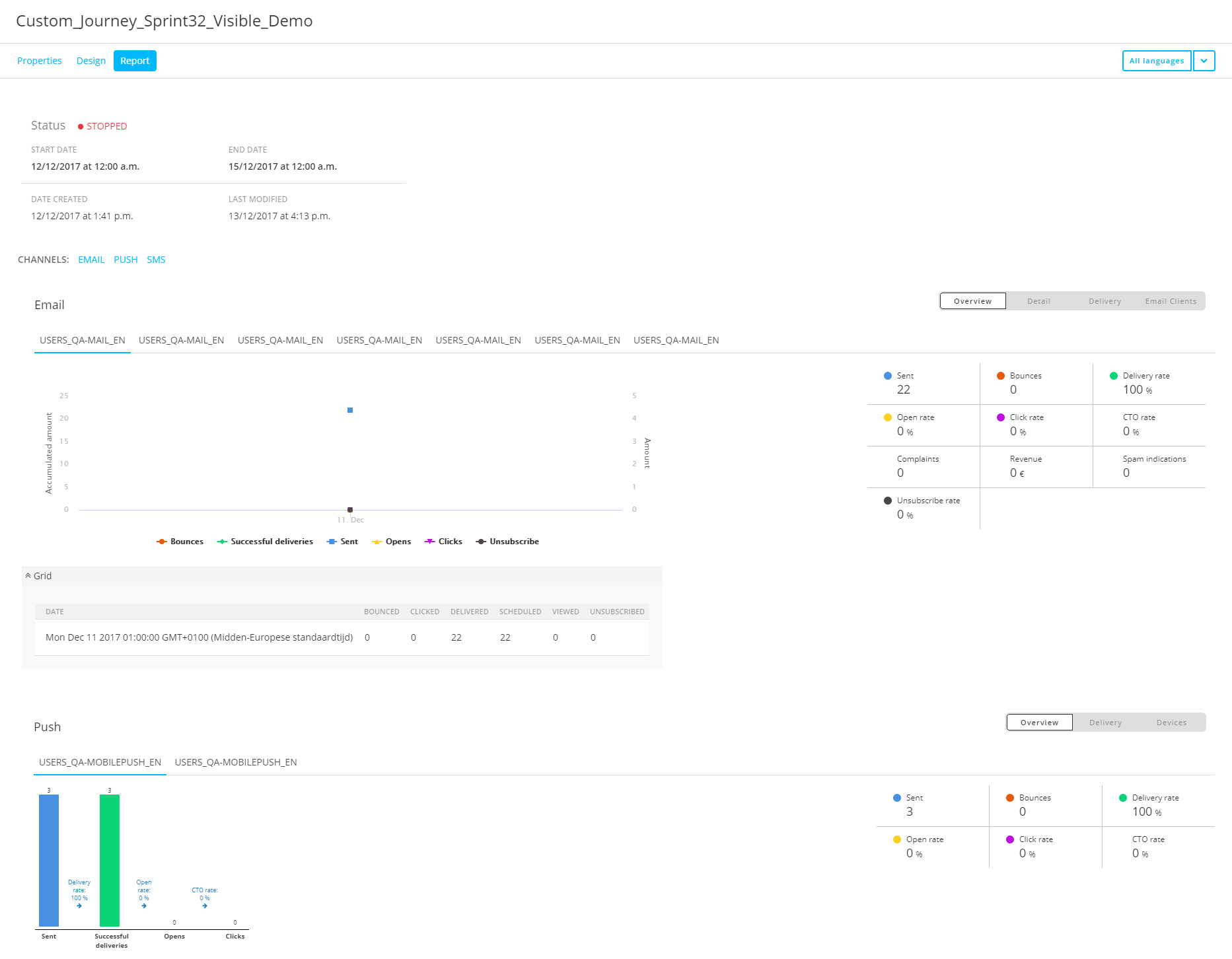
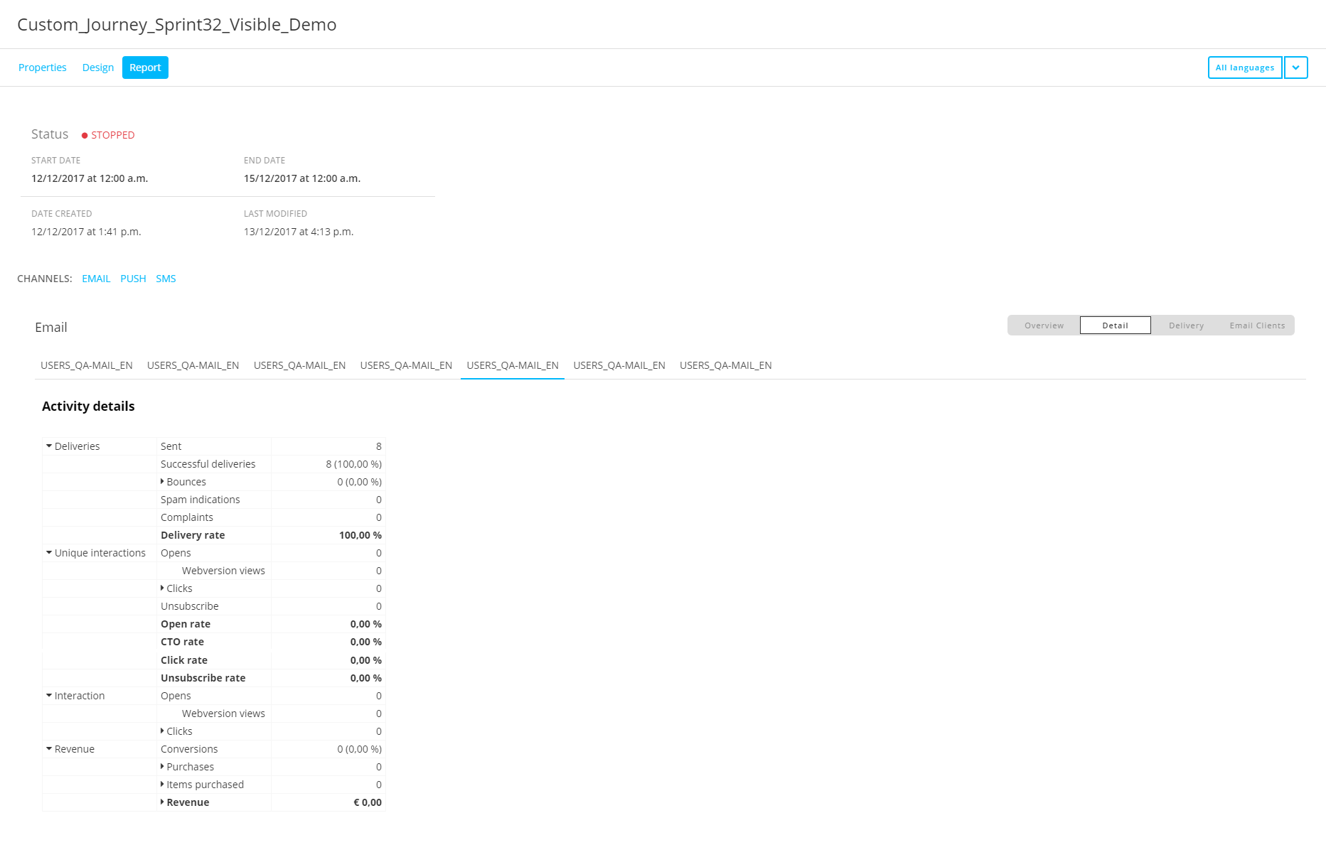
- Overview — Shows a delivery graph over time and activity values. Underneath the graph, a grid view can be expanded/collapsed to show/hide info about the activity over time.
You can select the start date-time, end date-time and 'grouped by' time frequency (hour, day, week, month, year) to 'show data from'. The view of the graph changes according to your selection. - Detail — Shows detailed activity values.
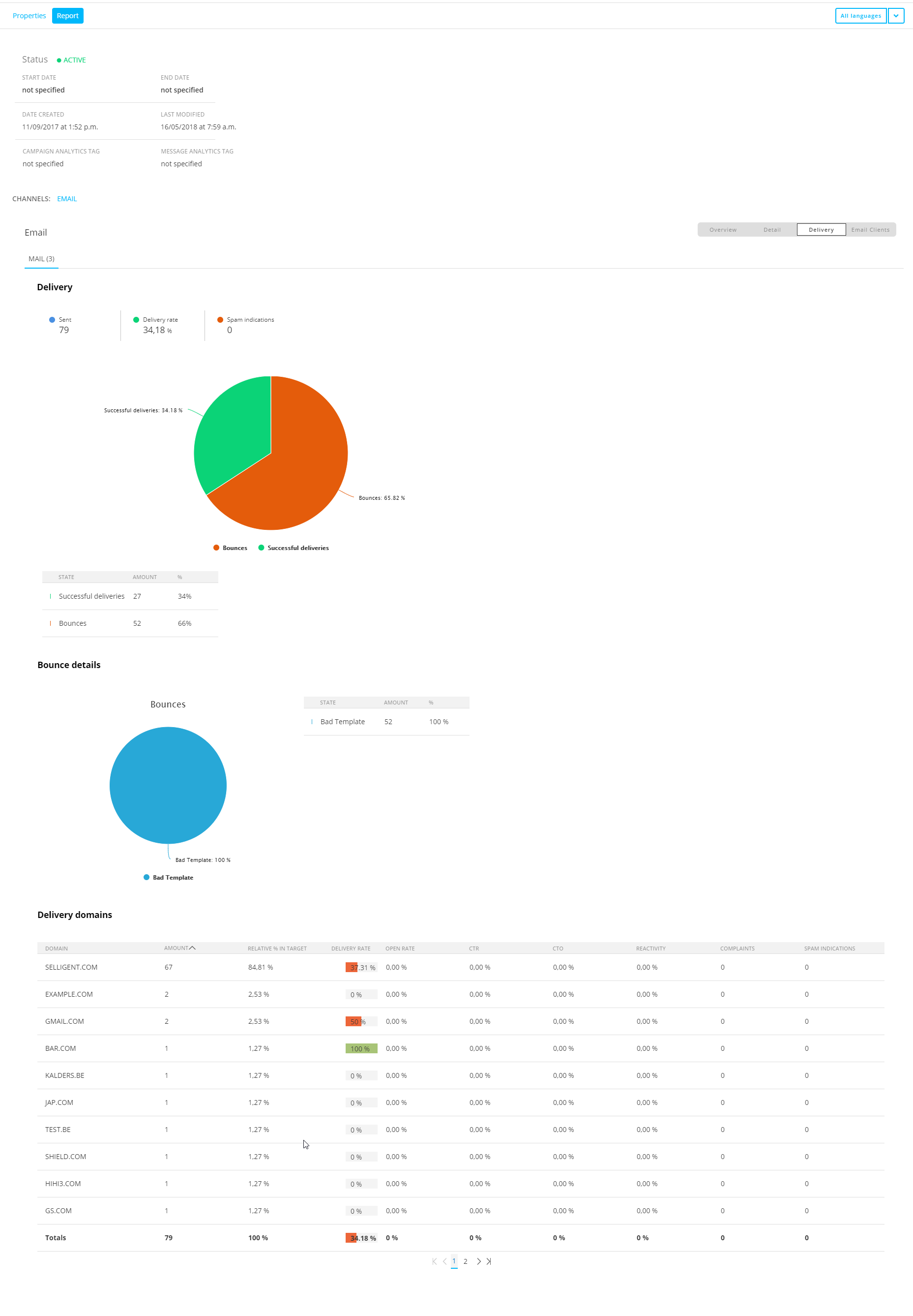
- Delivery — Shows delivery values and a pie chart, bounce details and delivery domains.
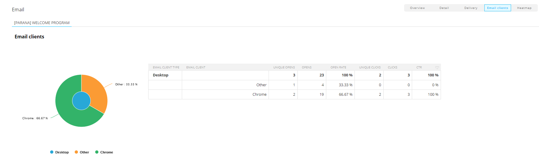
- Email clients — Shows the email clients used, categorized by device type (desktop, mobile, tablet, proxy), and their details such as opens, clicks and rates.
- Heatmap — The heatmap functionality visualizes links by heatmap reporting of emails in Marigold Engage. It allows to see the best performing areas, buttons and call-to-actions in emails.
- It's based on clicks and conversion
- An overlay that's enabled by default shows colored blocks on top of the areas in the email
- You can disable the heatmap overlay with the toggle shown at the top left
- Distinctive colors make it easy to interpret the best/worst performing areas
- A legend with color scales is visible at the top-right above the email
- Each area shows a permanent tooltip with the number of unique clicks and click rate percentage
- Heatmap data is shown for the selected language or all languages combined, depending on your choice at the top-right of the screen
- For Custom Journeys and AB Journeys, heatmap data for the currently selected message is visible. When you switch to another message, the email with its heatmap is updated to reflect this.
Note: The heatmap preview in Marigold Engage can differ from actual user messages.
- Heatmap data is generated for an anonymous user. This has an impact on personalized information, Live Content and Smart Content shown.
- For visibility constraints used at content level, the heatmap data preview does not show those sections unless the constraint contains a condition that will always be true for all anonymous users (example: “MASTER.ID is equal to 0”).Heatmap example :
This example shows that the best performing areas are the logo and header on the top left, and the 'Home' link in the top right section. They are shown in red, and contain tooltips with the highest numbers and percentages.
'Great royalty free images' is average (yellow), the 'Contact' link is slightly below average, while the areas shown in blue did not receive any clicks at all.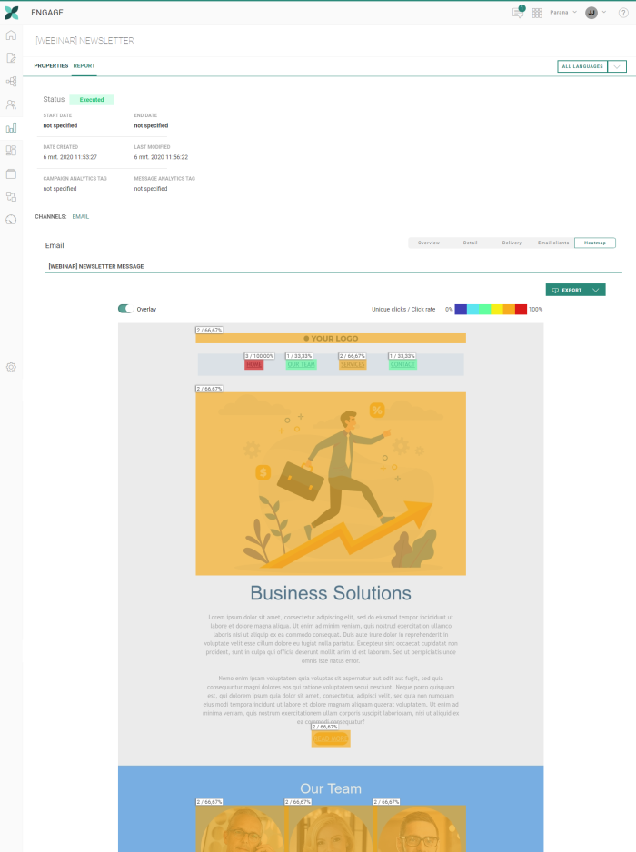
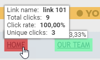
- When you hover over an area, an extra tooltip is shown with different metrics
- link name (when a link is coming from a Content Block, and an alias has been given, the alias is shown as link name)
- number of total clicks
- click rate percentage
- number of unique clicks
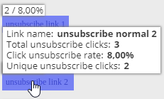
- Unsubscribe links are handled separately. When hovering such an unsubscribe link, a tooltip shows the
- link name
- number of total unsubscribe clicks
- click unsubscribe rate percentage
- number of unique unsubscribe clicks
- You can export the heatmap by clicking on the button at the top-right of the heatmap. A drop-down allows you to choose between 4 different file exports:
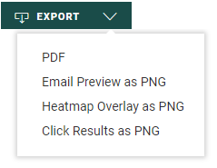
- PDF — An export that contains all of the following combined in a single PDF file :
- a preview of the original message without any heatmap data
- the message with the colored heatmap overlay and all the heatmap data (numbers and percentages)
- a grid with all the click results (Link name, Unique clicks, Click rate percentages and Total clicks)
- Email Preview as PNG — A PNG export that contains a preview of the original message without any heatmap data.
- Heatmap Overlay as PNG — A PNG export that contains the message with the colored heatmap overlays and all the heatmap data (numbers and percentages).
- Clicks Results as PNG — A PNG export that contains a grid with all the click data (Link name, Unique clicks, Click rate percentages and Total clicks).
Note: The used color scales are the same for all messages. That way it's easy to compare different exported heatmaps.
Note that heatmaps can not be generated when :
- no fallback language has been set in the properties of the email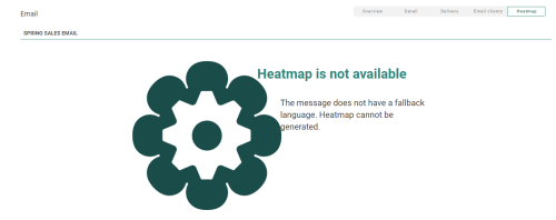
- a Recurring Batch Journey execution has been stopped (heatmap data is only available when the journey is active)
- the journey has not been launched
- the journey has been launched recently, but no data is available yet
- transactional data is missing (for Transactional Journeys)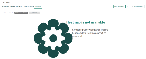
Note:
- Grids are shown with delivery, interaction (total and unique) and revenue info.
- The difference between opens and tracked opens is that when a user opens an email, it's only counted as a tracked open if they allow downloads of images (that are inside the body of the email).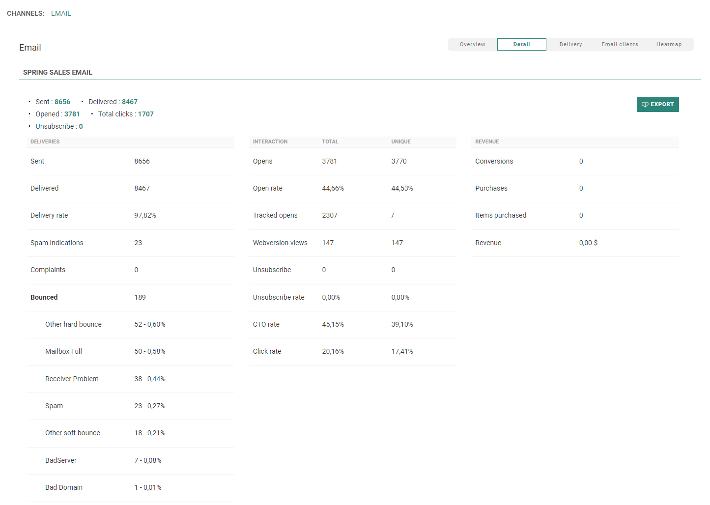
Underneath, a grid is shown with interaction info by link : Each row contains the link name and id, and the number and percentage of total clicks and unique clicks.
This grid can be sorted by total clicks or unique clicks, by clicking on the header.
- When this grid contains a lot of rows, a button is shown at the bottom-right to jump to the top.
- When clicks contain revenue data, this grid is extended with revenue, purchases and items purchased info. Sorting on the extra columns is also possible.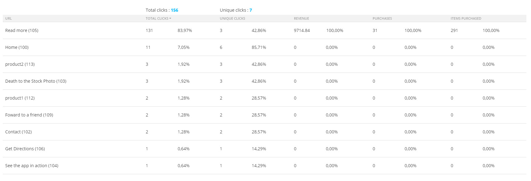
When a link is coming from a Content Block, and an alias has been given, the alias is shown as link name.

For the Push channel, the following buttons are available :
- Overview — Shows a delivery graph and activity values.
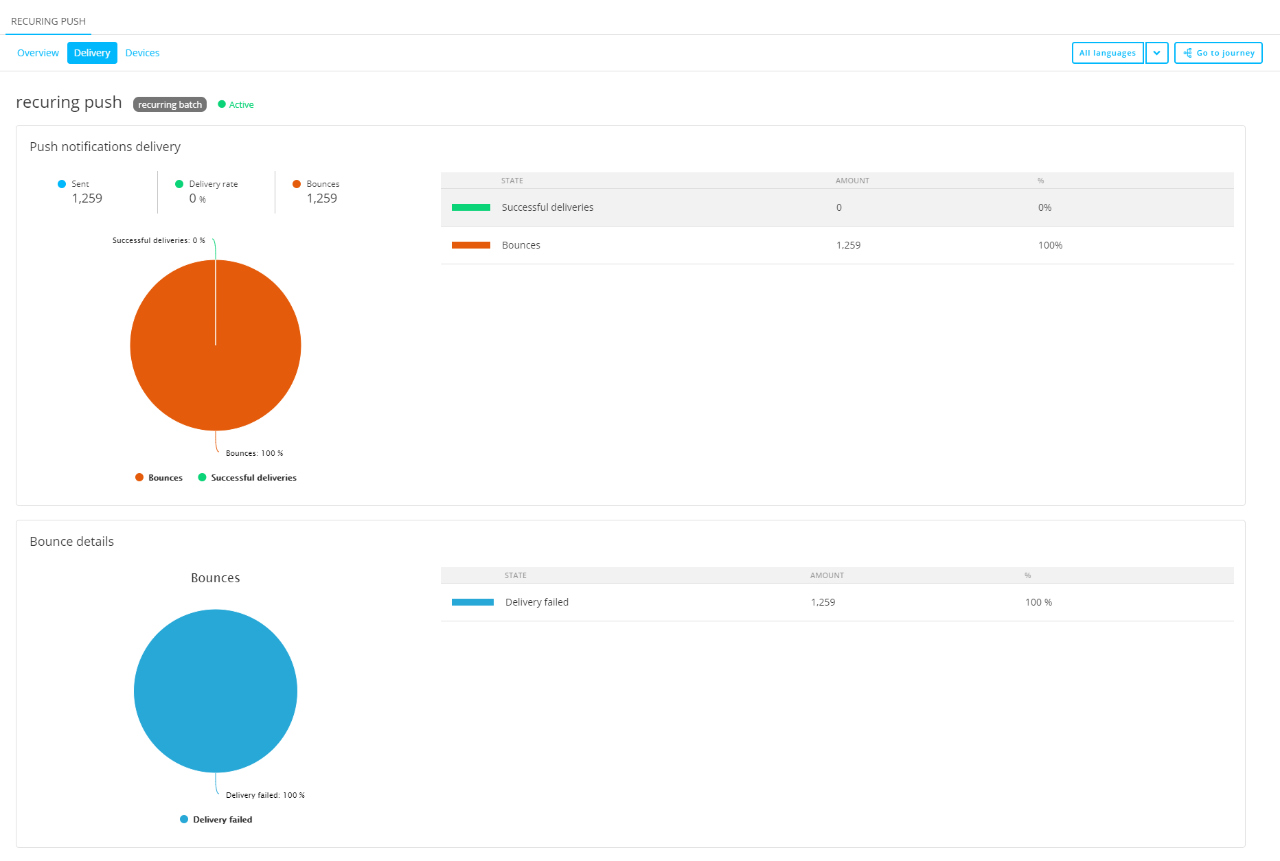
- Delivery — Shows a push notifications delivery pie chart and a bounce details pie chart.
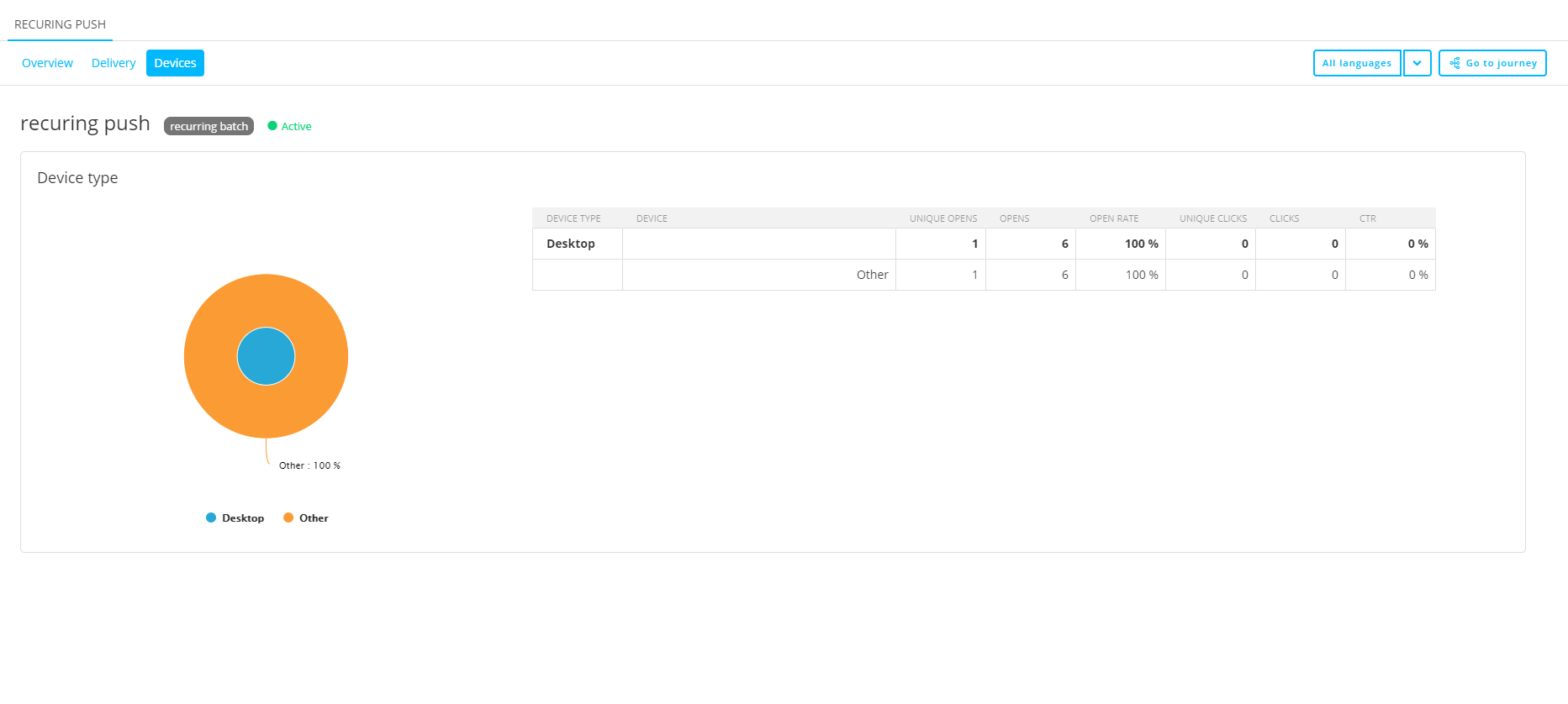
- Devices — Shows the devices used, categorized by device type (mobile, tablet), and their details such as opens, clicks and rates.
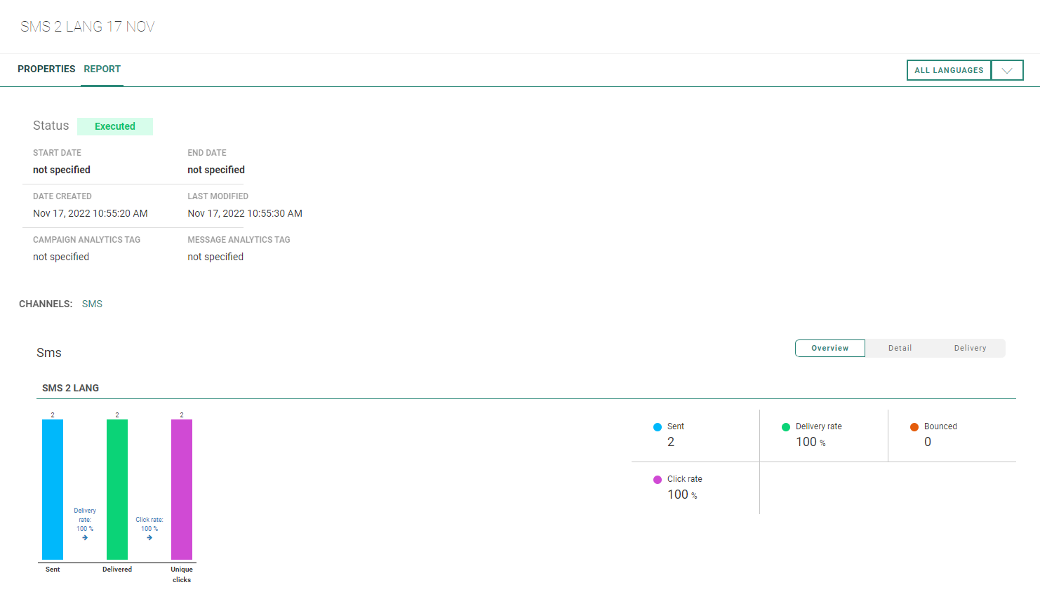
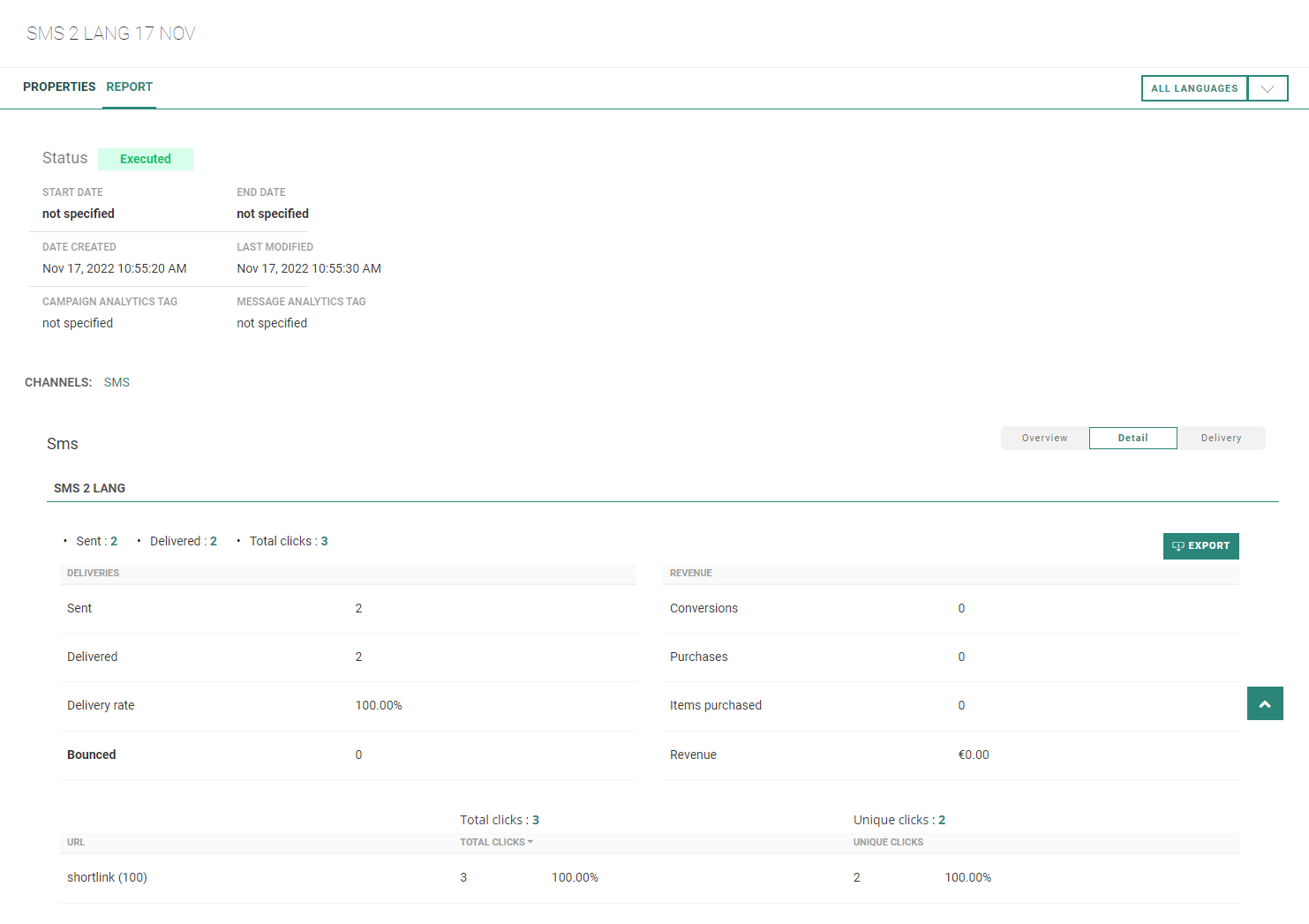
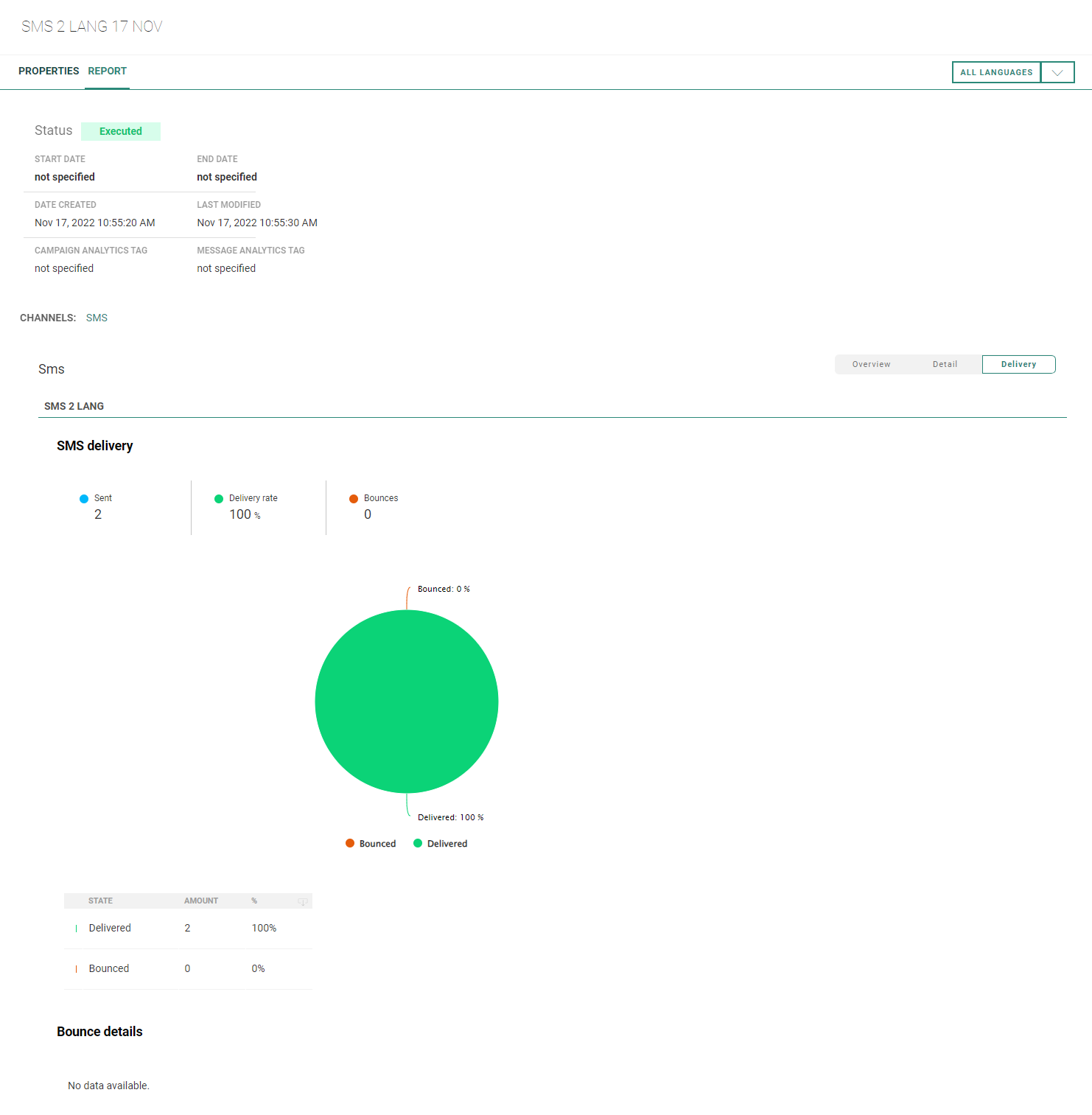
For the SMS channel, the following buttons are available :
- Overview — Shows a graph and values on sent, delivered (including delivery rate percentage) and bounced SMS messages.
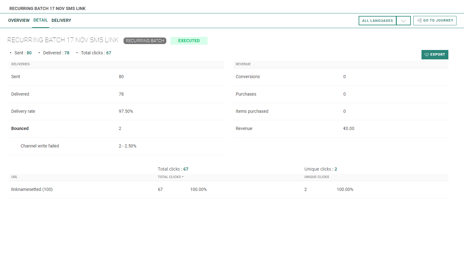
- Detail — Shows the number of sent and delivered SMS messages, the delivery rate percentage, and the total number of bounced SMS messages together with a split on bounces per bounce type.
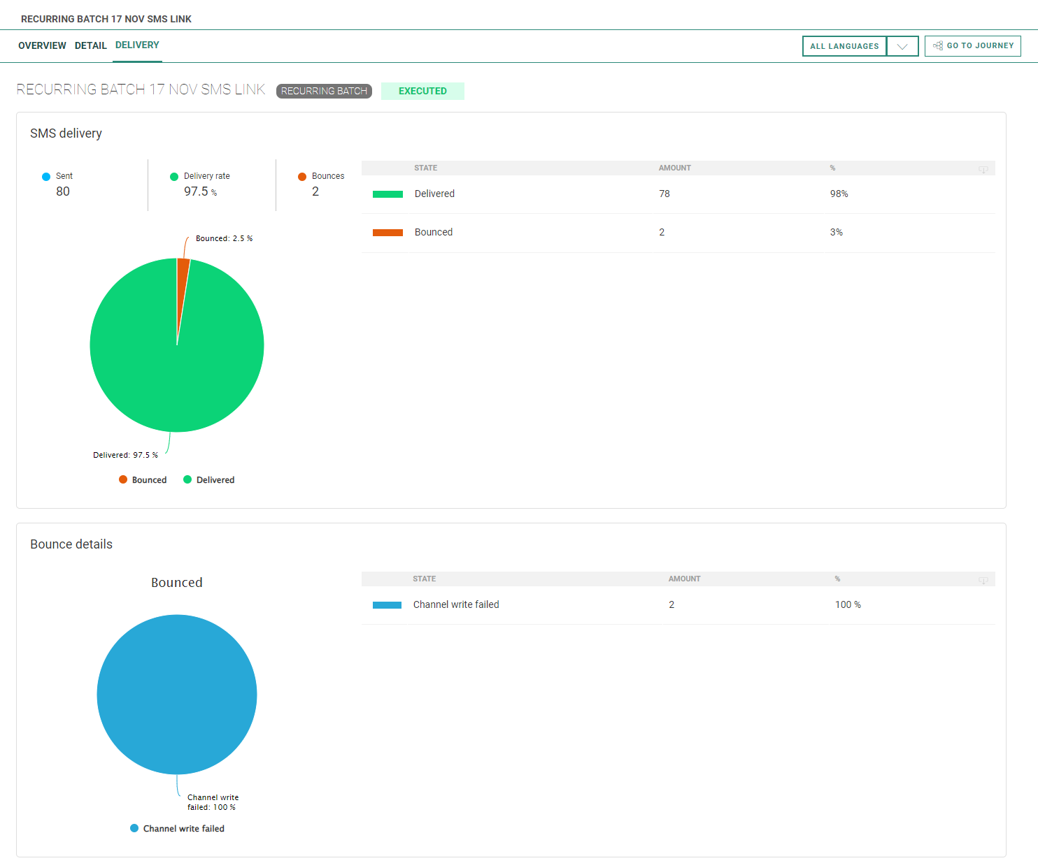
- Delivery — Shows an SMS delivery pie chart and a bounce details pie chart, both with numbers and percentage values.
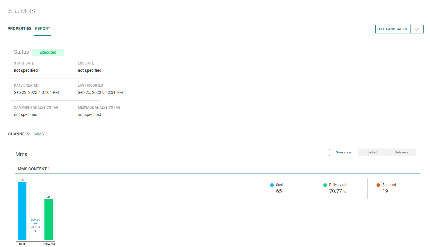
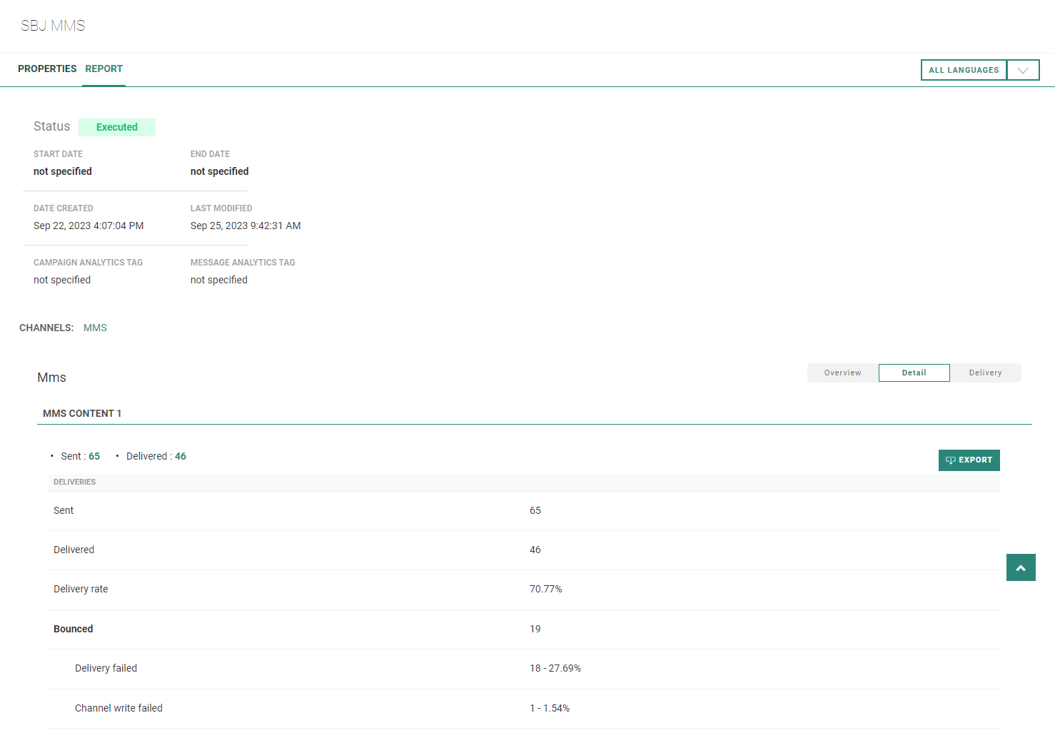
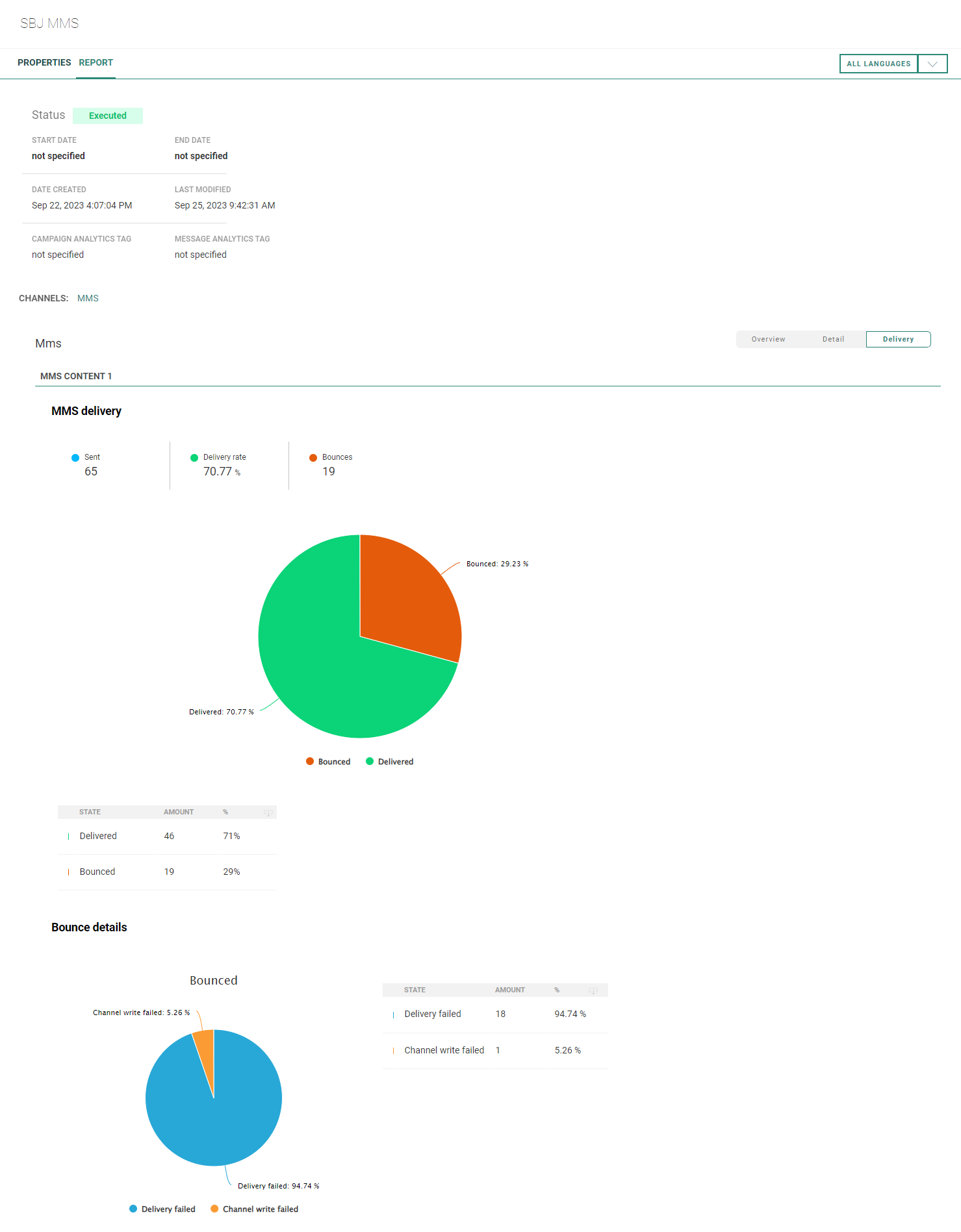
For the MMS channel, the following buttons are available :
- Overview — Shows a graph and values on sent, delivered (including delivery rate percentage) and bounced MMS messages.
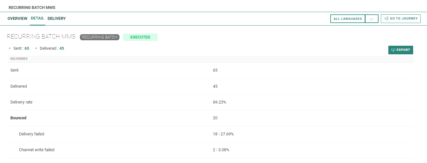
- Detail — Shows the number of sent and delivered MMS messages, the delivery rate percentage, and the total number of bounced MMS messages together with a split on bounces per bounce type.
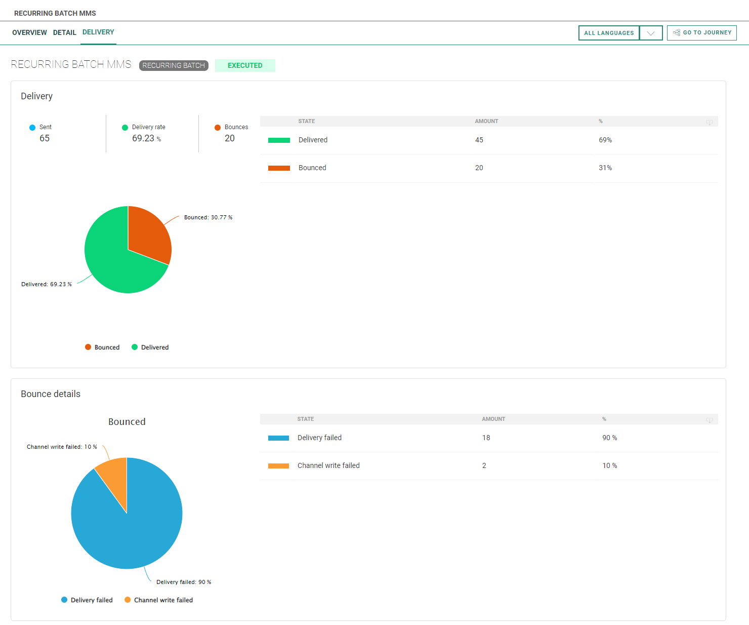
- Delivery — Shows an MMS delivery pie chart and a bounce details pie chart, both with numbers and percentage values.
Note:
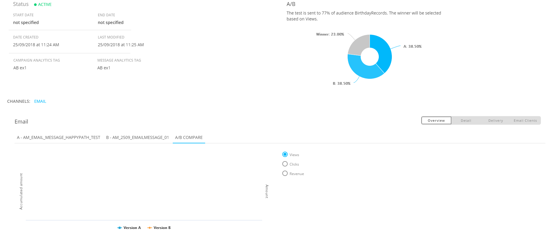
For A/B Journeys, reporting about each version is available in all different views (Overview, Detail, Delivery, Email clients).
To see the reporting of a version, click on the corresponding tab header.
For the Overview and Detail views, an extra 'A/B compare' tab is available, to compare the activity details for the different versions.
A radio button can be selected to switch between views/clicks/revenue. The graph shows the values for the chosen condition.
Reports for Recurring Batch Journeys
Depending on the channel type, reporting graphs and data can differ.
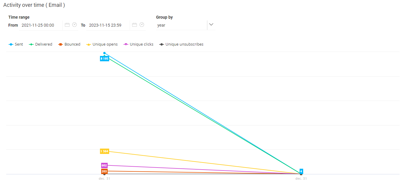
For the Email channel, the following buttons are available on the left of the toolbar on top to change the reporting view :
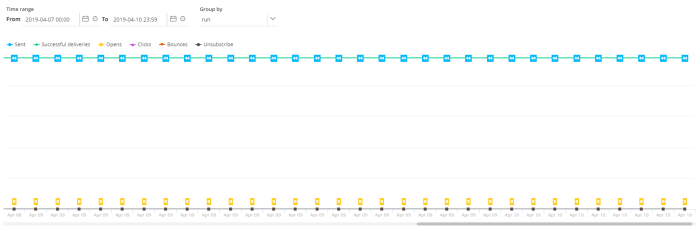
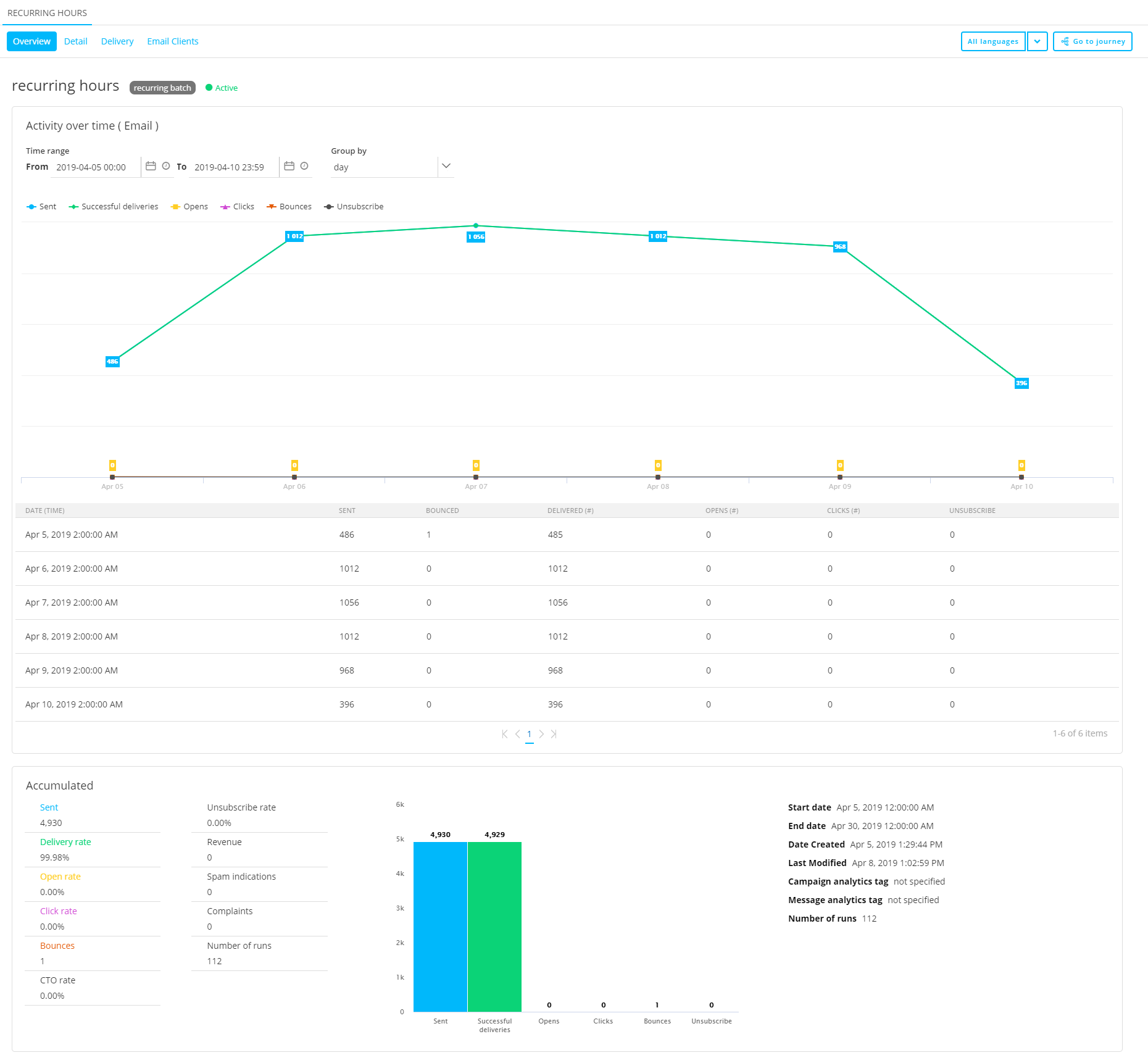
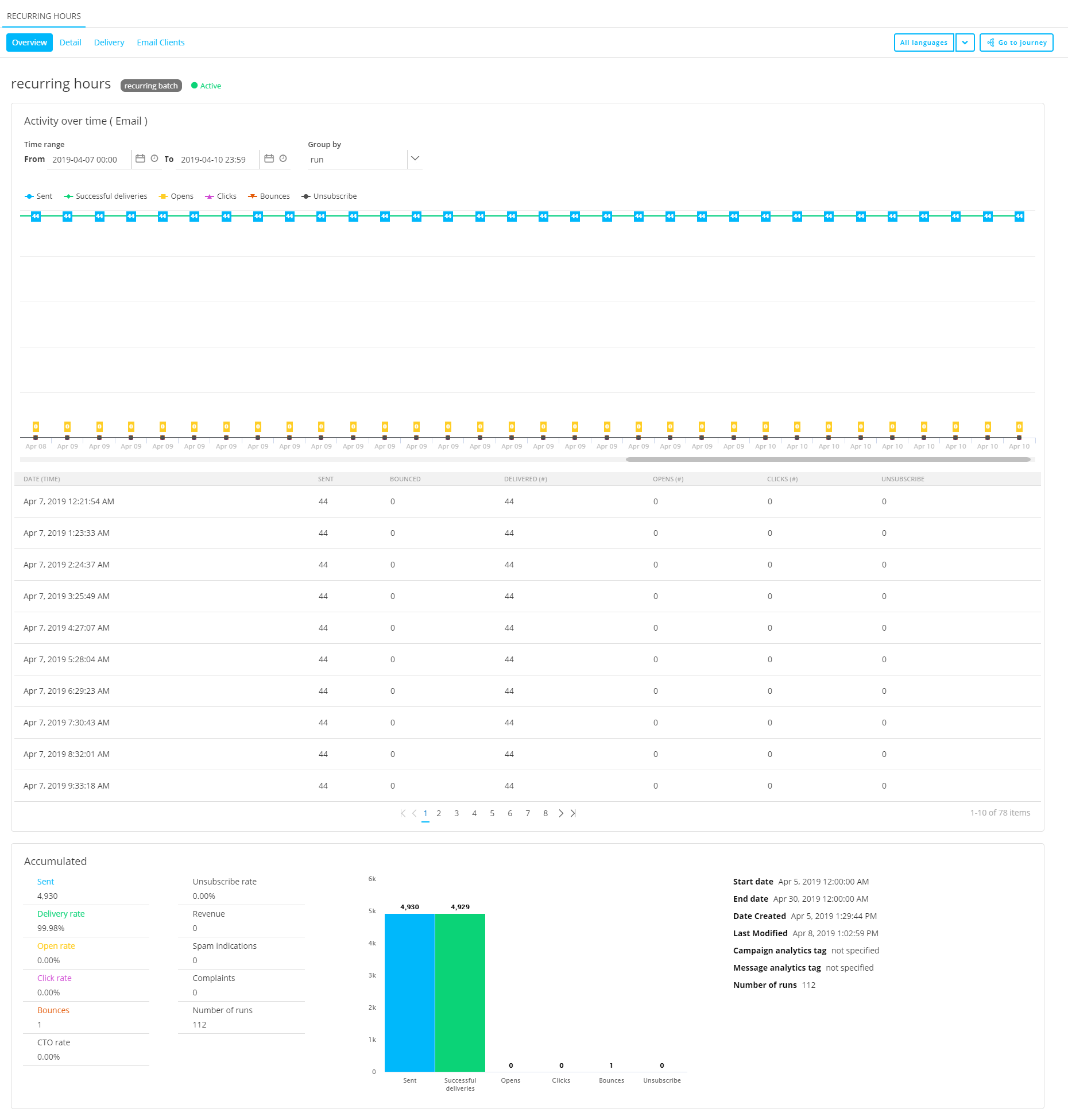
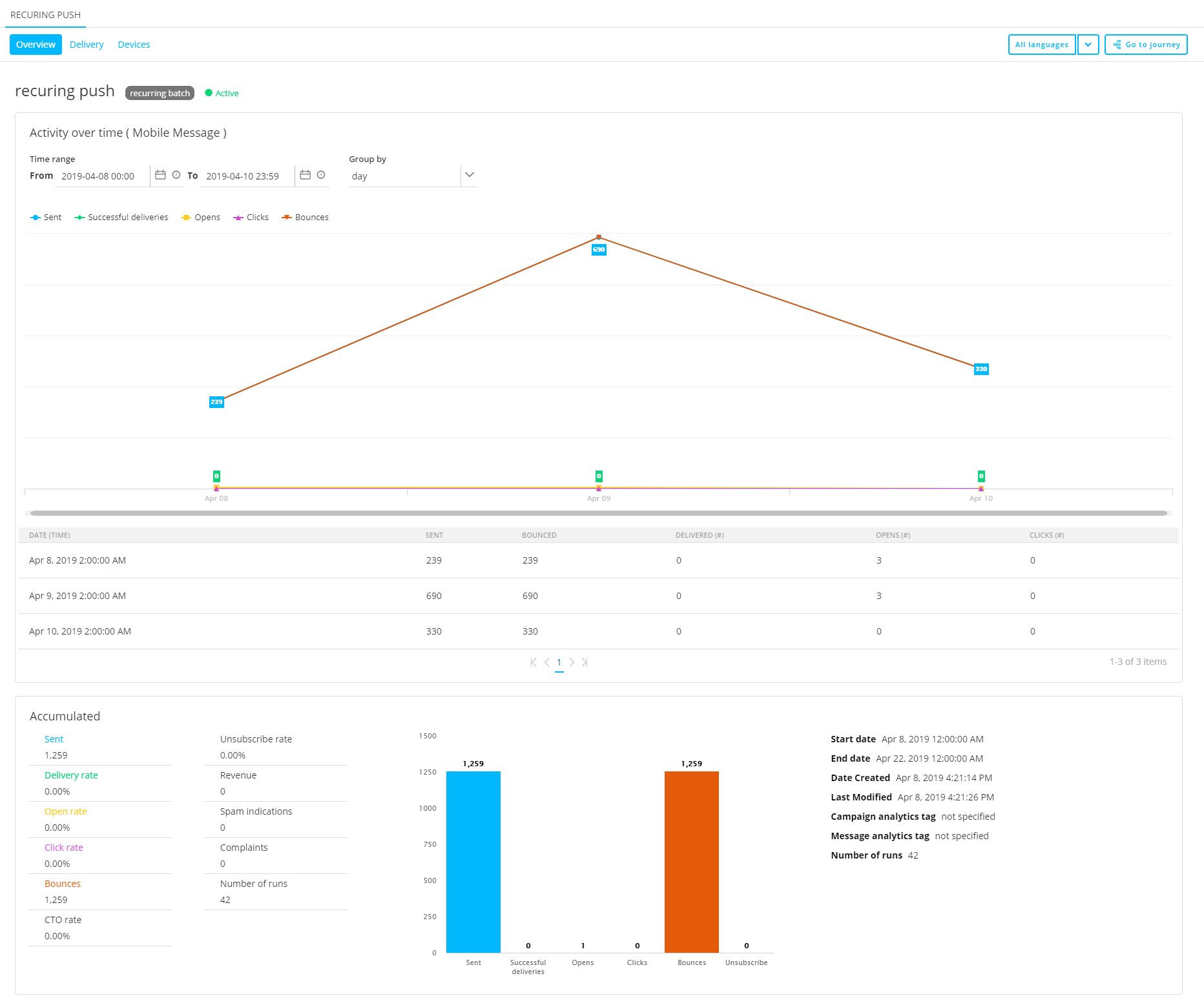
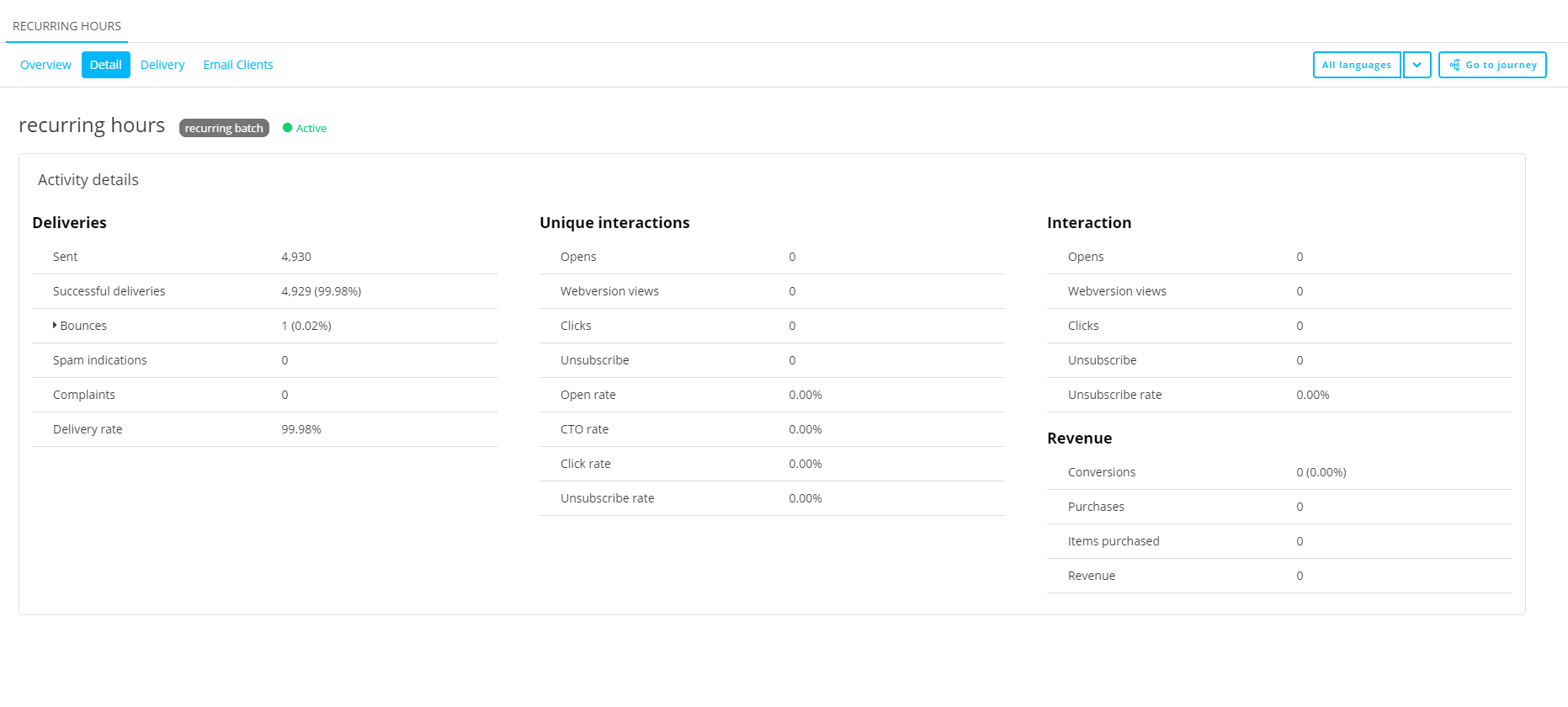
- Overview — Shows a delivery graph over time and activity values for:
- sent — Number of messages that are sent for the time frequency/run date, over the selected time range
- successful deliveries — Number of messages that are successfully delivered for the time frequency/run date, over the selected time range
- opens — Number of messages that have been viewed for the time frequency/run date, over the selected time range
- clicks — Number of clicks that occurred in the messages for the time frequency/run date, over the selected time range
- bounces — Number of messages that have been bounced for the time frequency/run date, over the selected time range
- unsubscribes — Number of unsubscribe links that have been clicked in messages from this journey for the time frequency/run date, over the selected time range
You can select the time range for which to show data:
- From 'start date-time'
- To 'end date-time'
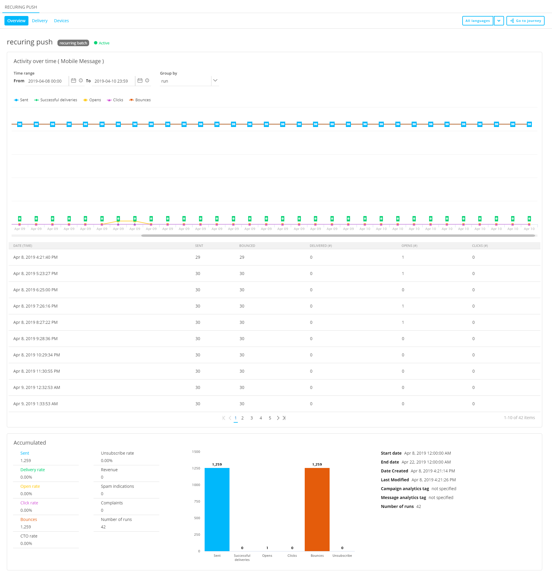
- Group by 'time frequency'
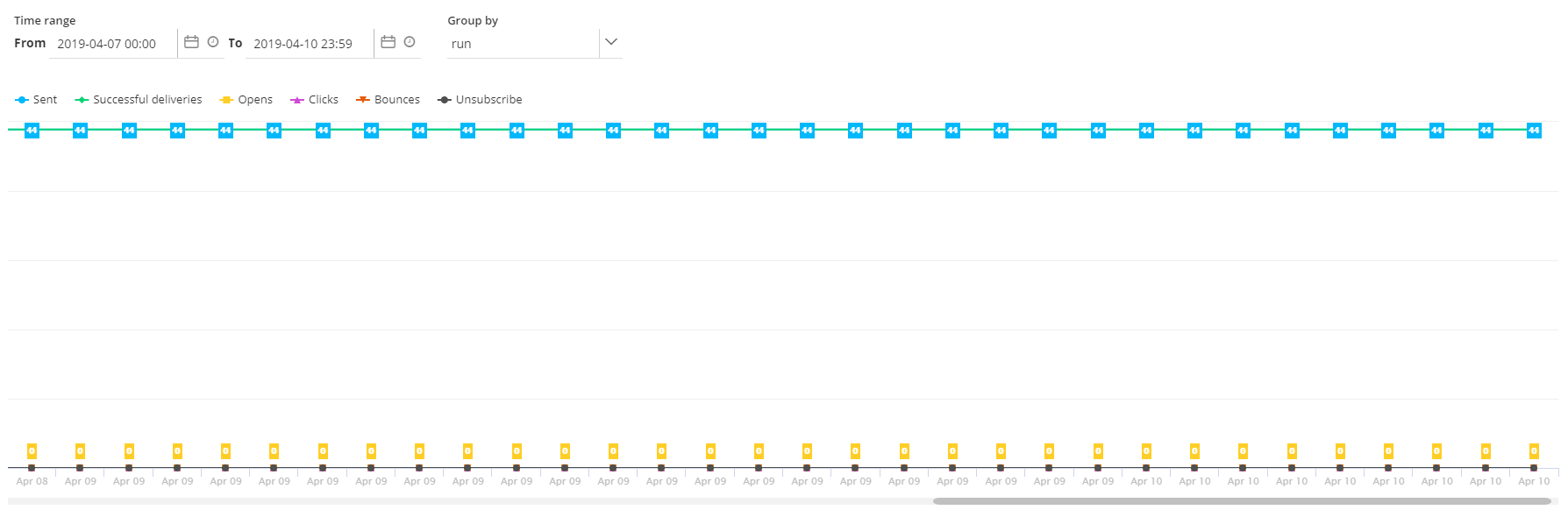
- day, month, year — This shows activity values per selected time frequency. Group by day is the default setting.

- run — This shows activity values per run of the Recurring Batch Journey
Note:
When you hover over a (run) date, a tooltip appears with numbers of all activities on that date: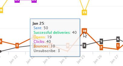
- day, month, year — This shows activity values per selected time frequency. Group by day is the default setting.
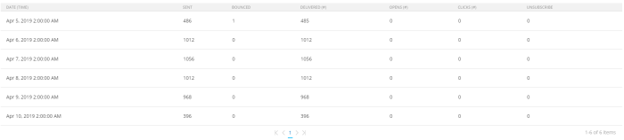
- Underneath the graph, a grid is shown with the activity values over time.
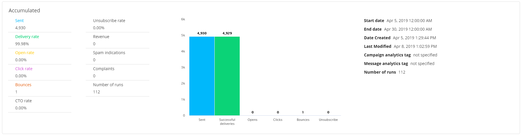
- There's also an 'Accumulated' section that contains all total values (numbers/percentages) for:
- sent
- delivery rate %
- open rate %
- click rate %
- bounces
- CTO rate %
- unsubscribe rate %
- revenue
- spam indications — These apply to messages that got rejected by the receiving mail server. It could be due to policies set on the server or some bad word choice in your emails, flagged by spam filters.
Spam indications count as 'bounces'. - complaints — A complaint is registered when a user clicks the 'spam report' button when viewing the message in an email client.
Complaints count as 'bounces'. - number of runs
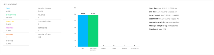
- Bar charts are shown for the total values of: sent, successful deliveries, opens, clicks, bounces, unsubscribes.
- The following details are also provided:
- Start date of the journey execution
- End date of the journey execution
- Date created for the creation date of the journey
- Last modified date of the journey
- Campaign analytics tag set in the journey properties
- Message analytics tag set in the journey properties
- Number of runs of the journey
- Detail — Shows detailed activity values. The information shown is comparable to other journey types.
- Delivery — Shows delivery values, bounce details and activity info on delivery domains.
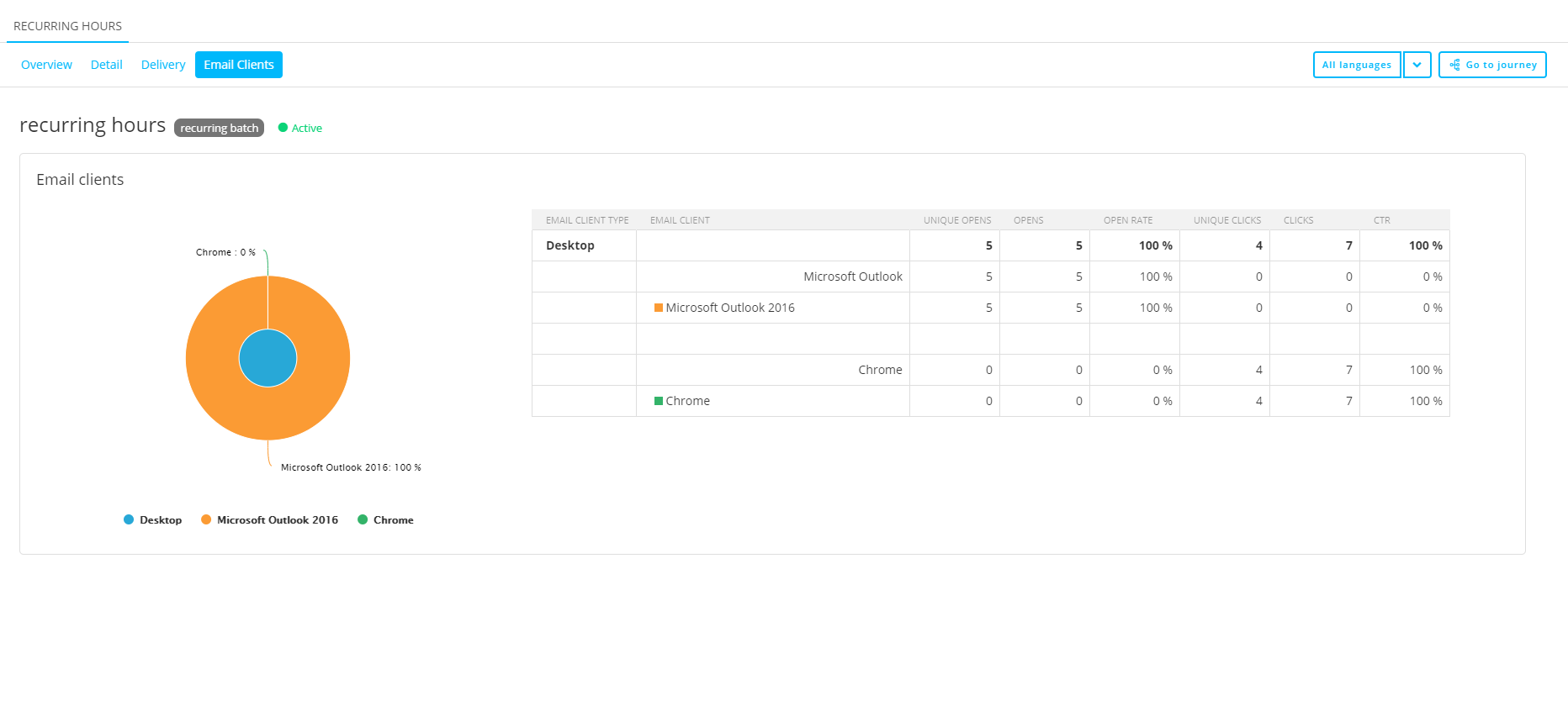
- Email clients — Shows the email clients used, categorized by device type (desktop, mobile, tablet, proxy), and their details such as opens, clicks and rates.
- Heatmap — The heatmap functionality is comparable to other journey types.

For the Push channel, the following buttons are available :
- Overview — Shows a delivery graph and activity values.
- Delivery — Shows push notifications delivery info and bounce details.
- Devices — Shows the devices used, categorized by device type (mobile, tablet), and their details such as opens, clicks and rates.
For the SMS channel, the following buttons are available :
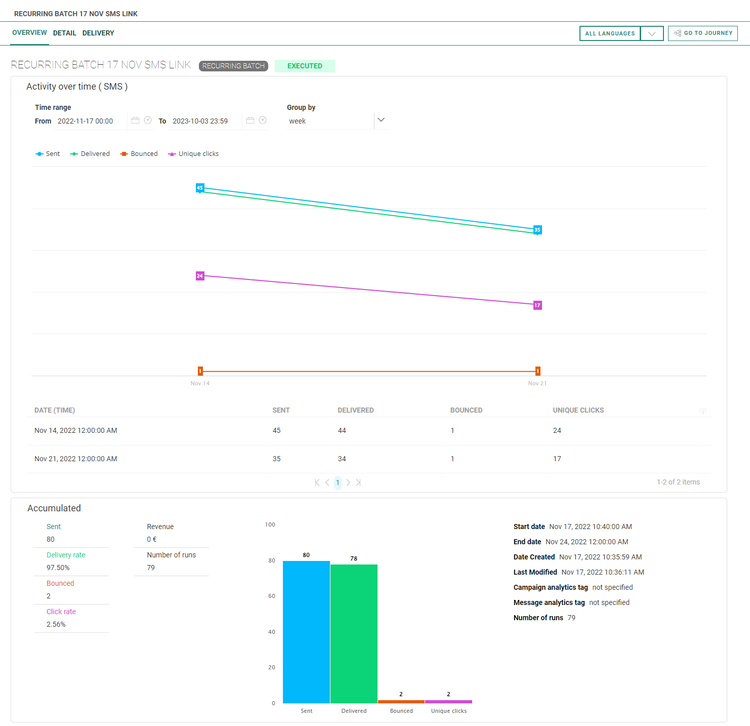
- Overview — Shows a graph with values for the activity over time, including sent, delivered and bounced SMS messages, and a chart with accumulated info.
- Detail — Shows the number of sent and delivered SMS messages, the delivery rate percentage, and the total number of bounced SMS messages together with a split on bounces per bounce type.
- Delivery — Shows an SMS delivery pie chart and a bounce details pie chart, both with numbers and percentage values.
For the MMS channel, the following buttons are available :
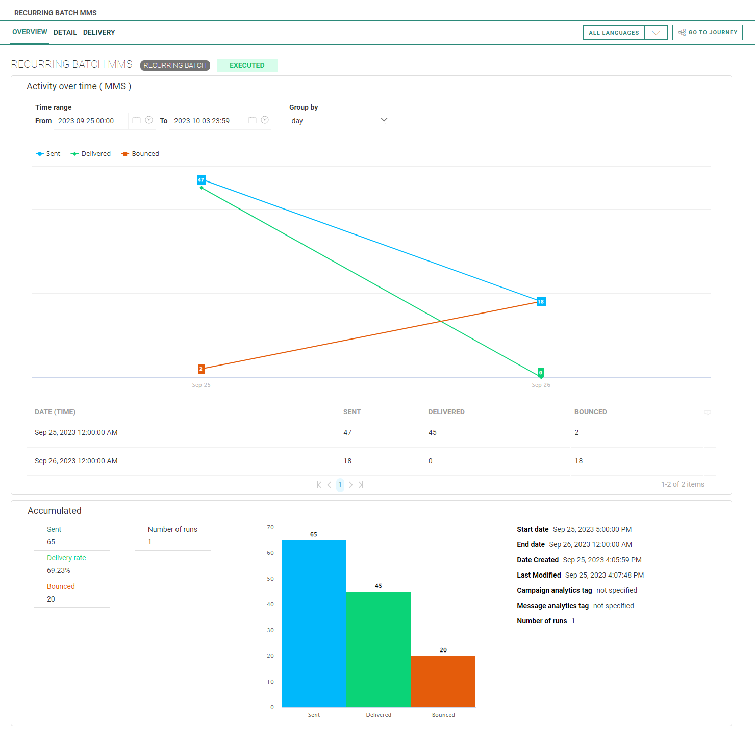
- Overview — Shows a graph with values for the activity over time, including sent, delivered and bounced MMS messages, and a chart with accumulated info.
- Detail — Shows the number of sent and delivered MMS messages, the delivery rate percentage, and the total number of bounced MMS messages together with a split on bounces per bounce type.
- Delivery — Shows an MMS delivery pie chart and a bounce details pie chart, both with numbers and percentage values.
The following items are always available on the right of the toolbar on top :
- All languages drop-down — Each available language can be selected to show specific reporting data for that language, or 'all languages' to show combined reporting data.
- Go to Journey button — To navigate to the Recurring Batch Journey itself (to view or edit it).
Examples
Examples (click on a link to see the corresponding screenshot) :
Custom Journey reporting :
Overview (example for Email and Push channels) :![]()
Overview (SMS example) :![]()
Overview (MMS example) :![]()
Detail (Email example) :![]()
Detail (SMS example) :![]()
Detail (MMS example) :![]()
Delivery (example for Email and Push channels) :![]()
Delivery (SMS example) :![]()
Delivery (MMS example) :![]()
Email clients (only for the Email channel):![]()
Recurring Batch Journey reporting :
Overview — Group by day (Email example) :![]()
Overview — Group by run (Email example) :![]()
Overview — Group by day (Push example) :![]()
Overview — Group by run (Push example) :![]()
Overview — Group by week (SMS example) :![]()
Overview — Group by day (MMS example) :![]()
Detail (Email example) : ![]()
Detail (SMS example) : ![]()
Detail (MMS example) : ![]()
Delivery (Email example) :![]()
Delivery (Push example) :
![]()
Delivery (SMS example) :
![]()
Delivery (MMS example) :
![]()
Email clients (only for the Email channel) :![]()
Devices (only for the Push channel) :![]()
AB Journey reporting :
Overview — version A (Email example) :![]()
Overview — AB Compare (Email example) :![]()
Transactional Journey reporting :
Overview (Email example) :![]()
![]()
Device types and email clients
There are 4 different device types :
- Desktop — When a desktop computer is being used.
- Mobile — When a mobile phone is being used.
- Tablet — When a tablet is being used.
- Proxy — This reflects 'Gmail (Google Image Caching)' and 'Apple (Mail Privacy Protection enabled)'. This proxy type groups all email clients that route emails through proxy servers, which masks the type of device the open came from.
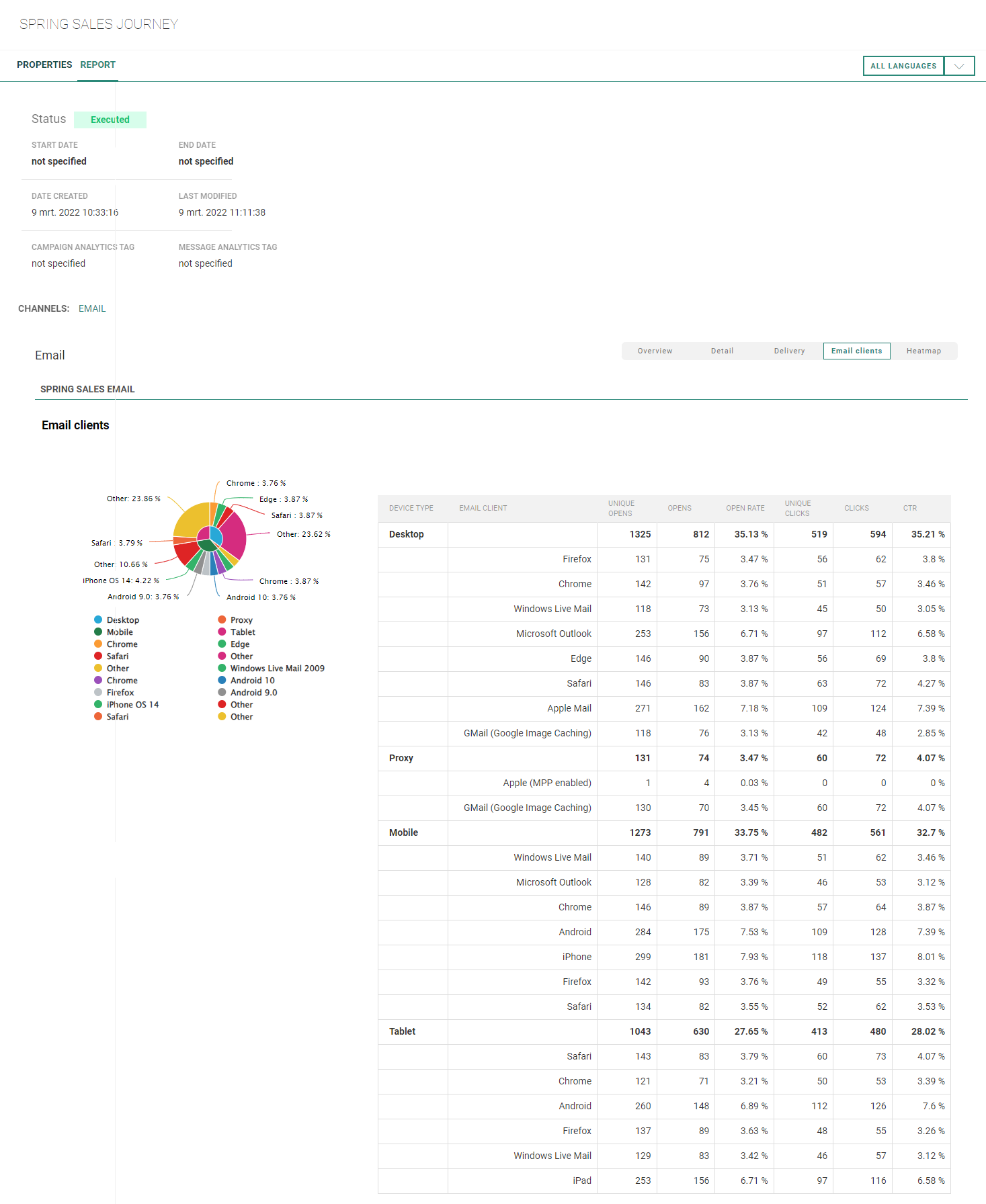
Per device type, the following 'email clients' are shown :
- Email client applications such as Apple Mail, Gmail, Microsoft Outlook, Windows Live Mail — When an email client app is used.
- Internet browsers such as Safari, Chrome, Firefox, Edge — When the email message is opened through an internet browser (for example: viewing an email on Chrome through Gmail's website https://mail.google.com/).
- Devices such as iPhone, iPad, Android — When a mobile device is used, and no app or internet browser could be recognized (for example: usage of a native Samsung browser on an Android phone).
Note:
- Email client applications often open the default internet browser (or most recently opened one) when a user clicks on a link. This results in low CTR numbers for apps, compared to higher CTR numbers for internet browsers and devices.
- Some email client applications mimic browser user agents (Mozilla/5.0, AppleWebKit/602.1.50, etc). Those cases also add up to numbers for the internet browsers and devices, instead of email client applications.
- 'Gmail (Google Image Caching)' and 'Apple (Mail Privacy Protection enabled)' route emails through proxy servers, which masks the type of device the open came from. They appear in the 'Proxy' email client category.
Email client namings for Apple
Regarding email clients for Apple, different namings may be used : Apple (MPP enabled), Apple Mail.
The table below shows how to interpret these differences.
| Email Client Name | Apple Mail Privacy Protection | Email through | Domains | Device |
|---|---|---|---|---|
| Apple (MPP enabled) |
activated | iOS 15 using Apple Mail app, with Apple Mail Privacy Protection activated | Known — Apple and others | Unknown — appears as proxy |
| Apple Mail | not activated | iOS 15 using Apple Mail app, with Apple Mail Privacy Protection not activated | Known — Apple and others | Known — mobile, tablets and desktop |
| not applicable | - iOS 15 using another app than Apple Mail - any other iOS version than iOS 15 |
Known — Apple and others | Known — mobile, tablets and desktop |
