 When a Button is placed in a message, you need to define what happens
when the contact clicks the Button. In the properties panel on the right,
do the following:
When a Button is placed in a message, you need to define what happens
when the contact clicks the Button. In the properties panel on the right,
do the following:
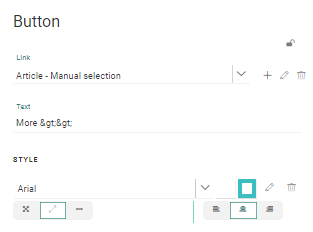
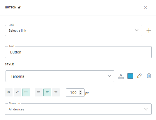
1. Assign an existing web URL link to the Button (select one from the drop-down list) or create a new one (through the +). The link URL can contain personalization fields. Clicks on the link are measured.
2. Set the text for the Button. Personalization fields and emoticons can be used and styling options are provided.
3. Define the styling properties of the text itself such as the font used and the color. Choose a color for the Button borders. You can access the Style editor from here and make other changes as well directly in the CSS.
4. Use the layout options at the bottom to adapt the size of the Button (100% width or actual size which depends on the text inside the button) and the position of the bottom (left, center, right)
Note: the button alignment options are not available for Buttons that have been placed horizontally in a column. In that case the alignment options of the column are applied.
5. Define if this Button must be displayed on All devices, desktop only or Mobile only. In case of desktop or mobile only, an icon is displayed within the content section representing the choice made.
Copy Button Component content to other languages
By default, when adding new Content Components to a message, only the structure of the component is copied automatically to other languages. However, using the function copy content to other languages, you can now copy the component with its content to one or more languages.
This option is available once the component is placed onto the message and multiple languages have been defined for the message.
Click the button Copy content to other languages in the component properties.
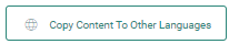
A dialog is displayed in which the target languages can be selected.

