The Journey interface consists of the following sections:
Toolbar
When the journey is being edited by another user, you can unlock the journey in the toolbar.

Once the journey is unlocked an editor toolbar is available.

The 'Save', 'Validate', and 'Publish' buttons are only available in Edit mode. The journey can be saved at any time during the design. Validation will check the journey for missing links and incomplete or wrongly configured components and Publish will make the journey available for use, in Marigold Engage.
Note: Save, Validate and Publish are disabled when another action is running. For example, when saving a journey, the Validate and Publish buttons will not be available as long as the save is ongoing. This is to avoid unwanted errors when clicking multiple buttons while actions are still running.
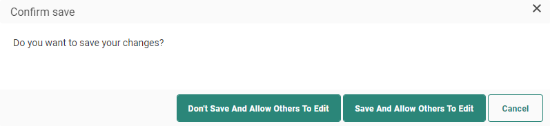
A journey that is locked for other users because the current user is working on it, can now be unlocked by the user.
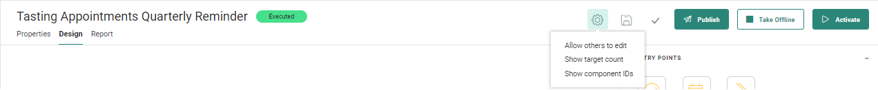
An Action menu gives access to the option 'Allow others to edit'. This will unlock the journey and other users will be able to edit the journey straight away.
The following dialog is displayed, allowing the current user to choose between saving and discarding the journey changes when unlocking it:
Other options available from the Action menu:
- Show/Hide target count — displays/hides the total number of contacts targeted for each component on the canvas. The journey needs to be published to display the target count.
- Show/Hide component IDs — displays/hides the IDs of the components on the canvas. These IDs are especially useful for technical users who need these to be able to debug the logfiles.
The journey Status buttons are used as follows (These buttons are only available after publish):
- Activate — Launches the journey. All standard buttons such as Save, Validate and Publish are no longer available. An activated journey can be paused or set offline.
Note: When launching the journey, users with Audience Validation (set to 'required') will be presented with a secondary check in the form of a dialog box detailing :
- the content to be sent
- the audience it will be sent to (including filters and segments)
- the number of messages to be sent
- the number of contacts to be targeted
This dialog box then requires confirmation for the journey to fully launch.
Users without Audience Validation (not set to 'required') will bypass this stage, and the journey will become immediately active without further prompts.
- Pause — Pauses the journey. Links in emails and pages will remain available when a journey is paused. Sending of content is paused. When a journey is paused, changes can be made, saved, validated and published. A paused journey can be activated again or taken offline completely.
- Take offline — Takes the journey offline. No messages are sent and links in emails and pages will no longer be available. An offline journey can be activated again or paused.
Note: When reactivating a journey, a check is done whether it matches the last published version.
If there's a mismatch between the last published version and the version you want to reactivate, a dialog box is presented with 3 possible actions:
- Publish and launch — This publishes the current version, and launches the journey using the new published version
- Launch without publishing — This doesn't publish the current version, and launches the journey using the existing (old) published version.
- Cancel — This cancels the reactivation and takes you back to the journey editor without doing anything.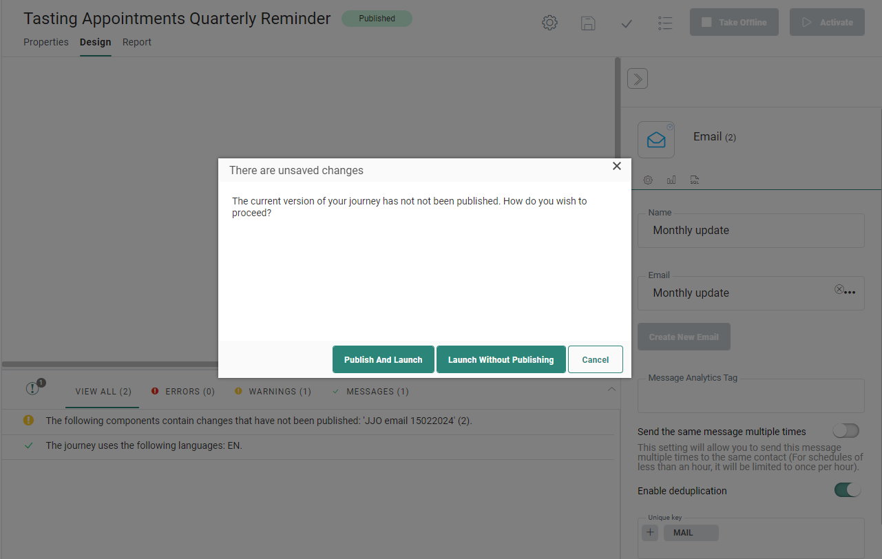
- Cancel — Cancels the execution of the journey. No new messages are sent out anymore and if messages are still being processed at the time of cancel, best effort is made to ensure they don't reach the inbox of the recipient. The links in already sent out emails will keep on working as well as the pages in the canceled journey. Canceled journeys cannot be relaunched.
Note: When the user cancels the journey, different alerts are displayed, depending on the execution status of the journey:
Some messages have been processed: A progress bar gives a very clear and visual representation of what has been processed. You can choose to cancel or keep the journey running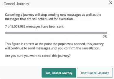
No processing data is available yet: You can choose to cancel the journey anyway or keep the journey running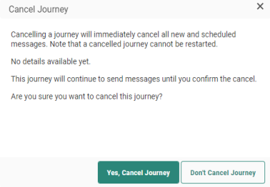
All messages have been processed: In this case, cancel ling is no longer possible, and the user is informed.
The buttons displayed to the left allow setting the properties and editing the journey in design mode.
- Properties — Click to toggle to the journey properties panel. The Design panel is hidden and the properties are displayed in overlay.
- Design — In Design mode, you can add content components to the journey and create events between these components.
Finally , a Report button is available for direct access to the reports concerning the status of the journey and the different channels used in the journey. This Report button is only available when the journey is launched.
Note: Users having read-only rights for Custom Journey will not have access to the above controls in the toolbar, except for the Report button.
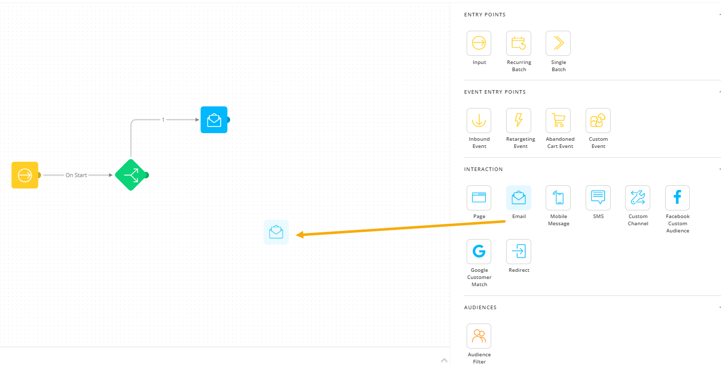
Components panel
The Components panel on the right contains a list of all possible components that can be placed onto the Design canvas. Components can be compared with building blocks. These building blocks are used to construct a scenario (such as a registration process). They embody the graphical representations of messages and processing actions. Each component corresponds to a step in the journey.
Note: Users having read-only rights for Custom journeys will not be able to access the components in this Components panel. They can however click existing components on the Design canvas and view the properties in read-only mode.
Drag and drop a component onto the canvas.
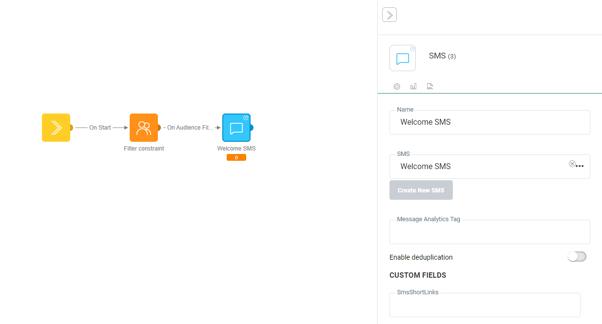
When you select a specific component on the Design area, the Component properties panel is displayed on top of the Components panel.
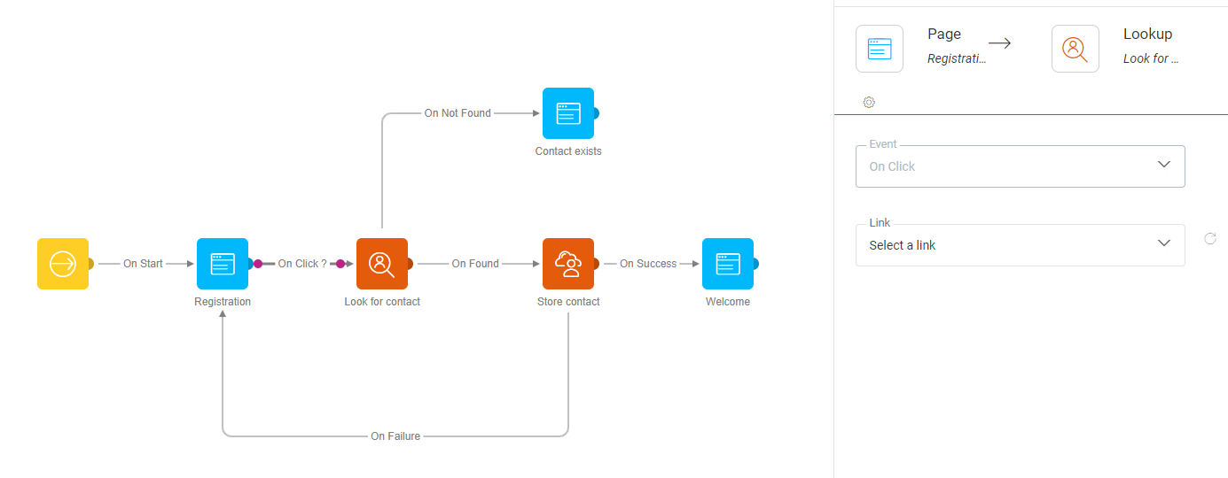
When you create an event or click an existing one between two components, the Events property panel is displayed in overlay of the components panel:

Note: You can copy components already on the canvas. When duplicated, internal settings are copied as well. Make sure when making the selection to include the links as well if you want these copied.
Design panel
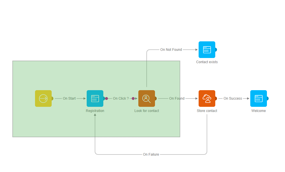
The Journey Builder canvas is the graphical environment of the main window that allows creating or editing journeys in a graphical way. The canvas displays the path that is followed throughout the journey by the target contacts in the journey audience.
Example: A registration
journey
Every contact entering the journey will get a registration form. When submitted
a check is made if the contact exists. If they do, he receives a welcome
page. If they don't exist, they will be created as a new contact. If the creation
was successful they get a welcome message. if it wasn't successful, they are sent back to the registration form.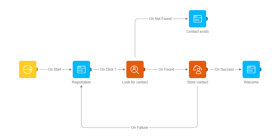
Each component (icon) in the journey represents a specific step. The lines between the components indicate how the different components are connected and thus how a contact moves from one step to another. The lines are the actual events that trigger the next step.
The different components can be placed on the canvas by dragging and dropping them from the Components panel on the right.
- To remove a component, click it and press Delete.
- Clicking a component on the canvas displays the properties panel on the right, on top of the components panel.
- Right- clicking a component displays a popup menu to copy, delete, cut or edit the component. Depending on the component, additional options may be available. (More information in the Component specific topics).
- CTRL + A selects all components on the canvas and lets you move all at once.
- Holding down the left mouse button an selecting a series of components allows moving all the selected components to the new location. You can also select an area on the canvas by holding down the left mouse button. All components in the selected area are highlighted. Release and then drag and drop the whole selection by clicking a single component in the selection and moving to the new location.
The different components in the journey are linked to each other with lines called connectors. The connectors define the path to follow throughout the journey.
In addition, events are defined on these connectors to indicate when a contact will pass from one component to another. Examples of events include 'Click', 'Success' or 'Failed'. The type of event that is associated with the connector depends on the component starting the link.
Example:
The typical event for a contact to pass from a Start component to an Email
component is the event 'OnStart'.
All targets in the journey Audience (List) will automatically pass to
the next step. A typical event for a contact to pass from a Page Component
to a Data Component is the event 'Click
link’. All targets will pass to the next step when they click a
certain link.
To draw a connector between two components, hold down the left mouse button and connect the dots on the components. The starting dot is displayed in pink when hovering it, an indication that a connector event is being created.
Note: Components that cannot be linked to one another are grayed out.
Components with only one event — When only one event is available, it is automatically used. For example, an Input Component generates one event: 'OnInput'.
Components with one event but multiple options — When a connector is drawn from a component that has one event with multiple options, the following is displayed:
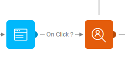
The above example is for a Page that has only one event: 'Onclick'. The event is automatically attributed to the connector, however no exact link has been selected yet in the event properties. To make changes to the connector event, click it. The selected connector event is marked with pink on the canvas and the Events properties panel is displayed on the right where the event can be configured.
Note: A default event is always attributed to the connector. Click the connector to make changes in the properties panel of the connector. Also, some connectors simply cannot be made. For instance, connecting a Page Component to an Input Component is impossible.
The events available from a component can either be standard events, such as 'Onsuccess' or 'OnFail' for Data Components, or component related events (such as clicks on links in Page Components).
Test your knowledge about manipulating an audience list during Journey execution
When a specific audience list is used in a Journey that is already launched and later on that audience list is changed (for example: force the use of a segment on the list), what do I need to do to make the Journey execution target the correct (updated) audience?
