A template or email is built from layout components and content components:
- Row components in the right panel determine the number of rows and columns in the template/email.
- Content components define what type of content is displayed within them.
The basic layout and content
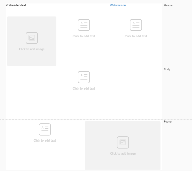
The layout of the default Engage template/email is as follows:
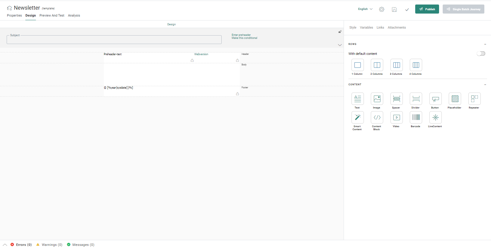
At the top, you can expand the email header to view the details. For more information on how to set that up, check this topic.
Note: The email header can be locked on template level. This means that when the template is used in a journey, the user cannot make changes to the email header.
The content contains following building blocks:
Header — Displayed at the top of the message. By default, the header contains one row with two columns with text components already placed in them. You can add additional elements to the header and remove the default elements if required.
Body — Contains the actual content of the email. The body is empty by default. You can first add Row components and then add Content components to them or you can add content rows with default content directly to the body. You need to click the toggle 'With default content' in order to see this option.
Footer — Displayed at the bottom of the page and is typically the same for the different templates/emails. The footer contains one Text Component by default. Changes can be made to the default footer by editing the existing content, removing it, or adding new content.
On the right side of the window, in the Links panel, there's a default link for each template/email:
Webversion —This link is added to email messages to allow contacts to read the email message in a web browser in case they are unable to view the email correctly in their email client. When you create a new template/email, the web version link is created by default in the Links pane and placed in the header. As best practice, it's no use showing the web version link when you are already viewing the email in a web browser. A visibility constraint can be added in this case SYSTEM.MAIL=1 to show it only in the email client and not in the browser.
Technical Note: When a template/email is created, automatically a List Unsubscribe link is added as well. This link has ID=9 but is not listed with the other links in the email. The link is used by certain web-based email clients to provide the user with an additional option to unsubscribe. A "list-unsubscribe" link is added to the head of the email. If the receiving mail client detects this link, they usually add a line of text with a link above the email "You are subscribed to this mailing list. Unsubscribe". If the contact clicks this link, he is unsubscribed from the entire Audience List (OPTOUT field is set to 9). This is only used when the email client supports the ‘list-unsubscribe’ standard. This Unsubscribe link does not replace the mandatory opt-out link in your email.
(More details on Links in email can be found here)
Adding rows and columns
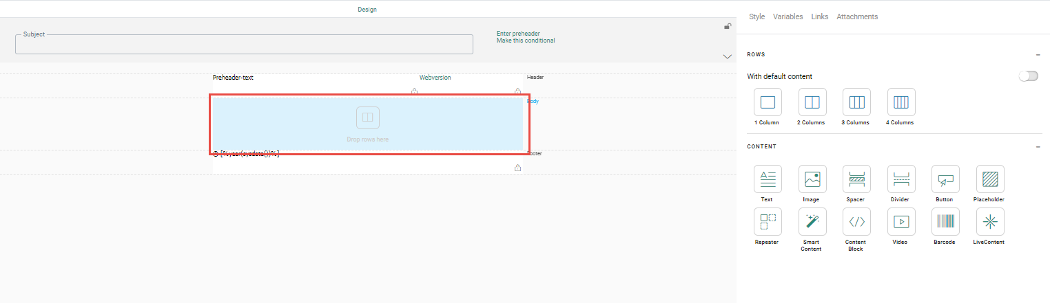
The body does not contain content when the template/email is first created. You need at least one row in each part of the email. You can add new rows by dragging them onto the canvas from the Components panel on the right.
Mandatory rows must be added to the sections where it says Drop rows here on hover over, but additional rows can be added to the header and footer as well.
Using rows with or without default content
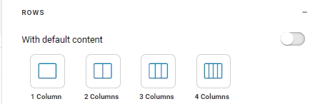
You can add rows with or without content using the With default content toggle button in the Components panel in the ROWS section.
Disabled — When the option is disabled, you can drag-and-drop empty rows with one to four columns onto the canvas. After, you can place multiple Content components in each one of the columns in a row.
Note: Use at least two columns for mobile devices to ensure the content will display correctly.
Enabled — When the option is enabled, you can drag-and-drop rows that contain default content such as image and text containers onto the canvas. These rows consist of one or two columns depending on the type of content selected. Use this option if you want to quickly create content that takes up the entire row.
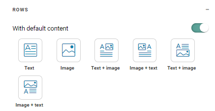
- Text — Adds a one-column row in which you can add text that can be personalized and styled.
- Image — Places an Image Component in the row and allows you to select an image to use in it.
- Text + image — Provides multiple possible layouts for a combination of text and image in one content box, as shown in the image on the component button.
Example:
This template is intended to be used as the basis for all messages.
So we need to define the header and footer and lock them on template level.
So, let's add a row with three columns to the header, one for the Parana
logo, one for the Edition date, and one for the hyperlinks to specific
sections on the website. In the footer, we'll add a row with two columns
and remove the default content.
Another row is added to the body of the template and will contain the introduction
text.
The result appears like this: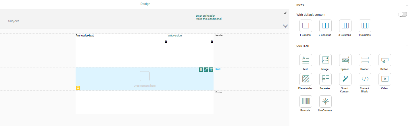
When hovering the different blocks added you will see labels appear to drop content here.
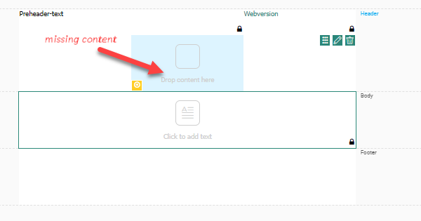
Note: When adding content to the design, the section in which the content will be dropped is highlighted in blue.
To access the properties of rows, columns and components, a color code is used for the different icons in the design. The icons pop up when hovering the element. When clicked, it gives access to the options for corresponding element:
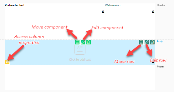
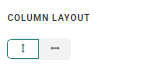
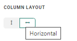
- Yellow — Selects the column and provides access to the column Style properties (displayed in the panel on the right), display options and the column layout (vertical or horizontal).
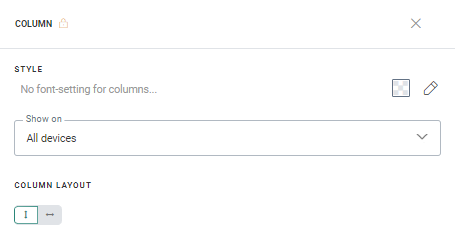
You can set styling options for the content and define on which devices the column content should be displayed. For multiple horizontal aligned content components in the column, you can set how they should be displayed on mobile devices: horizontally - one next to the other, or vertically - one below the other.
- Teal — Selects the row and gives access to the layout options for the row and the drop-down menu :
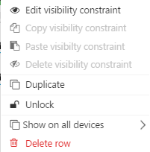
From the drop-down menu you can manage visibility constraints, duplicate the row, unlock or lock the row, define on what devices the row should be displayed or delete the row.
- Green — Selects the content component and provides access to content properties and drop-down menu.
Note: To un-select a component, row or column (and thus close the Properties panel), you can either click outside the email design, click the Close icon above the properties panel or press Esc.
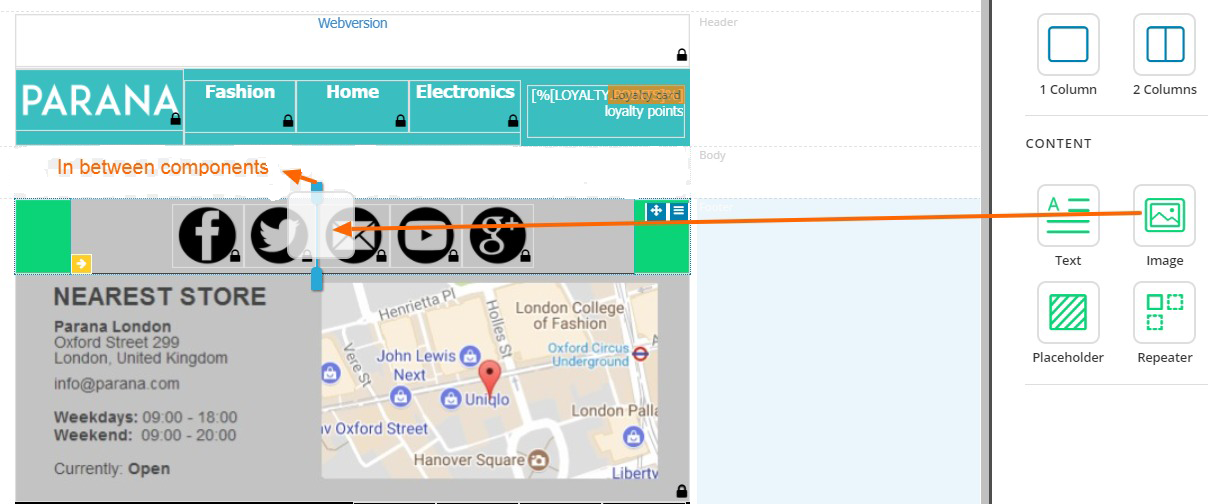
Adding Content components
Content components can be added to an existing row or column in a row.
When a row or column does not contain content, a text is displayed when hovering, indicating to drop content on the row or column. However, you can also add content components to columns that already have content in it.
The content can be aligned vertically or horizontally. This is defined through the column layout selection in the column properties. The horizontal column layout only works for buttons, images, and text.
- Vertical column layout
When dropping a content component onto a column, a horizontal green bar is automatically displayed. The new content component is added above/below another component. Every other component added afterward will automatically be added above/below another component. When adding content components vertically, any type of content can be added and different types can be mixed in the same column.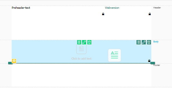
- Horizontal column layout
When dropping a content component onto a column, a vertical green bar is automatically displayed. The new content component is added on the left/right of another component. Every other component added afterward will automatically be added on the left/right of another component. When adding content components horizontally, only text, image and button components can be used.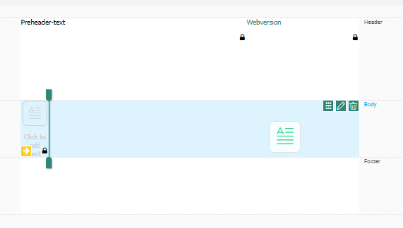


Any component can be added at the end of the horizontal row or in between already positioned components (this is the case for both horizontal and vertical column layouts):
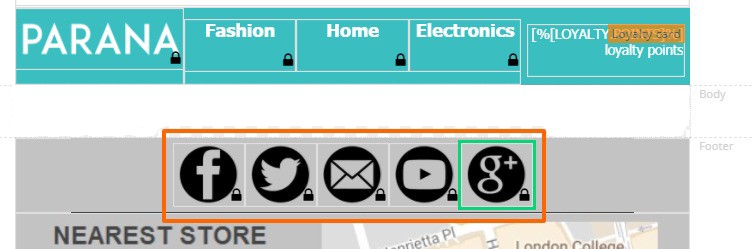
As a result, the content is placed (horizontally) next to each other.
Note: When Text components are added horizontally, it's possible to adapt the width of the text element in the properties panel. By default, the width is set to 100px.
Mobile behavior
When the email is going to be displayed on a mobile device, you can choose how the column content should be displayed, horizontally or vertically.
Example: For an email with three horizontal images,
the content will be displayed vertically if this option is selected.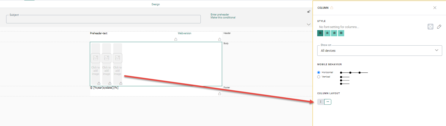
Note: A maximum of 10 content components can be added to one single column.
Technical note:
When components are added horizontally to a column, the alignment options
of the column are applied, not the ones of the component. For buttons
in particular, button alignment defined in the global style will be overruled.
When components have a fixed width, this will be applied in the
column. Components with 100% width will be divided equally in the remaining
space.
Editing content components
Hover over a component to access following operations:
 — Delete the component
 — Access the properties panel of the component
 — Move component to the new position
Right click a content component to access the following :
- Edit the visibility constraint — Sets a constraint on the component. The visibility constraint dialog is displayed.
- Copy/paste/delete — Modifies the visibility constraint.
- Duplicate the item — Creates a copy of the component just below the selected component. If there's a visibility constraint defined for the component, it will also be available in the duplicate
- Delete — Deletes the item.
- Lock/Unlock item — Locks and unlocks the component for editing by the user creating a journey using this template. This option is only available for templates, not for emails.
- Show on — Lets you select the devices to show the component on: all devices, mobile, or desktop.
- Copy content to other languages — Lets you copy the content as well as the layout of a component to another language.
Example:
We'll add the following components to our design:
* In the header, add an image for the Parana logo, text for the Edition
date and Website entry points.
* In the body, add text for the introduction text and a repeater that will
contain the items of this newsletter.
* In the footer, add the Parana unsubscribe link and an image for the payment
methods allowed.
The result looks like this: