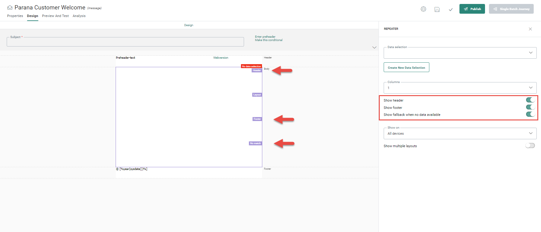
When a repeater is added to the design, it has a predefined layout with Header, Layout, Footer and No match section. Only the layout section is mandatory and is visible by default. The other sections are optional and can be hidden.
The repeater is like a structured placeholder in which layout and content components can be added defining how items will be displayed.
Adding layout elements
The first step is to add the rows, with or without content. You can add rows with up to four columns, meaning a maximum of 4 items can be displayed next to each other.
Example: We want to display an image with
the description of the item below it, and a button for more details. To achieve
this, drag a 1 Column
row to the layout section (you can toggle the option with default content off to only add a row). Since we do not need a
header or footer, we will hide these sections (in the properties panel
of the repeater):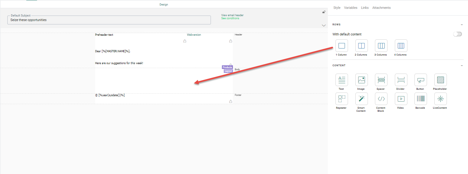
The above example shows
a repeater that will have only one column of items. So, every next item
is displayed below the previous one. If you would set the repeater to
three columns of items, the above ITEM content will be repeated three
times, one next to the other, like this: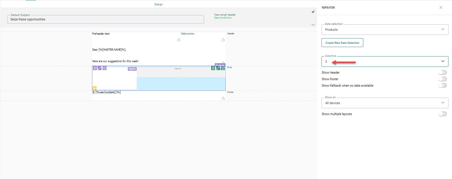
For the second and third item in the 3-column repeater, the reserved
space is displayed, but you cannot make any changes to it. All configuration
of the item is done in the first segment. The other two inherit from that
one.
Add content
The next step is to define the type of information you would like to display for each item. To do this, drag and drop the desired Content components from the Components panel on the right onto the layout component..
Example: Add an image to the
row and next a text and button. The result looks like
this: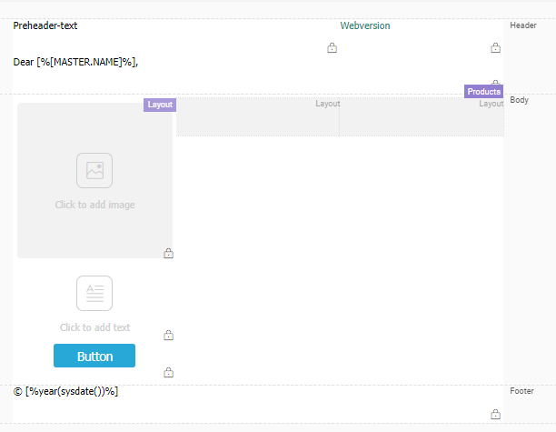
Define the content source
The last step is to indicate what should be used as content source for each of these content components. Because we display information coming from the data selection defined for this repeater, we will have to use personalization fields from the data selection.
Example: For an image, instead of using an image from the library, we will point
to the field in the data selection that contains the image of the item.
So first, go to the image properties (by clicking the Image component added earlier to the layout).
Then click the SRC field and
then the Personalization icon. 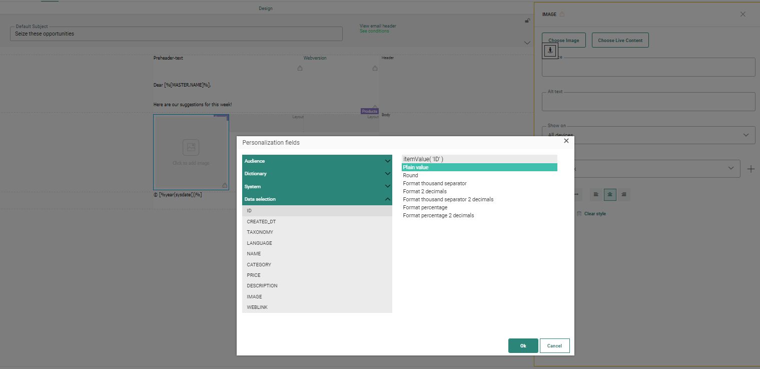
The Personalization dialog pops up.
Because a data selection is linked to the repeater, you have access
to all the fields in the data selection. Select the one containing the
image. As for any Image component, you can set an alternative text and
add a link.
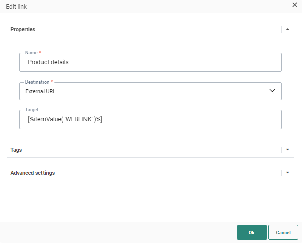
Note: The image used in the repeater points to the
item image url. This link might not yet exist and should be created in that
case, pointing to the item url.
.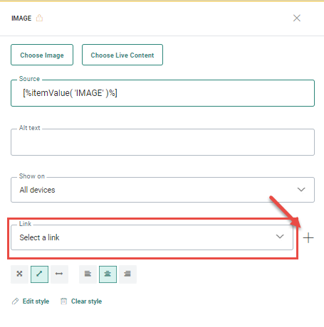
Click the + button to create a new link: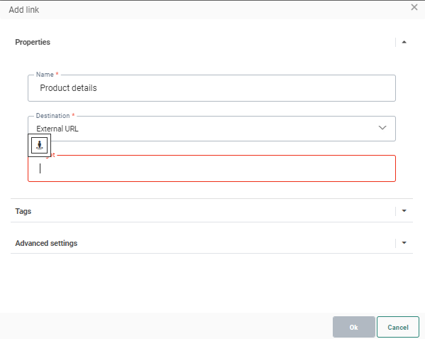
The Add link dialog is displayed. In the Target field, select the personalization icon to access the Personalization dialog and select the field that holds the URL of the product. The following value is returned to the Target field
Example: For the Text component, click the Personalization icon to, go to the Personalization
dialog. Expand the data selection folder and select the description of
the item or name for instance. As for any text you can set styling
here.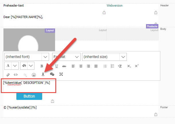
Example: You can do the same for the button
and display item content as text in the button or simply set text. Styling can be applied as
well.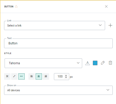
The link for the button can also be customized with a URL stored in
the data source.