Pages are created in source mode. Nevertheless, content components can be added easily to the source and the properties of these components can be modified in the Properties panel on the right. Moreover, a WYSYWIG editor is available as well and lets you create the content of the page in a visual way.
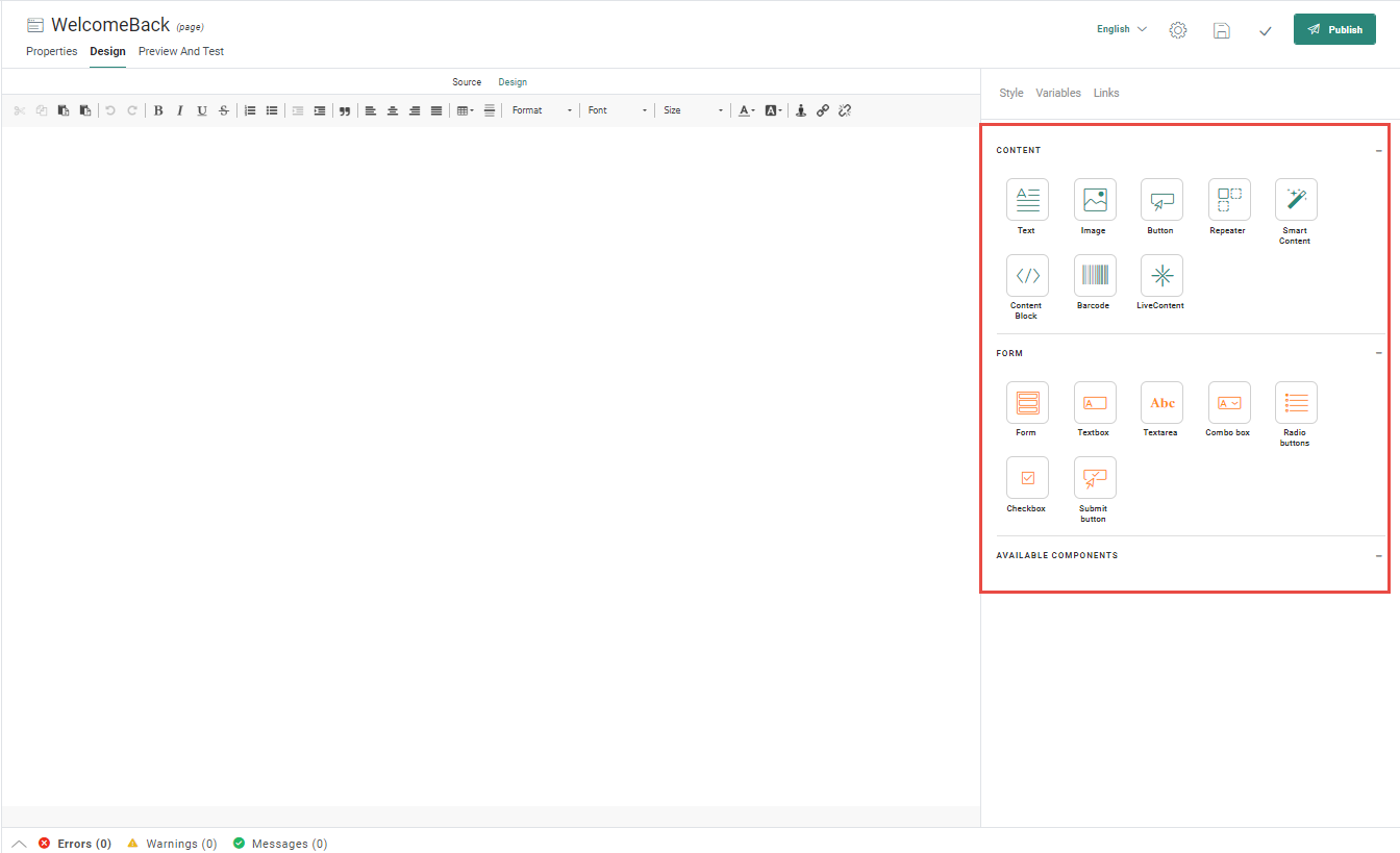
Following components are available:
-
 Text — Places
a content box for text input that supports hyperlinks, stylings, personalization
fields, and emojis.
Text — Places
a content box for text input that supports hyperlinks, stylings, personalization
fields, and emojis.  Image
— Places an image container that you can click to select or upload an
image. Supports adding alternative text and hyperlinks.
Image
— Places an image container that you can click to select or upload an
image. Supports adding alternative text and hyperlinks.
 Button —
Places a button and allows entering the button label and setting the
style, and associating a hyperlink URL to the button. The link can
be configured to be tracked or not.
Button —
Places a button and allows entering the button label and setting the
style, and associating a hyperlink URL to the button. The link can
be configured to be tracked or not. -
 Repeater — Inserts a repeater widget that holds items in a repeating layout.
Items displayed can be retrieved from a data source.
Repeater — Inserts a repeater widget that holds items in a repeating layout.
Items displayed can be retrieved from a data source. -
 Forms — Inserts a form into the page in which text, images and buttons can be placed
 -
 Content Block — Inserts a pre-defined Content Block into the message. Content Blocks are created in the Library section
 -
 Smart Content — Inserts Smart Content into the message. Smart Content is created in the Recommendations tool.
 -
 Barcode — Inserts a barcode or QR code into your message.
