 A text editor allows you to define the content of the Text Component and apply styling
to it. The text editor is displayed within the Design panel. Text can
contain the following elements:
A text editor allows you to define the content of the Text Component and apply styling
to it. The text editor is displayed within the Design panel. Text can
contain the following elements:
- Personalization fields from the audience, profile extension, data selection, custom variables , dictionary labels and system values.
- Tracked links
- Emoticons
- Expressions
- AI generated content
In the toolbar, a dedicated icon is available to generate text using AI.

Click it to display the Marigold AI panel on the right where you can enter some keywords or a question and generate an AI created text:
Note: If you select the existing text in your message and then click the AI icon, the selected text is used as the question in your dialog and the AI generated text will overwrite the selected text in your message if you agree to use it.
Additional options are available to make the selected text shorter, check the spelling, change the tone or completely rewrite the text.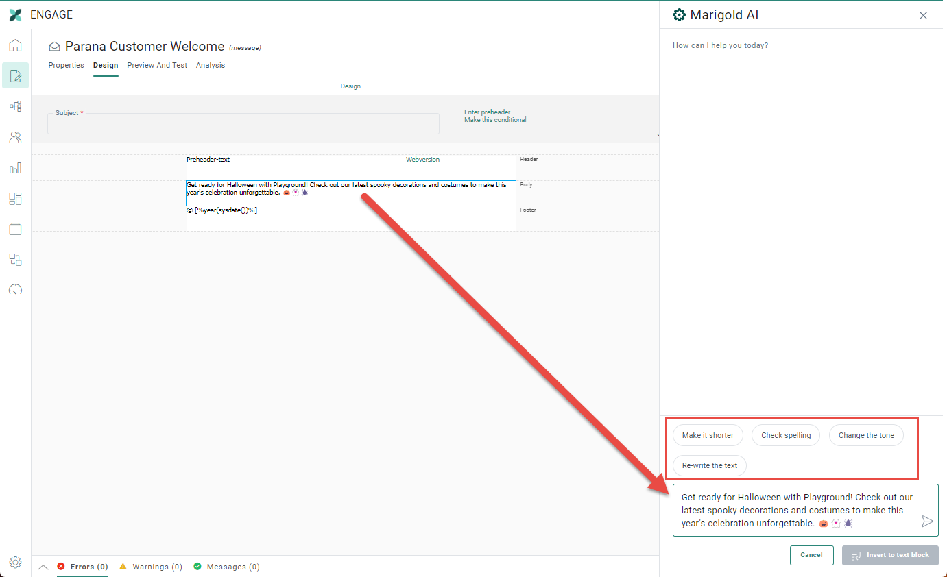
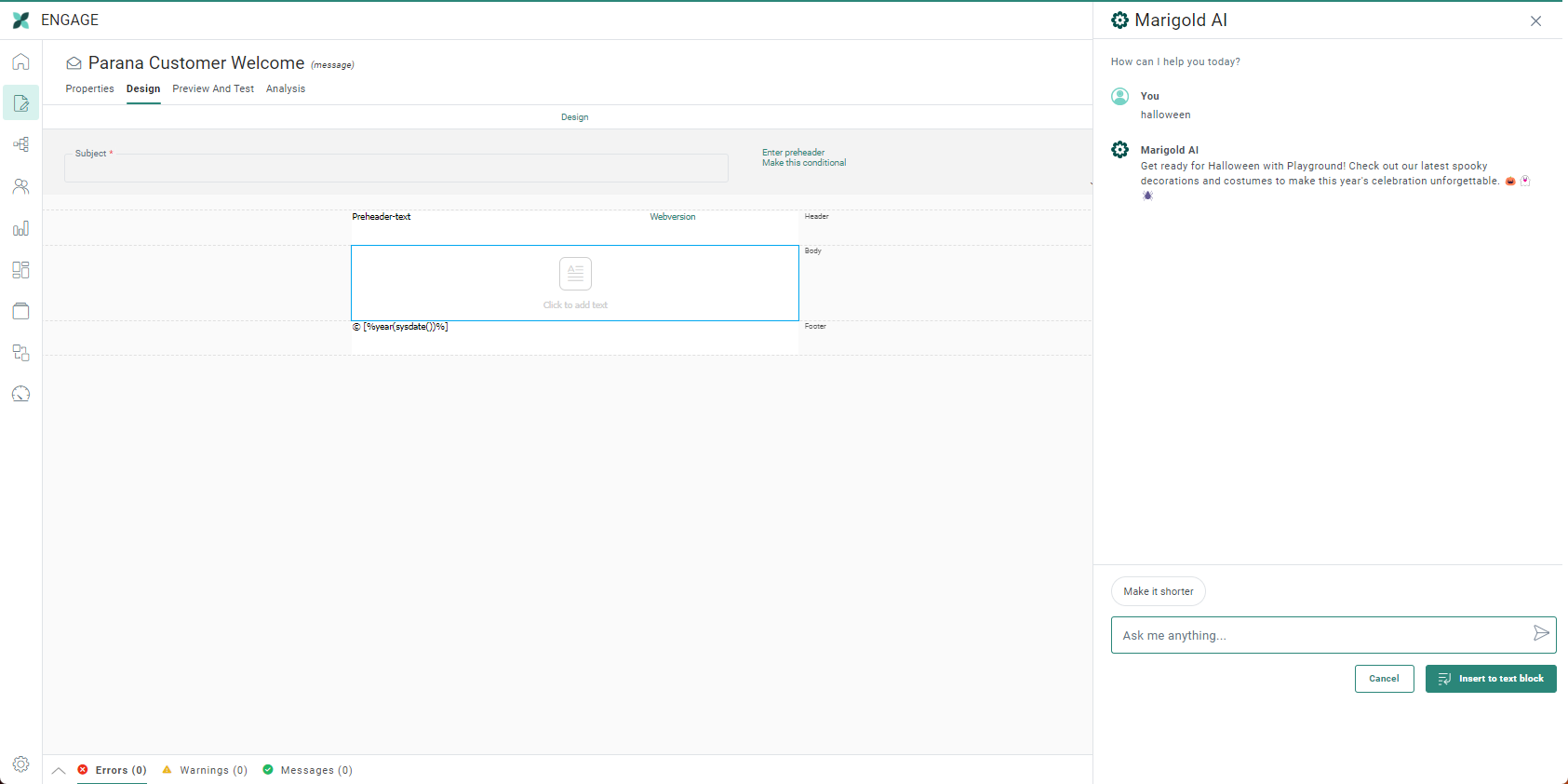
Note: The text is generated by default in English, unless specific instructions are given in the AI dialog. After generating the text, you can also ask to get it translated by adding for example 'in French' in the chat.
You can also use the instructions at the bottom to make the text shorter.
The generated text is adapted to the type of content you are creating, in this case an email. If you are happy with the generated text, click Insert to text block. The AI text is now added to your Text Component where you can make changes if needed.

Standard styling options are available, such as alignment, font, font size (manual values can be added as well), font color, lists, indent, headings, etc.

Moreover, the Source button  in the toolbar of the Text component editor allows you to use enter content in source mode:

Example:
Let's adapt our template/message and set the introduction text
using a personalization field: 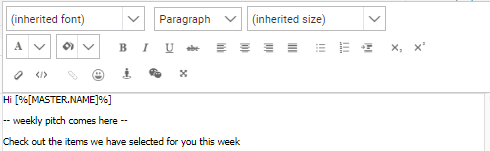
In the header we'll add the text that contains the links to specific
sections on the website as well as the edition (later we'll use a variable
to fill out the edition month when creating the message).
The result is like this: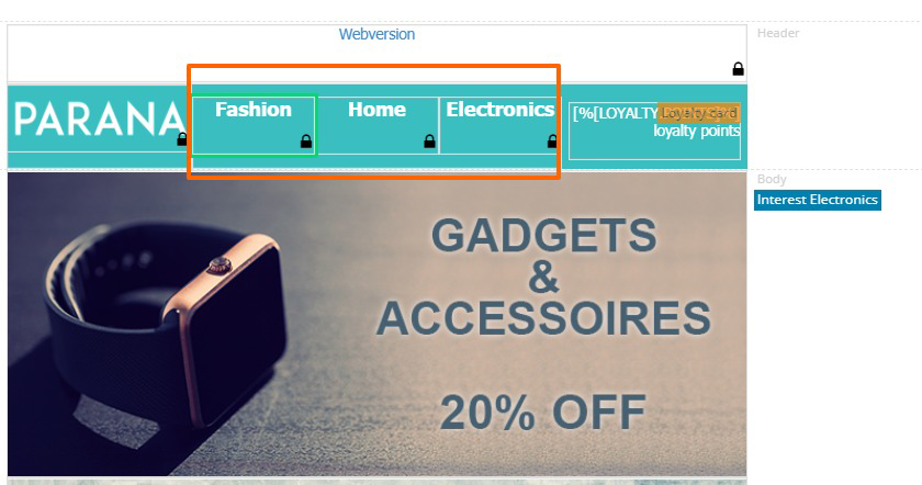
If a Text component is added to the Design canvas and then clicked, the properties panel on the right hand side is displayed. Here, you can specify the width of the text component if it's aligned horizontally with other text components in the design.
The default width of a text component box is set to 100 px.
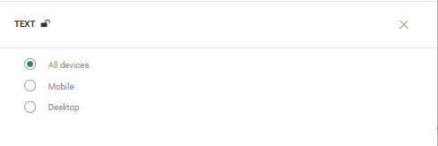
Note: The content of the text box can be locked/unlocked in a template
Copy Text Component content to other languages
By default, when adding new Content Components to a message, only the structure of the component is copied automatically to other languages. However, using the function copy content to other languages, you can now copy the component with its content to one or more languages.
This option is available once the component is placed onto the message and multiple languages have been defined for the message..
Click the button copy content to other languages in the component properties.
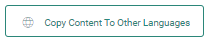
A dialog is displayed in which the target languages can be selected.

